All Prompts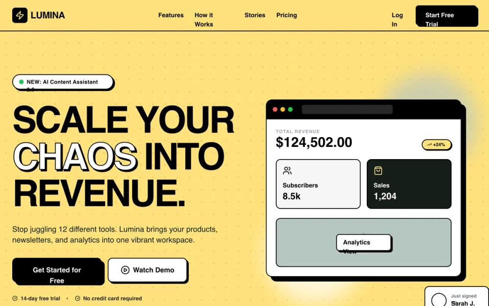 All Prompts
boldenergeticyellowstylelanding pagesaas landing
Lumina SaaS Landing Page
Lumina: Нео-бруталист лендинг для SaaS. Смелый дизайн с желтым цветом, типографикой Cabinet Grotesk и Satoshi. Идеально для стартапов, финтеха, EdTech.
by Shirley LouLive Preview
Prompt
# Lumina SaaS Landing Page

{
  "summary": "A vibrant Neo-Brutalist SaaS landing page utilizing a dominant #ffe17c yellow, deep charcoal #171e19, and sage #b7c6c2 accents. It features high-contrast black borders, hard offset shadows, and bold geometric typography to convey professional confidence with a playful edge.",
  "style": {
    "description": "The style is a modern take on Neo-Brutalism. Typography pairs the high-impact 'Cabinet Grotesk' (weights 400-800) for headings with 'Satoshi' for readability. The palette uses #ffe17c as a primary background, balanced by #171e19 charcoal and #b7c6c2 sage. Visual elements are defined by 2px solid black borders and 4px-8px hard shadows (no blur). Micro-interactions involve 'translate' effects on hover where buttons move 4px to 'fill' their shadow space.",
    "prompt": "Create a design based on Neo-Brutalist principles. Colors: Primary #ffe17c (Yellow), Background #171e19 (Charcoal), Accent #b7c6c2 (Sage), UI #ffffff (White), Text #000000 (Black). Typography: Headings in 'Cabinet Grotesk' (Extrabold, tracking-tighter), Body in 'Satoshi' (Medium, 500). UI Elements: Use 2px solid black borders on all cards, buttons, and sections. Implement 'Hard Shadows' using box-shadow: 4px 4px 0px 0px #000000 for standard elements and 8px 8px 0px 0px #000000 for large containers. Buttons should have a hover state that transforms: translate(4px, 4px) and removes the shadow to simulate a physical press. Include a 32px x 32px radial dot pattern (opacity 10%) on primary yellow backgrounds."
  },
  "layout_and_structure": {
    "description": "A vertically stacked landing page with high-contrast section transitions. It moves from a high-energy yellow hero to a dark charcoal social proof bar, followed by white/yellow feature grids and a dark-mode 'how it works' flow.",
    "prompts": [
      {
        "part": "Navigation",
        "prompt": "Fixed header at top-0, h-20, background #ffe17c, border-b-2 border-black. Left: Logo with a 10x10 black square icon containing a #ffe17c bolt. Center: Horizontal links in bold Satoshi. Right: 'Start Free Trial' button (Black background, white text, 2px border, hard shadow)."
      },
      {
        "part": "Hero Section",
        "prompt": "Two-column grid on #ffe17c background with radial dot pattern. Left column: Badge 'NEW: AI Content Assistant 2.0' (White, pill-shaped, 2px border). Heading: 'Cabinet Grotesk' 8xl, black, with one keyword using -webkit-text-stroke: 2px black and transparent fill. CTA group: Primary black button with 8px hard shadow, secondary white button with 4px hard shadow. Right column: Browser mockup (White, 2px border, 12px hard shadow) showing a dashboard with revenue charts and sage-colored accent panels."
      },
      {
        "part": "Social Proof Marquee",
        "prompt": "Full-width bar, background #171e19, border-b-2 border-black. Contains a continuous horizontal marquee of brand names (ACME, GLOBEX, etc.) in Cabinet Grotesk, color #b7c6c2, 50% opacity, moving infinitely at a slow linear pace."
      },
      {
        "part": "Problem vs Solution",
        "prompt": "White background section. Two large 3xl-rounded cards side-by-side. Card A (Problem): #f4f4f5, 2px dashed gray border, 70% opacity. Card B (Solution): #ffe17c, 2px solid black border, 8px hard shadow. Both cards use bold lists with custom check/x icons."
      },
      {
        "part": "Feature Grid",
        "prompt": "Background #ffe17c, border-y-2 border-black. 3-column grid of white cards. Each card: 2px border, 4px hard shadow. Top of card features a 16x16 icon box in #b7c6c2 that turns #ffe17c on hover. Headings are Cabinet Grotesk 2xl."
      },
      {
        "part": "How It Works",
        "prompt": "Dark mode section (Background #171e19). 3-step horizontal flow. Steps are marked by large 24x24 circles with 4px colored 'glow' borders (Sage, Yellow, White). Steps are connected by a dark gray #272727 horizontal line."
      },
      {
        "part": "Use Case Personas",
        "prompt": "White background. 3-column bento-style grid. Card 1: Sage (#b7c6c2). Card 2: Yellow (#ffe17c) with 8px hard shadow. Card 3: Dark Gray (#272727) with white text. Each card features a white 'pill' badge at the top indicating the user type."
      },
      {
        "part": "Testimonials",
        "prompt": "Background #b7c6c2. Grid of 3 white cards. Unique styling: Cards have asymmetric corner rounding (Top-Right and Bottom-Left are 3xl, Top-Left and Bottom-Right are 2px). Includes a 5-star rating in #ffbc2e yellow."
      },
      {
        "part": "Final CTA & Footer",
        "prompt": "Final CTA on #ffe17c with large centered heading. Footer in #171e19 with 4 columns. Social icons are 10x10 squares (#272727) with light gray borders that turn Yellow/Black on hover."
      }
    ]
  },
  "special_ui_components": [
    {
      "component": "Neo-Brutalist Push Button",
      "description": "A high-contrast button that visually 'depresses' when hovered or clicked.",
      "prompt": "Implementation: background-color: #000; color: #fff; padding: 1rem 2rem; border: 2px solid #000; border-radius: 0.75rem; box-shadow: 8px 8px 0px 0px #000; transition: all 0.2s cubic-bezier(0.175, 0.885, 0.32, 1.275); On Hover: transform: translate(4px, 4px); box-shadow: 4px 4px 0px 0px #000;"
    },
    {
      "component": "Browser Mockup Dashboard",
      "description": "A stylized application UI container for marketing visuals.",
      "prompt": "Implementation: Background white, border 2px solid black, border-radius 1rem, shadow 12px 12px 0px black. Header bar: background black, contains three small colored circles (Red #ff5f57, Yellow #febc2e, Green #28c840). Content area uses a grid layout with sage #b7c6c2 and charcoal #171e19 internal cards."
    }
  ],
  "special_notes": "MUST: Maintain a strict 2px border-width on all interactive elements. MUST: Use only hex values #ffe17c, #171e19, and #b7c6c2 for branded sections. MUST: Ensure all shadows have 0 blur radius. DO NOT: Use gradients or soft shadows. DO NOT: Use rounded corners on buttons larger than 12px; keep the aesthetic geometric."
}