All Prompts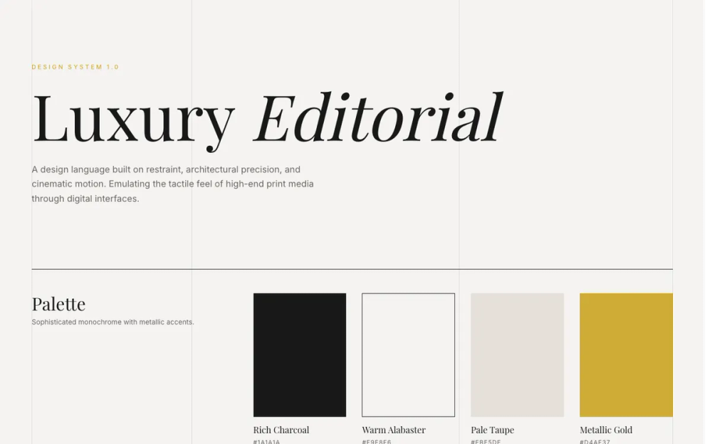 All Prompts
style
Luxury
Стильный UI-дизайн "Luxury" для элегантных интерфейсов. Минимализм, точность и глубина.
by Zhou JasonLive Preview
Prompt
# Luxury

<design-system>

# Design Style: Luxury / Editorial

## Design Philosophy

**Core Principles**: Elegance through restraint, precision, and depth. This style emulates high-end fashion magazines (Vogue, Harper's Bazaar, Kinfolk) and luxury brand websites (Chanel, Hermès, Aesop). Success depends on **exquisite typography hierarchy**, **generous negative space**, **slow cinematic motion**, **intentional asymmetry**, and **layered depth through subtle shadows**. The design creates visual tension through grid-breaking layouts while maintaining perfect architectural balance.

**Vibe**: Sophisticated, Timeless, Expensive, Serene, Curated, Deliberate, Editorial, Tactile.

**The Secret**: Luxury isn't about adding decoration—it's about removing everything unnecessary and perfecting what remains. Every element must feel intentional and considered. Slow down all motion to cinematic speeds (1500-2000ms for images). Add more space than feels comfortable. Use asymmetry to create visual interest. Layer depth through subtle shadows (never harsh drops) and inner borders. The design should feel like expensive paper that you want to touch.

## Design Token System (The DNA)

### Colors (Sophisticated Monochrome)

**Primary Palette:**

- **Background**: `#F9F8F6` (Warm Alabaster) — Not pure white (#FFFFFF). This off-white feels like expensive paper or linen. The warm undertone is critical.

- **Foreground**: `#1A1A1A` (Rich Charcoal) — Not pure black (#000000). Softer, more sophisticated. Used for primary text and sharp borders.

- **Muted Background**: `#EBE5DE` (Pale Taupe) — For subtle surface elevation, disabled states, or alternate backgrounds.

- **Muted Foreground**: `#6C6863` (Warm Grey) — For secondary text, captions, metadata. Maintains warmth of the palette.

- **Accent**: `#D4AF37` (Metallic Gold) — Use sparingly. For hover states, underlines, focus indicators, small decorative elements. Never use gold for large areas.

- **Accent Foreground**: `#FFFFFF` (Pure White) — Only used on top of dark backgrounds or gold elements.

**Layering Strategy:**

- Use opacity for borders and dividers: `#1A1A1A` at 10-20% opacity creates subtle separation

- Dark sections use inverted palette: `#1A1A1A` background with `#F9F8F6` text and `#EBE5DE` muted text at 60-80% opacity

- Never use pure black or pure white for text—always use the charcoal and alabaster values

### Typography (The Most Critical Element)

**Font Pairing:**

- **Heading Font**: "Playfair Display" (High-contrast serif) — Elegant, editorial, with distinctive high-contrast strokes. Use for headlines, large quotes, and emphasis.

- **Body Font**: "Inter" (Humanist sans-serif) — Clean, modern, highly legible. Use for body text, labels, UI elements.

**Type Scale & Hierarchy:**

- **Hero Headlines**: `text-6xl` to `text-9xl` (4rem to 8rem+) — Massive, dramatic. Use `leading-[0.9]` for tight, compressed vertical rhythm.

- **Section Headlines**: `text-5xl` to `text-7xl` (3rem to 4.5rem) — Still large, commanding attention.

- **Subsection Titles**: `text-3xl` to `text-4xl` (1.875rem to 2.25rem) — For card titles, feature headings.

- **Body Text**: `text-base` to `text-lg` (1rem to 1.125rem) — Comfortable reading size with `leading-relaxed` (1.625).

- **Overlines/Labels**: `text-xs` (0.75rem) — Always uppercase with wide tracking.

- **Micro-text**: `text-[10px]` — For metadata, copyright, tiny labels.

**Font Weight Distribution:**

- Playfair: Regular (400) for most headlines, Light (300) for specific contrast, Italic (400) for emphasis within headlines

- Inter: Medium (500) for buttons/links, Regular (400) for body, Light (300) sparingly

**Letter Spacing (Critical for Luxury Feel):**

- **Uppercase Labels**: `tracking-[0.25em]` to `tracking-[0.3em]` — Wide tracking creates elegance and readability

- **Buttons**: `tracking-[0.2em]` — Slightly less than labels but still generous

- **Headlines**: `tracking-tight` or default — Large serif headlines need tighter tracking

- **Body Text**: Default tracking — Never adjust body text spacing

**Line Height Strategy:**

- **Headlines**: `leading-[0.9]` to `leading-tight` (0.9 to 1.25) — Tight creates drama

- **Body Text**: `leading-relaxed` (1.625) — Generous for readability

- **Small Text**: `leading-relaxed` to default — Maintains breathing room

### Radius & Borders (Architectural Precision)

**Border Radius:**

- **Everything**: `0px` — Strictly rectangular. No rounded corners anywhere. This creates architectural precision and editorial sharpness.

**Border Treatment:**

- **Width**: Always `1px` — Thin, precise, deliberate

- **Color**: `#1A1A1A` at full opacity for strong borders, 10-20% opacity for subtle dividers

- **Style**: Single borders (top, bottom, left, right) rather than full boxes. Common pattern: `border-t` only

- **Dividers**: Use horizontal lines `h-px`) or vertical lines `w-px`) as decorative elements with background color

### Shadows & Effects (Subtle Layered Depth)

**Shadows:**

- **Philosophy**: Use extremely subtle, soft shadows to create depth and elevation—never harsh or prominent

- **Hero Image**: `shadow-[0_8px_32px_rgba(0,0,0,0.12)]` — Medium shadow for primary focal point

- **Feature Images**: `shadow-[0_4px_24px_rgba(0,0,0,0.08)]` — Light shadow with subtle inner border

- **Blog Images**: `shadow-[0_4px_20px_rgba(0,0,0,0.06)]` deepens to `shadow-[0_8px_32px_rgba(0,0,0,0.12)]` on hover

- **Cards**: `shadow-[0_2px_8px_rgba(0,0,0,0.02)]` deepens to `shadow-[0_8px_24px_rgba(0,0,0,0.06)]` on hover

- **Primary Buttons**: `shadow-[0_4px_16px_rgba(0,0,0,0.15)]` deepens to `shadow-[0_8px_24px_rgba(0,0,0,0.25)]` on hover

- **Inner Borders**: Use `shadow-[inset_0_0_0_1px_rgba(0,0,0,0.04-0.08)]` for subtle framing on images

**Texture & Grain:**

- **Paper Noise**: Subtle SVG noise texture overlay across entire page at 2% opacity to mimic expensive paper grain

- **Implementation**: Fixed position overlay with SVG fractal noise filter, pointer-events disabled, z-index 50

- **Purpose**: Adds tactile quality without being visible at first glance—creates "expensive paper" feel

**Image Treatment:**

- **Default State**: Grayscale filter `grayscale`) — Creates monochromatic editorial look

- **Hover State**: Full color `grayscale-0`) — Slow transition reveals color as reward

- **Transition**: `duration-[1500ms]` to `duration-[2000ms]` — Ultra-slow, cinematic reveal

- **Transform**: Subtle scale on hover `group-hover:scale-105`) combined with color transition

- **Shadow Evolution**: Images gain deeper shadows on hover to enhance lift effect

- **Group Context**: Use `group` utility on parent for coordinated hover effects

### Grid & Vertical Lines (Structural Framework)

**Visible Grid System:**

- **4 Vertical Gridlines**: Fixed position lines spanning full viewport height, positioned at column boundaries

- **Implementation**: `w-px` divs with `bg-[#1A1A1A]/20`, fixed position, pointer-events disabled

- **Purpose**: Creates visible editorial grid structure, adds architectural quality

- **Spacing**: Aligned with 12-column layout breakpoints, typically at container edges and middle thirds

**Layout Grid:**

- **Columns**: 12-column grid system

- **Max Width**: 1600px for content container

- **Padding**: `px-8` mobile, `px-16` desktop — Generous horizontal breathing room

- **Asymmetry**: Use offset column starts `col-start-2`, `col-start-6`) to create visual interest

## Component Styling Principles

### Buttons (Minimalist with Luxury Details)

**Visual Structure:**

- **Shape**: Rectangular, 0px border-radius, precise edges

- **Height**: `h-12` default (48px), `h-14` large (56px), `h-10` small (40px)

- **Padding**: Generous horizontal `px-8` to `px-10`)

- **Typography**: Uppercase, `text-xs`, `tracking-[0.2em]`, medium weight

**Primary Button:**

- **Default**: Dark background `bg-[#1A1A1A]`), white text

- **Hover Animation**: Gold layer `bg-[#D4AF37]`) slides in from left using transform

- Initial state: `translate-x-[-100%]` (off-screen left)

- Hover state: `translate-x-0` (covers button)

- Duration: `duration-500` with custom easing `cubic-bezier(0.25, 0.46, 0.45, 0.94)`

- Text stays white and appears above gold layer using z-index

- **Structure**: Requires internal `<span>` for gold overlay and another for content (z-10)

**Secondary Button:**

- **Default**: Transparent background, thin border `border border-[#1A1A1A]`), dark text

- **Hover**: Background fills to dark `bg-[#1A1A1A]`), text inverts to white

- **Transition**: Smooth `duration-500` for elegant fill

**Link Button:**

- **Style**: Text with underline on hover, no background or border

- **Color**: Dark text, gold on hover optional

### Cards & Containers (Defined by Lines)

**Visual Approach:**

- **Background**: Transparent or subtle `bg-transparent`)

- **Definition**: Single top border `border-t`) rather than full box

- **Border**: `border-[#1A1A1A]` at 1px width

- **Padding**: Generous `p-8` mobile, `p-12` desktop

- **Hover**: Subtle background color shift `hover:bg-[#F9F8F6]/50`) — barely visible

**Featured Cards:**

- Use thicker top border `border-t-4`) with gold color `border-t-[#D4AF37]`) to indicate importance

- Pricing tier highlighting, special features

**Image Cards:**

- Image in grayscale with slow color reveal on hover

- Use specific aspect ratios: `aspect-[3/4]` for features, `aspect-[4/5]` for blog posts

- Combine image scale with parent card hover state using `group` utility

### Inputs (Underline Only)

**Visual Style:**

- **Border**: Bottom border only `border-b`), no other borders

- **Background**: Transparent `bg-transparent`)

- **Border Color**: `#1A1A1A` default, `#D4AF37` on focus

- **Height**: `h-12` for consistency with buttons

- **Padding**: Minimal horizontal `px-0`), vertical `py-2`)

**Typography:**

- **Input Text**: Inter font, `text-sm`, dark color

- **Placeholder**: Playfair Display font, italic, warm grey color `text-[#6C6863]`)

- **Reasoning**: Italic serif placeholder creates elegant, editorial feel

**Focus State:**

- Border changes to gold `focus-visible:border-[#D4AF37]`)

- No ring or glow effects — keep it minimal

### Interactive States (Slow & Deliberate)

**Hover Effects:**

- **Duration**: `duration-500` to `duration-700` for most interactions (text, backgrounds, borders)

- **Duration (Images)**: `duration-[1500ms]` to `duration-[2000ms]` for image transitions

- **Easing**: `ease-out` or custom `cubic-bezier(0.25, 0.46, 0.45, 0.94)` for smooth luxury feel

- **Color**: Gold accent `#D4AF37`) appears subtly on hover (text, borders, underlines)

- **Transform**: Subtle scale `scale-105`) or translate — never abrupt

- **Shadow Evolution**: Shadows deepen on hover for lift effect

- **Testimonials**: Left border changes to gold, padding increases, avatar gains color

- **FAQ**: Question text turns gold, icon square rotates 90° and border turns gold

**Focus States:**

- Minimal focus rings: `focus-visible:ring-1 focus-visible:ring-[#1A1A1A]`

- Prefer border color change over visible rings

- Gold accent for focused inputs `focus-visible:border-[#D4AF37]`)

**Disabled States:**

- Reduced opacity `opacity-50`)

- Pointer events disabled

- No special color changes — muted appearance

**Micro-interactions:**

- **FAQ Accordion**: Icon rotates 90°, border turns gold on open, content fades in with translateY animation

- **Testimonial Stars**: Scale up slightly on card hover `group-hover:scale-110`)

- **Blog Cards**: Shadow deepens, image scales and gains color

- **Navigation Links**: Gold color on hover with 500ms transition

- **Button Animations**: Gold overlay slides from left on primary buttons, shadow deepens

## Layout Principles (Breaking Symmetry)

**Asymmetric Composition:**

- **Avoid 50/50 splits**: Use 7/5, 4/4/4, or 4 offset by 2 column starts instead

- **Bottom-left alignment**: Position primary content at bottom of container, aligned left

- **Offset grids**: Start content at column 2 or 6 instead of 1, leaving deliberate empty space

**Vertical Spacing (Generous Air):**

- **Section Padding**: `py-24` to `py-32` (6rem to 8rem) — Massive vertical space between sections

- **Component Padding**: `p-8` to `p-12` for cards and containers

- **Element Spacing**: Use `gap-12` or `gap-16` for component groups, not tight spacing

- **Breathing Room**: If it feels like too much space, it's probably correct for luxury design

**Section Alternation:**

- Alternate light `bg-[#F9F8F6]`) and dark `bg-[#1A1A1A]`) sections for rhythm

- Use top borders `border-t`) to separate sections without color changes

- Dark sections use inverted color palette with muted text at 60-80% opacity

**Content Width:**

- Maximum container: `max-w-[1600px]`

- Centered with `mx-auto`

- Text columns: `max-w-md` to `max-w-xl` for comfortable reading

## The "Bold Factor" (Non-Genericness)

These signature elements make Luxury/Editorial instantly recognizable and must be present:

 1. **Vertical Text Labels**: Use CSS `writing-mode: vertical-rl` for decorative side labels (e.g., "Editorial / Vol. 01"). Position absolutely on images, typically on left or right edges. Uppercase with wide tracking. Hidden on mobile, visible on desktop.

 2. **Drop Caps**: Large initial letter for introductory paragraphs using `float-left`, Playfair Display font, 7xl size, tight line-height (0.8), with right margin (mr-3). Applied to first paragraph of Product Detail and Features intro. Creates classic editorial feel.

 3. **Mixed Italic Headlines**: Within large headlines, alternate between regular and italic styling for specific words to create "spoken" cadence. Use gold color on italic words. Examples: "Curated *Excellence*", "The *Details*", "The *Process*". Headline splits across lines with specific words emphasized.

 4. **Grayscale Image Transitions**: All images default to grayscale filter with ultra-slow (1500-2000ms) transition to full color on hover. Combines with subtle scale transform `group-hover:scale-105`) and shadow deepening. Applied consistently to hero, features, blog, and testimonial avatars.

 5. **Visible Grid Lines**: Fixed vertical lines spanning viewport height, aligned with 12-column grid boundaries, at low opacity (20%). Four lines total (edges and middle thirds). Creates architectural editorial magazine feel. Pointer-events disabled.

 6. **Gold Sliding Animation**: Primary button hover reveals gold background `#D4AF37`) sliding from left using `translate-x` transform. Requires layered span structure with z-index. Combined with shadow deepening from `shadow-[0_4px_16px]` to `shadow-[0_8px_24px]`.

 7. **Decorative Horizontal Lines**: Short horizontal lines `h-px w-8 md:w-12`) used as decorative elements before labels (hero) or between metadata (blog dates). Deliberate, architectural spacing elements.

 8. **Extreme Type Scale**: Massive headlines `text-5xl` mobile to `text-9xl` desktop) combined with tiny uppercase labels `text-[10px]` to `text-xs`) creates dramatic hierarchy essential to luxury feel. Responsive scaling maintains proportions.

 9. **Layered Shadows**: Subtle shadows create depth without being obvious. Images have box shadows that deepen on hover. Inner borders `inset` shadows) frame images. Cards lift with shadow evolution. Never harsh—always soft and refined.

10. **Testimonial Interactions**: Left border animation (changes to gold and increases padding on hover), grayscale avatar transitions to color, author name turns gold, stars scale up. Multi-layered coordinated effect.

## Anti-Patterns (What to Avoid)

These mistakes will break the luxury aesthetic:

 1. **DO NOT use rounded corners** — Everything must be perfectly rectangular with 0px border-radius

 2. **DO NOT use harsh shadows** — Only use extremely subtle shadows with low opacity rgba values. Depth comes from layering, not prominent drops.

 3. **DO NOT use pure black (#000000) or pure white (#FFFFFF)** — Use charcoal (#1A1A1A) and alabaster (#F9F8F6)

 4. **DO NOT use fast animations** — Minimum 500ms for interactions, 1500-2000ms for images. Luxury is deliberate and slow.

 5. **DO NOT use vibrant colors** — Stick to monochromatic palette with gold (#D4AF37) as only accent

 6. **DO NOT center everything** — Use asymmetry, offset columns, bottom-left alignment. Break the grid intentionally.

 7. **DO NOT overcrowd spacing** — More space is better. If it feels too airy, you're on the right track. Mobile: py-20, Desktop: py-32.

 8. **DO NOT use decorative fonts** — Only Playfair Display (serif) and Inter (sans-serif). No script or display fonts.

 9. **DO NOT use icons prominently** — If needed, use lucide-react with thin strokes (1-2px), sparingly. Icons are functional, not decorative.

10. **DO NOT make gold dominant** — Gold is an accent for hover/focus states and specific emphasis, not a primary color

11. **DO NOT use small images** — Images should be large and prominent, portrait aspect ratios (3:4, 4:5) with shadows and inner borders

12. **DO NOT use tight tracking on body text** — Only uppercase labels get wide tracking (0.2-0.3em). Body text uses default tracking.

13. **DO NOT skip the grayscale filter** — All images must default to grayscale. Color is the reward on hover.

14. **DO NOT use generic mobile layouts** — Maintain the core aesthetic on mobile with proper scaling, not generic stacking

## Animation & Motion (Cinematic Timing)

**Philosophy:** All motion should feel deliberate, slow, and expensive. Nothing snaps or jumps. Think of camera movements in luxury fashion videos—smooth, gradual, cinematic.

**Timing:**

- **Button Interactions**: `duration-500` (500ms)

- **Color Transitions**: `duration-700` (700ms)

- **Image Effects**: `duration-[1500ms]` to `duration-[2000ms]` (1500-2000ms)

- **Background Transitions**: `duration-700` (700ms)

**Easing Functions:**

- **Default**: `ease-out` for most interactions

- **Custom**: `cubic-bezier(0.25, 0.46, 0.45, 0.94)` for smooth luxury feel (use in Tailwind with arbitrary values)

- **Never**: `ease-in-out` or `ease-in` — These feel too mechanical

**Transition Properties:**

- Combine multiple properties: `transition-all` or specific `transition-[colors,transform]`

- Image transforms: Combine `scale` (1 to 1.05) with `grayscale` (1 to 0) in same transition

- Button fills: Use transform on absolute positioned overlay rather than background color change

**Hover Effects:**

- Delay feels intentional — user must pause on element for effect to complete

- Multiple effects layer together (scale + color + grayscale) for richness

- Text color changes are instant or faster (300ms) while backgrounds are slower

## Accessibility Considerations

**Contrast:**

- Charcoal (#1A1A1A) on Alabaster (#F9F8F6): 12.6:1 — Excellent (AAA)

- Warm Grey (#6C6863) on Alabaster: 4.8:1 — Good for secondary text (AA)

- Gold (#D4AF37) on Charcoal: 5.2:1 — Sufficient for accents (AA)

- White on Charcoal: 14.5:1 — Excellent (AAA)

**Focus Indicators:**

- Use `focus-visible:ring-1` or `focus-visible:border-[color]` for keyboard navigation

- Gold accent on focus makes interactive elements clear

- Never remove focus indicators — just make them elegant

**Motion Preferences:**

- Respect `prefers-reduced-motion` for users with vestibular disorders

- Reduce animation durations to 0ms or use simpler transitions

- Keep color changes but remove transforms and scales

**Typography:**

- Large body text size (16-18px base) ensures readability

- High contrast ratio for primary text

- Generous line-height (1.625) improves readability

- Avoid justified text — use left alignment

**Interactive Areas:**

- Buttons have minimum 48px height (h-12) for touch targets

- Adequate padding creates larger clickable areas

- Spacing between interactive elements prevents mis-taps

## Implementation Notes

**Tech Stack:**

- Tailwind CSS v4 for all styling with custom color values

- Google Fonts for "Playfair Display" and "Inter"

- Lucide React for icons (if needed, use sparingly with thin stroke-width)

- Custom CSS for noise texture (SVG data URI) and vertical writing mode

**Responsive Strategy:**

- **Mobile (< 768px)**:

- Stack all columns vertically

- Reduce padding: `px-8`, `py-20` (instead of px-16, py-32)

- Scale down typography: `text-4xl` headlines (instead of text-6xl), `text-xl` quotes (instead of text-3xl)

- Reduce gaps: `gap-8`, `gap-12` (instead of gap-12, gap-24)

- Stats: 2 columns, smaller text (text-3xl instead of text-5xl)

- Hero: Smaller type scale `text-5xl` (instead of text-9xl), smaller line and decorative elements

- Testimonials: Smaller left padding `pl-6` (instead of pl-8)

- Footer CTA: Stack email input and button vertically with `flex-col` on small screens

- Maintain core aesthetic: grayscale images, gold accents, slow animations

- **Tablet (768px - 1024px)**:

- Begin introducing grid layouts (2-3 columns)

- Medium padding: `px-8 md:px-16`, `py-20 md:py-32`

- Typography scales up: `text-5xl md:text-6xl`

- Complex layouts still stack (testimonials, FAQ)

- **Desktop (> 1024px)**:

- Full 12-column asymmetric grid with offset columns

- Maximum padding and spacing

- Visible vertical gridlines (4 lines at column boundaries)

- Vertical writing mode text visible

- Full typographic scale (text-9xl for hero)

**Performance:**

- Use CSS transforms (translate, scale) for animations — GPU accelerated

- Grayscale filter is performant in modern browsers

- Fixed gridlines and noise overlay use minimal resources

- Shadows use rgba with low opacity for minimal render cost

**Code Organization:**

- Extract color values to config/constants for consistency

- Create button component with variant system (primary/secondary/ghost/link) and shadow on primary

- Create card component with border-top pattern and shadow evolution built in

- Create input component with underline-only styling and italic placeholder

- Add fadeIn keyframe animation for FAQ accordion content

</design-system>