All Prompts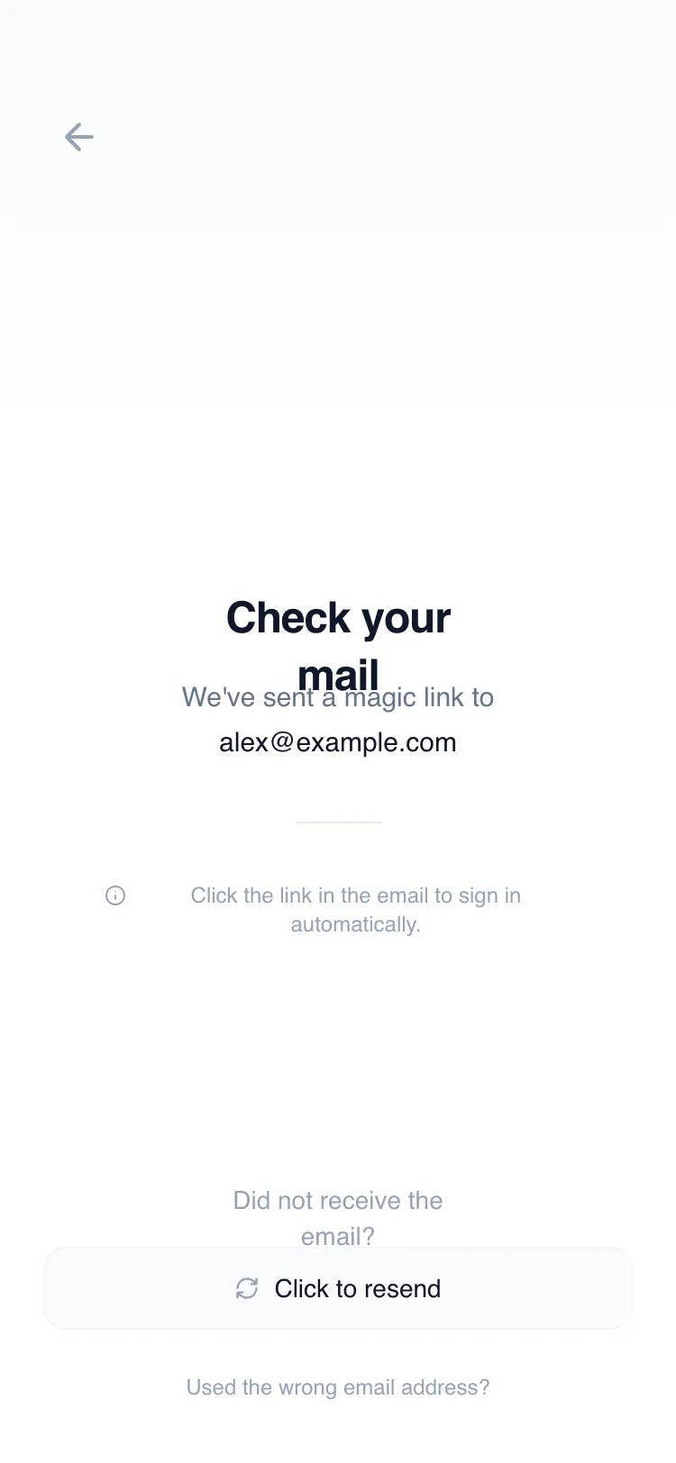 All Prompts
mobile appauthlayout
Magic Link Confirmation
Центрированный UI-шаблон для подтверждения email-аутентификации. Минималистичный дизайн, спокойный опыт ожидания в мобильных приложениях.
by Shirley LouLive Preview
Prompt
# Magic Link Confirmation

{
  "summary": "A clean, mobile-centric 'Check your email' confirmation page with soft UI elements, neutral tones, and elegant entrance animations designed to reassure the user during authentication.",
  "style": {
    "description": "The style is defined by its 'calm minimal' approach. It uses the Switzer typeface for a modern geometric feel, a neutral Slate-based color palette (#0F172A for headings, #64748B for body text), and subtle depth through soft shadows and rounded corners (24px for cards). Animations are smooth, utilizing cubic-bezier curves for organic motion.",
    "prompt": "Create a minimalist light-theme UI using the Switzer font family. Color Palette: Background #FFFFFF with a subtle top-to-bottom gradient from #F8FAFC to transparent; Headings and Primary text #0F172A; Body text #64748B; Accents #10B981 (Emerald). Typography: Heading 1 at 24px font-size, font-weight 600, tight tracking; Body text at 15px, leading-relaxed; Secondary text at 12px-14px. Components should have high border-radius (rounded-xl 12px and rounded-3xl 24px). Use extremely soft shadows: shadow-[0_8px_30px_rgb(0,0,0,0.04)]. Implementation includes a fadeInUp animation (0.8s, cubic-bezier(0.16, 1, 0.3, 1)) and a gentle 5px floating animation for central icons."
  },
  "layout_and_structure": {
    "description": "A single-column, vertically centered layout designed for mobile screens, structured into a fixed header, a flexible centered content area, and a bottom-aligned footer.",
    "prompts": [
      {
        "part": "Header",
        "prompt": "A thin header section (approx 56px height) with 24px horizontal padding. Includes a single circular back button (40x40px) on the left using a Lucide 'arrow-left' icon in #94A3B8. On hover, the button should transition to a background of #F8FAFC and icon color #0F172A."
      },
      {
        "part": "Hero Content Area",
        "prompt": "Centrally aligned container. Top element: A 96x96px (rounded-3xl) soft-card in #F8FAFC with a 1px #F1F5F9 border, containing a 'mail-open' icon in #1E293B. A small 32x32px circular badge with a green checkmark sits at the top-right corner of the card. Below the icon, place a text stack: H1 'Check your mail' followed by a body paragraph mentioning the user's email address in semi-bold."
      },
      {
        "part": "Information Divider",
        "prompt": "A small horizontal separator (48px width, 1px height) in #E2E8F0 followed by a secondary helper text section. The helper text includes a small Lucide 'info' icon paired with 12px text in #94A3B8, centered with a maximum width of 260px."
      },
      {
        "part": "Footer Actions",
        "prompt": "Bottom-aligned footer with 24px horizontal padding and 34px bottom padding (safe area). Contains a vertical stack: a 'Did not receive email?' prompt in 14px #94A3B8, a primary resend button (full width, 48px height, rounded-xl, #F8FAFC background, #F1F5F9 border), and a tertiary text link 'Used wrong email?' at 12px font-size."
      }
    ]
  },
  "special_ui_components": [
    {
      "component": "Animated Resend Button",
      "description": "A secondary CTA button with a rotating icon on hover.",
      "prompt": "A button styled with #F8FAFC background and 1px #F1F5F9 border. It features a Lucide 'refresh-cw' icon. When hovered, the icon should rotate 180 degrees over 500ms. On active click, the entire button should scale to 95% (active:scale-95)."
    },
    {
      "component": "Floating Icon Container",
      "description": "A central visual element that uses a slow floating animation to create a 'calm' vibe.",
      "prompt": "A 96px squircle container (rounded-3xl) with a soft shadow and subtle border. Apply a CSS animation 'float' that moves the component -5px on the Y-axis and back to 0 over 6 seconds with an ease-in-out timing function."
    }
  ]
}