All Prompts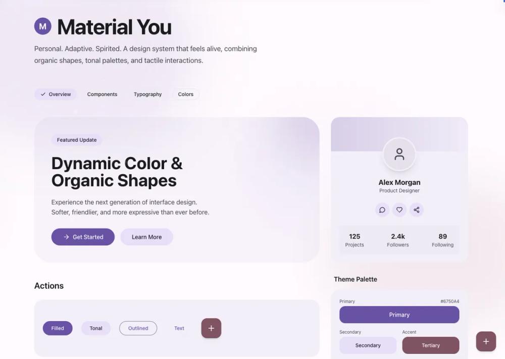 All Prompts
style
Material
Material Design 3 - UI-стиль для современных приложений. Создает интуитивно понятный и эстетичный пользовательский интерфейс.
by Zhou JasonLive Preview
Prompt
# Material

<design-system>

# Design Style: Material You (Material Design 3)

## Design Philosophy

**Core Principles**: Personal, adaptive, and spirited. Material You (MD3) represents a shift from Material Design 2's rigid "paper and ink" metaphor to a more organic, expressive system. The design extracts color palettes from seed colors (simulating the wallpaper-based personalization), emphasizes tonal surfaces over stark whites, and uses organic shapes with soft curves.

**Vibe**: Friendly, soft, rounded, colorful, and personal. The aesthetic feels modern yet approachable, with generous use of color through tonal surfaces rather than just accent highlights. Movement is smooth and confident, never jarring. Every interaction feels tactile and responsive, with micro-animations that provide satisfying feedback.

**Enhanced Implementation Details**:

This implementation goes beyond the baseline Material Design 3 specifications by incorporating:

- **Layered depth**: Multiple blur shapes, radial gradients, and shadow combinations create atmospheric backgrounds

- **Rich micro-interactions**: Hover states include scale transforms, shadow elevations, glow effects, and smooth color transitions

- **Asymmetric elevation**: Featured cards (like pricing tiers) use vertical translation to create visual hierarchy

- **Progressive disclosure**: Elements reveal depth on interaction through shadow transitions and background opacity changes

- **Tactile feedback**: All interactive elements include active:scale-95 for press feedback, enhancing the physical feel

**Key Differentiators from MD2**:

- Tonal surface system replaces pure white backgrounds

- Pill-shaped buttons replace rounded rectangles

- Organic shapes and blur effects replace flat geometric patterns

- State layers (opacity overlays) replace solid color changes

- Multi-layered atmospheric effects create rich visual depth

- Micro-interactions on every interactive element enhance perceived quality

## Design Token System (The DNA)

### Colors (Light Mode)

Material You uses a sophisticated tonal palette derived from a seed color. For this implementation, use a **Purple/Violet seed** (#6750A4).

**Core Palette Structure**:

- **Background (Surface)**: `#FFFBFE` - Slightly warm off-white, not pure white

- **Foreground (On Surface)**: `#1C1B1F` - Near-black with slight warmth

- **Primary**: `#6750A4` - Rich purple (seed color)

- **On Primary**: `#FFFFFF` - Pure white for text on primary

- **Secondary Container**: `#E8DEF8` - Light lavender tint

- **On Secondary Container**: `#1D192B` - Dark text for secondary surfaces

- **Tertiary**: `#7D5260` - Complementary mauve/dusty rose

- **Surface Container**: `#F3EDF7` - Subtle tinted surface, one step darker than background

- **Surface Container Low (Muted)**: `#E7E0EC` - For inputs and recessed surfaces

- **Outline (Border)**: `#79747E` - Medium gray for borders

- **On Surface Variant**: `#49454F` - For secondary text and icons

**Color Relationship Rules**:

- Use surface tones to create depth hierarchy: Background → Surface Container → Surface Container Low

- Primary color should appear in CTAs, focus states, and key interactive elements

- Secondary Container is for pills, chips, and less prominent containers

- Tertiary is for accent elements and FABs (Floating Action Buttons)

- Never use pure white (#FFFFFF) for backgrounds - always use the tinted Surface color

- On colored backgrounds (primary/tertiary), use transparent white/black overlays for states

**Opacity Patterns for State Layers**:

- Hover on solid colors: 90% of base color `bg-md-primary/90`)

- Active/pressed on solid colors: 80% of base color `bg-md-primary/80`)

- Hover on transparent surfaces: 10% of primary `bg-md-primary/10`)

- Focus on transparent surfaces: 5% of primary `bg-md-primary/5`)

- Subtle overlay effects: 20% opacity with backdrop-blur

### Typography

**Font Family**: **Roboto** (Google Fonts) - The canonical Material Design typeface

- Load weights: 400 (Regular), 500 (Medium), 700 (Bold)

- Use Medium (500) as default for headings to maintain the friendly, approachable feel

- Body text uses Regular (400)

**Type Scale** (Material Design 3 scale):

- **Display Large**: 3.5rem / 56px (Hero headlines)

- **Headline Large**: 3rem / 48px (Section titles)

- **Headline Medium**: 2rem / 32px (Subsection titles)

- **Title Large**: 1.5rem / 24px (Card titles)

- **Body Large**: 1.25rem / 20px (Lead paragraphs)

- **Body Medium**: 1rem / 16px (Standard body text)

- **Label Medium**: 0.875rem / 14px (Button text)

- **Label Small**: 0.75rem / 12px (Captions, metadata)

**Letter Spacing**:

- Headings: Normal to tight (0 to -0.01em)

- Body text: Normal (0)

- Labels/buttons: Slightly wide (0.01em) for Medium weight at small sizes

**Line Height**:

- Display/Headlines: 1.2 to 1.3 (tight for impact)

- Body text: 1.5 to 1.6 (relaxed for readability)

- Compact UI elements: 1.4

### Radius & Borders

Material You uses **organic, generous rounding** to create a friendly aesthetic.

**Radius Values**:

- **Extra Small**: `8px` - Minimal UI elements, chips

- **Small**: `12px` - Small cards, compact elements

- **Medium**: `16px` - Default card radius

- **Large**: `24px` - Prominent cards, containers

- **Extra Large**: `28px` - Dialogs, sheets, large surfaces

- **Extra Extra Large**: `32px` to `48px` - Hero sections, major containers

- **Full (Pills)**: `9999px` or `rounded-full` - All buttons, chips, badges, FABs

**When to Use Each**:

- Buttons, chips, badges: Always `full` (pill-shaped)

- Standard cards: `24px` (Large)

- Feature cards, FAQ items: `24px` (Large)

- Hero containers, major sections: `48px` (Extra Extra Large)

- Nested content cards: `32px`

- Input fields: Top corners `12px`, bottom corners `0px` (Material 3 filled text field style)

**Borders**:

- Use sparingly - tonal surfaces are preferred over borders

- When needed, use `#79747E` (Outline) color

- Thickness: 1px standard, 2px for focus states (bottom border on inputs)

- On colored backgrounds, use `white/10` or `white/20` for subtle borders

### Shadows & Effects

Material You uses **elevation** through subtle shadows combined with tonal surfaces, not dramatic drop shadows. This implementation enhances the baseline with progressive shadow transitions.

**Shadow Philosophy**:

- **Elevation 0** (Default): No shadow or `shadow-sm` - use tonal surface difference for depth

- **Elevation 1**: `shadow-sm` - Subtle lift for cards at rest (default state for most cards)

- **Elevation 2**: `shadow-md` - Hover state for interactive cards, default for important containers

- **Elevation 3**: `shadow-lg` to `shadow-xl` - FABs, major sections, raised buttons on hover

- **Elevation 4+**: Reserved for modals, dialogs (not common in base design)

**Enhanced Shadow Patterns**:

- All interactive cards transition from `shadow-sm` to `shadow-md` on hover

- Important sections (Benefits, Final CTA) start at `shadow-lg`

- Combined with scale transforms `hover:scale-[1.02]`) for depth enhancement

- Shadow transitions use 300ms duration for smooth, confident movement

**Shadow Composition**:

- Soft, diffuse shadows (large blur, minimal spread)

- Shadow colors should be near-black with low opacity (5-15%)

- Combine with tonal surface colors for best effect

- Layer shadows with background blur shapes for atmospheric richness

**Blur Effects** (Signature Technique):

- Large organic shapes: `blur-3xl` (64px+)

- Background decorative elements: Colored circles/shapes at 10-30% opacity with heavy blur

- Atmospheric effect: Multiple overlapping blurred shapes with radial gradients

- Glass-morphism cards: `backdrop-blur-sm` with `bg-white/10` to `bg-white/15` and borders at `border-white/10` to `border-white/20`

- Hero sections: Multiple blur shapes positioned off-canvas with transforms

**Glow/Aura Effects**:

- Use radial gradients with transparency for ambient light

- Color: Primary, secondary, or tertiary at 10-30% opacity

- Position: Behind hero content, in major sections (Benefits, Final CTA), or on hover states

- Animated glow: `opacity-0 group-hover:opacity-30` for progressive disclosure

- Example: Numbered badges in How It Works section have hidden blur that reveals on hover

### Textures & Patterns

**Organic Decorative Shapes**:

- Large rounded rectangles `rounded-[100px]`) with one corner less rounded `rounded-tr-[20px]`)

- Perfect circles `rounded-full`)

- Layered with `mix-blend-multiply` for color richness

- Use primary, secondary, and tertiary colors at 80-90% opacity

- Apply `blur-3xl` for soft, atmospheric quality

- Position partially off-canvas (using negative translate values)

**Background Treatment**:

- Never use solid white - always use Surface color (#FFFBFE)

- Radial gradients for subtle color washes: `bg-[radial-gradient(circle_at_top_right,_var(--color-md-secondary)_0%,_transparent_40%)]`

- Opacity: 10-20% for background patterns

**Layering Strategy**:

1. Base surface (tinted off-white)

2. Decorative organic shapes (blurred, multiply blend)

3. Surface container (content backgrounds)

4. Content

5. Interactive elements with state layers

## Component Styling Principles

### Buttons

Material You buttons are **pill-shaped** and use a state layer system.

**Variants**:

1. **Filled (Primary)**:

- Background: Primary color

- Text: White

- Shape: `rounded-full` (pill)

- Shadow: None at rest, `shadow-md` on hover

- State layer: `bg-md-primary/90` on hover, `/80` on active

- Scale: `active:scale-95` for tactile feedback

2. **Tonal (Secondary)**:

- Background: Secondary Container color

- Text: On Secondary Container color

- Shape: `rounded-full`

- State layer: Similar to filled

- Use for less prominent actions

3. **Outlined**:

- Background: Transparent

- Border: 1px Outline color

- Text: Primary color

- Shape: `rounded-full`

- State layer: `bg-md-primary/5` on hover

4. **Text/Ghost**:

- Background: Transparent

- Text: Primary color

- State layer: `bg-md-primary/10` on hover

- Shape: `rounded-full`

5. **FAB (Floating Action Button)**:

- Background: Tertiary color

- Text: White

- Shape: `rounded-2xl` (28px) for square FABs, `rounded-full` for circular

- Shadow: `shadow-md` at rest, `shadow-xl` on hover

- Size: 56x56px (h-14 w-14)

**Animation**:

- Transition: 300ms duration

- Easing: `cubic-bezier(0.2, 0, 0, 1)` - Material You's signature easing

- Scale on active: `scale-95` for press feedback

- Shadow should animate smoothly with same timing

**Sizing**:

- Small: `h-9` (36px)

- Default: `h-10` (40px)

- Large: `h-12` (48px)

- Horizontal padding: Generous `px-6` to `px-8`)

### Cards/Containers

**Visual Treatment**:

- Background: Surface Container `#F3EDF7`), never pure white

- Border radius: `24px` (Large) for standard cards

- Border: None by default - use tonal background for separation

- Shadow: `shadow-sm` at rest, `shadow-md` on hover

- Padding: Generous `p-6` to `p-8`)

**State Transitions**:

- Hover: `hover:bg-md-surface-variant/20` or `hover:shadow-md`, combined with transforms

- Duration: 300ms with standard easing `transition-all duration-300`)

- Scale: `hover:scale-[1.02]` for feature cards and interactive elements

- Shadow elevation: `shadow-sm` to `shadow-md` on hover for all interactive cards

- Group pattern: Use `group` class and `group-hover:` modifiers for coordinated animations

**Nested Cards**:

- Use even lighter backgrounds or transparent with borders

- Example: On colored container, use `bg-white/10` with `border-white/10`

**Special Containers**:

- Hero sections: Extra large radius `rounded-[48px]`), surface container background

- Section backgrounds: Tonal fills with decorative blur shapes

- Glass-morphism effects: `bg-white/10 backdrop-blur-sm border border-white/10`

### Inputs (Material 3 Filled Text Field)

**Distinctive Style**:

- Top corners rounded `rounded-t-lg` / 12px)

- Bottom corners square

- Bottom border: 2px solid Outline color

- Background: Muted (Surface Container Low) color

- Height: Tall `h-14` / 56px)

- Focus state: Bottom border changes to Primary color

**Structure**:

~~~

┌─────────────┐ ← Rounded top

│ Input │ ← Muted background fill

└─────────────┘ ← Square bottom with 2px border
~~~

↑

~~~

Focus: Primary color
~~~

**State Handling**:

- Rest: `border-md-border` (bottom)

- Focus: `border-md-primary` (bottom)

- Transition: 200ms color transition

- Label: Placeholder uses `text-md-on-background/50`

### Interactive States

**State Layer System** (Key Material You Concept):

Instead of changing the base color, overlay a semi-transparent layer:

1. **Solid Color Elements** (buttons with bg):

- Hover: Base color at 90% `bg-md-primary/90`)

- Active: Base color at 80% `bg-md-primary/80`)

2. **Transparent Elements** (ghost buttons, text buttons):

- Hover: Primary at 10% `bg-md-primary/10`)

- Active: Primary at 5% `bg-md-primary/5`)

3. **Focus States**:

- Ring: 2px Primary color with 2px offset

- Additional: Can combine with hover state

4. **Disabled States**:

- Opacity: 50% on entire element

- Cursor: `cursor-not-allowed`

- Pointer events: None

**Transition Timing**:

- Standard: `transition-all duration-300 ease-[cubic-bezier(0.2,0,0,1)]`

- Fast interactions (clicks): `duration-200`

- Color transitions only: `transition-colors duration-200`

## Layout Principles

**Grid Usage**:

- Use CSS Grid for card layouts: `grid grid-cols-1 md:grid-cols-2 lg:grid-cols-3`

- Gap: Consistent spacing, typically `gap-6` (24px) or `gap-8` (32px)

- Container: Use `.container` with `mx-auto` for centered max-width layouts

**Spacing Rhythm**:

- Base unit: 4px (Tailwind default)

- Component internal padding: `p-6` (24px) to `p-8` (32px)

- Section padding: `py-12` (48px) to `py-24` (96px)

- Between sections: `mb-12` or `mb-24`

- Generous whitespace is encouraged - don't cram content

**Section Flow**:

- Alternate between tonal backgrounds and default background

- Hero in large rounded container with surface-container background

- Some sections on default background, others on surface-container

- Use full-width colored containers (primary/tertiary) sparingly for emphasis

**Responsive Behavior**:

- Border radius scales down on mobile (48px → 24px)

- Padding reduces proportionally

- Grid collapses gracefully to single column

- Text sizes scale down one step on mobile

## The "Bold Factor" (Non-Genericness)

These signature elements MUST be present to achieve authentic Material You aesthetic with enhanced visual richness:

1. **Organic Blur Shapes with Layering**:

- Large circular or pill-shaped divs with heavy blur `blur-3xl`)

- Use primary, secondary, tertiary colors at 10-30% opacity

- Layer multiple shapes in major sections (Hero, Benefits, Final CTA)

- Combine with radial gradients for atmospheric depth

- Position partially off-canvas with transforms `-translate-x-1/4`, `translate-y-1/3`)

- Creates atmospheric, dynamic backgrounds that feel alive

2. **Tonal Surface System with Shadow Progression**:

- NEVER use pure white backgrounds

- Layer surfaces: Background → Surface Container → Surface Container Low

- Color difference is subtle but creates depth without heavy shadows

- All cards use surface-container color by default

- Progressive shadows: `shadow-sm` at rest, `shadow-md` on hover, `shadow-lg` for important sections

3. **Pill-Shaped Buttons with Active Feedback**:

- ALL buttons must be `rounded-full` (except FABs which are rounded-2xl)

- No rectangular or lightly rounded buttons

- Active state: `active:scale-95` for tactile press feedback

- This is the most instantly recognizable Material You characteristic

4. **Large Organic Border Radii**:

- Hero sections and major containers use 32px to 48px radius

- Regular cards use 24px radius

- This isn't just "rounded corners" - it's architectural, shaping the entire layout

- Creates a friendly, approachable feel vs. the rigid rectangles of MD2

5. **State Layer Interaction Model with Micro-Animations**:

- Hover/press states use opacity overlays, not color shifts

- Visible as `bg-color/90` or `bg-color/10` patterns

- Smooth cubic-bezier easing: `cubic-bezier(0.2, 0, 0, 1)`

- Enhanced with scale transforms, shadow elevations, and glow effects

- Group interactions: Use `group` and `group-hover:` for coordinated animations

6. **Asymmetric Elevation** (Enhancement):

- Featured pricing tier: `md:-translate-y-4` to lift above siblings

- Creates visual hierarchy through vertical positioning

- Combined with ring highlight `ring-2 ring-md-primary`) for emphasis

7. **Rich Micro-Interactions** (Enhancement):

- Blog cards: Image zoom on hover `group-hover:scale-105`)

- Feature cards: Hover scale on entire card `hover:scale-[1.02]`)

- How It Works badges: Glow effect reveals on hover

- Pricing features: Translate-x on hover for list items

- Every interactive element has smooth, satisfying feedback

## Anti-Patterns (What to Avoid)

**Don't:**

- ❌ Use pure white (#FFFFFF) for backgrounds - breaks the tonal system

- ❌ Use rectangular or slightly rounded buttons - must be pill-shaped

- ❌ Use heavy drop shadows - MD3 prefers subtle elevation with tonal surfaces

- ❌ Change button colors on hover - use state layers (opacity overlays) instead

- ❌ Use sharp corners on major containers - generosity with border radius is key

- ❌ Ignore the organic blur shapes - they're signature to the style

- ❌ Use pure black text - use the On Surface color (#1C1B1F) with warmth

- ❌ Flatten inputs - use the distinctive filled text field style with bottom border

- ❌ Create harsh geometric patterns - shapes should feel organic, soft, flowing

- ❌ Rely on borders for container separation - use tonal backgrounds instead

**Common Mistakes**:

- Making border radius too small (16px is minimum for cards, 24px+ is better)

- Forgetting to round top corners but square bottom corners on inputs

- Using hover color changes instead of state layers

- Over-using shadows when tonal surfaces would work better

- Not layering enough organic shapes in backgrounds

- Making the color palette too muted - MD3 is expressive and colorful

- Missing micro-interactions - every interactive element should have smooth feedback

- Forgetting the `group` pattern for coordinated hover effects

- Not using `active:scale-95` on clickable elements for tactile feedback

- Static cards without hover states - breaks the interactive, responsive feel

## Animation & Motion

**Easing Function**:

- Standard: `cubic-bezier(0.2, 0, 0, 1)` - Material You's signature easing

- This creates smooth, confident movement that feels neither robotic nor bouncy

- Also known as "Emphasized Decelerate" in Material specs

**Duration**:

- Micro-interactions (button hover): 200ms

- Standard transitions (cards, surfaces): 300ms

- Large surfaces (modals, sheets): 400-500ms

- Never exceed 500ms for UI transitions

**Transform Patterns**:

- Scale on press: `active:scale-95` for tactile feedback

- Hover lift: Can use subtle `translate-y` (1-2px) combined with shadow increase

- Entrance animations: Fade + slight scale or slide

- Exit animations: Faster than entrance (200ms vs 300ms)

**What Animates**:

- Background color (state layers)

- Shadow elevation

- Scale (on press)

- Opacity (for overlays, toasts)

- Transform (for FABs, special interactions)

**What Doesn't Animate**:

- Border radius (stays constant)

- Layout shifts (use fixed dimensions or smooth height transitions)

- Color hue shifts (only opacity changes for state layers)

## Accessibility Considerations

**Contrast Requirements**:

- Text on Surface background: 4.5:1 minimum (On Surface color: #1C1B1F)

- Text on Primary: AAA level (pure white #FFFFFF)

- Outline color for borders: 3:1 against surfaces

- Ensure tonal surface differences are visible (not just decorative)

**Focus States**:

- All interactive elements must have visible focus ring

- Use `focus-visible:ring-2 focus-visible:ring-md-primary focus-visible:ring-offset-2`

- Ring color: Primary

- Ring offset: 2px for separation from element

**Touch Targets**:

- Minimum: 44x44px (follows WCAG guidelines)

- Default button height: 40-48px (meets minimum)

- FABs: 56x56px (generous touch target)

- Add padding around small interactive elements if needed

**Motion Preferences**:

- Respect `prefers-reduced-motion` for users with vestibular disorders

- Reduce or remove scale transforms, translate animations

- Keep color transitions but remove movement

- Example: `@media (prefers-reduced-motion: reduce) { * { animation: none; transition-duration: 0.01ms; } }`

**Screen Reader Considerations**:

- Decorative organic shapes should have `aria-hidden="true"`

- Ensure color isn't the only indicator of state

- Icon-only buttons must have accessible labels

- Form inputs need associated labels (visible or aria-label)

---

## Implementation Checklist

To ensure full Material You compliance with enhanced depth and interactivity:

**Core Material You Elements**:

- [ ] Using Roboto font (400, 500, 700 weights)

- [ ] All buttons are `rounded-full` (pill-shaped)

- [ ] Background is #FFFBFE (not pure white)

- [ ] Cards use Surface Container (#F3EDF7) backgrounds

- [ ] Organic blur shapes present in hero/key sections

- [ ] State layers (opacity overlays) for hover/active states

- [ ] Cubic-bezier(0.2, 0, 0, 1) easing on transitions

- [ ] Large border radii on major containers (32-48px)

- [ ] Inputs use filled text field style (rounded top, border bottom)

- [ ] Focus rings on all interactive elements

- [ ] Generous spacing and padding throughout

**Enhanced Implementation**:

- [ ] Progressive shadow system: `shadow-sm` → `shadow-md` on hover

- [ ] Multiple blur shapes with radial gradients in major sections

- [ ] `active:scale-95` on all clickable elements for tactile feedback

- [ ] `group` pattern with coordinated hover animations

- [ ] Hover scale `hover:scale-[1.02]`) on feature cards

- [ ] Image zoom on blog card hover `group-hover:scale-105`)

- [ ] Asymmetric elevation on featured pricing tier `md:-translate-y-4`)

- [ ] Glow effects that reveal on hover (How It Works badges)

- [ ] Glass-morphism cards in Benefits section with backdrop-blur

- [ ] Shadow-inner on Product Detail visualization container

- [ ] Header with border-bottom and backdrop-blur

- [ ] All transitions use 300ms duration minimum

- [ ] Hover states on FAQ items with color transitions

- [ ] Input focus states include ring for enhanced visibility

</design-system>