All Prompts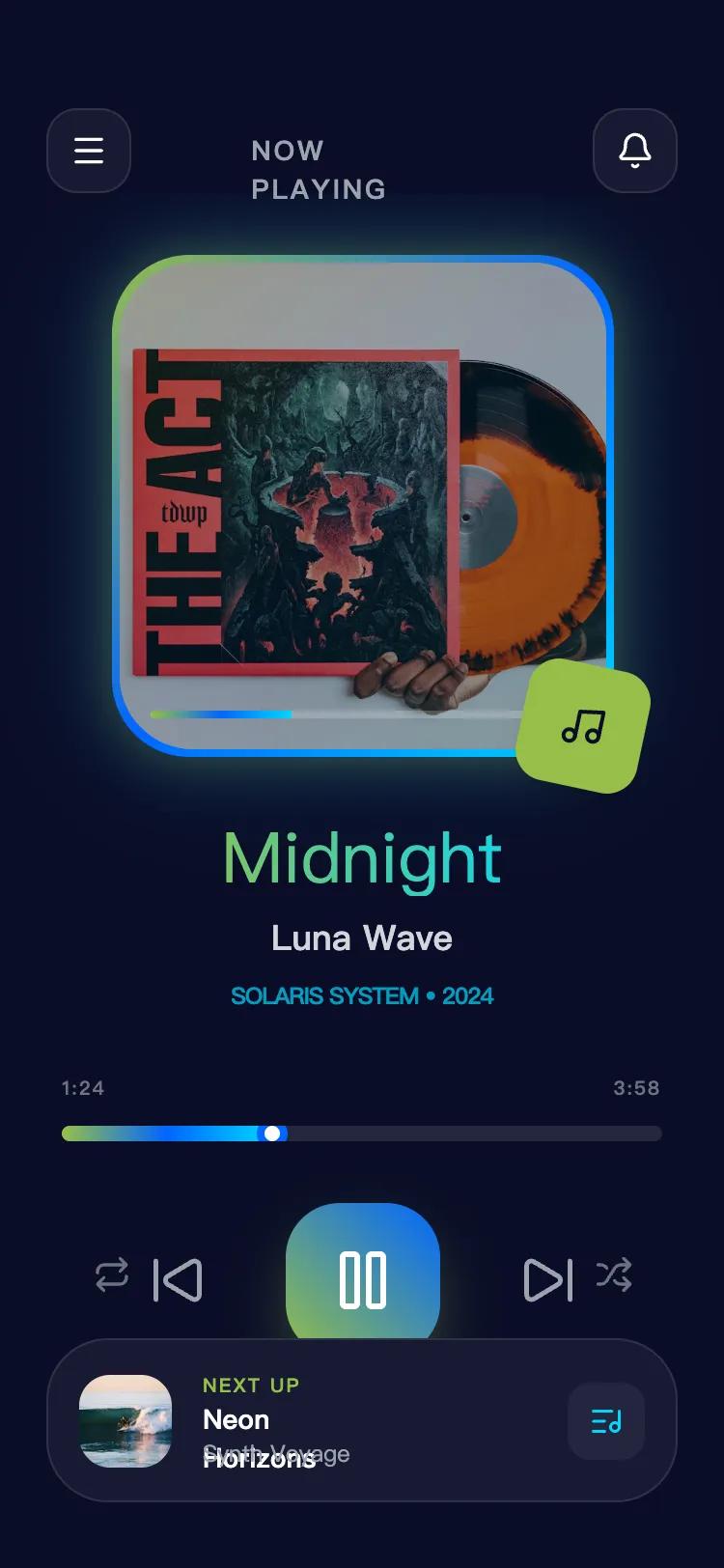 All Prompts
Midnight Echo Music Player
UI-стиль музыкального плеера в стиле 'Midnight Echo' с тёмной темой, неон-акцентами и Glassmorphism. Идеален для высокоэнергетичных приложений.
by jing zhangLive Preview
Prompt
# Midnight Echo Music Player

{
  "summary": "Midnight Echo is a high-fidelity, dark-themed design system characterized by vibrant neon gradients, glassmorphism, and fluid motion. It uses a hierarchy of deep blues for depth, contrasted by glowing primary elements to guide user attention.",
  "style": {
    "description": "The style utilizes a 'Dark Glass' theme. Typography pairs 'Cabinet Grotesk' (Extrabold) for headlines to create a brutalist/modern feel, with 'Satoshi' (Regular to Bold) for functional text. The color system is built on a #0a0e27 background with a 'Tri-Tone Neon' gradient (Lime #96bf48, Blue #0066ff, Cyan #00d9ff). Components use 1px semi-transparent borders and 12px backdrop blurs to achieve a layered glass effect.",
    "prompt": "Create a UI with a #0a0e27 background. Use 'Cabinet Grotesk' for display headers and 'Satoshi' for body text. Primary palette: Lime (#96bf48), Blue (#0066ff), Cyan (#00d9ff). Apply border-radius of 24px-40px on all cards. Implement 'Glassmorphism' using background: rgba(255,255,255,0.05) and backdrop-filter: blur(12px) with a 1px border of rgba(255,255,255,0.1). Include a 'Glossy Shine' effect (animated 45-degree linear-gradient sweep). Shadows should be vibrant and colored, specifically shadow-rgba(150,191,72,0.4) for primary actions. Use a 'pulse-glow' animation on main containers that cycles box-shadow intensity between 20px and 80px spread."
  },
  "layout_and_structure": {
    "description": "A vertically stacked mobile-first layout with a fixed header and footer, centering on a primary high-impact visual card. The structure uses generous padding (px-6 to px-8) and 'Bento' style grouping for controls.",
    "prompts": [
      {
        "part": "Header",
        "prompt": "Top navigation bar with a height of 80px. Left and right utility buttons are 44x44px glass cards with 16px border-radius. Center title uses 14px bold uppercase tracking-widest text in gray-400."
      },
      {
        "part": "Hero Visual Area",
        "prompt": "A central 260x260px container with 40px rounded corners. It must have a 4px thick animated gradient border (#96bf48 to #00d9ff). Inside, an image with 90% opacity features a 'glossy shine' animation sweep and a bottom-aligned mini-progress bar (4px height)."
      },
      {
        "part": "Information and Metadata",
        "prompt": "Centered text block below the hero. Title uses 36px-40px Cabinet Grotesk with a horizontal gradient from #96bf48 to #00d9ff. Subtitle in 18px Satoshi Medium. Tertiary metadata in 12px uppercase cyan with tight tracking."
      },
      {
        "part": "Interaction Controls",
        "prompt": "Horizontal control cluster. Central play/action button is 80x80px with a 28px border-radius and a heavy lime-to-blue gradient. Secondary skip buttons are 48x48px with a scale-down micro-interaction on active state. Progress bar is 8px tall, rounded, with a tri-color gradient fill and a 16px circular white thumb with a blue border."
      },
      {
        "part": "Persistent Context Footer",
        "prompt": "A bottom-pinned glass card (32px radius) containing a list item. Left side features a 48x48px thumbnail with 16px radius. Right side includes a 40x40px icon button. Background transitions from rgba(255,255,255,0.05) to 0.1 on hover."
      }
    ]
  },
  "special_ui_components": [
    {
      "component": "Pulsing Neon Card",
      "description": "A high-visibility container with a breathing glow effect.",
      "prompt": "A 260px square container with 40px border-radius. Apply a continuous 4s ease-in-out animation that pulses the box-shadow from '0 0 20px rgba(150, 191, 72, 0.3)' to '0 0 80px rgba(0, 217, 255, 0.4)'. Use a border-image or a padded gradient background to create a 4px frame."
    },
    {
      "component": "Cyber-Gloss Overlay",
      "description": "A light-sweep effect that gives a premium glass/metallic feel.",
      "prompt": "Create a pseudo-element over a container with a background linear-gradient(45deg, transparent 0%, rgba(255,255,255,0.13) 50%, transparent 100%). Animate its 'left' property from -150% to 150% over 6 seconds in a continuous loop to simulate a moving light reflection."
    }
  ]
}