All Prompts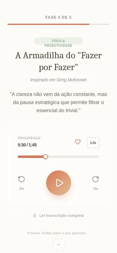 All Prompts
Mindfy Ritual - Phase 4: Insight
Аудио-интерфейс для медитаций и обучения. Zen-дизайн с градиентом, стеклянными элементами и анимацией. Для приложений mindfulness и wellbeing.
by Jimmy BastosLive Preview
Prompt
# Mindfy Ritual - Phase 4: Insight

{
  "summary": "A warm, organic mobile UI for audio consumption with a focus on mindfulness. It uses a high-contrast serif and sans-serif typography pairing, a glassmorphic central control card, and subtle background animations to create a calm, premium experience.",
  "style": {
    "description": "The style is 'Zen Organic' with a focus on warmth and focus. It uses a palette of soft cream (#FDFBF7), deep terracotta (#D97757), and sage green (#8BA888). Typography pairs the elegant Playfair Display for headings with the modern Plus Jakarta Sans for UI elements. The interface features 'floating' background blobs with heavy blurs (60px) and a glassmorphism audio player with backdrop filters.",
    "prompt": "Create a design with a 'Zen Organic' aesthetic. \n- **Color Palette:** Background: #FDFBF7; Primary Accent: #D97757; Secondary: #8BA888; Soft UI Text: #4A3F35; Decorative Gold: #E0C097. \n- **Typography:** Headings in 'Playfair Display' (Medium 500, font-size: 32px-36px). UI labels, buttons, and body text in 'Plus Jakarta Sans' (Weights 400, 600; font-sizes 10px-14px). \n- **Visual Effects:** Use two large floating background shapes: one Gold (#E0C097) top-right and one Terracotta (#D97757) bottom-left, both with 60px blur and 40% opacity. \n- **Interactions:** Content should use a `fade-in-up` animation (0.8s ease-out). Buttons should have a hover/active scale effect (0.92x). \n- **Cards:** Use a white translucent container (white/40) with `backdrop-filter: blur(12px)` and a subtle 1px border (#FFFFFF/50)."
  },
  "layout_and_structure": {
    "description": "A vertical mobile-optimized layout with a clear hierarchical flow: progress tracking at the top, hero content in the center, and a fixed-width audio control deck at the bottom-center.",
    "prompts": [
      {
        "part": "Header & Progress Tracking",
        "prompt": "Place a thin, full-width progress bar at the very top. Include a label above it (e.g., 'PHASE 4 OF 5') in 10px uppercase, tracking-widest (0.1em) font. The progress bar background should be a light gray (#E5E7EB), with a fill using #D97757 at 80% width."
      },
      {
        "part": "Content Hero Section",
        "prompt": "Center the primary content vertically. Start with a category badge: pill-shaped, background rgba(139, 168, 136, 0.15), text color #8BA888, 10px uppercase bold. Below the badge, place a large serif heading (Playfair Display) followed by a short italicized author attribution. Finally, include a concise 2-line quote or summary in 16px text with 1.6 line-height."
      },
      {
        "part": "Audio Control Card",
        "prompt": "An anchored glassmorphism card (white/40 backdrop-blur). Layout: \n1. **Top Row:** Left side shows 'Progress' label (10px) and current/total time (14px tabular-nums). Right side shows a 'Save' heart icon and a speed toggle (1.0x) in a small border-box. \n2. **Middle Row:** A full-width horizontal track (#4A3F35/10) with an active progress fill (#D97757). At the end of the active fill, place a white circular handle (16px) with a subtle shadow. \n3. **Bottom Row:** Large central play button (80x80px) with a linear-gradient (135deg, #D97757 to #E0C097). Flanking the play button are 'Back 15s' and 'Forward 15s' icons in 60% opacity text."
      },
      {
        "part": "Footer Navigation Hint",
        "prompt": "At the bottom of the screen, place a faint navigation indicator. A chevron-down icon inside a subtle circular border (#4A3F35/10), topped by a text prompt like 'Next: Reflect on your learning' in 11px font at 40% opacity."
      }
    ]
  },
  "special_ui_components": [
    {
      "component": "Ritual Gradient Play Button",
      "description": "A prominent, circular action button with a specific brand gradient and interaction states.",
      "prompt": "A 80px circle button with `background: linear-gradient(135deg, #D97757 0%, #E0C097 100%)`. Include a white 'play' icon (30px). Apply a shadow: `0 10px 25px -5px rgba(217, 119, 87, 0.4)`. On active/click, scale the button to 0.92x and reduce shadow intensity."
    },
    {
      "component": "Floating Organic Background",
      "description": "Dynamic, non-intrusive background elements that create depth.",
      "prompt": "Create CSS-based circular divs with large dimensions (250px-320px). Use absolute positioning (off-screen or on edges). Apply `filter: blur(60px)` and `opacity: 0.4`. Animate using a keyframe named `float` that translates the shapes +/- 15px over a 10s duration using `ease-in-out infinite alternate`."
    }
  ]
}