All Prompts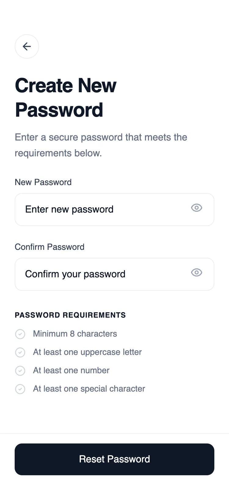 All Prompts
mobile applayoutauth
Minimal Reset Password Wireframe
Минималистичный UI-шаблон для сброса пароля. Одно поле ввода, без лишней навигации. Идеально для быстрой аутентификации в мобильных приложениях.
by Shirley LouLive Preview
Prompt
# Minimal Reset Password Wireframe

{
  "summary": "A clean, functional mobile wireframe for a reset password screen using a monochrome palette (#101828 and various grays) and General Sans typography. The design features a tall header, vertical form stack, and a high-impact sticky footer button.",
  "style": {
    "description": "The style is characterized by a minimalist 'wireframe-plus' aesthetic. It uses a range of grays (#FCFCFD to #101828) for depth, General Sans for a clean geometric look, and 12px (xl) border radii for components. Animations are subtle, focusing on focus-states and hover-colors to guide the user.",
    "prompt": "Apply a minimalist monochrome design system. Typography: Use 'General Sans'. Headings (H1) at 32px/1.2 leading, semibold, -0.02em tracking. Body text at 16px/1.6 leading, medium. Secondary text at 14px. Small labels/uppercase headers at 12px, 0.05em tracking. Colors: Primary Black (#101828), Borders (#EAECF0), Backgrounds (#F9FAFB or white), Muted Text (#667085). Interactive Elements: Use 12px border-radius (rounded-xl) for buttons and inputs. Focus State: When an input is active, change border to #101828 and apply a 4px spread shadow with 5% opacity of #101828. Transition: All interactive elements should have a 0.2s ease-in-out transition for color and scale changes."
  },
  "layout_and_structure": {
    "description": "A mobile-first vertical layout consisting of three main areas: a spacious header, a scrollable form body, and a sticky footer containing the primary action.",
    "prompts": [
      {
        "part": "Header Section",
        "prompt": "The header starts with a 56px (pt-14) top margin. Include a 40x40px circular back button with a 1px #EAECF0 border. The title is 32px bold, tracking-tight, with a line break to emphasize 'Create New Password'. Below the title, add a 16px description in #667085 gray with a 24px vertical gap."
      },
      {
        "part": "Form Body",
        "prompt": "Main content area has 24px horizontal padding (px-6). Inputs are stacked with a 24px gap (gap-6). Each input group contains: a 14px medium weight label (#344054), followed by a 52px tall input wrapper. The wrapper has a 1px border (#EAECF0) and contains the input field plus an optional 20px icon (eye icon) on the far right."
      },
      {
        "part": "Password Requirements",
        "prompt": "Below the inputs, include a checklist section. Header: 12px bold, uppercase, tracking-wider in #101828. List: Each item is a 14px row with a 10px horizontal gap. Use a 'check-circle' icon in #D0D5DD for inactive states. Spacing between list items should be 10px (space-y-2.5)."
      },
      {
        "part": "Sticky Footer",
        "prompt": "The footer is pinned to the bottom with a 1px top border (#F2F4F7). It has 24px horizontal padding and 34px bottom padding. Inside, place a full-width primary button: 52px height, #101828 background, white text, 16px medium font. Include a 0.98 scale-down effect on active click."
      }
    ]
  },
  "special_ui_components": [
    {
      "component": "Interactive Input Wrapper",
      "description": "A state-aware container for form inputs that handles focus styling for the entire group.",
      "prompt": "Create a wrapper div (rounded-xl, border-1, border-#EAECF0). Inside, place a transparent background input and an absolute-positioned icon button at right-14px. CSS Rule: When focus-within is triggered, change wrapper border-color to #101828 and add box-shadow: 0 0 0 4px rgba(16, 24, 40, 0.05). Transition all properties over 0.2s."
    }
  ],
  "special_notes": "MUST: Maintain a strict grayscale palette; do not introduce accent colors. MUST: Ensure inputs have a 12px border radius. MUST: Use a high-quality geometric sans-serif font like General Sans or Inter. DO NOT: Use standard 8px (lg) rounding; the 12px (xl) rounding is key to the modern look. DO NOT: Add heavy drop shadows; keep the UI flat with only subtle focus rings."
}