All Prompts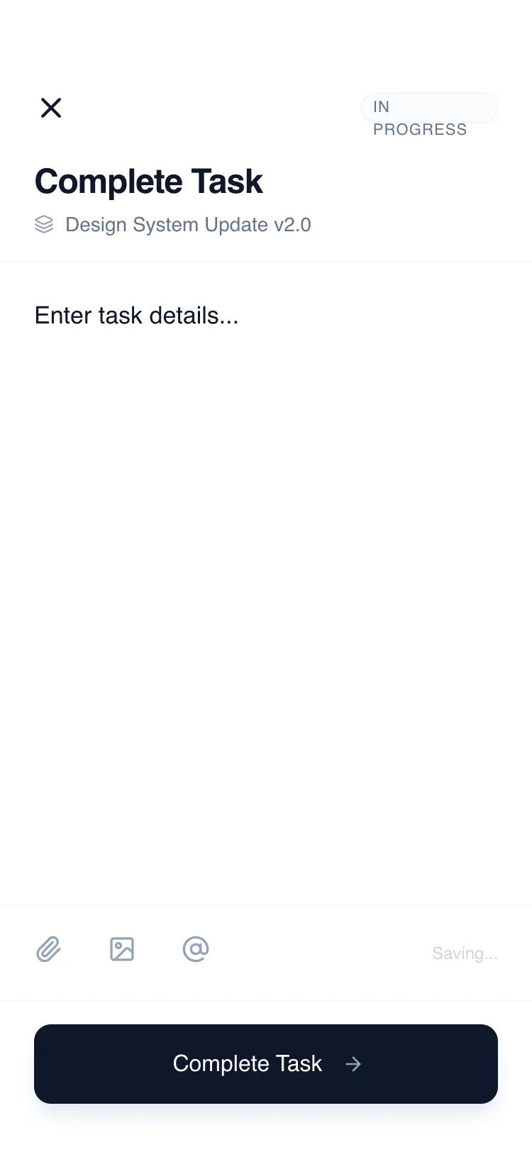 All Prompts
mobile appcreatepagelayout
Minimal Task Completion
Минималистичный UI-интерфейс для мобильных приложений для завершения задач. Фокус на продуктивности, управлении проектами. Отвлекающий дизайн.
by Shirley LouLive Preview
Prompt
# Minimal Task Completion

{
  "summary": "A clean, productivity-focused mobile interface for task completion that prioritizes content entry. The style is characterized by a wireframe-inspired aesthetic, high-contrast black/white elements, and a 'no-distraction' philosophy. Every element serves a functional purpose, using white space and subtle dividers rather than shadows or heavy colors to define hierarchy.",
  "style": {
    "description": "The visual language relies on the 'General Sans' font family and a monochromatic Slate palette. Typography is used to create hierarchy through weight and size rather than color variety. Hex values range from the near-black text (#0F172A) to near-white borders (#F8FAFC). Transitions are quick (200ms) with ease-out curves, and interactivity is signaled by subtle background shifts (#F1F5F9) or micro-scales (0.98).",
    "prompt": "### Typography & Color System - Font: 'General Sans' (Weights: 400, 500, 600, 700) - Primary Text: #0F172A (Slate-900) - Secondary Text: #64748B (Slate-500) - Input Text/Placeholder: #CBD5E1 (Slate-300) - Background: #FFFFFF - Borders: #F1F5F9 (Slate-100) and #F8FAFC (Slate-50) - Status Tag: BG #F8FAFC, Border #F1F5F9, Text #64748B ### Animation Specs - Entrance: FadeIn (0.3s, ease-out) for header elements - Hover: 200ms transition-colors - Active: scale(0.98) for buttons - Tooltips: 300ms opacity fade ### Spacing & Sizing - Side Margins: 24px (px-6) - Header Height: ~140px (including 56px top padding) - Action Button: 56px height (h-14) - Footer Padding: 34px bottom (safe area) ### Border System - Thickness: 1px - Radius: 12px (rounded-xl) for primary button and cards, 9999px (full) for status tags and utility buttons"
  },
  "layout_and_structure": {
    "description": "Vertical stack consisting of a fixed header, a flex-growing main content area, a utility toolbar, and a bottom-anchored footer.",
    "prompts": [
      {
        "part": "Header Section",
        "prompt": "56px top padding (pt-14) and 24px side padding. Features a top row with a 40x40px circular close button (icon: lucide:x) and a pill-shaped status badge (#F8FAFC bg, uppercase 11px bold text 'In Progress'). Below, a 24px Semibold H1 title 'Complete Task' and a 14px Medium subtitle with an icon prefix (lucide:layers). A 1px border (#F8FAFC) separates it from the main content."
      },
      {
        "part": "Main Input Area",
        "prompt": "A flexible, full-width container (flex-1) holding a full-height textarea. No internal borders. Typography: 17px text, leading-relaxed, Slate-900. Placeholder: 'Enter task details...' in Slate-300. On focus, the background shifts to a very subtle Slate-50/30. Bottom-right of the input features a contextual hint 'Markdown supported' (12px text, Slate-300) that only appears when the input is active."
      },
      {
        "part": "Utility Toolbar",
        "prompt": "A 1px border-top (#F8FAFC) separates this from the input. horizontal row of buttons (paperclip, image, at-sign icons) in Slate-400. Hover state: Slate-900. Right-aligned 'Saving...' indicator in 12px Slate-300 to provide system feedback."
      },
      {
        "part": "Footer Action",
        "prompt": "Bottom-anchored bar with 34px bottom padding for safe area. Contains one primary button: 56px height, 100% width, #0F172A background, 12px rounded corners. White 16px Medium text 'Complete Task' with a lucide:arrow-right icon. Hover: changes to black with a shadow-xl. Active: scales to 0.98."
      }
    ]
  },
  "special_ui_components": [
    {
      "component": "Contextual Markdown Hint",
      "description": "A subtle indicator that appears only when the user is typing.",
      "prompt": "Position: absolute bottom-4 right-6 inside the input container. Styling: 12px font, #CBD5E1 color, white background with 1px Slate-100 border and subtle shadow. Animation: Transition opacity from 0 to 100 when textarea:focus-within is true."
    },
    {
      "component": "Primary Action Button",
      "description": "A high-impact floating action button that anchors the mobile view.",
      "prompt": "Height: 56px. Background: #0F172A. Text: White, 16px, medium weight. Icon: lucide:arrow-right positioned right of text. Interaction: On hover, the icon moves 2px to the right. On click, the entire button scales to 0.98. Shadow: shadow-lg shadow-slate-200/50."
    }
  ],
  "special_notes": "MUST: Ensure the textarea is auto-focused on page load. MUST: Use the General Sans font for the professional, tech-forward look. MUST: Keep borders extremely subtle (#F8FAFC) to avoid visual clutter. DO NOT: Use heavy drop shadows except for the primary footer button. DO NOT: Use vibrant colors; stick to the Slate/White monochromatic palette to maintain focus."
}