All Prompts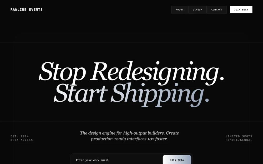 All Prompts
high conversion pagelanding pageproduct launchwaitliststyle
Minimalist Beta Capture
UI Kit для SaaS: минималистичный дизайн, темная тема, бэнто-сетка. Идеален для лендингов, продуктовых запусков и страниц ожидания.
by Shirley LouLive Preview
Prompt
# Minimalist Beta Capture

{
  "summary": "A minimalist, dark-themed design system characterized by editorial typography, technical monospace labels, and frosted-glass UI elements for a premium 'elite' digital experience.",
  "style": {
    "description": "The style essence is 'Modern Obsidian'. It pairs high-impact serif italics with technical monospace and functional sans-serif. The palette is strictly monochromatic (#080808 to #FFFFFF) with silver gradients. Layouts use extreme spacing (fluid 92vw) and a noise-textured background to create depth without color. Animation is purposeful, using cubic-bezier curves for slide-up entry and smooth transitions.",
    "prompt": "### Core Style Specs\n- **Palette**: Obsidian Background (#080808), Pure White (#FFFFFF), Silver Text (#E2E8F0), Silver Gradient (linear-gradient 135deg, #F8FAFC 0%, #94A3B8 100%).\n- **Typography**:\n  - **Serif (Headlines)**: 'DM Serif Display', italicized, tracking-tighter, leading-0.85. Hero size: clamp(42px, 10vw, 140px).\n  - **Mono (System/UI)**: 'Geist Mono', weight 100-900. Used for labels, buttons, and metadata at 10px-14px. Tracking: 0.2em to 0.5em uppercase.\n  - **Sans (Body)**: 'Inter', weight 300-600. Used for readability at 14px-18px.\n- **Borders & Corners**: Border color `rgba(255, 255, 255, 0.08)`. Hero radius: 4rem (desktop), 2rem (mobile). Card radius: 1rem (16px).\n- **Effects**:\n  - **Noise**: SVG fractal noise overlay at 0.05 opacity.\n  - **Glass**: `background: rgba(255, 255, 255, 0.02)`, `backdrop-filter: blur(24px)`.\n  - **Buttons**: Silver gradient background, black text, 1px lift on hover with `box-shadow: 0 0 20px rgba(255,255,255,0.15)`.\n- **Transitions**: `cubic-bezier(0.16, 1, 0.3, 1)` for all entry animations (0.8s duration)."
  },
  "layout_and_structure": {
    "description": "The page follows a vertical narrative flow: Navigation -> Explosive Hero -> Data Metadata -> Capture Form -> Urgency/Social Proof -> Feature Bento -> Value Proposition -> Testimonials -> Final CTA -> Footer.",
    "prompts": [
      {
        "part": "Header / Navigation",
        "prompt": "Full width (92vw), padding 8 (32px). Left side: Monospace brand logo with uppercase tracking. Right side (Desktop): Flex container with border-separated links (`bg-white/5`, `border-white/10`) and a solid white 'Join' button. Mobile: Single hamburger icon or minimalist label."
      },
      {
        "part": "Hero Section",
        "prompt": "Container: 92vw. Centered layout. Background: Faint frosted glass container (`opacity-30`) with large 4rem radius. Content: Massive serif headline with italicized silver-gradient span. Below headline: A fluid three-column 'Metadata Bar' in monospace (Est. Date, Description, Location/Limit). Spacing: `py-12` to `py-32` depending on viewport."
      },
      {
        "part": "Beta Capture Form",
        "prompt": "Width: max-w-2xl. Structure: Horizontal flex (sm:row) inside a `frosted-glass` 2xl-rounded container. Input: Transparent background, `font-mono` text, no-border, 100% width. Button: `silver-btn`, high-contrast black text, `font-mono` bold, uppercase tracking, `rounded-xl`."
      },
      {
        "part": "Bento Feature Grid",
        "prompt": "Grid: 1 col (mobile), 2 col (md), 4 col (lg). Borders: `border-y` and `border-r` using `white/10` to create a technical grid look. Cards: `bento-card` with hover effects (background `white/0.03` and border `white/0.2`). Content: Top-left index (e.g., 01 / EFFICIENCY) in 10px mono, followed by 4xl serif headline and mono-case body text."
      },
      {
        "part": "Testimonials",
        "prompt": "Full width background `white/[0.01]`. Headline: Massive centered serif italics. Content: Two-column grid with deep `pl-16` border-left accent. Typography: 5xl serif for the quote, monospace for the attribution/title. Avatars: Grayscale with contrast-125 filter."
      }
    ]
  },
  "special_ui_components": [
    {
      "component": "Countdown Timer",
      "description": "Editorial style countdown with serif numerals and slash separators.",
      "prompt": "Font: 'DM Serif Display', Size: 5xl to 120px. Color: White/90. Separators: `/` at opacity-10. Layout: Flex-row with individual containers for HH / MM / SS. Sub-labels (if any) in 10px monospace above digits."
    },
    {
      "component": "Floating Mobile Bottom Nav",
      "description": "A pill-shaped navigation bar that appears only after the hero section is passed.",
      "prompt": "Position: Fixed, bottom-6, centered. Style: `mobile-nav-blur` (blur 24px, obsidian 85% opacity). Shape: Fully rounded (pill). Content: 5-item flex layout. Middle item is a primary action button (white bg, black text). Other items: Icon + 8px monospace label. Transition: `translate-y-32` and `opacity-0` when hidden."
    },
    {
      "component": "Member Registry Card",
      "description": "A bento card showing small user badges with hover interactions.",
      "prompt": "Grid: 2x2 layout inside a bento card. Items: 10px grayscale avatar + 8px monospace title. Hover: `translate-x-1`, text color transitions to full white, avatar scales to 1.1x. Background: Large decorative icon (e.g., ID card) at 5% opacity in bottom right."
    }
  ],
  "special_notes": "MUST maintain the strict monochrome/silver palette; any standard colors (blue, red, green) will break the premium aesthetic. MUST use 'Geist Mono' for all technical labels to maintain the 'engineered' feel. MUST use fluid width (92vw) instead of standard Tailwind containers to maximize editorial impact. MUST NOT use standard box-shadows; use borders or backdrop-blurs for depth. MUST NOT use non-italicized serif for headlines."
}