All Prompts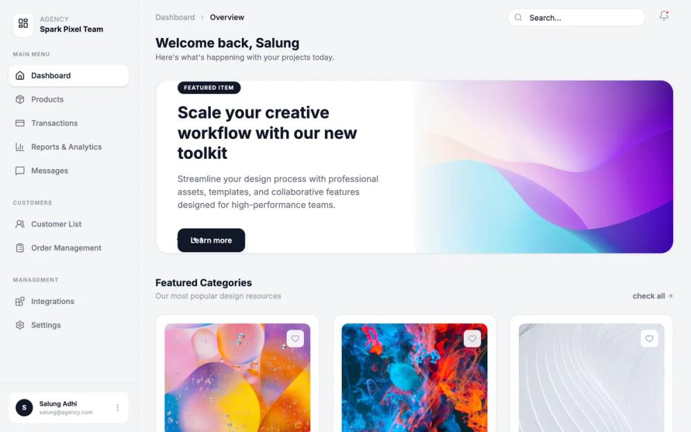 All Prompts
Minimalist Monospace Dashboard
Минималистичный дашборд с моноширинным шрифтом JetBrains Mono. Идеален для SaaS, финтеха, инструментов разработчиков. Чистый дизайн, акцент на ясность.
by Shams DigitalLive Preview
Prompt
# Minimalist Monospace Dashboard

{
  "summary": "A sophisticated monospace dashboard with a sidebar navigation, sticky header, and a content area featuring geometric card designs. The interface uses a neutral light-gray background with sharp white cards, high-contrast dark text, and abstract vector patterns instead of traditional photography.",
  "style": {
    "description": "The style is defined by its Monospace typography (JetBrains Mono), high-contrast grayscale palette, and geometric 'blueprint' aesthetic. It uses 1px borders for structure rather than heavy shadows, and employs abstract SVG patterns (grids, circles, paths) with low opacity to create depth. Colors are strictly limited to white (#FFFFFF), light grays (#F3F4F6, #E5E7EB), and deep charcoal/black (#111827).",
    "prompt": "### Typography\n- **Primary Font**: 'JetBrains Mono', monospace.\n- **Hierarchy**: \n  - Headings: Bold, #111827, 2xl (24px) for hero titles, xl (20px) for section headers.\n  - Metadata/Labels: Uppercase, font-bold, 9px-10px, tracking-widest, color #9CA3AF.\n  - Body/UI Text: Medium, 11px-12px, color #111827 or #6B7280.\n\n### Color Palette\n- **App Background**: #F3F4F6\n- **Surface/Card Background**: #FFFFFF\n- **Interactive/Primary**: #111827\n- **Borders/Lines**: #E5E7EB\n- **Accents/Shapes**: #FAFAFA (for geometric containers)\n\n### Effects & Interactivity\n- **Borders**: 1px solid #E5E7EB for all containers and cards.\n- **Shadows**: Very subtle (shadow-sm: 0 1px 2px 0 rgb(0 0 0 / 0.05)).\n- **Hovers**: Transition from #E5E7EB border to #111827 border on 150ms ease-in-out.\n- **Transitions**: Smooth scale and color shifts for icons and primary buttons.\n\n### Decoration\n- **Geometric Assets**: Use low-opacity (10-30%) SVG patterns (10x10 grids, concentric circles, isometric triangles) in a dark stroke (#111827) against light backgrounds."
  },
  "layout_and_structure": {
    "description": "Fixed-width sidebar navigation on the left (256px) with a scrollable main content area on the right. The layout uses a structured hierarchy with a sticky header and grid-based content sections.",
    "prompts": [
      {
        "part": "Sidebar",
        "prompt": "### Sidebar Layout\n- **Width**: 256px (w-64), Fixed height, border-right: 1px #E5E7EB.\n- **Logo Area**: 24px padding, includes a white icon box (rounded-lg, border, shadow-sm) and a two-line text group (upper-case label over bold title).\n- **Navigation**: Grouped sections (e.g., Main Menu, Customers, Management) with 10px bold uppercase labels. Items should be 12px font size, 8px padding-y, transition color from #6B7280 to #111827 on hover.\n- **Active State**: Background #FFFFFF, border-radius 8px, shadow-sm, text #111827."
      },
      {
        "part": "Header",
        "prompt": "### Header Layout\n- **Height**: 64px (h-16), sticky position, background #F3F4F6.\n- **Breadcrumbs**: Left-aligned, 10px bold uppercase text with chevron-right icons, transitioning from #9CA3AF to #111827.\n- **Search/Profile**: Right-aligned. Search bar: 192px width expanding to 256px on focus, bg-white/50, border-gray-200, icon-prefixed. Profile: Initials in a 32px dark circle (#111827) with white text."
      },
      {
        "part": "Hero Section",
        "prompt": "### Featured Carousel/Hero\n- **Container**: White background, 1px border, 12px rounded corners, shadow-sm.\n- **Layout**: 50/50 split. Left side: Text content (badge, 2xl title, xs body text, and a primary CTA button). Right side: A 200px+ height container with a light gray fill and an intricate geometric SVG background (grid pattern + low opacity shapes).\n- **CTA Button**: #111827 background, white text, 12px font-bold, rounded-lg, includes trailing arrow icon."
      },
      {
        "part": "Category Grids",
        "prompt": "### Content Grid\n- **Section Header**: Left title (12px uppercase) and sub-label (10px gray). Right 'Check All' link with arrow-circle icon.\n- **Cards**: 3-column grid. Each card is white with a 1px border. \n- **Card Content**: Top aspect-square container with #FAFAFA background and a unique geometric SVG (e.g., cross-matrix, radial mesh). Bottom: Two-column layout with bold item title, asset count/tag, and right-aligned price/status."
      }
    ]
  },
  "special_ui_components": [
    {
      "component": "Abstract Geometric Card",
      "description": "A card where the visual anchor is an SVG pattern instead of an image.",
      "prompt": "Construct a square container (aspect-square) with background #FAFAFA. Inside, place a centered Lucide icon in #E5E7EB. Layer an absolute-positioned SVG over the background with opacity 0.1. The SVG should consist of either: A) a 10px repeating grid, B) Concentric circles with crosshair lines, or C) A series of isometric triangles. On parent hover, the central icon should transition to #111827 and the card border should darken."
    },
    {
      "component": "Technical Badge",
      "description": "Small, high-contrast label for categorizing items.",
      "prompt": "Background #F3F4F6, 1px border #E5E7EB, text-color #6B7280, font-size 9px, font-weight 700, uppercase, tracking-widest, padding 2px 8px, border-radius 4px."
    }
  ],
  "special_notes": "MUST: Maintain JetBrains Mono for every single text element to ensure the technical aesthetic. MUST: Use strict 1px borders instead of rounded shadows. DO NOT: Use realistic photography; replace all image slots with SVGs using stroke-width 0.2 to 0.5. MUST: Keep letter-spacing wide for all uppercase labels (tracking-widest)."
}