All Prompts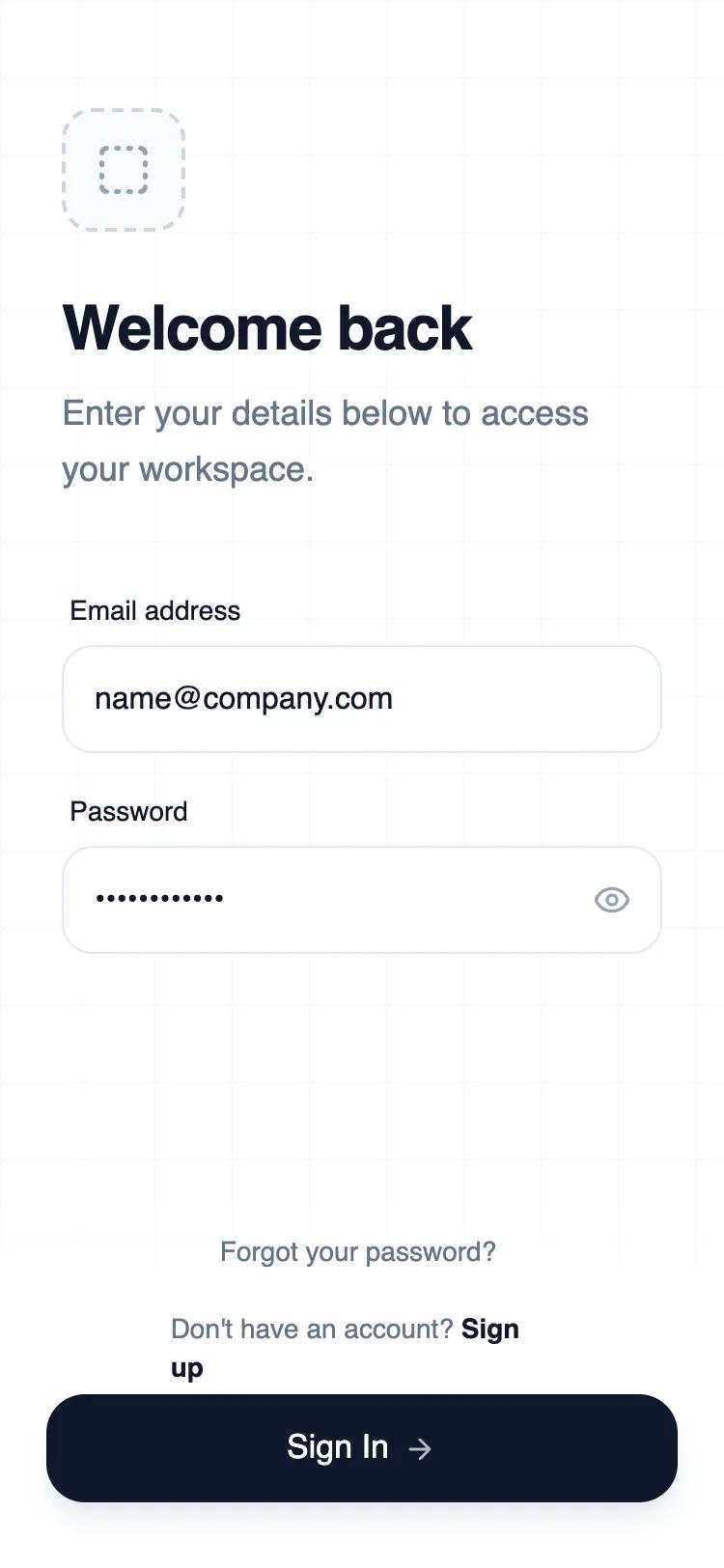 All Prompts
mobile apploginauthlayout
Minimalist Wireframe Login
Минималистичный UI-шаблон входа для мобильных приложений. Контрастный дизайн, оптимизированный для удобства использования. Идеален для SaaS, финтеха, инструментов разработчика.
by Shirley LouLive Preview
Prompt
# Minimalist Wireframe Login

{
  "summary": "Mobile login interface following a top-heavy layout for identity and a bottom-anchored interaction zone. Employs a blueprint-style grid background, large tap targets (56px height), and high-contrast accessibility (Slate-900 on White).",
  "style": {
    "description": "The design utilizes 'General Sans' across four weights (400-700) for strict hierarchy. The color palette is a monochromatic Slate scale: #FFFFFF (base), #0F172A (primary text/button), #64748B (secondary text), and #E2E8F0 (borders). Micro-interactions include a subtle scale-down effect (0.98x) on buttons and a 4px soft shadow focus ring for input fields. A recurring 40px grid pattern defines the 'wireframe' aesthetic.",
    "prompt": "Create a UI with a minimalist industrial 'Wireframe' aesthetic. \n- **Typography**: Font-family: 'General Sans'. Headings: 32px/1.1 leading, font-weight 600. Body text: 18px, color: #64748B. Labels: 14px, weight 500, color: #0F172A. \n- **Color Palette**: Background: #FFFFFF. Text/Buttons: #0F172A. Secondary Text: #64748B. Borders: #E2E8F0. Placeholder: #CBD5E1. \n- **Background**: Apply a subtle blueprint grid using linear gradients of #F1F5F9 at 1px thickness with 40px square size. \n- **Interactive Elements**: Inputs and Buttons should be exactly 56px height with a border-radius of 16px to 20px. \n- **Animation**: Button active state: `transform: scale(0.98)`. Transitions: `all 200ms ease-in-out`. \n- **Shadows**: Primary CTA uses a soft shadow: `box-shadow: 0 10px 15px -3px rgba(15, 23, 42, 0.1)`."
  },
  "layout_and_structure": {
    "description": "Three-tier vertical stack: Top identity section, middle input group, and bottom-anchored action footer with a sticky gradient background.",
    "prompts": [
      {
        "part": "Identity Section (Top)",
        "prompt": "Padding top: 56px. Padding horizontal: 32px. Element 1: Logo placeholder (64x64px), background #F8FAFC, border-style: dashed (2px), border-color #CBD5E1, border-radius 16px. Element 2: Heading 'Welcome back' (32px). Element 3: Subtext 'Enter details...' (18px) with a margin-bottom of 48px."
      },
      {
        "part": "Input Group (Middle)",
        "prompt": "Stacked layout with 20px vertical gap. Input height: 56px. Padding: 16px. Border: 1px solid #E2E8F0. Focus state: Border color #0F172A with a 4px spread ring in #0F172A at 5% opacity. Password field includes an absolute-positioned eye icon button on the right edge."
      },
      {
        "part": "Action Footer (Bottom)",
        "prompt": "Anchored to the screen bottom with a white-to-transparent linear gradient overlay. Bottom padding: 34px (Safe Area). Element 1: Stacked secondary links (Forgot password, Sign up) centered horizontally. Element 2: Primary CTA button (56px height), background #0F172A, text #FFFFFF, font-weight 500. Include a right-arrow icon that translates +4px on hover."
      }
    ]
  },
  "special_ui_components": [
    {
      "component": "Wireframe Logo Box",
      "description": "A placeholder container representing the brand mark.",
      "prompt": "Width/Height: 64px. Border-radius: 16px. Border: 2px dashed #CBD5E1. Background: #F8FAFC. Centered icon: 'lucide:box-select' at 30px size in #94A3B8."
    },
    {
      "component": "Industrial Input Field",
      "description": "High-radius, clean input with custom focus state.",
      "prompt": "Height: 56px. Border-radius: 16px. Border: 1px solid #E2E8F0. Background: #FFFFFF. Typography: 16px text-base. On focus: border-color change to #0F172A and outer glow `0 0 0 4px rgba(15, 23, 42, 0.05)`."
    }
  ],
  "special_notes": "MUST ensure all clickable elements (inputs/buttons) have a minimum height of 56px for accessibility. MUST use the 40px grid background to maintain the wireframe concept. DO NOT use vibrant colors; keep the palette restricted to Slate and White. Ensure the secondary sign-up link uses a font-weight of 600 to distinguish it from static text."
}