All Prompts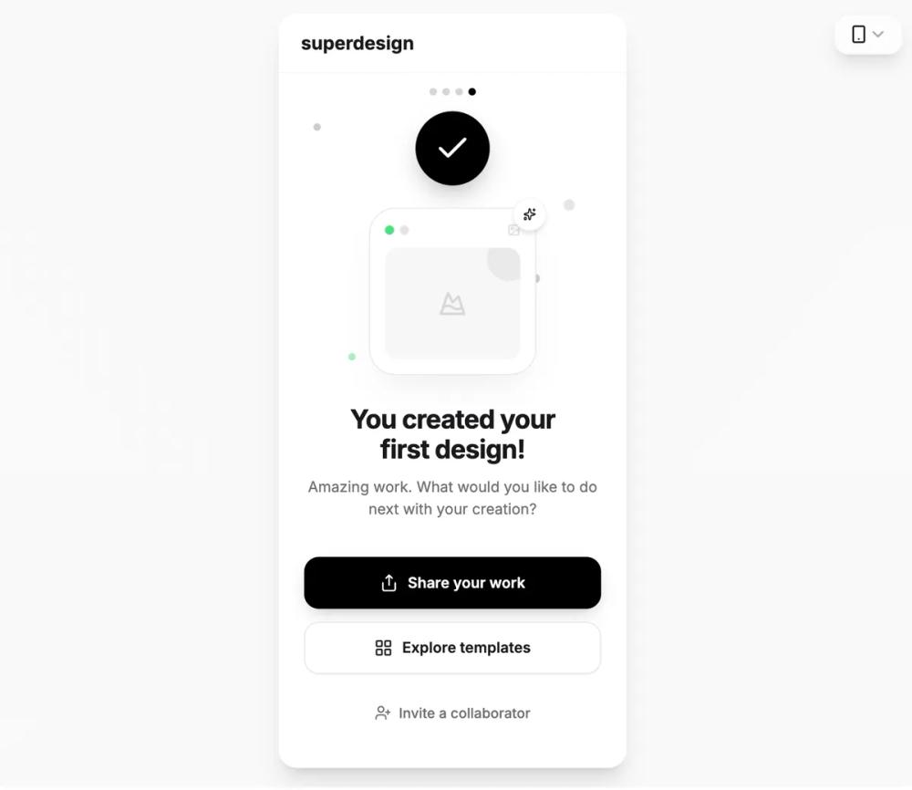 All Prompts
skill
Mobile App / Onboarding
UI-компоненты для онбординга мобильных приложений. Оптимизируйте или создайте новый пользовательский опыт при первом запуске.
by Shirley Lou
Prompt
# Mobile App / Onboarding

name: mobile-onboarding
description: Design or improve mobile app onboarding flows. Gets users to their "aha moment" through personalization, progressive disclosure, and value-first design. Covers strategy, UI patterns, copy, empty states, and measurement.
args:
  - name: app_type
    description: The type of app (e.g., SaaS, e-commerce, social, productivity, health/fitness, fintech)
    required: false
  - name: goal
    description: What you're trying to accomplish (e.g., design new flow, audit existing, improve retention, reduce drop-off)
    required: false
  - name: target_users
    description: Primary audience description (e.g., beginners, power users, mixed, B2B teams)
    required: false
---

Design or improve mobile app onboarding that converts installs into retained users.

## Phase 1: Discovery

Before designing screens, get clear on who you're building for and what "done" looks like.

### Understand the User

Define 2-3 personas. For each one, answer:

- **Who are they?** Technical comfort, device habits, demographics.
- **Why did they download?** What triggered the install — an ad, a recommendation, a problem they're trying to solve?
- **What does success look like for them?** Not for you — for them.
- **What are they coming from?** A competitor? A spreadsheet? Nothing? This shapes expectations.
- **When and where do they use it?** Commute, desk, couch — context shapes attention span.

### Find the Aha Moment

This is the moment a user *feels* the value, not just reads about it. Work backward:

1. What's the core value the app delivers?
2. What single action lets someone experience that value?
3. What's the shortest path to that action?
4. What info is strictly required to get there?

Cut everything else. If it doesn't serve the path to that moment, it doesn't belong in onboarding.

**The 30-second rule**: Users should encounter your core value within 30 seconds of active interaction. Not read about it — encounter it. If your onboarding takes longer than that to get to the point, you're losing people.

### Question Zero: Do You Even Need Onboarding?

Before designing a flow, honestly assess whether you need one at all. If the core UI is intuitive enough — standard patterns, clear affordances, obvious first action — a dedicated onboarding sequence can actually slow users down. As one UX director put it: if it feels like school, users drop out.

Test your app with new users and no onboarding. Watch where they get stuck. If they mostly figure it out, you might only need contextual hints at specific friction points rather than a formal flow. Only build onboarding for the gaps that real users actually hit.

**Real examples:**
- **Duolingo** — Completing a mini-lesson and seeing your progress bar fill. Users get here in under 60 seconds, before they even make an account.
- **Slack** — Sending a message and getting a response from Slackbot. The tool clicks when you use it, not when you read about it.
- **DoorDash** — Browsing restaurants near you with real menus and prices. No sign-up needed to feel the pull.
- **Calm** — Finishing a short guided session. The benefit is felt, not described.

### Align with Business Goals

Onboarding has to serve the business too — just not at the user's expense.

The most common mistake is front-loading monetization. A paywall before the aha moment is asking someone to pay for something they haven't experienced yet. It rarely works outside of apps with massive brand recognition.

Better patterns:
- **Freemium**: Let users hit the aha moment on the free tier. Paywall the *second* or *third* win, not the first.
- **Data collection**: Ask for info you need to personalize the experience. Explain what they get in return. Collect the rest later.
- **Engagement**: Build a habit loop early — a small daily action, a streak, a notification that earns its place.
- **Referrals**: Ask after the user has had a genuine success, not during onboarding.

---

## Phase 1.5: Reference Inputs & Brand Foundation

Before jumping into flow design, gather the visual and brand inputs that will ground every screen you create. Onboarding that feels disconnected from the rest of the app — different palette, different tone, different energy — breaks trust immediately.

### Brand Kit Inputs

Collect or define these before designing any screens:

| Input | What you need | Why it matters |
|---|---|---|
| **Color palette** | Primary, secondary, accent, neutrals — with hex values | CTAs, progress indicators, and backgrounds need to be on-brand from screen one |
| **Typography** | Font families, weights, and sizes for headings, body, captions | Onboarding often introduces the app's typographic voice — inconsistency here feels off |
| **Logo & wordmark** | SVG or high-res versions, clear space rules | Welcome screen usually features it; get placement and sizing right |
| **Icon style** | Outline vs. filled, stroke weight, corner radius conventions | Personalization chips, feature highlights, and empty states all use icons |
| **Illustration style** | If the brand uses illustrations — flat, 3D, hand-drawn, isometric, etc. | Welcome and empty state screens lean heavily on illustrations |
| **Tone of voice** | Brand copy guidelines — casual, professional, playful, minimal | Onboarding copy is often the first brand writing a user reads |
| **Motion principles** | Easing curves, duration ranges, animation personality | Transitions and micro-interactions should match the app's feel |

If a formal brand kit doesn't exist yet, extract these from the existing app or marketing site. Consistency matters more than polish at this stage.

### App Screenshot References

When working from an existing app — or studying a competitor — capture reference screenshots for these key states:

**From your own app:**
- Home / main screen (what users land on after onboarding)
- The core action screen (the thing onboarding should point toward)
- Current empty states (these are often the weakest link)
- Settings or profile (to match visual language)
- Any existing onboarding screens (to audit what's there now)

**From competitor or inspiration apps:**
- Their onboarding flow (screen-record the full sequence)
- How they handle the same aha moment your app targets
- Empty states and contextual tooltips
- Sign-up and personalization patterns
- Permission request screens and timing

Organize these as a reference board — Figma frame, Notion page, or even a folder of screenshots. The goal isn't to copy; it's to understand the patterns your users already expect based on other apps they use, and to spot where you can do better.

### Using References During Design

- **Match, don't clash.** Onboarding screens should feel like they belong to the same app the user will land in afterward. Pull colors, type, spacing, and component styles directly from the existing product.
- **Study the transitions.** Pay attention to how reference apps move from onboarding into the main experience. Abrupt shifts (polished welcome → raw app) feel jarring.
- **Note what competitors skip.** Gaps in competitor onboarding are opportunities. If they dump users into an empty dashboard with no guidance, that's a problem you can solve.
- **Screenshot your own flow regularly.** After launch, capture your onboarding every few months. It drifts as features change — make sure it still tells a coherent story.

---

## Phase 2: Flow Architecture

### The Three Onboarding Components

Most onboarding flows are built from three types of content, mixed in different proportions:

1. **Feature promotion** — Educating users on what the app can do. Works best when contextual (shown when relevant) rather than front-loaded at first launch. Users skip feature carousels they didn't ask for.
2. **Customization** — Collecting info to personalize the experience. Limit this to content-relevant inputs (goals, preferences that change what they see). Avoid visual customization early (themes, layouts) — users can't predict what they'll prefer without using the app first. Defaults are almost always fine.
3. **Instructions** — Teaching interactions, gestures, or workflows. Keep these brief and optional. Focus on things that are genuinely novel or non-obvious — don't explain standard mobile patterns.

The best flows lean heavily on #2 and use #1 and #3 sparingly and contextually.

### Pick Your Model

Most good onboarding combines 2-3 of these:

| Model | Works well for | Watch out for |
|---|---|---|
| **Benefit slides** | Simple apps with a clear pitch | Feels passive — users swipe through without absorbing |
| **Personalization quiz** | Apps that adapt to user needs | More than 3 questions and drop-off spikes |
| **Interactive tutorial** | Apps with unique or unfamiliar mechanics | Feels forced if it's too long or too hand-holdy |
| **Progressive / contextual** | Complex tools with lots of surface area | Users may miss key features entirely |
| **Delayed sign-up** | Marketplace or browse-first apps | Can make PMs nervous about conversion, but data usually supports it |
| **Empty state guidance** | Creation and productivity tools | Requires thoughtful empty state design or it just feels bare |

A solid default combo: **Personalization quiz (1-2 screens) → Guided first action → Progressive contextual tips from there.**

### Map the Flow

Think of it as a funnel:

```
INSTALL
  ↓
WELCOME (1 screen)
  Benefit headline + emotional hook
  ↓
PERSONALIZE (1-2 screens)
  Just enough to tailor the experience — always skippable
  ↓
FIRST ACTION (1-2 screens)
  User does something real, not reads about something
  ↓
AHA MOMENT ✦
  User feels the value
  ↓
NEXT STEPS
  Clear path forward — contextual discovery handles the rest
```

**Guardrails:**
- 3-7 screens max before the user is "in" the app doing real things
- Every screen needs to justify its existence — if removing it doesn't hurt completion, cut it
- Progress indicators throughout (e.g., dots, "2 of 4")
- "Skip" visible on every non-critical screen, no guilt-tripping

### Sign-Up Timing

Sign-up is the single highest-friction moment. Push it as late as you can:

| Approach | When it makes sense |
|---|---|
| **Delayed sign-up** | User can get value without an account (browsing, first lesson, first session) |
| **Social login** | Consumer apps where speed beats everything |
| **Email + magic link** | Privacy-conscious audiences, eliminates password friction |
| **Minimal form** | Collect only what you need now, gather more progressively |
| **SSO** | B2B where IT manages access |

If you require email verification, let users into the app first. Verify in the background or prompt later.

---

## Phase 3: Screen Design

### Welcome Screen

The user gives you about 5 seconds here. Earn the next tap.

```
┌─────────────────────────┐
│                         │
│     [Illustration /     │
│      Animation]         │
│                         │
│   Benefit headline      │
│   One line of context   │
│                         │
│   [ Get Started ]       │
│                         │
│   Already have account? │
│        Sign in          │
└─────────────────────────┘
```

**Copy guidance:**
- Headline states the benefit, not the feature. "Find your calm" beats "Guided meditation app."
- Subtext is one sentence. If you need two, the headline isn't working.
- CTA uses an action verb — "Start Your First Lesson," "Browse Restaurants," not "Next" or "Continue."
- Keep total visible copy under ~15 words.

### Personalization Screens

These serve two purposes: you get data to tailor the experience, and the user feels like the app was built around them. Psychologically, this taps into what researchers call the "This is Just for Me" effect — people engage more deeply when they believe an experience has been shaped by their own input.

- Frame around the user's goals, not your data needs. "What brings you here?" not "Select your category."
- Visual selectors (chips, icon cards) over dropdowns or text fields. Faster, friendlier, more mobile-native.
- One question per screen. Two max if they're closely related.
- Show what their answer does: "We'll customize your home screen based on this."
- Default to a sensible general experience for users who skip.
- Stick to content-relevant personalization. Visual customization (themes, color schemes) should come later — users don't know what they prefer until they've used the app.

### First Action Screen

This is where onboarding earns its keep. The user should *do* something, not watch something.

| App type | First action | How to lower the barrier |
|---|---|---|
| Learning | Complete a micro-lesson | Pre-select a topic, start immediately |
| Productivity | Create first item | Offer a template or pre-filled example |
| Social | Follow interests or people | Curated suggestions, not an empty feed |
| Marketplace | Browse and discover | Personalized recommendations from the start |
| Health / Fitness | Complete a starter session | Short, guided, low commitment |
| Finance | Set a goal or connect an account | Show a value preview (projected savings, etc.) |

The key ingredient: **pre-populated content.** Templates, sample data, curated suggestions — anything that keeps the user from staring at a blank screen.

### Empty States

Every blank screen in your app is an onboarding surface. Treat it like one.

**What a good empty state includes:**
1. What will appear here — "Your saved recipes show up here"
2. Why it matters — "Save recipes to build your weekly meal plan"
3. How to start — a clear CTA, ideally with a template or shortcut option
4. Visual interest — an illustration or icon that communicates, not just decorates

**Tone by type:**
- **First use**: Encouraging. "No projects yet — create your first one."
- **No results**: Helpful. "Nothing matched. Try broader terms or clear your filters."
- **User-cleared**: Light touch. "All done! Create something new whenever you're ready."
- **Error**: Honest. "Couldn't load this. Retry or contact support."
- **No permission**: Clear. "You need editor access. Request it from your admin."

### Category-Specific Considerations

Some app types need onboarding patterns that go beyond the general framework:

**Fintech, health, and sensitive-data apps** — Trust comes before value. Users need to feel safe before they'll hand over financial info, health data, or identity documents. Lead with security reassurances (encryption, compliance badges), show timeline estimates for multi-step processes like KYC, and explain *why* you need each piece of sensitive information as you ask for it. The aha moment still matters, but it sits behind a trust gate.

**Gamified and habit-forming apps** — Front-load a micro-win. Duolingo's first lesson, Calm's first breathing exercise — these create an immediate sense of progress. Pair with streaks, badges, or progress markers that give users a reason to come back tomorrow. The psychology here draws on commitment and consistency: once someone has started, they're more likely to continue.

**Social and community apps** — The empty feed problem is real. Pre-populate with content, suggest follows aggressively, or use interest-based onboarding to ensure the first screen after onboarding has something worth looking at. Social proof works well here too — showing how many people share similar interests or are active nearby.

**Marketplace and e-commerce** — Let users browse before asking for anything. The value is in the catalog, not in the account. Defer sign-up to the point of commitment (save, purchase, book). Location-based personalization helps surface relevant content fast.

### Psychological Levers That Work

A few principles from behavioral psychology that reliably improve onboarding performance:

- **Social proof** — Showing that others have completed onboarding or achieved results ("Join 2M+ learners") can increase conversion. One developer reported 5x conversion improvement by studying social proof placement. Use it where it feels natural — not as a desperate badge on every screen.
- **Commitment and consistency** — Small early actions (picking a goal, choosing preferences) make users more invested. Each micro-commitment raises the cost of abandoning the flow.
- **The endowed progress effect** — A progress bar that starts at "1 of 4" instead of "0 of 4" makes users feel they've already begun, which increases completion rates.
- **Loss aversion** — Framing around what users could miss ("Your personalized plan is ready") tends to outperform neutral framing. Use sparingly — it tips into manipulation fast.
- **Celebration at the right moment** — A "congrats" screen or subtle animation after the first completed action reinforces the behavior. Don't celebrate trivial steps (signing up isn't an achievement), save it for the first real value moment.

---

## Phase 4: Visual Design & Interaction

### Hierarchy

Every onboarding screen should have a clear reading order:

1. **Primary** — Headline or key visual. Largest, boldest element.
2. **Secondary** — Supporting text or illustration.
3. **Tertiary** — CTA button. High contrast, positioned in the thumb zone (bottom third).
4. **Quaternary** — Skip or secondary actions. Present but not competing.

One primary action per screen. If there are two things competing for attention, one of them shouldn't be there.

### Typography & Color

- Body text at 16-18pt minimum. Comfortable line height around 1.5×.
- Headlines at 24-28pt. Bold weight for contrast.
- Contrast ratio of 4.5:1 minimum (WCAG AA). Test this — don't eyeball it.
- Stick to 2-3 colors in onboarding. Use brand color for CTAs and progress indicators.
- Sans-serif for body. Brand font for headlines if it's legible at mobile sizes.

### Animation

Use animation to guide, confirm, or celebrate. If you can't say which of those three it's doing, cut it.

| Purpose | Example | Duration |
|---|---|---|
| Guide attention | Pulsing indicator on a feature to try | 2-3s loop |
| Confirm action | Checkmark on task completion | 300-500ms |
| Show progress | Bar filling as steps complete | Matches real progress |
| Screen transition | Slide or fade between onboarding steps | 200-400ms |
| Celebrate | Subtle effect on first success | 1-2s, fires once |

Keep total animation time across the entire onboarding flow under 10 seconds. Respect `prefers-reduced-motion` — provide static alternatives for every animation.

### Touch Targets

- Minimum 44×44pt for all interactive elements
- Generous spacing between tappable elements — fat-finger errors during onboarding kill momentum

---

## Phase 5: Accessibility

This isn't a nice-to-have section. ~15% of users have some form of disability, and many more are in challenging contexts (bright sunlight, one-handed, distracted).

**Checklist:**
- [ ] All images have meaningful alt text
- [ ] Screen readers can navigate the full flow in logical order
- [ ] Touch targets are 44×44pt minimum
- [ ] Color alone doesn't communicate state or meaning
- [ ] Animations have `prefers-reduced-motion` fallbacks
- [ ] Text remains usable when scaled up to 200%
- [ ] Contrast meets WCAG AA (4.5:1 for body, 3:1 for large text)
- [ ] Focus states are visible for keyboard and switch navigation
- [ ] Works in both portrait and landscape
- [ ] No auto-playing audio or video

---

## Phase 6: After Onboarding

The welcome flow is just the beginning. Plan for how users keep learning.

### Contextual Discovery
- Surface tooltips when users first encounter a feature naturally — not on a schedule.
- Keep tooltip copy under 140 characters. If it takes more than that, the feature needs better self-evident design, not a longer explanation.
- Subtle badges or dots on unexplored features. Make them dismissable.
- "Did you know?" moments tied to what the user just did, not arbitrary.

### Returning Users
- If someone drops off mid-onboarding, pick up where they left off. Don't restart.
- "Welcome back" should feel different from "Welcome" — acknowledge they've been here before.
- Don't re-show onboarding to returning users. Track completion state and respect it.

### Growing Complexity
- Surface advanced features after users have the basics down.
- Suggest next steps based on actual usage patterns.
- Power-user tips earn their place when the user is ready, not before.

---

## Phase 7: Measurement

### What to Track

| Metric | What it tells you |
|---|---|
| **Onboarding completion rate** | Is the flow too long, too confusing, or not valuable enough to finish? |
| **Screen-by-screen drop-off** | Which specific screen is losing people? Fix that one first. |
| **Time to aha moment** | How quickly do users reach the core value action? Shorter is almost always better. |
| **Skip rate** | High skip rates mean the content isn't earning attention. Low skip rates on optional steps mean it's working. |
| **Day 1 retention** | Did onboarding create enough pull to bring them back tomorrow? |
| **Day 7 retention** | Did they learn enough to build a habit? |
| **Permission grant rate** | Are you asking at the right time with the right framing? |

Benchmarks vary wildly by category, so treat published "targets" with skepticism. Your own week-over-week trend matters more than any industry average.

### Iteration Process

1. **Instrument everything** — screen views, taps, time on screen, scroll depth.
2. **Find the worst screen** — the one with the steepest drop-off — and fix that first.
3. **Change one thing at a time.** A/B test it. Multi-variable changes make it impossible to learn what worked.
4. **Pair quant with qual.** Analytics tell you *what's* happening. User interviews and session recordings tell you *why*.
5. **Revisit regularly.** User expectations shift. Competitors improve. What worked six months ago might feel stale now.

---

## Quick-Start Flows

### Simple Consumer App (3 screens → in-app)
```
1. Welcome — Benefit headline, illustration, [Get Started]
2. Personalize — One question with visual selectors, [Skip]
3. First Action — Guided task with pre-populated content
→ User is in the app. Contextual tips handle the rest.
```

### Complex Productivity Tool (5 screens → in-app)
```
1. Welcome — Value prop, honest time estimate, [Get Started] / [I'll explore]
2. Use Case — "What are you using this for?" (visual cards)
3. Workspace Setup — Name it, pick a template, optional team invite
4. First Action — Create first item using the template
5. Success — "You're set up" + 2-3 suggested next steps
→ Progressive tooltips from here.
```

### Marketplace / Browse-First (2 screens → browse → sign-up at commitment)
```
1. Welcome — Benefit headline, [Browse Now] / [Sign Up]
2. Personalize (optional) — Location or preference for better results
→ User browses freely. Sign-up only when they want to save, purchase, or book.
```

---

## Things That Consistently Go Wrong

A few patterns that come up repeatedly in onboarding audits:

- **Asking for permissions on the first screen.** Location, notifications, camera — ask when the user is about to do something that needs it, not before they've seen the app. Explain what they get in return.
- **Feature tours that teach the interface instead of the workflow.** "This is the settings button" doesn't help. "Here's how to invite your team" does. Focus on *tasks*, not *buttons*.
- **Treating onboarding as a one-time event.** The welcome flow is 20% of onboarding. The other 80% is empty states, contextual tips, and smart defaults spread across the first few weeks.
- **Designing for the demo, not the user.** Stakeholder walkthroughs reward comprehensive tours. Users reward speed. These are different goals — optimize for the user.
- **No way to replay or revisit.** Some users skip onboarding and regret it later. Put a "Getting Started" option in help or settings.
- **Ignoring the skip data.** If 60%+ of users skip a screen, that screen isn't earning its place. Either make it more valuable or remove it.