All Prompts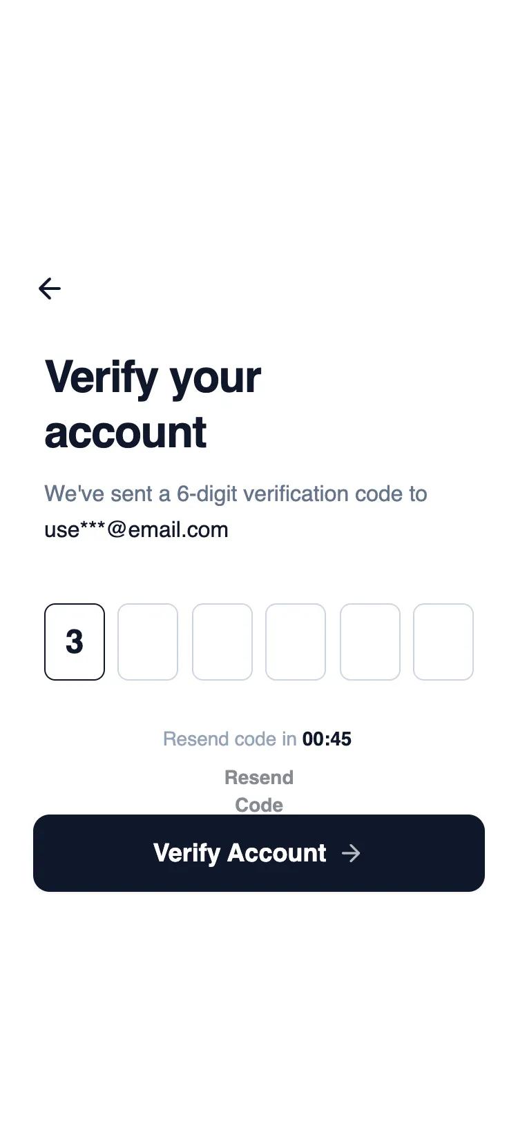 All Prompts
mobile appauthlayout
Mobile OTP Verification
Мобильная верификация OTP: поля ввода кода по центру, второстепенные действия. Для аутентификации в мобильных приложениях.
by Shirley LouLive Preview
Prompt
# Mobile OTP Verification

{
  "summary": "A clean, high-contrast mobile OTP verification screen utilizing a wireframe aesthetic. The design prioritizes focus and ease of use with large input fields, a strong typographic hierarchy, and a clear call-to-action.",
  "style": {
    "description": "The style is minimalist wireframe-chic. It uses a monochromatic palette ranging from pure white to slate-900. Typography relies on 'General Sans' for a professional, slightly geometric look. Transitions are subtle (hover and active states) to maintain a fast, performant feel without excessive fluff.",
    "prompt": "### Visual Identity & Style\n- **Palette**: \n  - Background: `#FFFFFF` (White)\n  - Primary Text: `#0F172A` (Slate 900)\n  - Secondary Text: `#64748B` (Slate 500)\n  - Disabled/Tertiary Text: `#94A3B8` (Slate 400)\n  - Borders: `#CBD5E1` (Slate 300) for inactive, `#0F172A` (Slate 900) for active/focused.\n- **Typography**: \n  - Font Family: 'General Sans' (Primary), Sans-serif (Fallback).\n  - Title: 32px size, `leading-tight`, `font-bold`, `-0.02em` tracking-tight.\n  - Body: 16px size, `leading-relaxed`, `font-regular`.\n  - OTP Text: 24px size, `font-semibold`.\n  - Timer: Use `tabular-nums` for consistent width during countdown.\n- **Animations**: \n  - Input Focus: Smooth transition (150ms) from Slate 300 to Slate 900 border with a 1px inner box-shadow.\n  - Button Press: `active:scale-[0.98]` interaction to provide tactile feedback.\n- **Shadows**: \n  - Small shadow-sm on primary buttons for subtle elevation."
  },
  "layout_and_structure": {
    "description": "A vertical stack optimized for mobile viewports (375px max width), divided into a top header, central content area, and a fixed bottom CTA section.",
    "prompts": [
      {
        "part": "Header",
        "prompt": "### Navigation Header\n- **Padding**: Top: 56px (pt-14), Horizontal: 24px (px-6).\n- **Elements**: A 40x40px circular back button with a 24px 'arrow-left' icon. \n- **Interaction**: Active state should show a subtle `#F3F4F6` (gray-100) background circle."
      },
      {
        "part": "Hero & Content",
        "prompt": "### Main Content Area\n- **Padding**: Horizontal: 32px (px-8), Vertical Margin: 40px (mb-10) after title.\n- **Title Section**: Large h1 heading with 'Verify your account' (forced line break for mobile visual balance). Followed by a description paragraph using Slate 500 text, highlighting the target email in Slate 900 font-medium."
      },
      {
        "part": "OTP Input Grid",
        "prompt": "### OTP Input Interaction\n- **Layout**: Flex container with `justify-between` and 8px gap (gap-2).\n- **Input Boxes**: 6 identical fields, each 44px wide and 56px tall. \n- **Styling**: 8px rounded corners (rounded-lg), 1px border. Text centered horizontally and vertically. \n- **States**: Focused input gets a Slate 900 border and subtle inner shadow."
      },
      {
        "part": "Timer & Feedback",
        "prompt": "### Resend Feedback\n- **Layout**: Centered flex column below inputs with 8px spacing (space-y-2).\n- **Timer**: 'Resend code in 00:45' text. Labels in Slate 400, digits in Slate 900 bold.\n- **Resend Action**: A text button with font-semibold and underline on hover. Default state is 50% opacity when disabled."
      },
      {
        "part": "Footer CTA",
        "prompt": "### Primary Action Footer\n- **Padding**: Bottom safe area: 34px, Horizontal: 24px.\n- **Button**: Full-width (w-full) 56px height (h-14) button in Slate 900.\n- **Radius**: 12px (rounded-xl).\n- **Elements**: White text 'Verify Account' with a trailing 20px 'arrow-right' icon (70% opacity)."
      }
    ]
  },
  "special_ui_components": [
    {
      "component": "Individual OTP Field",
      "description": "A specialized 1-digit input field designed for code entry.",
      "prompt": "### OTP Field Spec\n- **Dimensions**: 44px x 56px.\n- **Border**: Slate 300 inactive, Slate 900 active.\n- **Typography**: 24px font-semibold, centered.\n- **Functionality**: `maxlength='1'`, `autofocus` on first field. The container should support `transition-all` for smooth border color shifts."
    },
    {
      "component": "Haptic Button",
      "description": "Primary action button with physical interaction feedback.",
      "prompt": "### Haptic Button Spec\n- **Background**: `#0F172A` (Slate 900).\n- **Text**: White, 18px size, `font-semibold`.\n- **Feedback**: Scale down to 98% on click/tap (`active:scale-[0.98]`).\n- **Icon**: Right-aligned 'arrow-right' icon with `opacity-70` to soften its visual weight compared to the text."
    }
  ],
  "special_notes": "MUST: Maintain strict monochrome levels; any addition of color (blue/red) will break the wireframe aesthetic. MUST: Use 'tabular-nums' for the countdown to prevent horizontal text jitter. DO NOT: Increase border thickness beyond 1px as it loses the minimalist feel. MUST: Ensure inputs are exactly 56px tall to match the height of the CTA button for visual harmony."
}