All Prompts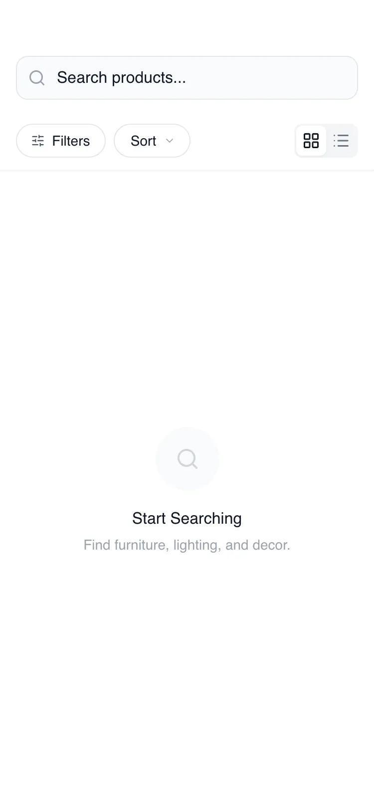 All Prompts
mobile appbrowseindexlayout
Mobile Search & Browse
Мобильный поиск и просмотр: макет для приложений ритейла, мебели, моды. Структура, юзабилити, скелетная загрузка. Оптимизация для браузинга.
by Shirley LouLive Preview
Prompt
# Mobile Search & Browse

{
  "summary": "A minimalist, functional mobile browse and search interface utilizing a grayscale wireframe aesthetic with high-polish interactions. The design centers on a persistent header containing search and filter controls, a dynamic results area supporting grid and list views, and an expandable bottom-sheet filter panel with advanced UI controls like range sliders and toggle switches.",
  "style": {
    "description": "Clean, modern minimalist style using General Sans typography. The color palette is strictly neutral (#FFFFFF to #111827) with subtle depth provided by Gray-50 and Gray-100 backgrounds. Interactions are characterized by cubic-bezier easing for drawers and a linear shimmer effect for loading states. Borders are thin (1px) and subtle, using #E5E7EB.",
    "prompt": "Create a design system using 'General Sans' (400, 500, 600). Palette: White (#FFFFFF), Primary Black (#000000), Background Gray (#F9FAFB), Border Gray (#E5E7EB), Text Muted (#6B7280), Text Deep (#111827). Borders: 1px solid #E5E7EB throughout. Border-radius: 12px (rounded-xl) for inputs and cards, 100px (rounded-full) for action pills. Animations: Use cubic-bezier(0.16, 1, 0.3, 1) for all transform transitions (300ms). Loading state: Shimmer effect using a linear gradient from #F3F4F6 to #E5E7EB and back. Shadows: Subtle 2px blur on header and toggles."
  },
  "layout_and_structure": {
    "description": "A three-part mobile layout consisting of a sticky navigation/filter header, a scrollable main results container, and an overlay-based filter drawer.",
    "prompts": [
      {
        "part": "Sticky Header",
        "prompt": "Container: padding pt-14 px-4 pb-3, background #FFFFFF, border-b #F3F4F6. Search Input: height 44px, background #F9FAFB, border 1px #E5E7EB, rounded-xl. Includes a Lucide:search icon at 12px left and a Lucide:x-circle at 12px right for clearing. Control Bar: flex row below search with 12px gap. Left: Two rounded-full buttons for 'Filters' and 'Sort'. Right: A toggle switch container with a 2px padding, holding two icons (grid vs list) on a sliding #FFFFFF background."
      },
      {
        "part": "Main Content Area",
        "prompt": "Full-height scrollable container with padding-bottom: 100px. Results Grid: 2-column layout with 16px gap (gap-4). Results List: 1-column layout with 8px vertical gap. Product Card (Grid): 3:4 aspect ratio placeholder (#F3F4F6) with rounded-xl corners, followed by a title (text-sm font-medium), category/price line, and a rating row (text-xs with a #EAB308 star icon). Product Card (List): Horizontal layout with 80px square image placeholder, text details centered vertically, and a right-chevron icon."
      },
      {
        "part": "Filter Bottom Sheet",
        "prompt": "Fixed overlay with #000000/20 backdrop-blur-sm. Drawer: slides up from bottom, height 85vh, rounded-t-3xl, background #FFFFFF. Content: Includes a 48px wide centered drag handle at top. Sections: Price Range (two input fields with currency symbols and a range slider), Category Chips (horizontal flex-wrap of rounded-full buttons), and Availability Toggle (a binary switch). Footer: Sticky bottom bar with 24px padding and two 48px height buttons ('Reset' vs 'Apply')."
      }
    ]
  },
  "special_ui_components": [
    {
      "component": "Shimmer Skeleton",
      "description": "Animated loading placeholder for cards.",
      "prompt": "Create a skeleton card: aspect ratio 3:4, rounded-xl background. Apply an animation 'shimmer' 1.5s linear infinite. Gradient: linear-gradient(90deg, #F3F4F6 0%, #E5E7EB 50%, #F3F4F6 100%). Background size 200% 100%."
    },
    {
      "component": "Interactive Toggle Switch",
      "description": "Standard binary switch for filters.",
      "prompt": "Outer track: 44px width, 24px height, rounded-full, background transition from #E5E7EB (off) to #000000 (on). Knob: 20px diameter white circle, absolute positioning, 2px offset, translates 20px when active. Transition: transform 0.2s ease-in-out."
    }
  ],
  "special_notes": "MUST maintain the 1px border consistency across all UI elements. MUST use General Sans for all text; fallback to sans-serif is only acceptable if General Sans fails to load. MUST ensure the bottom sheet drawer uses a springy cubic-bezier transition for a 'native' feel. DO NOT use vibrant colors; stick to the #000-#FFF grayscale to preserve the wireframe intent. DO NOT use sharp corners; all structural elements should have at least an 8px radius."
}