All Prompts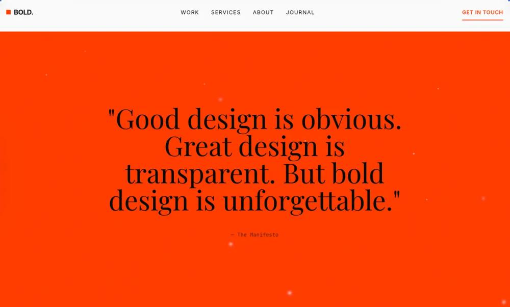 All Prompts
style
Modern Bold
Modern Bold: стильная типографика для UI. Используйте для уникального дизайна интерфейсов, подчеркивая заголовки и важные элементы.
by Zhou JasonLive Preview
Prompt
# Modern Bold

<design-system>

# Bold Typography Design System

## Design Philosophy

Bold Typography is **poster design translated to web**. Typography isn't decoration—it's the entire visual language. Every design decision serves the type: color exists to create contrast, space exists to frame letterforms, and interaction exists to reveal typographic details.

### Core Principles

1. **Type as Hero**: Headlines aren't just labels—they're the visual centerpiece. A well-set 80pt headline is more compelling than any stock photo.

2. **Extreme Scale Contrast**: The gap between headline and body creates drama. Think 6:1 or greater ratio between H1 and paragraph text.

3. **Deliberate Negative Space**: White (or black) space isn't empty—it's the frame around your type. Generous margins make headlines feel intentional, not cramped.

4. **Strict Hierarchy**: Every element has a clear rank. No two elements compete for attention. The eye flows naturally: headline → subhead → body → action.

5. **Restrained Palette**: Black, white, and one accent. Maybe two. More colors dilute the typographic impact. Let the type shapes do the work.

### The Vibe

**Confident. Editorial. Deliberate.** This isn't friendly SaaS—it's a design manifesto. The page feels like a gallery exhibition or luxury magazine spread. Every word earns its place.

Visual signatures:

- Massive headlines that make you scroll

- Tight letter-spacing on display text `-0.04em` to `-0.06em`)

- Wide letter-spacing on labels `0.1em` to `0.2em`)

- Text that bleeds to edge on mobile

- Underlines as the primary interactive affordance

- No rounded corners—sharp edges match sharp typography

---

## Design Token System

### Colors (Dark Mode)

~~~

background: #0A0A0A // Near-black, not pure black

foreground: #FAFAFA // Warm white

muted: #1A1A1A // Subtle surface elevation

mutedForeground: #737373 // Secondary text (WCAG AA on dark)

accent: #FF3D00 // Vermillion—warm, urgent, visible

accentForeground: #0A0A0A // Dark text on accent

border: #262626 // Barely-there dividers

input: #1A1A1A // Input backgrounds

card: #0F0F0F // Slight elevation from bg

cardForeground: #FAFAFA

ring: #FF3D00 // Focus states match accent
~~~

The accent is deliberate: vermillion/red-orange creates urgency and warmth against the cold dark background. It's used sparingly—headlines, key CTAs, and underlines only.

### Typography

**Primary Stack**: `"Inter Tight", "Inter", system-ui, sans-serif`

- Inter Tight for headlines (tighter default spacing)

- Clean, geometric, professional

**Display Stack**: `"Playfair Display", Georgia, serif`

- For pull quotes and testimonials only

- Creates elegant contrast with sans headlines

**Mono Stack**: `"JetBrains Mono", "Fira Code", monospace`

- Labels, stats, technical details

**Scale System**:

~~~

xs: 0.75rem // 12px - fine print

sm: 0.875rem // 14px - captions

base: 1rem // 16px - body

lg: 1.125rem // 18px - lead paragraphs

xl: 1.25rem // 20px - subheads

2xl: 1.5rem // 24px - section intros

3xl: 2rem // 32px - H3

4xl: 2.5rem // 40px - H2

5xl: 3.5rem // 56px - H1 mobile

6xl: 4.5rem // 72px - H1 tablet

7xl: 6rem // 96px - H1 desktop

8xl: 8rem // 128px - Hero statement

9xl: 10rem // 160px - Decorative numbers
~~~

**Tracking**:

~~~

tighter: -0.06em // Display headlines

tight: -0.04em // Large headings

normal: -0.01em // Body (slightly tightened)

wide: 0.05em // Small labels

wider: 0.1em // All-caps labels

widest: 0.2em // Sparse emphasis
~~~

**Line Heights**:

~~~

none: 1 // Single-line headlines

tight: 1.1 // Multi-line headlines

snug: 1.25 // Subheads

normal: 1.6 // Body text

relaxed: 1.75 // Long-form reading
~~~

### Radius & Border

~~~

radius: 0px // No border-radius anywhere. Sharp edges only.

border: 1px // Thin, precise dividers

borderThick: 2px // Accent underlines
~~~

### Shadows & Effects

No traditional shadows. Depth comes from:

- **Layered type**: Large muted text behind smaller bright text

- **Underlines**: 2-3px accent lines under interactive elements

- **Dividers**: Full-width horizontal rules

~~~

shadow: none

textShadow: none
~~~

### Textures & Patterns

**Subtle noise grain texture**: A very subtle fractal noise pattern at 1.5% opacity overlays the entire page, adding tactile quality to the dark background without being obtrusive. Implemented via inline SVG data URL with feTurbulence filter.

**Typographic layering for depth**:

- Decorative oversized numbers/text behind content with low opacity

- Text shadow technique: duplicate text offset 1-2px in border color creates depth without traditional shadows

- Accent bars: thin horizontal accent-colored bars (h-1, w-16) as visual anchors on key elements

---

## Component Stylings

### Buttons

Primary button is **text-only with animated underline**:

~~~

- No background fill

- Text in accent color

- Animated underline: absolute positioned span, h-0.5, bg-accent

- Base state: scale-x-100, on hover: scale-x-110

- Uppercase, wide tracking (tracking-wider: 0.1em)

- Font-weight: 600 (semibold)

- Padding: py-2/3/4 based on size (sm/default/lg), px-0

- Gap between children: gap-2/2.5/3

- Active state: translate-y-px for press feedback

- Transition: 150ms all
~~~

Secondary/outline button:

~~~

- Border: 1px solid foreground

- Text: foreground

- No background fill initially

- On hover: bg-foreground, text becomes background color (full inversion)

- Sharp corners (0px radius)

- Padding: px-6 (needs horizontal padding unlike primary)

- Uppercase, tracking-wider
~~~

Ghost button:

~~~

- No border, no fill

- Text: mutedForeground

- Padding: px-4

- On hover: text becomes foreground

- Underline appears via scale-x-0 to scale-x-100 transition

- Underline is h-px (thinner than primary)
~~~

All buttons:

~~~

- Focus-visible: 2px ring in accent, 2px offset

- Disabled: pointer-events-none, opacity-50

- Inline-flex for proper alignment

- Whitespace-nowrap to prevent wrapping
~~~

### Cards/Containers

**Minimal card usage.** Content is primarily separated by:

- Generous section padding (py-20 to py-40)

- Full-width horizontal borders (border-t/border-b)

- Typography scale changes

- Background color alternation (background ↔ muted)

When a "card" is necessary (pricing, testimonials):

~~~

- Border: 1px solid border (controlled by `bordered` prop)

- Background: transparent (bg-transparent)

- No radius (0px, sharp corners)

- No shadow

- Padding: p-6 (mobile) to p-8 (desktop)

- Transition on hover: border-hover color (150ms)
~~~

Highlighted cards (featured pricing tier):

~~~

- Border: 2px solid accent (overrides default 1px)

- Small accent badge above content (bg-accent, px-3 py-1, uppercase mono text)

- No background change, border is the differentiator
~~~

Special depth technique (Product Detail card):

~~~

- Add accent top border: absolute h-1 w-16 bg-accent

- Layered text: duplicate text element offset with -z-10 and border color

- Creates subtle dimensionality without shadows
~~~

### Inputs

~~~

- Background: input color (#1A1A1A)

- Border: 1px solid border

- Border-radius: 0px (rounded-none, sharp corners)

- Height: h-12 (mobile) to h-14 (desktop), responsive

- Font-size: text-base (16px, prevents zoom on iOS)

- Padding: px-4

- Text color: foreground

- Placeholder: mutedForeground

- Focus: border-accent, no ring, no glow, outline-none

- Transition: colors 150ms

- Disabled: cursor-not-allowed, opacity-50

- File input: special styling for file upload elements
~~~

Special case (Final CTA inverted section):

~~~

- Background: transparent (to show inverted bg)

- Border: border-background/30 (semi-transparent white)

- Text: background color (inverted)

- Placeholder: background/50 (semi-transparent)

- Focus border: accent (stands out on white bg)
~~~

---

## Layout Strategy

### Container

~~~

maxWidth: 1200px (max-w-5xl)

padding: 24px mobile, 48px tablet, 64px desktop
~~~

### Section Spacing

~~~

py-20 (80px) - tight sections

py-28 (112px) - standard sections

py-40 (160px) - hero/CTA sections
~~~

### Grid Philosophy

- **Asymmetric grids**: 7/5 or 8/4 splits instead of 6/6

- **Staggered alignment**: Elements don't always align top

- **Text columns**: max-w-2xl for readability, but headlines can span full width

---

## Effects & Animation

### Motion Philosophy

**Fast and decisive.** No bouncy easing. No playful delays. Movement is confident and direct.

~~~

duration: 150ms - micro-interactions (buttons, underlines)

duration: 200ms - standard transitions (FAQ accordion, colors)

duration: 500ms - image hover effects

easing: cubic-bezier(0.25, 0, 0, 1) - fast-out, crisp stop
~~~

### Specific Effects

**Link/Button interactions**:

- Underline scale animation (scale-x-0 to scale-x-100 on hover for ghost, scale-x-100 to scale-x-110 for primary)

- Text color transition (150ms)

- Active press feedback: translate-y-px for tactile response

- No scale, no glow, no bounce

**Card hover**:

- Border color lightens (border-hover token)

- Background color change on feature cards (transparent → muted)

- No lift, no shadow, no scale

**Image hover** (blog posts):

- Scale transform (scale-105) over 500ms

- Image only, not container

- Overflow hidden on container

**Page scroll animations** (Framer Motion):

- Fade in + slide up (opacity 0→1, translateY 20px→0) over 500ms

- Stagger children by 80ms with 100ms delay before first

- Viewport trigger: once only, 15% threshold, -50px margin

- Container stagger, individual fadeInUp variants

**FAQ accordion**:

- Height auto-animate with opacity fade

- 200ms duration with ease-out

- Icons swap (Plus ↔ Minus) instantly

**Step number hover** (How It Works):

- Color transition from border color to accent (fast, 150ms)

- No movement, pure color change

---

## Iconography

From `lucide-react`:

~~~

- Stroke width: 1.5px (thinner than default 2px for elegance)

- Sizes by context:

- 16px: inline with small text (arrows in buttons)

- 18px: FAQ toggle, footer social icons

- 20px: standard navbar icons

- 24px: feature section icons (28px on desktop)

- Color: currentColor (inherits from parent text color)

- Accent icons: explicitly text-[var(--accent)] class

- Style: Use sparingly—text labels are preferred

- Positioning: icons sit left of text in buttons, above text in feature cards

- Never use filled icons, always outline/stroke style
~~~

Icon mapping by section:

~~~

Features: Users, Zap, BarChart3, Link, Shield, Headphones, Globe (from data.icon field)

Social: Twitter, Linkedin, Github

UI controls: Plus, Minus (FAQ), ArrowRight (CTAs), Check (pricing features)
~~~

---

## Responsive Strategy

**Mobile-first typography scaling**:

- Headlines: text-3xl (mobile) → text-4xl/5xl (tablet) → text-6xl/7xl/8xl (desktop)

- Hero headline specifically: text-4xl → text-5xl → text-6xl → text-7xl → text-8xl (progressive enhancement)

- Body text: text-base (16px) throughout with md:text-lg on key sections

- Maintain hierarchy ratio at all sizes

- Icon sizes: 16px-18px inline, 24px standard, scaling down on mobile

**Layout shifts**:

- Stats: 1 column → 2 columns (sm) → 4 columns (md)

- Features: 1 column → 2 columns (sm) → 3 columns (lg)

- Blog/Testimonials/Pricing: 1 column → 2 columns (sm) → 3 columns (lg)

- How It Works: stacked → 3-column grid with number|title|description (lg)

- Benefits: stacked → 2-column side-by-side (lg)

- Footer: 2 columns → 4 columns (md) → 5 columns (lg)

- Asymmetric grids collapse to stacked on mobile

**Spacing adjustments**:

- Section padding: py-20 (mobile) → py-28 (md) → py-32/40 (lg)

- Container padding: px-6 (mobile) → px-12 (md) → px-16 (lg)

- Gap spacing: gap-4 → gap-6 → gap-8 progression

- Internal card padding: p-6 (mobile) → p-8 (md+)

**Mobile-specific fixes**:

- Hide decorative overflow elements (large "01", "ACME" text) on mobile to prevent horizontal scroll

- Reduce decorative number sizes to prevent layout breaking

- Ensure touch targets are minimum 44x44px (buttons h-12 on mobile, h-14 on desktop)

- Stack email input + button on mobile, side-by-side on tablet+

- Adjust navigation gaps to be tighter on smaller screens

**Typography integrity**:

- Headlines scale smoothly with responsive classes (never one size for all)

- Keep letter-spacing consistent across breakpoints

- Ensure underlines remain visible and touchable (2px minimum)

- Line-height increases slightly for smaller screens for readability

- Max-width constraints on body text prevent overly long lines (max-w-xl, max-w-2xl, max-w-3xl)

---

## Accessibility

**Contrast**:

- foreground (#FAFAFA) on background (#0A0A0A) = 18.1:1 ✓

- mutedForeground (#737373) on background = 5.3:1 ✓ (AA)

- accent (#FF3D00) on background = 5.4:1 ✓ (AA for large text)

**Focus states**:

- 2px accent outline

- 2px offset from element

- No glow, no fill change

- Visible on all interactive elements

**Typography**:

- Body text minimum 16px

- Line-height minimum 1.5 for body

- No thin weights below 400

**Interaction**:

- Touch targets minimum 44x44px

- Underlines are 2px+ for visibility

- Color is never the only indicator

</design-system>