All Prompts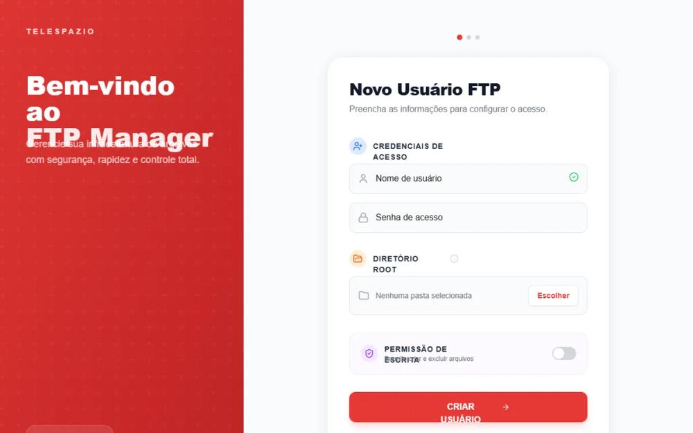 All Prompts
Modern Card-Based FTP Manager
Современный FTP-менеджер на основе карточек. Интерфейс SaaS-панелей, облачных хранилищ, финтех-порталов. Стильный дизайн с анимацией и iOS-элементами.
by Igor GonsalvesLive Preview
Prompt
# Modern Card-Based FTP Manager

{
  "summary": "A modern split-panel UI design for administration and configuration. The left side features a dynamic animated gradient with geometric overlays, while the right side focuses on a highly-elevated white card containing modular form sections with icon badges and taller, icon-inclusive inputs.",
  "style": {
    "description": "Modern geometric aesthetics using Plus Jakarta Sans (400-800 weight) for a tech-forward look. Color palette: Primary Brand Red (#e53935), Deep Red (#9b1c1c), and accent colors for categorization (Blue-100/600, Orange-100/600, Purple-100/600). The style emphasizes depth with a specific 0 4px 20px rgba(0,0,0,0.08) shadow and large 28px border radii for cards.",
    "prompt": "Apply a design system based on 'Plus Jakarta Sans'. Typography: Titles should be font-weight: 800 with tight tracking; body text in #1a1a1a. Color Palette: Primary #e53935, Background #f8fafc, Card White #ffffff. Elevation: Cards must have 28px border-radius and shadow '0 4px 20px rgba(0,0,0,0.08)'. Accents: Use categorical badges with 10% opacity backgrounds (Blue #3b82f6, Orange #f59e0b, Purple #8b5cf6). Buttons: Primary CTA at 56px height, background #e53935, with active:scale(0.98) micro-interaction. Inputs: 56px height, 12px border-radius, #f9fafb background, with left-aligned 20px icons and #e53935 focus borders. Visual effects: Glassmorphism for small badges (backdrop-filter: blur(12px), bg-white/10, border-white/20). Animations: Gradient-move 8s ease infinite for branding panels."
  },
  "layout_and_structure": {
    "description": "A responsive dual-panel layout. Mobile shows stacked panels; desktop features a fixed-width left information sidebar (400px-450px) and a centered content area with a modular card.",
    "prompts": [
      {
        "part": "Left Sidebar",
        "prompt": "Fixed-width sidebar (450px) with an animated linear-gradient background (from #e53935 to #9b1c1c). Overlay a repeating white geometric SVG pattern at 8% opacity. Content includes a top-aligned uppercase logo with 0.3em letter spacing, a central hero headline (text-4xl, font-extrabold), and a bottom-aligned glassmorphic version badge with a pulsing green status dot."
      },
      {
        "part": "Progress Indicator",
        "prompt": "Centered above the main card, a horizontal row of indicator dots. Current step is 10px diameter in #e53935; inactive steps are 8px diameter in #d1d5db. 8px spacing between dots."
      },
      {
        "part": "Main Configuration Card",
        "prompt": "A container with max-width 520px, 28px rounded corners, and 40px internal padding. Structure: Header with 30px font-size title, followed by vertical sections separated by 32px spacing. Each section starts with a circular icon badge (32px diameter) and a tracking-wide uppercase label."
      },
      {
        "part": "Sectional Groups",
        "prompt": "Group related inputs inside sections. For special permissions, use a full-width container with 20px padding, #faf5ff background (Purple-50), and a light border. Include a descriptive title, subtitle, and right-aligned iOS toggle switch."
      },
      {
        "part": "Selection Modal",
        "prompt": "Full-screen overlay with backdrop-blur(4px) and bg-black/40. Center a 500px wide white card with 24px border-radius. Features a sticky header with breadcrumb navigation and a footer with a primary/secondary button pair. Content area is a scrollable list of interactive items with 16px hover-scaling and border transitions."
      }
    ]
  },
  "special_ui_components": [
    {
      "component": "Category Icon Badges",
      "description": "Circular icons used to label form sections.",
      "prompt": "32px x 32px circular containers. Credentials: bg-blue-100, text-blue-600. Folder: bg-orange-100, text-orange-600. Permissions: bg-purple-100, text-purple-600. Place centered 18px icons inside."
    },
    {
      "component": "iOS-Style Toggle",
      "description": "Smooth sliding switch for boolean inputs.",
      "prompt": "44px width, 24px height pill-shaped track. Default state: bg-gray-300. Active state: bg-[#e53935]. Inner circle: 20px diameter, white, 2px padding from edge, transitions with transform: translateX(100%) when checked."
    },
    {
      "component": "Success Field Indicator",
      "description": "Micro-interaction for validated inputs.",
      "prompt": "Position a 18px check-circle icon (#22c55e) absolutely at the right-center of input fields (right: 16px). Only show when input condition is met."
    }
  ],
  "special_notes": "MUST: Use 56px heights for all primary interactive elements (buttons, inputs) for touch-friendliness. MUST: Ensure the geometric pattern in the sidebar remains subtle (opacity < 0.1). MUST NOT: Use standard 4px or 8px border radii; the design relies on the soft look of 24px-28px curves. MUST: Include internal padding of at least 16px for all input fields to accommodate icons."
}