All Prompts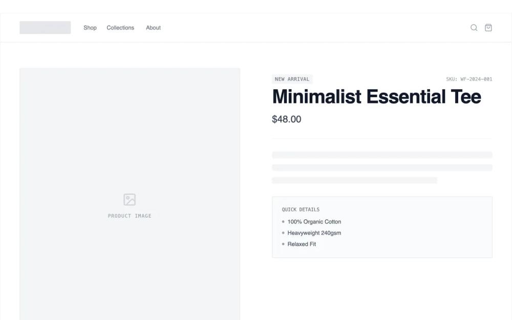 All Prompts
shopifyecommercelayoutproduct pagepdp
Modular Section Builder Product Page
Конструктор блоков для страниц товаров Shopify. Создавайте и меняйте секции местами для гибкой кастомизации и A/B тестов.
by Shirley LouLive Preview
Prompt
# Modular Section Builder Product Page

{
  "summary": "A high-fidelity grayscale e-commerce wireframe design system featuring modular sections, skeleton loaders, and a clean typography hierarchy for rapid product page prototyping.",
  "style": {
    "description": "The style is a professional 'developer-first' wireframe aesthetic. It uses a strict grayscale palette: #2d2d2d (titles), #666666 (body), #e8e8e8 (borders/placeholders), and #ffffff (backgrounds). Typography relies on General Sans for headings and body, with a monospaced font used for technical labels and SKU data. Interaction design includes subtle dashed outlines and drag-handle visibility on hover to indicate modularity.",
    "prompt": "Create a high-fidelity wireframe style using a grayscale palette: Primary Text #111827, Secondary Text #6B7280, Borders #E5E7EB, Light Backgrounds #F9FAFB, and Dark Accents #111827. Typography: 'General Sans' font family; Headings at 3rem/48px bold with -0.02em tracking; Body at 1rem/16px regular; Labels in 0.75rem/12px uppercase monospace with 0.1em letter spacing. UI elements should feature 2px border-radius, 1px solid borders, and 'pulse' animation skeleton placeholders (background-color cycle #F3F4F6 to #E5E7EB). All sections must have a 2px dashed outline (#E5E7EB) that appears on hover, along with a floating drag-handle icon (lucide:grip-vertical) in the top-left corner."
  },
  "layout_and_structure": {
    "description": "A vertically stacked modular layout within a max-width 1440px container. The structure is built from independent, full-width sections separated by light horizontal dividers (#F3F4F6). Each section utilizes a consistent padding-x of 1.5rem to 3rem (mobile to desktop) and padding-y of 4rem to 6rem.",
    "prompts": [
      {
        "part": "Header",
        "prompt": "Sticky header (height: 80px) with #ffffff background and 95% opacity backdrop-blur. Left side: 128px x 32px pulsed logo placeholder. Center: horizontal nav with 1.5rem spacing, 14px medium weight gray text. Right side: icons for search and cart (20px size)."
      },
      {
        "part": "Product Hero",
        "prompt": "Two-column grid (1:1 ratio). Left: 4:5 aspect ratio image placeholder with a centered iconify 'image' icon and uppercase monospace label. Right: Details stack including a 'New Arrival' badge, SKU label, 48px bold H1, 24px price, and a set of 3 animated skeleton text lines. Include a boxed 'Quick Details' list with 6px bullet points."
      },
      {
        "part": "Feature Highlights",
        "prompt": "Three-column grid with 2rem gap. Each item: 64px circular gray placeholder with centered icons, 18px bold heading, 48px wide horizontal bar (2px height), and centered body text (max-width 320px). Add a subtle white background and gray border on hover."
      },
      {
        "part": "Image + Text Split",
        "prompt": "50/50 horizontal split. Left side: solid #E5E7EB background with large centered image icon. Right side: centered content block (max-width 448px) featuring 30px heading, leading-relaxed body text, and a ghost-style button (1px solid black, 14px uppercase bold text, 32px padding-x)."
      },
      {
        "part": "Purchase Module",
        "prompt": "Centered layout with a 2-column configuration block inside a #F9FAFB container. Left column: Color circles (40px diameter with 2px offset rings) and a custom size dropdown (height: 48px, no border-radius). Right column: Stepper quantity selector and a full-width 'Add to Cart' button (height: 56px, #111827 background, 14px bold uppercase text)."
      },
      {
        "part": "Reviews List",
        "prompt": "Single column centered (max-width 672px). Stacked cards with 2rem spacing. Each card: 5-star rating icon row, date label, multi-line review text (16px, leading-relaxed), and a user avatar (32px circle) + name. Bottom: Underlined 'Load More' button with 4px offset."
      },
      {
        "part": "Footer",
        "prompt": "Four-column layout on #F9FAFB. Col 1: Logo and bio. Col 2-3: Link lists with uppercase bold headers. Col 4: Newsletter input (1px border) + 'JOIN' button. Bottom row: 12px copyright text and 3 small rectangular payment method placeholders (32px x 20px)."
      }
    ]
  },
  "special_ui_components": [
    {
      "component": "Drag Handle Indicator",
      "description": "A floating tooltip that appears on section hover to indicate reorderability.",
      "prompt": "An absolute-positioned div at top-left: 4px. Style: white background, 1px #E5E7EB border, shadow-sm, padding: 6px 10px, border-radius: 4px. Elements: Lucide GripVertical icon + 'SECTION [NUMBER]: [NAME]' in 10px monospace uppercase gray text. Visibility: Opacity 0 default, Opacity 1 on parent section hover."
    },
    {
      "component": "Skeleton Text Loader",
      "description": "Animated placeholders for text content to simulate loading or wireframe status.",
      "prompt": "Divs with background-color #F3F4F6 and border-radius 4px. Use 'animate-pulse' (duration 2s). Varied widths: 100%, 90%, and 75% for multi-line blocks. Height: 16px. Vertical gap: 12px."
    }
  ]
}