All Prompts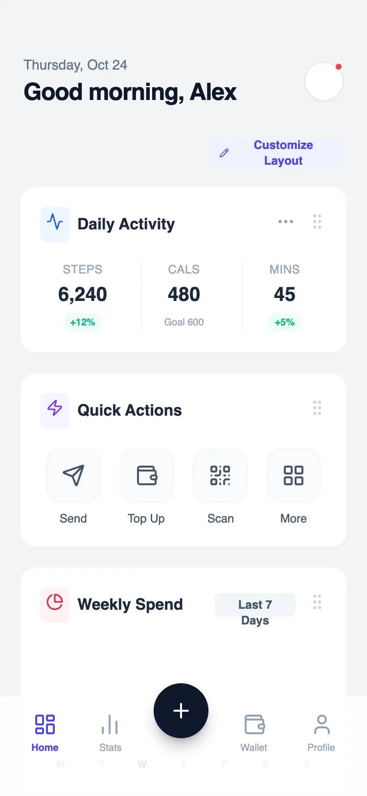 All Prompts
mobile apphomelayout
Modular Widget Home
Модульный виджет для главного экрана: вертикальный стек настраиваемых блоков с заголовком и контентом. Идеален для дашбордов и админ-панелей.
by Shirley LouLive Preview
Prompt
# Modular Widget Home

{
  "summary": "A clean, modular dashboard interface designed for mobile-first interaction, using a card-based widget system with subtle shadows, sophisticated typography pairing, and a glassmorphism bottom navigation bar.",
  "style": {
    "description": "The style is defined by a 'Satoshi' and 'Plus Jakarta Sans' typography pairing, a soft grey/blue background (#F2F4F6), and vibrant accent colors (Indigo, Emerald, Rose). Widgets are contained in white rounded cards with extremely subtle borders and soft shadows. Interactions are highlighted by background color shifts (e.g., Indigo-50) and micro-scaling effects.",
    "prompt": "Create a modern modular interface with the following specs:\n- **Typography**: Headers in 'Plus Jakarta Sans' (bold, tracking-tight); Body text in 'Satoshi' (medium/regular weight).\n- **Colors**: Background: #F2F4F6; Primary: #4F46E5 (Indigo-600); Success: #10B981 (Emerald-500); Neutral Text: #0F172A (Slate-900); Muted Text: #64748B (Slate-500).\n- **Cards**: Background: #FFFFFF; Border-radius: 16px (2xl); Border: 1px solid #F1F5F9; Shadow: 0 2px 12px -4px rgba(0,0,0,0.04).\n- **Icons**: Use Lucide-style line icons. Place icons inside 32x32px rounded-md containers with a 10% opacity version of the icon color as background (e.g., Blue-50 background for Blue-600 icon).\n- **Animations**: Hover states should transition background colors over 200ms. Buttons should scale by 0.95 on click. Navigation should use backdrop-filter: blur(12px) with 85% opacity."
  },
  "layout_and_structure": {
    "description": "The layout is a single-column vertical scroll of stacked widgets with fixed header and bottom navigation. Spacing is governed by a 20px (px-5) horizontal margin and 20px (gap-5) vertical spacing between cards.",
    "prompts": [
      {
        "part": "Header",
        "prompt": "Fixed-top or static header with a greeting. Left side: Date in Slate-500 (text-sm, font-medium) above a 24px bold H1 greeting. Right side: Profile button (40x40px) with a circular image, 1px border, and a status indicator dot (Red-500) positioned at the top-right of the avatar."
      },
      {
        "part": "Metric Widget",
        "prompt": "A card containing a header with a Lucide:activity icon and 'Daily Activity' title. Below, a 3-column grid separated by vertical hair-line dividers (#F1F5F9). Each column features a tiny uppercase label, a 20px bold value, and a tiny rounded-full pill for percentage changes (+12% in Emerald-500 on Emerald-50 background)."
      },
      {
        "part": "Quick Actions Grid",
        "prompt": "A 4-column icon grid. Each action is a vertical stack: a 56x56px rounded-2xl square button (bg: #F8FAFC) containing a 24px icon, followed by a text-xs font-medium label. Hover state for the square: bg-indigo-50, border-indigo-100, text-indigo-600."
      },
      {
        "part": "Data Visualization Widget",
        "prompt": "Weekly spend bar chart. Header includes a 'Filter' button (text-xs, bg-slate-100). Content: Seven vertical bars. Active bar: #6366F1 (Indigo-500) with a shadow-lg; Inactive bars: #CBD5E1 (Slate-300). Bars have rounded-t-sm corners and sit in a #F1F5F9 track. X-axis labels are text-[10px] font-medium."
      },
      {
        "part": "Bottom Navigation",
        "prompt": "A fixed glassmorphism bar (85% white, 12px blur). Features 5 slots: 4 icon-label pairs (active: Indigo-600, inactive: Slate-400) and a center 'Floating Action Button'. The FAB is a 56x56px Slate-900 circle with a white plus icon, elevated 24px above the nav line with a prominent shadow."
      }
    ]
  },
  "special_ui_components": [
    {
      "component": "High-Contrast Dark Widget",
      "description": "A dark-themed variant of the standard widget for emphasis.",
      "prompt": "Card with bg-slate-900 and text-white. Features a progress bar system with multiple segments (Indigo-500, Blue-400, Emerald-400). Headers use Slate-800 background for icon containers. 'Upgrade' button is a pill-shaped Indigo-600 button with white text."
    },
    {
      "component": "Interactive Task List",
      "description": "List items with custom checkboxes and priority markers.",
      "prompt": "Vertical stack of items. Each item: 20x20px custom checkbox (Indigo-500 when checked), title, and subtitle. On the far right, a 4x32px vertical pill acts as a priority color indicator (e.g., Orange-400 for high priority). Hovering the row adds a light slate-50 background and 1px border."
    }
  ]
}