All Prompts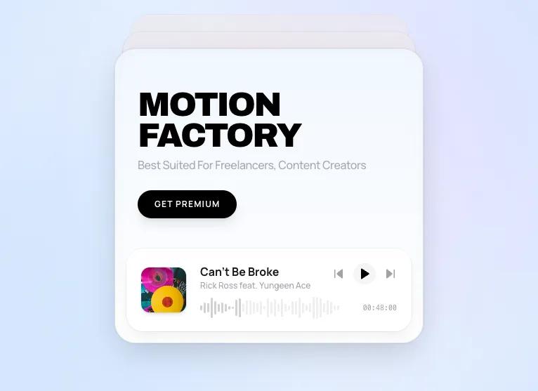 All Prompts
ui component
Motion Music Player
UI-компонент музыкального плеера с анимациями. Интегрируйте современный дизайн и интерактивность в ваше приложение.
by Zhou JasonLive Preview
Prompt
# Motion Music Player

You are given a task to integrate an existing React component in the codebase

~~~/src/App.tsx
import React from 'react';
import { HashRouter } from 'react-router-dom';
import DeckPlayer from './components/DeckPlayer';
import './global.css';

// Setup Tailwind config for the app
if (typeof window !== 'undefined') {
  window.tailwind = window.tailwind || {};
  window.tailwind.config = {
    theme: {
      extend: {
        fontFamily: {
          sans: ['Manrope', 'sans-serif'],
          display: ['Archivo', 'sans-serif'],
        },
        colors: {
          bg: '#eff6ff',
          card: '#ffffff',
          primary: '#18181b',
        },
        animation: {
          'pulse-slow': 'pulse 3s cubic-bezier(0.4, 0, 0.6, 1) infinite',
        }
      },
    },
  };
}

export default function App() {
  return (
    <HashRouter>
      <div className="w-full h-screen bg-[#eff6ff] text-zinc-900 flex items-center justify-center p-4 overflow-hidden relative selection:bg-blue-500 selection:text-white">
        {/* Ambient Background */}
        <div className="absolute inset-0 bg-[radial-gradient(circle_at_50%_50%,rgba(255,255,255,0.8),rgba(219,234,254,1))] pointer-events-none" />
        <div className="absolute top-0 left-0 w-full h-full bg-[url('https://grainy-gradients.vercel.app/noise.svg')] opacity-[0.03] pointer-events-none" />

        {/* Decorative Blobs for Gen Z vibe */}
        <div className="absolute top-[-10%] right-[-5%] w-[500px] h-[500px] rounded-full bg-purple-300/20 blur-[100px] pointer-events-none mix-blend-multiply" />
        <div className="absolute bottom-[-10%] left-[-5%] w-[500px] h-[500px] rounded-full bg-blue-300/20 blur-[100px] pointer-events-none mix-blend-multiply" />

        <DeckPlayer />
      </div>
    </HashRouter>
  );
}
~~~

~~~/package.json
{
  "name": "motion-music-player",
  "description": "A premium music player with card stack interactions",
  "dependencies": {
    "react": "^18.2.0",
    "react-dom": "^18.2.0",
    "framer-motion": "^10.16.4",
    "lucide-react": "^0.292.0",
    "clsx": "^2.0.0",
    "tailwind-merge": "^2.0.0",
    "react-router-dom": "^6.20.0"
  }
}
~~~

~~~/src/global.css
@import url('https://fonts.googleapis.com/css2?family=Archivo:ital,wght@0,100..900;1,100..900&family=Manrope:wght@200..800&display=swap');

@tailwind base;
@tailwind components;
@tailwind utilities;

:root {
  --color-bg: #eff6ff;
  --color-card: #ffffff;
  --color-text: #18181b;
  --color-text-muted: #71717a;
  --color-accent: #3b82f6;
}

body {
  background-color: var(--color-bg);
  color: var(--color-text);
  font-family: 'Manrope', sans-serif;
  overflow: hidden; /* Prevent scrolling for the app-like feel */
  -webkit-font-smoothing: antialiased;
}

.font-display {
  font-family: 'Archivo', sans-serif;
}

/* Custom Scrollbar */
::-webkit-scrollbar {
  width: 6px;
}
::-webkit-scrollbar-track {
  background: transparent;
}
::-webkit-scrollbar-thumb {
  background: #d4d4d8;
  border-radius: 3px;
}

/* Utilities */
.glass-panel {
  background: rgba(255, 255, 255, 0.6);
  backdrop-filter: blur(12px);
  -webkit-backdrop-filter: blur(12px);
  border: 1px solid rgba(0, 0, 0, 0.05);
}

/* Animation specific */
.waveform-bar {
  transition: height 0.15s ease;
}
~~~

~~~/src/components/Card.tsx
import React from 'react';
import { motion } from 'framer-motion';
import { Play, Pause, SkipBack, SkipForward } from 'lucide-react';
import Waveform from './Waveform';

export interface Song {
  id: string;
  title: string;
  artist: string;
  cover: string;
  duration: string;
  bgGradient: string;
  headerText: string;
  subText: string;
}

interface CardProps {
  song: Song;
  isPlaying: boolean;
  onTogglePlay: () => void;
  onNext: () => void;
  onPrev: () => void;
  index: number;
  isBackground?: boolean;
}

export default function Card({ song, isPlaying, onTogglePlay, onNext, onPrev, isBackground = false }: CardProps) {
  return (
    <div className={`relative w-full h-full bg-white rounded-[30px] overflow-hidden flex flex-col border border-zinc-200 shadow-[0_8px_30px_rgba(0,0,0,0.04)] transition-all ${isBackground ? 'brightness-95 grayscale-[0.3] shadow-none' : 'ring-1 ring-black/5'}`}>
      {/* Dynamic Background - subtle gradient */}

      {/* Enhanced glow effect for light mode */}
      {!isBackground && (
        <div className="absolute inset-0 rounded-[30px] shadow-[inset_0_0_20px_rgba(0,0,0,0.02)] pointer-events-none z-20" />
      )}
      <div
        className="absolute inset-0 opacity-40 pointer-events-none transition-colors duration-500"
        style={{ background: `linear-gradient(to bottom, ${song.bgGradient}, #ffffff)` }}
      />

      {/* Card Content */}
      <div className="flex-1 px-8 flex flex-col relative z-10 pt-8 justify-center">
        <motion.h1
          layoutId={`header-${song.id}`}
          className="font-display text-5xl font-black tracking-tighter text-black mb-2 leading-[0.9]"
        >
          {song.headerText}
        </motion.h1>

        <motion.p
          initial={{ opacity: 0 }}
          animate={{ opacity: 0.6 }}
          className="text-base text-zinc-500 max-w-[90%] font-medium tracking-tight"
        >
          {song.subText}
        </motion.p>

        <motion.div
          initial={{ opacity: 0, y: 20 }}
          animate={{ opacity: 1, y: 0 }}
          transition={{ delay: 0.2 }}
          className="mt-6"
        >
          <button className="px-6 py-3 rounded-full bg-black hover:bg-zinc-800 text-white text-xs font-bold tracking-widest transition-colors uppercase shadow-lg shadow-black/10 active:scale-95">
            Get Premium
          </button>
        </motion.div>
      </div>

      {/* Player Section */}
      <div className="p-4">
        <div className="bg-white/80 rounded-[24px] p-5 flex items-center gap-5 shadow-lg shadow-zinc-200/50 border border-white/50 backdrop-blur-md relative overflow-hidden group ring-1 ring-black/5">
          {/* Mini Cover */}
          <div className="relative w-16 h-16 rounded-xl overflow-hidden flex-shrink-0 shadow-md ring-1 ring-black/5">
             <img src={song.cover} alt="cover" className="w-full h-full object-cover group-hover:scale-110 transition-transform duration-500" />
          </div>

          {/* Info & Controls */}
          <div className="flex-1 flex flex-col justify-center min-w-0 gap-2">
            <div className="flex justify-between items-start">
              <div className="min-w-0">
                <h3 className="text-zinc-900 font-bold text-base truncate pr-2">{song.title}</h3>
                <p className="text-zinc-400 text-xs truncate font-medium">{song.artist}</p>
              </div>

              {/* Controls */}
              <div className="flex items-center gap-3">
                 <button onClick={onPrev} className="text-zinc-400 hover:text-black transition-colors">
                   <SkipBack size={18} fill="currentColor" />
                 </button>
                 <button onClick={onTogglePlay} className="text-black hover:scale-110 transition-transform bg-zinc-100 p-1.5 rounded-full">
                   {isPlaying ? <Pause size={18} fill="currentColor" /> : <Play size={18} fill="currentColor" className="ml-0.5" />}
                 </button>
                 <button onClick={onNext} className="text-zinc-400 hover:text-black transition-colors">
                   <SkipForward size={18} fill="currentColor" />
                 </button>
              </div>
            </div>

            {/* Waveform & Time */}
            <div className="flex items-center gap-3 mt-1">
               <div className="flex-1 h-6 flex items-center">
                  <Waveform isPlaying={isPlaying} />
               </div>
               <span className="text-[10px] font-mono text-zinc-400">{song.duration}</span>
            </div>
          </div>
        </div>
      </div>
    </div>
  );
}
~~~

~~~/src/components/Waveform.tsx
import React, { useEffect, useState } from 'react';
import { motion } from 'framer-motion';

export default function Waveform({ isPlaying }: { isPlaying: boolean }) {
  // Generate random heights for the bars
  const barCount = 40;
  const [bars, setBars] = useState<number[]>(Array.from({ length: barCount }, () => Math.random()));

  useEffect(() => {
    if (!isPlaying) return;

    const interval = setInterval(() => {
      setBars(prev => prev.map(h => {
        const change = (Math.random() - 0.5) * 0.5;
        return Math.max(0.1, Math.min(1, h + change));
      }));
    }, 100);

    return () => clearInterval(interval);
  }, [isPlaying]);

  return (
    <div className="flex items-center gap-[2px] h-8 w-full opacity-60">
      {bars.map((height, i) => (
        <motion.div
          key={i}
          className="rounded-full w-[3px]"
          animate={{
            height: `${height * 100}%`,
            opacity: isPlaying ? 0.8 + (height * 0.2) : 0.3
          }}
          transition={{ duration: 0.1 }}
          style={{
            backgroundColor: i < barCount * 0.3 ? '#000000' : '#a1a1aa' // Black and Zinc-400
          }}
        />
      ))}
    </div>
  );
}
~~~

~~~/src/components/DeckPlayer.tsx
import React, { useState } from 'react';
import { motion, AnimatePresence } from 'framer-motion';
import Card, { Song } from './Card';

// Mock Data - Updated for Light Mode / Gen Z
const SONGS: Song[] = [
  {
    id: '1',
    title: "Can't Be Broke",
    artist: "Rick Ross feat. Yungeen Ace",
    cover: "https://images.unsplash.com/photo-1619983081563-430f63602796?q=80&w=1000&auto=format&fit=crop",
    duration: "00:48:00",
    bgGradient: "#dbeafe", // Light Blue
    headerText: "MOTION FACTORY",
    subText: "Best Suited For Freelancers, Content Creators"
  },
  {
    id: '2',
    title: "Midnight City",
    artist: "M83",
    cover: "https://images.unsplash.com/photo-1493225255756-d9584f8606e9?q=80&w=1000&auto=format&fit=crop",
    duration: "04:03:00",
    bgGradient: "#f3e8ff", // Light Purple
    headerText: "NEON DREAMS",
    subText: "Synth-pop anthems for late night drives"
  },
  {
    id: '3',
    title: "Starboy",
    artist: "The Weeknd",
    cover: "https://images.unsplash.com/photo-1614613535308-eb5fbd3d2c17?q=80&w=1000&auto=format&fit=crop",
    duration: "03:50:00",
    bgGradient: "#ffe4e6", // Light Red/Pink
    headerText: "STAR POWER",
    subText: "Chart topping hits from the modern legend"
  },
  {
    id: '4',
    title: "Levitating",
    artist: "Dua Lipa",
    cover: "https://images.unsplash.com/photo-1470225620780-dba8ba36b745?q=80&w=1000&auto=format&fit=crop",
    duration: "03:23:00",
    bgGradient: "#e0f2fe", // Light Sky
    headerText: "FUTURE NOSTALGIA",
    subText: "Retro disco vibes reimaged for today"
  }
];

const swipeVariants = {
  enter: (direction: number) => ({
    scale: 0.95,
    y: -35,
    opacity: 0.6,
    zIndex: 2,
    x: 0,
  }),
  center: {
    zIndex: 3,
    x: 0,
    y: 0,
    scale: 1,
    opacity: 1,
    transition: {
      duration: 0.4,
      ease: [0.16, 1, 0.3, 1]
    }
  },
  exit: (direction: number) => ({
    zIndex: 3,
    x: direction > 0 ? 350 : -350,
    opacity: 0,
    scale: 1,
    rotate: direction > 0 ? 10 : -10,
    transition: {
      duration: 0.4,
      ease: [0.16, 1, 0.3, 1]
    }
  })
};

export default function DeckPlayer() {
  const [currentIndex, setCurrentIndex] = useState(0);
  const [direction, setDirection] = useState(0);
  const [isPlaying, setIsPlaying] = useState(false);

  const handleNext = () => {
    setDirection(1);
    setCurrentIndex((prev) => (prev + 1) % SONGS.length);
  };

  const handlePrev = () => {
    setDirection(-1);
    setCurrentIndex((prev) => (prev - 1 + SONGS.length) % SONGS.length);
  };

  const togglePlay = () => setIsPlaying(!isPlaying);

  const activeSong = SONGS[currentIndex];
  const nextSong = SONGS[(currentIndex + 1) % SONGS.length];
  const nextNextSong = SONGS[(currentIndex + 2) % SONGS.length];

  return (
    <div className="relative w-[440px] h-[420px] flex items-center justify-center perspective-[1000px]">

      {/* Background Stack 2 */}
      <motion.div
        key={`bg2-${nextNextSong.id}`}
        className="absolute inset-0 w-full h-full pointer-events-none"
        initial={{ scale: 0.85, y: -70, opacity: 0 }}
        animate={{
          scale: 0.9,
          y: -70,
          zIndex: 1,
          opacity: 0.5 // Increased opacity for light mode
        }}
        transition={{ duration: 0.4 }}
      >
         <Card
            song={nextNextSong}
            isPlaying={false}
            onTogglePlay={() => {}}
            onNext={() => {}}
            onPrev={() => {}}
            index={currentIndex + 2}
            isBackground={true}
          />
      </motion.div>

      {/* Background Stack 1 */}
      <motion.div
        key={`bg1-${nextSong.id}`}
        className="absolute inset-0 w-full h-full pointer-events-none"
        initial={{ scale: 0.9, y: -35, opacity: 0.3 }}
        animate={{
          scale: 0.95,
          y: -35,
          zIndex: 2,
          opacity: 0.8 // Increased opacity for light mode
        }}
        transition={{ duration: 0.4 }}
      >
         <Card
            song={nextSong}
            isPlaying={false}
            onTogglePlay={() => {}}
            onNext={() => {}}
            onPrev={() => {}}
            index={currentIndex + 1}
            isBackground={true}
          />
      </motion.div>

      {/* Active Card */}
      <AnimatePresence custom={direction} mode="popLayout">
        <motion.div
          key={activeSong.id}
          custom={direction}
          variants={swipeVariants}
          initial="enter"
          animate="center"
          exit="exit"
          className="absolute inset-0 w-full h-full z-30 shadow-[0_20px_50px_-12px_rgba(0,0,0,0.15)] rounded-[30px]"
          drag="x"
          dragConstraints={{ left: 0, right: 0 }}
          dragElastic={0.7}
          onDragEnd={(e, { offset, velocity }) => {
            const swipe = offset.x;
            if (swipe < -100) {
              handlePrev();
            } else if (swipe > 100) {
              handleNext();
            }
          }}
        >
          <Card
            song={activeSong}
            isPlaying={isPlaying}
            onTogglePlay={togglePlay}
            onNext={handleNext}
            onPrev={handlePrev}
            index={currentIndex}
          />
        </motion.div>
      </AnimatePresence>
    </div>
  );
}
~~~

Implementation Guidelines

1. Analyze the component structure, styling, animation implementations
2. Review the component's arguments and state
3. Think through what is the best place to adopt this component/style into the design we are doing
4. Then adopt the component/design to our current system

Help me integrate this into my design