All Prompts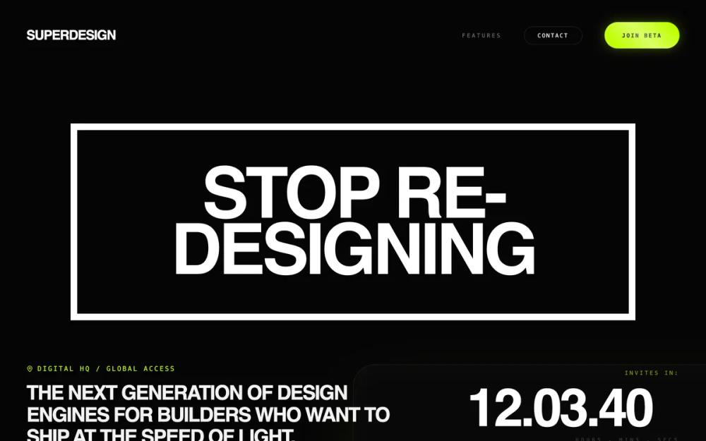 All Prompts
product launchstylelanding pagehigh conversion pagewaitlist
Neon Velocity Countdown
Система дизайна Neon Velocity: футуристичный дарк-мод с неоновыми акцентами. Идеально для стартапов, SaaS, финтеха. Скорость, точность, инновации.
by Shirley LouLive Preview
Prompt
# Neon Velocity Countdown

{
  "summary": "The 'Neon Velocity' style guide is a minimalist yet aggressive design system that blends brutalist structure (heavy borders, massive type) with futuristic glass effects. It focuses on high contrast, uppercase technical labels, and immersive background glows to create a premium, 'elite' software atmosphere.",
  "style": {
    "description": "The style is built on a high-contrast foundation of deep blacks (#050505) and vibrant neon lime (#BFFF00). It employs 'Plus Jakarta Sans' (800 weight) for heavy, tightly-tracked headlines and 'Geist Mono' for technical, wide-tracked labels. Key visual techniques include 3D perspective transforms, grain/noise overlays for texture, and luminosity-based hover states that make components feel light-emitting.",
    "prompt": "### Core Aesthetics\n- **Color Palette**: Primary Background: `#050505`; Accent Green: `#BFFF00`; Text Primary: `#FFFFFF`; Text Secondary: `rgba(255, 255, 255, 0.4)`; Borders: `rgba(255, 255, 255, 0.1)`.\n- **Typography**:\n  - **Headlines**: 'Plus Jakarta Sans', weight 800, tracking -0.05em, uppercase. Fluid sizing: `clamp(2.6rem, 10vw, 8.75rem)`.\n  - **Technical Meta**: 'Geist Mono', weight 400-600, tracking 0.2em to 0.5em, uppercase, font-size: 10px-12px.\n  - **Body**: 'Inter', weight 300-400, leading-relaxed.\n- **Visual Effects**:\n  - **Noise Overlay**: Subtle SVG fractal noise at 3% opacity fixed to the viewport.\n  - **Refraction Glow**: Large, blurred radial gradients (`#BFFF00` at 15% opacity) acting as background ambiance.\n  - **Glassmorphism**: `backdrop-filter: blur(12px)` with 1px solid white borders at 8% opacity.\n- **Animations**: Use `cubic-bezier(0.16, 1, 0.3, 1)` for all transitions. Implement scroll-reveal effects where elements translate 40px Y-axis while fading in."
  },
  "layout_and_structure": {
    "description": "The layout is a single-column flow with wide containers (max-width 1600px). It uses a '3D Glass' background to anchor the hero and a modular bento-grid for feature sections.",
    "prompts": [
      {
        "part": "Header",
        "prompt": "Full-width container (max 1600px). Left: Logo in 'Plus Jakarta Sans' bold uppercase. Right: Navigation links using 'Geist Mono' 10px, tracking 0.3em. Include a primary 'Laser Button' with rounded-full shape for the CTA."
      },
      {
        "part": "Hero Section",
        "prompt": "A central stacked layout. Background: A '3D Glass' card tilted at 15deg using `perspective(1000px) rotateX(15deg)`. Foreground: A massive headline wrapped in a white border box (border-width: 12px). Below the headline, a split-row metadata section: left side contains a location/status tag; right side contains a large countdown timer in 'Plus Jakarta Sans' using `font-variant-numeric: tabular-nums`."
      },
      {
        "part": "Feature Bento Grid",
        "prompt": "3-column grid (collapsing to 1 on mobile). Each card (Luminosity Card) should have a 2rem border-radius, minimum height of 450px, and use a radial-gradient top-left glow. Content: Top-aligned mono index (e.g., 01/ETHOS), middle-aligned large headline, bottom-aligned description."
      },
      {
        "part": "Social Proof & Form",
        "prompt": "Avatar stack with 5 overlapping images, each having a 2px `#BFFF00` border and neon shadow. Horizontal form: A pill-shaped container with `rgba(255,255,255,0.05)` background and blur, containing a borderless mono input and a rounded-full 'Laser Button'."
      },
      {
        "part": "Mobile Navigation",
        "prompt": "A fixed bottom navigation pill. `background: rgba(10, 10, 10, 0.8)`, `backdrop-filter: blur(20px)`, 1px border. Icons should be centered with high-contrast hover states to `#BFFF00`."
      }
    ]
  },
  "special_ui_components": [
    {
      "component": "Laser Button",
      "description": "A high-energy interactive button with a sweeping light effect.",
      "prompt": "Background color: `#BFFF00`; Color: `#000000`; Border-radius: 9999px; Box-shadow: `0 0 20px rgba(191, 255, 0, 0.3)`. On hover: An absolute-positioned pseudo-element with a linear-gradient (transparent, white 40%, transparent) translates across the button at a 45-degree angle over 0.6s."
    },
    {
      "component": "Luminosity Card",
      "description": "A responsive container that reacts to mouse proximity with light.",
      "prompt": "Background: `radial-gradient(circle at top left, rgba(255, 255, 255, 0.03), transparent)`. Border: 1px solid `rgba(255, 255, 255, 0.05)`. Transition: 0.5s ease. Hover state: Change border-color to `rgba(191, 255, 0, 0.3)` and background to a radial-gradient using the accent green `#BFFF00` at 5% opacity."
    }
  ],
  "special_notes": "MUST: Use uppercase for all technical labels and headlines to maintain the brutalist feel. MUST: Use `tabular-nums` for the countdown to prevent horizontal layout shift during ticks. MUST: Maintain a minimum touch target of 48px for the mobile bottom nav buttons. DO NOT: Use standard rounded corners on the large Hero border-box; keep them sharp (0px) to contrast with the rounded cards below. DO NOT: Use pure black (#000) for backgrounds; stick to the slightly lighter `#050505` to allow the noise texture to be visible."
}