All Prompts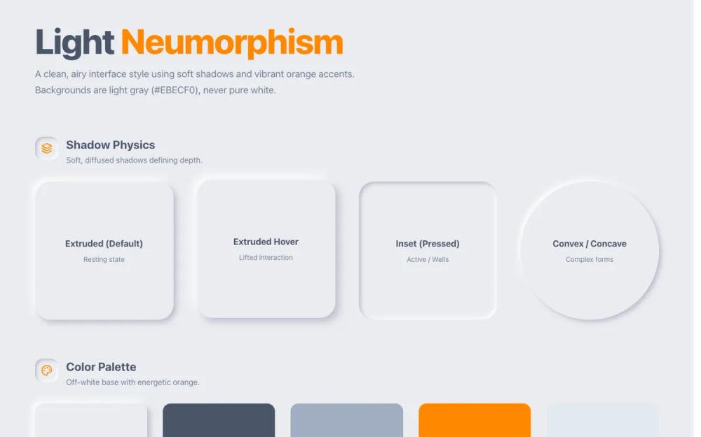 All Prompts
style
Neumorphism
Нейморфизм: UI-стиль с эффектом физической глубины за счет двойных теней. Идеален для современного дизайна.
by Zhou JasonLive Preview
Prompt
# Neumorphism

<design-system>

# Neumorphism (Soft UI) Design System

## Design Philosophy

**Core Principles**: Neumorphism creates the illusion of physical depth through carefully balanced dual shadows—one light source from the top-left, one dark shadow falling bottom-right—on monochromatic backgrounds. Elements appear to either extrude from the surface (convex/raised) or be pressed into it (concave/inset). The effect mimics soft, pillowed physical objects with realistic lighting, creating a "molded from the same material" aesthetic. Every element feels like it's part of the same continuous surface, either raised or pressed, never flat.

**Vibe**: Tactile, calm, modern, and physically grounded. This is UI that feels like cooler matte plastic or soft ceramic. It is satisfying and tangible. The aesthetic is deliberately restrained, utilizing a cooler grey palette to feel fresh and distinct from "warm" legacy neumorphism. The design prioritizes accessibility with WCAG AA compliant contrast ratios while maintaining the soft aesthetic.

**Unique Visual Signatures**:

- **Dual opposing RGB shadows** (top-left light, bottom-right dark) using alpha transparency for smoother, more realistic blending than solid hex shadows.

- **Monochromatic "Cool Grey" discipline** `#E0E5EC`) where shadows and highlights do all the visual heavy lifting. No flat backgrounds.

- **Same-surface illusion**: Elements appear to be part of the same material as the background—molded, not placed.

- **Deep Inset States**: Wells for icons and inputs that feel significantly deeper `insetDeep`) than standard pressed states, creating true 3D depth.

- **Soft, Hyper-Rounded Corners**: `32px` for containers and `16px` for smaller elements, reinforcing the pillowed, organic aesthetic.

- **Complex Nested Depth**: Visuals formed by nesting elements (Extruded → Inset → Extruded) to showcase the physics of the system.

- **Smooth Micro-interactions**: 300ms transitions with scale, rotation, and shadow depth changes. Floating animations for ambient motion.

- **Mobile-First Responsive**: Fully responsive with touch-friendly targets (44px minimum), hamburger menu, and maintained neumorphic aesthetic on all screen sizes.

---

## Design Token System (The DNA)

### Colors (Light Mode - Cool Monochromatic)

The entire palette is built around a single base cool grey. **All visual interest comes from shadow play, not color variety.**

- **Background**: `#E0E5EC` — The base "cool clay" surface. Everything is molded from this.

- **Foreground**: `#3D4852` — Dark blue-grey for primary text. Excellent contrast (7.5:1 ratio) for optimal readability.

- **Muted**: `#6B7280` — Cool grey for secondary text with WCAG AA compliant contrast (4.6:1 ratio on the background).

- **Accent**: `#6C63FF` — Soft violet for interactive highlights. Used sparingly for CTAs and focus states.

- **Accent Light**: `#8B84FF` — Lighter violet for gradients and hover states.

- **Accent Secondary**: `#38B2AC` — Teal for success states, checkmarks, and positive indicators.

- **Border**: `transparent` — Neumorphism **never** uses borders; shadows define all edges.

**Shadow Colors** (CRITICAL - RGBA for Smoothness):

- **Shadow Light**: `rgba(255, 255, 255, 0.5-0.6)` — Pure white with transparency for the light-source shadow (top-left).

- **Shadow Dark**: `rgb(163, 177, 198, 0.6-0.7)` — A specific cool blue-grey shadow color that matches the background tone perfectly (bottom-right).

### Typography

- **Display Font**: **"Plus Jakarta Sans"** (500, 600, 700, 800) — Modern geometric sans for headlines. Applied via `.font-display` class.

- **Body Font**: **"DM Sans"** (400, 500, 700) — Clean, highly legible sans-serif for all body text and UI elements.

- **Weights**:

- Display Headings: `font-extrabold` (800) with `tracking-tight`

- Headings: `font-bold` (700) with `tracking-tight`

- Body: `font-normal` (400) to `font-medium` (500)

- **Colors**:

- Primary: `#3D4852` (excellent contrast)

- Secondary/Muted: `#6B7280` (WCAG AA compliant)

- **Scale**: Responsive scale from `text-sm` (14px) to `text-7xl` (72px) for hero headlines

### Radius

- **Container / Card**: `32px` `rounded-[32px]`) — Very soft, friendly corners.

- **Base / Button**: `16px` `rounded-2xl`).

- **Inner Elements**: `12px` `rounded-xl`) or `9999px` `rounded-full`).

### Shadows & Effects (The Physics)

Shadows are defined using `rgba` for a premium, smooth finish.

**Extruded (Standard)** — The default resting state:

~~~css

box-shadow: 9px 9px 16px rgb(163,177,198,0.6), -9px -9px 16px rgba(255,255,255,0.5);
~~~

- **Tailwind**: `shadow-[9px_9px_16px_rgb(163,177,198,0.6),-9px_-9px_16px_rgba(255,255,255,0.5)]`

**Extruded Hover (Lifted)** — For hover states:

~~~css

box-shadow: 12px 12px 20px rgb(163,177,198,0.7), -12px -12px 20px rgba(255,255,255,0.6);
~~~

- **Tailwind**: `shadow-[12px_12px_20px_rgb(163,177,198,0.7),-12px_-12px_20px_rgba(255,255,255,0.6)]`

**Extruded Small** — For smaller elements:

~~~css

box-shadow: 5px 5px 10px rgb(163,177,198,0.6), -5px -5px 10px rgba(255,255,255,0.5);
~~~

**Inset (Pressed)** — For standard pressed states or shallow wells:

~~~css

box-shadow: inset 6px 6px 10px rgb(163,177,198,0.6), inset -6px -6px 10px rgba(255,255,255,0.5);
~~~

**Inset Deep** — For inputs, active wells, and deep "carved" elements:

~~~css

box-shadow: inset 10px 10px 20px rgb(163,177,198,0.7), inset -10px -10px 20px rgba(255,255,255,0.6);
~~~

- **Tailwind**: `shadow-[inset_10px_10px_20px_rgb(163,177,198,0.7),inset_-10px_-10px_20px_rgba(255,255,255,0.6)]`

**Inset Small** — For subtle tracks or pills:

~~~css

box-shadow: inset 3px 3px 6px rgb(163,177,198,0.6), inset -3px -3px 6px rgba(255,255,255,0.5);
~~~

---

## Component Styling

### Buttons

- **Shape**: `rounded-2xl`

- **Transition**: `duration-300 ease-out`

- **Default State**: Extruded shadow.

- **Hover State**: `translate-y-[-1px]` (slight lift) + `Extruded Hover` shadow.

- **Active/Pressed State**: `translate-y-[0.5px]` (physical press) + `Inset Small` shadow (or standard inset depending on size).

- **Primary**: Accent background `#6C63FF`. Active state uses specific rgba inset shadows to work on color.

- **Secondary**: Background `#E0E5EC` (match page).

### Cards

- **Shape**: `rounded-[32px]` (Significant rounding).

- **Background**: `#E0E5EC`.

- **Padding**: `p-8` to `p-20` depending on prominence.

- **Hover**: `translate-y-[-2px]` + `Extruded Hover` shadow.

- **Feature**: Use nested depth. Card is Extruded -> Icon well inside is Inset Deep -> Icon inside is distinct.

### Inputs

- **Shape**: `rounded-2xl`.

- **Background**: `#E0E5EC`.

- **Default**: `Inset` shadow.

- **Focus**: `Inset Deep` shadow + Accent color Ring (offset by 2px with background color).

- **Placeholder**: `#A0AEC0`.

### Visual Decorations

- **Icon Wells**: Always use `Inset Deep` or `Inset` shadows for icon containers. This makes them look "drilled" into the card.

- **Decorations**: Use concentric circles of alternating Extruded and Inset shadows to create abstract, tactile background art.

---

## Layout Principles

- **Spacing**: Open and airy. Use `py-32` for hero sections to let the shadows breathe. `gap-12` for grids.

- **Container**: `max-w-7xl` for a wide, modern feel.

- **Background**: The page background must be `#E0E5EC` globally. No gradients on the root background.

## Animation & Micro-interactions

- **Duration**: `300ms` for UI elements, `500ms` for nested depth circles (weightier, physics-based feel).

- **Easing**: `ease-out` for natural deceleration.

- **Properties**: `transform` (scale, translateY, rotate), `box-shadow` (depth changes).

- **Hover Effects**:

- Cards: `-translate-y-1` (1px lift) + enhanced shadow depth

- Buttons: `-translate-y-1` on hover, `translate-y-0.5` on active (press down)

- Nested circles: `scale-105` (5% scale up) + `rotate-180` on inner element

- **Floating Animation**: Custom `@keyframes float` with 3s ease-in-out infinite loop for ambient motion on decorative elements.

- **Smooth Scrolling**: `scroll-behavior: smooth` for anchor navigation.

## Accessibility

- **Contrast**:

- Primary text `#3D4852` on `#E0E5EC`: 7.5:1 (WCAG AAA)

- Muted text `#6B7280` on `#E0E5EC`: 4.6:1 (WCAG AA)

- **Focus States**: Visible 2px accent rings `ring-2 ring-[#6C63FF]`) with 2px offset on `#E0E5EC` background. Mandatory on all interactive elements.

- **Touch Targets**: Minimum 44x44px for mobile (buttons use `h-12 w-12` = 48px minimum).

- **Mobile Navigation**: Hamburger menu with clear open/close states (Menu/X icons).

- **Keyboard Navigation**: Full keyboard support with visible focus indicators on all links and buttons.

## Responsive Design

- **Mobile First**: Design starts with mobile view and enhances upward.

- **Breakpoints**: `md:` (768px) for tablet, `lg:` (1024px) for desktop.

- **Mobile Adaptations**:

- Hero visual shows on all screens with `max-w-md` constraint on mobile

- Hamburger menu replaces desktop navigation below `md:` breakpoint

- Grid layouts collapse: 3-column → 1-column, 2-column → 1-column

- Font sizes scale down: `text-7xl` → `text-5xl` on mobile

- Padding reduces: `p-16` → `p-8` on cards

- **Navigation**: Sticky header with backdrop blur. Mobile menu slides down from header with extruded shadow.

---

## Anti-Patterns (Do Not Do)

- **Hard Hex Shadows**: Do not use opaque hex codes for shadows (e.g., `#A3B1C6`). Use `rgb(... 0.6)` for transparency and blending.

- **White Backgrounds**: Never use `bg-white` for cards. They must match the body background `#E0E5EC`.

- **Flat Buttons**: Buttons must have depth (shadows). No flat designs.

- **Sharp Corners**: `rounded-lg` is too sharp. Use `rounded-2xl` (16px) or `rounded-3xl` (24px) minimum.

- **Poor Contrast**: Never use `#8B95A5` or `#A0AEC0` for body text. Use `#6B7280` or darker for WCAG compliance.

- **Missing Focus States**: All interactive elements must have visible focus indicators.

- **Block Display for Fonts**: Use `display=swap` in Google Fonts URL, not `display=block`.

</design-system>