All Prompts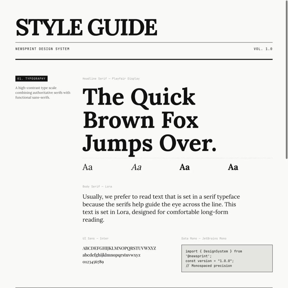 All Prompts
style
News Print
Стиль UI "News Print" для веб. Имитирует дизайн печатных изданий, создавая винтажную атмосферу.
by Zhou JasonLive Preview
Prompt
# News Print

<design-system>

# Design Style: Newsprint

## 1. Design Philosophy

**"All the News That's Fit to Print."**

This style is an ode to the golden age of print journalism, reimagined for the web. It embodies **absolute clarity, hierarchy, and structure** through its unwavering commitment to high-contrast typography, grid-based layouts, and sharp geometric precision.

### Core DNA

The newsprint aesthetic rejects modern web trends of soft shadows, blurred backgrounds, and rounded corners. Instead, it embraces:

- **Stark Geometry**: Zero border radius. Every element is a perfect rectangle with sharp 90-degree corners.

- **High Information Density**: Tight padding, collapsed grid borders, and efficient use of space mimic newspaper column layouts.

- **Typographic Drama**: Massive serif headlines (up to 9xl on desktop) paired with smaller, highly legible body text create extreme hierarchy.

- **Visible Structure**: Grid lines aren't hidden—they're celebrated. Borders between columns and sections are explicit and prominent.

- **Editorial Authority**: The design feels serious, timeless, and trustworthy—like a publication of record.

- **Paper Texture**: Subtle grain overlays and line patterns simulate the tactile quality of newsprint without being overly skeuomorphic.

### Vibe

Authoritative, intellectual, urgent, timeless. It feels like holding a fresh morning newspaper—crisp, organized, and information-rich. The design exudes confidence and credibility.

## 2. Design Token System (The DNA)

### Colors (Single Palette)

**Mode:** Light (Permanent - no dark mode)

- **Background:** `#F9F9F7` (Newsprint Off-White)

A warm off-white that mimics aged paper. Not pure white—adds subtle warmth and reduces eye strain.

- **Foreground:** `#111111` (Ink Black)

Very deep black, not pure `#000`. Used for all text and borders.

- **Muted:** `#E5E5E0` (Divider Grey)

Light grey for secondary borders and subtle backgrounds.

- **Accent:** `#CC0000` (Editorial Red)

Bright, unapologetic red used extremely sparingly—only for breaking news badges, CTAs, and hover states. 99% of the design is black and white.

- **Border:** `#111111` (Ink Black)

The primary structural element. Borders define the grid and create visual rhythm.

- **Neutral Shades:**

`neutral-100`: `#F5F5F5` (hover backgrounds)

`neutral-200`: `#E5E5E5` (image placeholders)

`neutral-400`: `#A3A3A3` (muted text in dark sections)

`neutral-500`: `#737373` (metadata, captions)

`neutral-600`: `#525252` (body text variations)

`neutral-700`: `#404040` (secondary headings)

### Typography

**Font Stack:**

- **Serif (Headlines & Display):** `'Playfair Display', 'Times New Roman', serif`

High-contrast, elegant, authoritative. Used for all major headings.

- **Serif (Body):** `'Lora', Georgia, serif`

Highly legible serif for long-form reading text and paragraphs.

- **Sans-Serif (UI):** `'Inter', 'Helvetica Neue', sans-serif`

Clean, modern sans for labels, buttons, navigation, and metadata.

- **Monospace (Data):** `'JetBrains Mono', 'Courier New', monospace`

For stats, dates, edition numbers, and technical information.

**Scale Strategy:**

- **H1 (Hero Headlines):** `text-5xl sm:text-6xl lg:text-9xl` (80px → 128px)

Massive, viewport-dominating. Use `leading-[0.9]` for ultra-tight line height. Apply `tracking-tighter` for condensed feel.

- **H2 (Section Headers):** `text-4xl lg:text-5xl` (36px → 48px)

Bold, `font-black`, uppercase or sentence case depending on context.

- **H3 (Card Titles):** `text-2xl lg:text-3xl` (24px → 30px)

`font-bold`, serif.

- **Body Text:** `text-sm` to `text-lg` (14px → 18px)

Body font (Lora), `leading-relaxed` (line-height: 1.625).

- **Metadata/Labels:** `text-xs` (12px)

Uppercase, `tracking-widest`, monospace or sans.

**Text Transform:**

- Uppercase for: Navigation, labels, metadata, badges, small caps for author bylines.

- Sentence case for: Headlines, article titles, body text.

### Radius & Border

**Border Radius:** `0px` everywhere. No exceptions.

Use inline styles or a `.sharp-corners` utility class to enforce zero radius on all components.

**Border Width:**

- Standard: `1px` solid black `border`, `border-r`, `border-b`)

- Heavy emphasis: `border-b-4` or `border-4` (4px solid) for major section dividers

- Collapsed grids: Adjacent elements share borders to avoid double lines

**Border Style:**

Always solid. Never dashed or dotted except for rare decorative elements (e.g., `border-dashed` inside pricing cards for feature dividers).

### Shadows/Effects

**Philosophy:** Flat design. No soft drop shadows.

**Hover Effects:**

- **Hard Offset Shadow:** `box-shadow: 4px 4px 0px 0px #111111`

Applied on hover to blog cards or interactive elements. Creates a "lifted" newspaper cutout effect.

- **Implementation:**

~~~css

.hard-shadow-hover:hover {
~~~

box-shadow: 4px 4px 0px 0px #111111;

transform: translate(-2px, -2px);

~~~

}
~~~

**No Effects:**

- No blur

- No inner shadows (except for rare decorative purposes)

- No gradient overlays

### Textures & Patterns

**Critical for Depth:** The newsprint style avoids "flat generic web design" through layered textures.

**1. Dot Grid Pattern (Main Background):**

~~~html

backgroundImage: `url("data:image/svg+xml,%3Csvg xmlns='http://www.w3.org/2000/svg' width='4' height='4' viewBox='0 0 4 4'%3E%3Cpath fill='%23111111' fill-opacity='0.04' d='M1 3h1v1H1V3zm2-2h1v1H3V1z'%3E%3C/path%3E%3C/svg%3E")`
~~~

Subtle 4×4px dot pattern applied to the body background.

**2. Line Grid Overlay (Section Texture):**

~~~css

.newsprint-texture {

position: relative;

}

.newsprint-texture::before {

content: '';

position: absolute;

inset: 0;

background-image:
~~~

linear-gradient(0deg, transparent 98%, rgba(0,0,0,0.02) 100%),

linear-gradient(90deg, transparent 98%, rgba(0,0,0,0.02) 100%);

~~~

background-size: 3px 3px;

pointer-events: none;

opacity: 0.5;

}
~~~

Apply `.newsprint-texture` to major sections for a fine graph-paper effect.

**3. Radial Dot Pattern (Image Placeholders):**

~~~html

<div className="bg-[radial-gradient(#000_1px,transparent_1px)] opacity-10 [background-size:16px_16px]" />
~~~

Used in placeholder images to simulate halftone printing.

**4. Ornamental Dividers:**

Use serif ornaments between major sections:

~~~html

<div className="py-8 text-center font-serif text-2xl text-neutral-400 tracking-[1em]">

✧ ✧ ✧

</div>
~~~

## 3. Component Stylings

### Buttons

**Primary Button (Default):**

~~~tsx

className="bg-[#111111] text-[#F9F9F7] border border-transparent hover:bg-white hover:text-[#111111] hover:border-[#111111]"
~~~

- Solid black background, white text

- On hover: Inverts to white background, black text and border

- Sharp corners (enforced)

- Uppercase text with `tracking-widest`

- Transition: `transition-all duration-200`

**Secondary Button (Outline):**

~~~tsx

className="border border-[#111111] bg-transparent hover:bg-[#111111] hover:text-[#F9F9F7]"
~~~

- Transparent background, black border and text

- On hover: Fills with black, text turns white

**Ghost Button:**

~~~tsx

className="hover:bg-[#E5E5E0] hover:text-[#111111]"
~~~

- No border, subtle grey background on hover

**Link Button:**

~~~tsx

className="text-[#111111] underline-offset-4 decoration-2 decoration-[#CC0000] hover:underline"
~~~

- Text-only, red underline on hover

**Touch Targets:**

Ensure minimum `min-h-[44px]` and `min-w-[44px]` for mobile accessibility.

### Cards/Containers

**Standard Card:**

~~~tsx

<div className="border border-[#111111] bg-[#F9F9F7] p-6">
~~~

- Sharp black border

- Off-white background

- Tight padding (p-4 to p-8)

**Newspaper Column Grid:**

- Use `border-r` and `border-b` to create collapsed grid layouts

- Example: 4-column feature grid where each cell has `border-r` except the last, and all have `border-b` on mobile

**Hover States:**

- Add `hover:bg-neutral-100` to interactive cards

- Optionally add `.hard-shadow-hover` for dramatic lift effect

### Inputs

**Style:**

~~~tsx

className="border-b-2 border-[#111111] bg-transparent px-3 py-2 font-mono text-sm focus-visible:bg-[#F0F0F0] focus-visible:outline-none"
~~~

- Transparent background

- Only bottom border (2px solid black)

- Monospace font

- On focus: Light grey background `#F0F0F0`), no ring

**No Radius:** Enforce `borderRadius: 0px` inline.

### Icons

**Library:** `lucide-react`

**Style:**

- `stroke-width={1.5}` or `stroke-1` class

- Color: Always black `text-[#111111]`) except in inverted sections (white)

- Size: `h-6 w-6` standard, `h-4 w-4` for small

**Icon Containers:**

- Wrap in bordered boxes: `border border-black h-12 w-12 flex items-center justify-center`

- Hover effect: `hover:bg-black hover:text-white transition-all`

## 4. Non-Genericness (The "Bold" Factor)

### Mandatory Bold Choices

**1. Vertical Grid Dividers:**

Don't just separate sections horizontally. Use `border-r` to create strict vertical columns even within the same row. The page should feel like a newspaper grid, not a typical website.

**2. Drop Caps:**

Apply massive drop caps `text-7xl`, `float-left`) to the first letter of key paragraphs (hero intro, product detail). Accent color optional.

**3. Marquee Ticker:**

Use a horizontal scrolling ticker (e.g., `react-fast-marquee`) for stats. Black background, white text, red accent badges. Mimics stock ticker or breaking news crawl.

**4. Edition Metadata:**

Add newspaper-style metadata:

- "Vol. 1 | [Date] | New York Edition" in header

- "Edition: Vol 1.0 | Printed in NYC" in footer

- "Fig. 1.1" captions on images

**5. Justified Text:**

Use `text-justify` for multi-column body text (blog descriptions, product detail) to create that newspaper column look.

**6. Grayscale Images:**

Apply `grayscale` filter to all images by default. On hover, add `sepia-[50%]` for a vintage newspaper photo effect.

**7. Asymmetric Layouts:**

Don't default to 50/50 splits. Use 8-col/4-col, 5-col/7-col splits for editorial feel.

**8. Uppercase Labels:**

Liberally use `uppercase tracking-widest text-xs font-mono` for section labels, navigation, and metadata.

**9. Inverted Sections:**

Flip at least one major section to black background with white text (e.g., How It Works). Use red accent for numbered steps.

## 5. Layout Strategy

### Container

**Max Width:** `max-w-screen-xl` (1280px)

Centered with `mx-auto`, horizontal padding `px-4`

### Grid System

**Base:** 12-column grid

Use Tailwind's `grid-cols-12` with `col-span-*` for precise control.

**Common Splits:**

- Hero: `lg:col-span-8` / `lg:col-span-4`

- Benefits: `lg:col-span-5` / `lg:col-span-7`

- Footer: `col-span-2` for logo/description, `col-span-1` for link columns

**Collapsed Borders:**

Adjacent grid cells share borders. Use `border-r` on all but the last column, `border-b` on all rows.

### Spacing

**Philosophy:** High information density. Tighter than typical web design.

- Section padding: `py-16` (vertical)

- Card padding: `p-6` to `p-8`

- Gap between items: `gap-6` to `gap-8`

- Mobile: Reduce to `p-4`, `gap-4`

### Z-Index Layers

- Header (sticky): `z-40`

- Overlays/modals: `z-50`

## 6. Effects & Animation

### Motion Philosophy

Fast, snappy, mechanical. No bouncy or organic easing.

**Transition Classes:**

~~~tsx

"transition-all duration-200 ease-out"

"transition-colors duration-200"
~~~

**Hover Behaviors:**

1. **Color Inversion:** Buttons, icons flip between black/white instantly

2. **Hard Shadows:** Cards gain offset shadow + slight translate

3. **Underlines:** Links gain thick underline `decoration-2 decoration-[#CC0000]`)

4. **Scale:** Small elements like dots can `hover:scale-150`

5. **Background:** Containers get subtle grey background `hover:bg-neutral-100`)

**No Floating:** Elements don't "lift" with soft shadows. They snap into place with hard shadows.

**Accordion Animation:**

~~~tsx

className="grid transition-all duration-300 ease-in-out"

// Open: grid-rows-[1fr] opacity-100

// Closed: grid-rows-[0fr] opacity-0
~~~

### Micro-Interactions

- FAQ plus icons rotate 45° when open

- Blog card images scale 105% on hover

- Feature icon boxes invert colors on hover

- Navigation links turn red on hover

## 7. Spacing, Layout & Iconography

### Default Max-Width

`max-w-screen-xl` (1280px) for primary content container.

### Spacing System

Use an 8px grid system. Common values:

- Tight: `gap-2` (8px), `p-2` (8px)

- Standard: `gap-4` (16px), `p-4` (16px)

- Comfortable: `gap-8` (32px), `p-8` (32px)

- Spacious: `gap-16` (64px), `py-16` (64px)

**Mobile:** Reduce by one step (e.g., `p-8` → `p-6`)

### Iconography

**Integration:**

- Icons inside bordered boxes (feature cards)

- Icons as section markers (small squares, bullets)

- Icons in navigation (minimal use)

- Icons in social links (bordered boxes in footer)

**Style Consistency:**

- All icons from `lucide-react`

- Consistent stroke width `stroke-1`)

- Black color by default, white in inverted sections

## 8. Responsive Strategy

### Breakpoints

- Mobile: `< 768px` (default)

- Tablet: `md:` (768px+)

- Desktop: `lg:` (1024px+)

### Mobile Adaptations

1. **Grid Collapse:**

Multi-column grids collapse to single column `grid-cols-1`)

2. **Border Removal:**

Remove `border-r` on mobile, keep `border-b` for horizontal separators

~~~css

@media (max-width: 767px) {
~~~

.grid-border-r { border-right: none; }

~~~

}
~~~

3. **Typography Scaling:**

Headlines shrink dramatically: `text-5xl` → `text-6xl` → `text-9xl`

4. **Padding Reduction:**

`p-16` → `p-8` → `p-6` on smaller screens

5. **Touch Targets:**

All interactive elements minimum `44x44px` `min-h-[44px] min-w-[44px]`)

6. **CTA Buttons:**

Full width on mobile `w-full md:w-auto`)

7. **Navigation:**

Show hamburger menu icon on mobile (44px tap target)

Hide main nav links, show mobile menu

### Maintaining Aesthetic

Even on mobile, preserve:

- Sharp corners (zero radius)

- High contrast

- Grid-based layout (just single column)

- Horizontal rule separators between sections

- Uppercase labels and metadata

## 9. Accessibility & Best Practices

### Contrast Ratios

- Black `#111111` on Off-White `#F9F9F7`: **AAA compliant** (>17:1)

- Red `#CC0000` on Off-White: **AA compliant** (>5:1)

- Never put red text on black background

### Focus States

~~~tsx

"focus-visible:outline-none focus-visible:ring-2 focus-visible:ring-neutral-950 focus-visible:ring-offset-2"
~~~

- Thick black ring (2px)

- 2px offset for visibility

- Only visible when using keyboard navigation `:focus-visible`)

### Semantic HTML

- Use `<header>`, `<nav>`, `<section>`, `<footer>`

- Use `<h1>` through `<h6>` in proper hierarchy

- Use `<button>` for interactive elements, not divs

- Use `<a>` for links with proper `href`

### ARIA Labels

- Add `aria-label` to icon-only buttons

- Add `alt` text to all images (even decorative ones)

- Add `role="img"` and `aria-labelledby` to SVG icons

### Keyboard Navigation

- All interactive elements must be keyboard accessible

- Visible focus states (see above)

- Accordion items use `button` with proper `aria-expanded`

## 10. Implementation Constraints

### Font Import

Use `@import` in inline `<style>` tag:

~~~css

@import url('<https://fonts.googleapis.com/css2?family=Inter:wght@400;500;600;700&family=JetBrains+Mono:wght@400;500&family=Playfair+Display:ital,wght@0,400;0,600;0,700;0,900;1,400&family=Lora:ital,wght@0,400;0,600;1,400&display=block>');
~~~

Define font classes:

~~~css

.font-serif { font-family: 'Playfair Display', serif; }

.font-body { font-family: 'Lora', serif; }

.font-sans { font-family: 'Inter', sans-serif; }

.font-mono { font-family: 'JetBrains Mono', monospace; }
~~~

### Tailwind Utilities

Create custom utilities in `<style>` block:

- `.sharp-corners { border-radius: 0px !important; }`

- `.newsprint-texture { ... }` (see Textures section)

- `.hard-shadow-hover:hover { ... }` (see Effects section)

### Border Collapse Logic

To avoid double borders in grids:

1. Use `border-l` and `border-t` on the container

2. Use `border-r` and `border-b` on children

3. Remove `border-r` on last column

4. Remove `border-b` on last row (if needed)

### Component Structure (React 19+)

- Use ref as prop, not `forwardRef`

- Use `class-variance-authority` for button/card variants

- Use `tailwind-merge` to merge className props

### Performance

- Lazy load images below the fold

- Use `transform` and `opacity` for animations (GPU accelerated)

- Avoid animating `box-shadow` directly (use `will-change` if needed)

</design-system>