All Prompts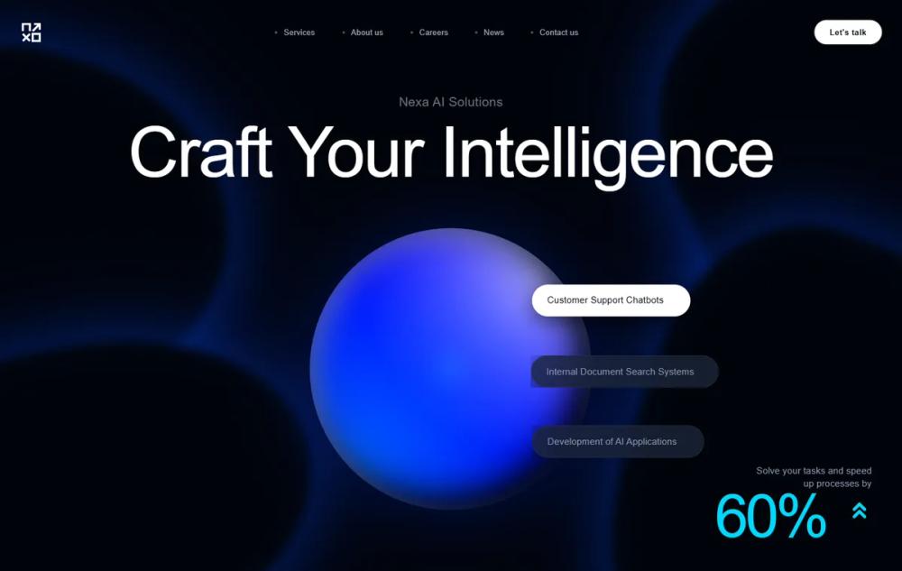 All Prompts
Nexa AI - Premium Animated Experience
Система дизайна UI с футуристичными анимациями и темной темой. Идеально для SaaS, Fintech, AI-сервисов и корпоративных сайтов.
Prompt
# Nexa AI - Premium Animated Experience

{
  "summary": "Nexa AI is a high-end tech design system featuring a deep obsidian background with vibrant cyan accents. It focuses on movement and micro-interactions, including liquid-textured 3D elements, floating particle fields, and smooth scroll-triggered transitions that guide the user through a cinematic digital experience.",
  "style": {
    "description": "The style blends high-tech brutalism with fluid organic motion. Typography uses 'Outfit' for high-impact headlines and 'Plus Jakarta Sans' for readable body text. Color palette relies on #01040a for the void background, with #00d9ff and #0080ff providing electric light sources. Visual depth is created via glassmorphism (20px blur) and complex layered shadows.",
    "prompt": "### Visual Theme\n- **Base Background**: `#01040a` (Solid or subtle dark gradient).\n- **Primary Accent**: `#00d9ff` (Electric Cyan).\n- **Secondary Accent**: `#0080ff` (Azure Blue).\n- **Neutral Tones**: `#ffffff` (Pure White), `#8b97b1` (Slate Gray), `#a0aabf` (Muted Blue-Gray).\n\n### Typography\n- **Headlines**: 'Outfit', sans-serif. Weights: 400 (light display) to 800 (bold). Letter spacing: tight (`-0.02em`).\n- **Body Text**: 'Plus Jakarta Sans', sans-serif. Sizes: 14px to 18px. Weight: 400 (regular) to 600 (semi-bold).\n\n### Core Aesthetics\n- **Glassmorphism**: `background: rgba(255, 255, 255, 0.02)`, `backdrop-filter: blur(20px)`, `border: 1px solid rgba(255, 255, 255, 0.06)`.\n- **Gradients**: Animated linear gradients shifting across `background-size: 200%`.\n- **Motion Curve**: High-performance easing using `cubic-bezier(0.16, 1, 0.3, 1)` for entry reveals and `ease-in-out` for ambient loops.\n- **Borders**: Subtle 1px borders with gradient overlays that light up on hover."
  },
  "layout_and_structure": {
    "description": "A vertically-scrolling landing page structure with generous breathing room (padding: 8rem 0), centered section headers, and grid-based feature layouts. Uses absolute positioning for 'organic shapes' that drift behind the content to create depth.",
    "prompts": [
      {
        "part": "Sticky Header",
        "prompt": "Fixed top navigation with `backdrop-filter: blur(20px)` and `#01040a` at 70% opacity. Height around 80px. Left-aligned SVG logo. Center-aligned navigation links with a dot indicator (`w-1 h-1`) and an animated underline on hover. Right-aligned 'Talk to us' button in pure white."
      },
      {
        "part": "Hero Section",
        "prompt": "Full-height container. Main headline in 'Outfit' font using a letter-by-letter reveal animation (staggered by 0.04s). Centered below is a liquid 3D sphere (450px diameter) with rotating noise textures and a glowing shadow. Floating around the sphere are 3 pill-shaped elements (e.g., tags) with individual `float` animations and shimmer effects. Include a bottom-right 'Counter' stat element using `#00d9ff` that counts up on page load."
      },
      {
        "part": "Features Grid",
        "prompt": "4-column grid for desktop. Cards feature a 1px gradient border that changes from white/10 to cyan/blue on hover. Inside each card: a 14x14 rounded icon container with a subtle pulse. Feature title in white, body in slate-gray. On hover, the whole card should lift `-4px`."
      },
      {
        "part": "Process Section (How It Works)",
        "prompt": "3-column layout. Behind the steps, a thin horizontal line (`h-px`) with a gradient fill that 'draws' itself when the section becomes visible. Each step features a large glassmorphic card. Step numbers (01, 02, 03) are oversized, semi-transparent cyan, and rotate 360 degrees when the user hovers over the card."
      },
      {
        "part": "Pricing Section",
        "prompt": "Centered toggle switch for Monthly/Annual billing using a sliding cyan circle indicator. 3-tier pricing cards. The center 'Pro' card is highlighted with a glow (`box-shadow: 0 0 40px rgba(0, 217, 255, 0.3)`) and an animated 'Most Popular' badge with a continuous shimmer sweep. Prices should animate (count up/down) when the billing toggle is switched."
      },
      {
        "part": "Testimonial Marquee",
        "prompt": "An infinite horizontal scrolling marquee of glassmorphic quote cards. Cards pause on hover. Each card includes a star-rating sequence where stars fill sequentially from left to right when the card enters the viewport."
      },
      {
        "part": "CTA Section",
        "prompt": "A large glassmorphic container with 48px rounded corners. Includes two large blurred light sources (cyan and blue) in opposite corners. Centered text with high-impact primary button featuring a 'shimmer' overlay and a secondary 'Schedule Demo' button with an icon that rotates on hover."
      }
    ]
  },
  "special_ui_components": [
    {
      "component": "Liquid 3D Sphere",
      "description": "A rotating, morphing sphere representing core AI engine.",
      "prompt": "Create a 50% border-radius container. Use two pseudo-elements with different radial gradients and contrasting blend modes (overlay and screen). Animate each layer with different rotation speeds (`15s` and `20s`) and a shared `float` animation (vertical translate). Add an inner shadow `inset 15px 15px 40px rgba(255,255,255,0.25)` to simulate volume."
    },
    {
      "component": "Shimmer Pulse Button",
      "description": "High-conversion CTA button with multiple lighting effects.",
      "prompt": "Button with background `#00d9ff`, text `#0a0f1c`, and `border-radius: 9999px`. Add a `:before` element with a 45-degree white gradient that translates from `-100%` to `200%` on hover (`shimmer` animation). Apply a `pulse-glow` keyframe that alternates box-shadow intensity every 2 seconds."
    },
    {
      "component": "Organic Background Blobs",
      "description": "Ambient shapes that morph behind content.",
      "prompt": "Large absolute-positioned divs with low z-index. Use `border-radius` with 8 values (e.g., `40% 60% 70% 30% / 40% 50% 60% 50%`) and morph between four different radius states over 20 seconds. Apply `filter: blur(8px)` and a soft glow to avoid hard edges."
    }
  ]
}