All Prompts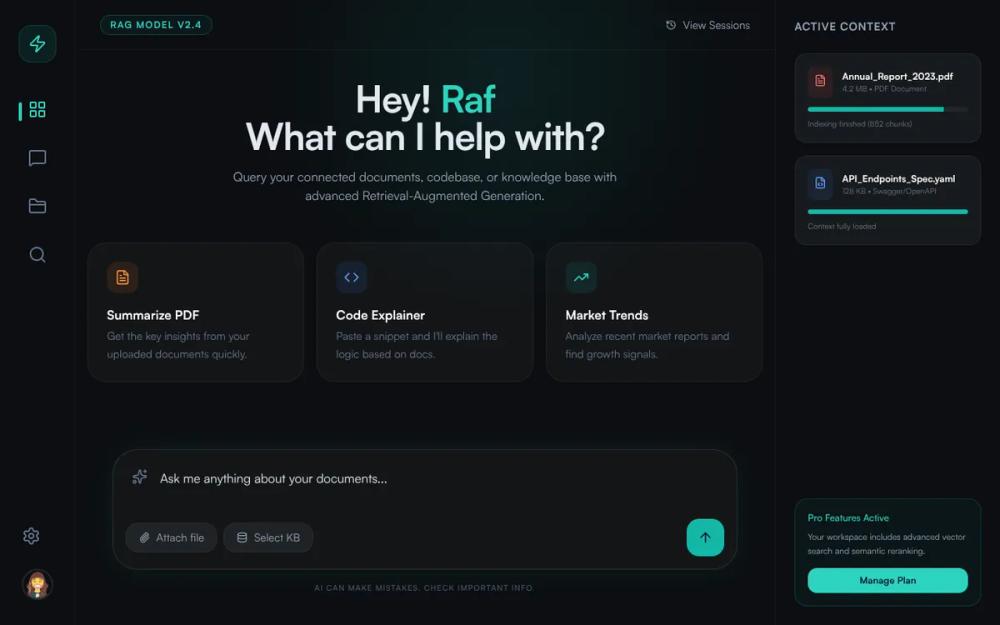 All Prompts
NexGen RAG - Cyan Midnight Theme Update
Футуристичный UI для RAG-платформ и SaaS. Тема 'Cyan Midnight' с глaссморфизмом, сеткой и современной типографикой. Оптимизирован для AI-интерфейсов.
by Júlio MoraisLive Preview
Prompt
# NexGen RAG - Cyan Midnight Theme Update

{
  "summary": "A sophisticated AI/RAG workspace design with a triple-column layout, deep dark-mode aesthetic, and refined glassmorphism. The UI prioritizes content focus with a floating chat input and high-contrast accent buttons.",
  "style": {
    "description": "The style is characterized by a dark midnight theme (#0F1419) with a 3% opacity glassmorphism effect. Typography relies on the geometric 'Satoshi' and 'Inter' font families for a clean, technical feel. Accents are strictly bright cyan (#00D9FF) and muted slate grays, with subtle radial gradients (0.1 opacity) providing depth without clutter.",
    "prompt": "### Visual Language\n- **Color Palette**: Primary background #0F1419 (Midnight); Accent color #00D9FF (Cyan); Text colors ranging from #F1F5F9 (Slate-100) to #64748B (Slate-500).\n- **Typography**: Primary font 'Satoshi', fallback 'Inter'. Headings: font-weight 700, tracking-tight. Body: font-weight 400, leading-relaxed. Small caps used for metadata and tracking-widest (0.1em).\n- **Glassmorphism**: Panels use `background: rgba(255, 255, 255, 0.03)`, `backdrop-filter: blur(12px)`, and `border: 1px solid rgba(255, 255, 255, 0.05)`.\n- **Glow & Shadows**: Container shadows use `rgba(0, 217, 255, 0.15)` with 40px blur. Background features a 600px radial gradient blob at top-center with #00D9FF at 0.1 opacity.\n- **Transitions**: Smooth 200ms ease-in-out for all hover states. Buttons use `active:scale-95` for tactile feedback."
  },
  "layout_and_structure": {
    "description": "A responsive three-column architecture: a narrow utility sidebar on the left, a central chat/content area, and a context-sensitive sidebar on the right.",
    "prompts": [
      {
        "part": "Left Utility Sidebar",
        "prompt": "Width: 80px to 96px. Background: #0F1419. Border-right: 1px solid rgba(255, 255, 255, 0.05). Vertical layout: Logo at top in a 12x12 (48px) rounded-2xl box with cyan-500/10 background. Middle nav: icons (size 24px) with a vertical cyan pill indicator for the active state. Bottom: Profile avatar (40x40px) with 2px border-white/10."
      },
      {
        "part": "Main Content & Header",
        "prompt": "Header: 64px height, border-bottom: 1px solid white/5. Contains version badges (uppercase, tracking-widest, cyan text) and session history buttons. Main area: Flex-1, centered content. Empty state features a large heading (48px-60px) using 2-line break with a highlighted user name in cyan."
      },
      {
        "part": "Suggestion Grid",
        "prompt": "3-column grid of 'Suggestion Cards'. Cards are glass-panels with 24px padding and 32px border-radius. Icons inside cards are 40x40px rounded-xl with 10% opacity backgrounds matching the icon color (Orange, Blue, Cyan). Hover state: background moves to 8% cyan, border turns 30% cyan, and card shifts translateY(-2px)."
      },
      {
        "part": "Floating Chat Input",
        "prompt": "Located at page bottom with 40px padding. Container: glass-panel, 32px border-radius, border: white/10. Inner: Textarea (no-border, focus:ring-0) and a bottom action row. Action row includes 2 pill-shaped 'Attach' buttons (background: white/5) and a 48x48px cyan (#00D9FF) send button with a dark slate (#0F172A) arrow-up icon."
      },
      {
        "part": "Right Context Sidebar",
        "prompt": "Width: 288px (fixed). Border-left: 1px solid white/5. Features 'Active Context' cards. Cards use background: white/5, rounded-2xl. Includes 1.5px height progress bars in cyan to indicate indexing status. Footer of sidebar contains a promotional/upgrade box with cyan-500/5 background and cyan-400 text."
      }
    ]
  },
  "special_ui_components": [
    {
      "component": "Glass Suggestion Card",
      "description": "Interactive card for quick actions with color-coded icons and hover elevation.",
      "prompt": "Create a card with `background: rgba(255, 255, 255, 0.03)` and `backdrop-filter: blur(12px)`. Corner radius: 32px. Padding: 24px. On hover: border-color: rgba(0, 217, 255, 0.3), transform: translateY(-2px). Inside, place a 40px square icon container with 10% opacity of its primary color."
    },
    {
      "component": "Dynamic Progress Document",
      "description": "A document status indicator with a technical bar.",
      "prompt": "A list item component with a 16x16px file icon. Title: 12px semi-bold white. Subtitle: 10px slate-500. Below text, a 6px height track (white/5) containing a cyan (#00D9FF) progress bar reflecting a specific percentage (e.g., 85%)."
    },
    {
      "component": "Neon Action Button",
      "description": "High-visibility primary action button.",
      "prompt": "A 48x48px square button with 16px (rounded-2xl) corners. Background: #00D9FF. Text: #0F172A. On hover: background: #67E8F9. On click: scale 0.95. Shadow: none, or very subtle cyan glow on hover."
    }
  ]
}