All Prompts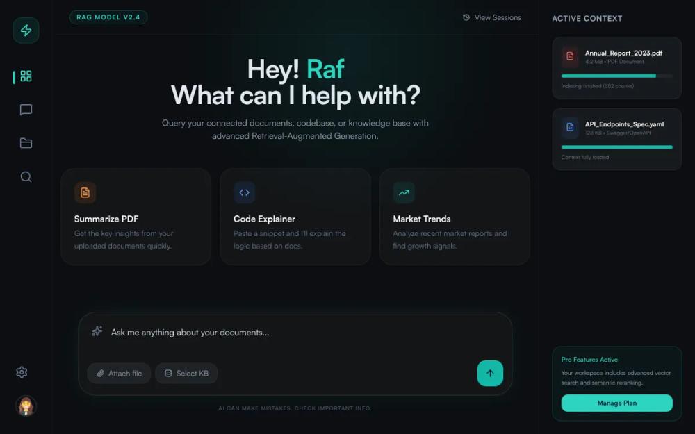 All Prompts
NexGen RAG - Cyan Midnight Theme Update
Тема Cyan Midnight для дашборда AI и RAG. Современный UI с глубокой палитрой и стеклянными эффектами. Идеально для SaaS, баз знаний, инструментов разработчика.
by Júlio MoraisLive Preview
Prompt
# NexGen RAG - Cyan Midnight Theme Update

{
  "summary": "NexGen RAG UI: A sleek, dark-mode conversational AI interface using a navy-black background, cyan highlights, and ultra-thin glassmorphism layers. The design emphasizes data transparency with active context sidebars and a centralized, high-radius search/chat input.",
  "style": {
    "description": "The style is defined by a 'Midnight' base (#0F1419) and 'Electric Cyan' (#00D9FF). Typography uses the Satoshi font family for a geometric, modern look, supported by Inter. UI elements feature 12px background blurs, 1px white/5% borders, and subtle radial gradient glows. Interactive states use Y-axis translations and soft cyan glows to denote focus.",
    "prompt": "### Visual Theme & Color Palette\n- **Primary Background**: #0F1419 (Dark Navy Black).\n- **Accent Color**: #00D9FF (Electric Cyan) used for primary buttons, active states, and focus indicators.\n- **Secondary Accents**: Blue-500 (#3B82F6), Orange-500 (#F97316), and Red-400 (#EF4444) for categorized tags.\n- **Surface/Glass**: rgba(255, 255, 255, 0.03) with a 12px backdrop-filter: blur() and 1px solid rgba(255, 255, 255, 0.05).\n- **Typography**: Primary: 'Satoshi'; Fallback: 'Inter', sans-serif. Headings should be bold with tight tracking (-0.025em). Labels should be uppercase with wide tracking (0.1em).\n\n### Shadows & Glows\n- **Chat Input Shadow**: 0 0 40px -10px rgba(0, 217, 255, 0.15).\n- **Background Decor**: Large radial gradients: radial-gradient(circle, rgba(0, 217, 255, 0.1) 0%, rgba(20, 184, 166, 0) 70%).\n\n### Interactive Details\n- **Hover States**: Cards should translate -2px upwards and increase border opacity to rgba(0, 217, 255, 0.3).\n- **Buttons**: 2xl (16px) corner radius. Primary buttons use #00D9FF with slate-900 text."
  },
  "layout_and_structure": {
    "description": "A three-column grid system consisting of a narrow functional sidebar (80-96px), a flexible central chat/main content area, and a context sidebar (288px) for document metadata.",
    "prompts": [
      {
        "part": "Left Navigation Sidebar",
        "prompt": "Width: 80px to 96px. Background: #0F1419 with a 1px border-right (white/5%). Content: Center-aligned vertical stack. Top: Rounded-2xl icon logo (#00D9FF/10 background). Middle: Navigation icons (Lucide-style) with a vertical 4px cyan indicator pill for the active state. Bottom: Profile avatar (40x40px) with 10% white border."
      },
      {
        "part": "Main Chat Viewport",
        "prompt": "Center-aligned container, max-width 1024px. Header: 64px height, contains a version tag (caps, cyan border) and session history button. Hero: Large bold typography ('Hey! [Name]') followed by a slate-400 description. Content: 3-column grid of 'Suggestion Cards' with large icons and rounded-3xl corners."
      },
      {
        "part": "Conversational Input Area",
        "prompt": "Fixed at bottom with 40px padding. Container: 'glass-panel' with 32px corner radius. Structure: Top row for multiline textarea (no-border, slate-200 text); Bottom row flexbox for attachment buttons (white/5% background) and a 48x48px square-ish cyan send button (rounded-2xl)."
      },
      {
        "part": "Right Context Sidebar",
        "prompt": "Width: 288px. Fixed right. Border-left: 1px (white/5%). Includes 'Active Context' document list. Items use rounded-2xl white/5% cards with progress bars (cyan height 6px) to show indexing status. Bottom: A 'Pro' call-to-action card with a cyan-5% background and solid cyan button."
      }
    ]
  },
  "special_ui_components": [
    {
      "component": "Suggestion Action Card",
      "description": "Interactive tile used for quick actions or AI prompts.",
      "prompt": "Background: rgba(255, 255, 255, 0.03). Border: 1px rgba(255, 255, 255, 0.05). Radius: 24px (3xl). Padding: 24px. Features: A 40x40px icon container with 10% opacity colored background. Title: White font-semibold. Body: Slate-500 text-sm. Interaction: On hover, background shifts to 8% cyan opacity and border to 30% cyan opacity, with a 2px lift."
    },
    {
      "component": "Context Document Card",
      "description": "Visual representation of an uploaded file or knowledge source.",
      "prompt": "Background: white/5% alpha. Padding: 16px. Radius: 16px. Layout: Flex-row icon (red/blue/green-500/10) + text stack. Includes a progress bar: full width track (white/5%), filled portion (#00D9FF)."
    }
  ],
  "special_notes": "Maintain high contrast for cyan text on dark backgrounds to ensure readability. Do not use solid white for text; use slate-200 for body and slate-400/500 for secondary text. Ensure all 'glass' borders are ultra-thin (1px) to maintain the premium technical feel. Use Satoshi font specifically for titles to achieve the geometric branding."
}