All Prompts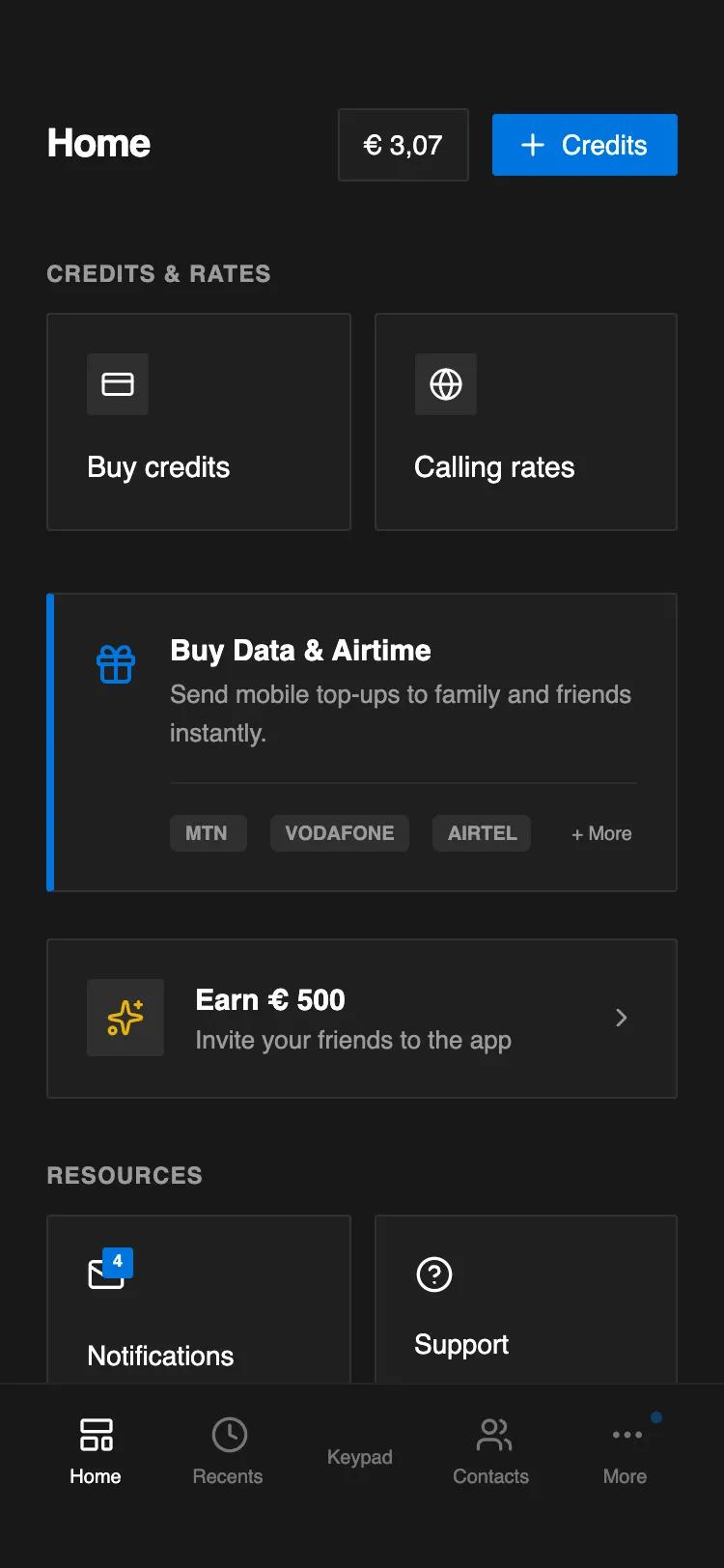 All Prompts
Notion-Style Dark Telecom Home Screen
Минималистичный UI-темный экран для телеком-приложений в стиле Notion. Удобный для SaaS, финтеха, документов. Темная палитра, иконки, сетка.
by Emmanuel MensahLive Preview
Prompt
# Notion-Style Dark Telecom Home Screen

{
  "summary": "A clean, document-inspired dark mode UI design that replicates the Notion aesthetic using a deep charcoal theme, sharp rectangular elements, and subtle gray borders for a structured, utilitarian layout.",
  "style": {
    "description": "The style is characterized by high legibility, low-strain dark backgrounds, and a 'blocks' based layout. It pairs the Inter font family with a monochromatic palette, using a specific blue (#0075de) for primary actions. Borders are extremely subtle, and corners use a very small 2px radius for a nearly sharp look.",
    "prompt": "### Visual Theme\n- **Color Palette:** Primary background: `#191919`; Surface/Card background: `#202020`; Icon containers: `#2e2e2e`; Accent color: `#0075de`; Text colors: White (`#FFFFFF`) for primary, Muted Gray (`#9B9B9B`) for secondary/labels.\n- **Typography:** Font Family: 'Inter', sans-serif. Sizes: H1/Title: 20px (Bold); Section Headers: 12px (Semi-bold, Uppercase, 0.05em tracking); Body/Card titles: 15px (Medium); Subtext: 13px (Regular).\n- **Borders & Shadows:** No box-shadows. Borders: 1px solid `rgba(255, 255, 255, 0.08)`. Border-radius: 2px (sharp but not harsh).\n- **Interactive States:** Hover state for cards: `background-color: rgba(255, 255, 255, 0.03)`. Transitions: 200ms ease-in-out color and background transitions.\n- **Icons:** Minimalist white stroke icons (Lucide-style) with a consistent 20px-24px sizing."
  },
  "layout_and_structure": {
    "description": "A mobile-first, single-column scrollable layout with a fixed bottom navigation bar and grouped 'block' sections.",
    "prompts": [
      {
        "part": "Header",
        "prompt": "Fixed-top or top-aligned header with a height of roughly 80px. Left-aligned H1 title ('Home') in 20px bold text. Right-aligned action area containing a balance indicator (gray surface, 1px border) and a primary 'Credits' button in blue (#0075de) with a '+' icon and sharp corners."
      },
      {
        "part": "Grid Action Section",
        "prompt": "Two-column grid with a 12px gap. Each card is a 'Notion-style' block: background `#202020`, 20px padding, 2px border radius. Elements inside: a small 32x32px icon square in `#2e2e2e` and a 15px medium-weight label below it. Full-card clickability with a subtle hover color change."
      },
      {
        "part": "Callout Banner",
        "prompt": "A full-width container mimicking the Notion 'Callout' block. Background `#202020`, 1px border on three sides, and a distinct 4px thick left border in accent blue (#0075de). Layout: icon on the left (24px), content on the right. Includes a horizontal divider (`border-top: 1px solid rgba(255, 255, 255, 0.05)`) and a footer area with small status tags in `#2e2e2e`."
      },
      {
        "part": "Bottom Navigation",
        "prompt": "Fixed footer at the bottom. Background `#191919` with a subtle top border. Five equally spaced navigation items. Active item: White (`#FFFFFF`) with 100% opacity. Inactive items: White with 40% opacity. Each item consists of a 20px icon and a 10px font-size label. Include a small notification dot (6px blue circle) on icons where status updates are present."
      }
    ]
  },
  "special_ui_components": [
    {
      "component": "Status Notification Badge",
      "description": "Small, sharp-cornered square badge for notifications.",
      "prompt": "A 16x16px square with 2px radius, background `#0075de`, text white, font-size 9px, bold. Centered text. Used as an overlay on icons to indicate unread counts."
    },
    {
      "component": "Notion Action Card",
      "description": "Standard interactive block for navigation.",
      "prompt": "Container background: `#202020`; Padding: 20px; Border: 1px solid `rgba(255, 255, 255, 0.08)`; Layout: Vertical stack (icon then text) for grids or horizontal stack (icon, text-group, chevron) for lists. Icons are always placed in a slightly lighter `#2e2e2e` square background."
    }
  ]
}