All Prompts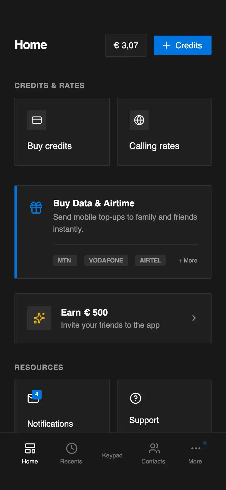 All Prompts
Notion-Style Dark Telecom Home Screen
Тёмный UI-дашборд в стиле Notion для телеком-сервисов. Минималистичный дизайн с синим акцентом, bento-гридами и баннерами. Идеально для SaaS, финтеха, мобильных приложений.
by Emmanuel MensahLive Preview
Prompt
# Notion-Style Dark Telecom Home Screen

{
  "summary": "A clean, dark-themed mobile dashboard interface inspired by Notion's layout and border logic, featuring a 2-column utility grid and callout-style banners for services like credits, data, and referral programs.",
  "style": {
    "description": "The style is defined by a low-contrast dark interface using varying shades of gray to create hierarchy. It uses the Inter font family with specific weights (Bold for titles, Medium for buttons, Semibold for subheadings). Borders are thin (1px) and translucent, while icons are thin-line Lucide variants. Animations are minimal, focusing on subtle background color shifts on hover.",
    "prompt": "Create a UI with a background color of #191919 and text color of #FFFFFF. Use 'Inter' as the primary font family. Define a card style ('notion-border') with background #202020, 1px solid border of rgba(255, 255, 255, 0.08), and a small border-radius of 2px. Primary accent color is #0075de for active buttons and highlights. Secondary text color is #9B9B9B. Use font-size 20px for headers, 15px for card titles, 13px for descriptions, and 10px for utility badges. Micro-interactions should include a hover state on cards that changes background to rgba(255, 255, 255, 0.03) with a quick transition-color ease-in-out."
  },
  "layout_and_structure": {
    "description": "A mobile-first vertical stack layout featuring a sticky-style header, a scrollable content area with distinct semantic sections (Grids, Callouts, Lists), and consistent 24px (6 units) horizontal padding.",
    "prompts": [
      {
        "part": "Header",
        "prompt": "The header section should have a pt-14, px-6, and pb-6 layout. Include a left-aligned title 'Home' at text-xl font-bold. On the right, place a horizontal flex container with two elements: a status badge (#202020 background, 1px border, text-sm) showing a balance, and a primary CTA button (#0075de background, text-white, px-3 py-1.5, text-sm font-medium) with a plus icon."
      },
      {
        "part": "Utility Grid (Credits & Rates)",
        "prompt": "A section titled 'Credits & Rates' in #9B9B9B uppercase text-xs font-semibold. Below it, a 2-column grid with a 12px gap. Each card is a vertical flexbox with p-5, a 32x32px square icon container with #2e2e2e background, and a 15px font-medium title. The card should have the standard 'notion-border'."
      },
      {
        "part": "Feature Callout Banner",
        "prompt": "A promotional banner using the Notion callout style: #202020 background, notion-border, and a 4px wide left border of #0075de. Layout is a flex row with a 16px gap. Left side contains a 24px icon in blue. Right side contains a 15px font-semibold title and 13px #9B9B9B description. At the bottom, include a horizontal row of tags (#2e2e2e background, 10px bold text) separated by a thin 5% white border line."
      },
      {
        "part": "Horizontal List Item (Referral)",
        "prompt": "A wide card (notion-border) with p-5. Flex row layout containing a 40x40px #2e2e2e icon container on the left, a central text block (15px title, 13px subtext), and a right-aligned chevron icon in #9B9B9B."
      },
      {
        "part": "Resource Grid",
        "prompt": "A 2-column grid for resources. Cards follow the standard notion-border and p-5 padding. Include a notification badge on the icon for the first card: a small #0075de square with 9px bold white text positioned at the top-right of the icon."
      }
    ]
  },
  "special_ui_components": [
    {
      "component": "Notion-Style Icon Box",
      "description": "A squared icon container used inside cards.",
      "prompt": "A container with width and height of 32px or 40px, background color #2e2e2e, border-radius of 2px (rounded-sm), and centered flex content for icons."
    },
    {
      "component": "Micro-Badge Tags",
      "description": "Small utility tags for displaying brands or categories.",
      "prompt": "Inline-block elements with background #2e2e2e, border-radius 4px, font-size 10px, font-weight 700 (bold), color #9B9B9B, and padding 2px 8px."
    }
  ]
}