All Prompts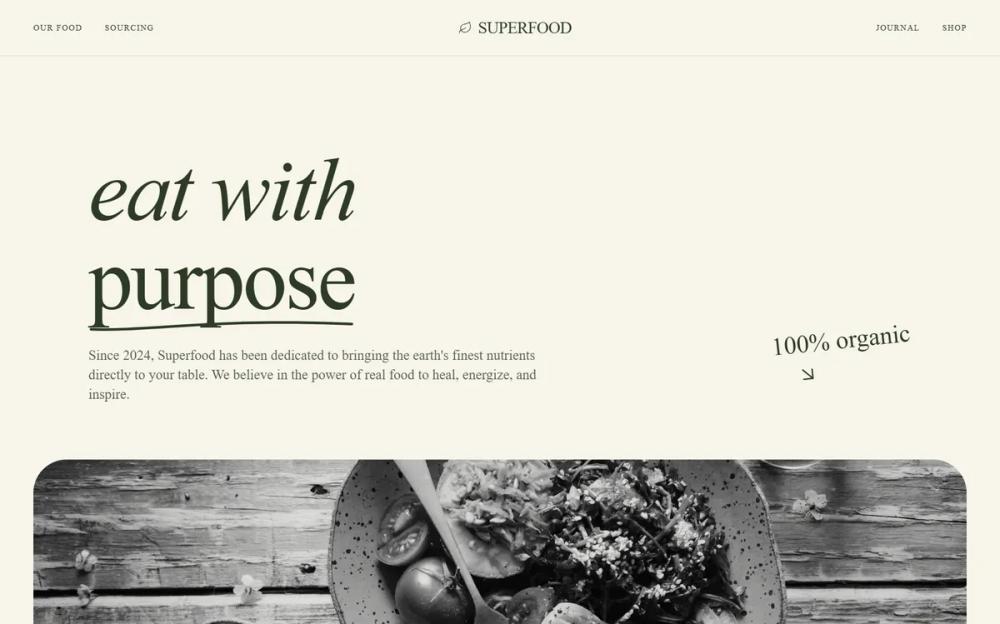 All Prompts
style
Organic Modern Style
Стиль Organic Modern: минимализм, тактильные текстуры, классическая типографика. Идеально для люксовых брендов, дизайн-студий, AI-стартапов.
by Zhou JasonLive Preview
Prompt
# Organic Modern Style

{
  "summary": "A refined, editorial-style interface that balances technological precision with human-centric organic elements, defined by its high-contrast serif typography and soft, paper-like textures.",
  "style": {
    "description": "The style essence is 'Modern Organic Editorial.' It pairs a deep charcoal (#202A2D) with a warm cream base (#F7F5EB) and sage accents (#CBD0B5). Typography is a mix of high-contrast serifs for impact and clean sans-serifs for utility. Visual interest is generated through subtle noise textures, hand-drawn SVG flourishes, and large-radius container corners (40px-64px). Animations are deliberate, focusing on upward fades and smooth scaling.",
    "prompt": "Style Guide Specification:\n- **Colors**: Primary Background: #F7F5EB; Primary Text: #202A2D; Accent Color (Sage): #CBD0B5; Secondary Background: #F0EDE1. \n- **Typography**: \n  - Headings: 'DM Serif Display', weights 400 (normal) and 400 (italic). Sizes ranging from 48px to 160px. Leading: 0.85 to 1.1.\n  - Body/UI: 'Inter', weights 300, 400, 500. UI labels should use uppercase with 0.2em to 0.3em tracking, size 10px.\n  - Accents: 'Reenie Beanie' (handwritten) at 48px for annotations.\n- **Texture**: Apply a subtle noise overlay using a natural paper texture pattern at 0.4 opacity as a fixed global layer.\n- **Borders & Radii**: Use large border-radius (40px-64px) for main image containers. UI buttons use full pill-shape (999px).\n- **Animations**: \n  - Text Entry: `translateY(20px)` to `translateY(0)` with opacity 0 to 1 over 0.8s (ease-out).\n  - Image Hover: Transition from grayscale(100%) to grayscale(0%) and scale(1.05) over 2000ms.\n- **Interactions**: Buttons transition from charcoal background to sage background on hover."
  },
  "layout_and_structure": {
    "description": "A vertical-scrolling layout with distinct sections including a spacious hero, high-impact media blocks, staggered grids, and horizontal-scrolling galleries.",
    "prompts": [
      {
        "part": "Navigation",
        "prompt": "Sticky top-0 bar with `backdrop-blur-md` and 80% opacity of #F7F5EB. Height approx 80px. Left side contains logo (Icon + Serif text) and uppercase menu items (10px, 0.2em tracking). Right side features a pill-shaped 'Get Started' button in #202A2D."
      },
      {
        "part": "Hero Section",
        "prompt": "Massive serif heading (up to 160px) with italicized first line. One word should be underlined with a custom hand-drawn SVG stroke (color #CBD0B5). Subtext is 24px Inter, max-width 650px, with a 200ms animation delay. Right-aligned 'handwritten' annotation with a downward arrow icon."
      },
      {
        "part": "Hero Image Block",
        "prompt": "Full-width section with 24px-48px side padding. Image container has 64px border-radius, height 80vh. Features a bottom-left overlay including a horizontal rule (48px wide), uppercase label, and a secondary italicized serif heading (72px)."
      },
      {
        "part": "Team Grid",
        "prompt": "Staggered grid layout. Cards consist of an aspect-ratio 4:5 grayscale image with 24px border-radius. On hover, image turns to color. Use asymmetrical vertical alignment (e.g., column 2 and 4 are shifted down by 48px)."
      },
      {
        "part": "Horizontal Process Gallery",
        "prompt": "A section featuring a header with navigation arrows (chevron-left/right). The content area is a horizontal scroll container with a linear-gradient mask on the left and right edges. Each card has a 16:10 aspect ratio image, a 'Phase' tag in a glassmorphism pill, and a serif title."
      },
      {
        "part": "CTA Section",
        "prompt": "A centered card with #CBD0B5 background and 48px border-radius. Includes a subtle white glow (blur-120px) at the top. Large serif heading 'Ready to evolve?' and a massive pill-shaped button that scales on hover."
      },
      {
        "part": "Footer",
        "prompt": "Bg-color #F0EDE1. Multi-column layout. Top section features large logo and tagline. Bottom section features a horizontal rule and fine-print text (10px, 0.2em tracking) for copyright and legal links."
      }
    ]
  },
  "special_ui_components": [
    {
      "component": "Hand-Drawn Underline",
      "description": "An organic, non-linear stroke appearing under specific hero text.",
      "prompt": "SVG path element: `M2 8C50 9.5 100 -2 298 4` with `stroke-width: 4` and `stroke-linecap: round`. Color should be #CBD0B5. Positioned absolutely relative to the text span."
    },
    {
      "component": "Philosophy Card",
      "description": "A feature card that inverted its theme on hover.",
      "prompt": "Initial state: #CBD0B5 background, #202A2D text. Hover state: #202A2D background, white text. Transition duration: 500ms. Padding: 32px. Includes a top-left icon and bottom-aligned serif quote."
    },
    {
      "component": "Grayscale Transition Image",
      "description": "Images that feel 'latent' or 'archival' until hovered.",
      "prompt": "Apply `filter: grayscale(100%)` and `transition: all 2000ms ease-out`. On parent hover, apply `filter: grayscale(0%)` and `transform: scale(1.05)`."
    }
  ],
  "special_notes": "MUST: Maintain extremely generous white space between sections (minimum 160px). MUST: Use the noise texture overlay to prevent the design from looking 'flat' or 'digital'. MUST: Keep lowercase or specific tracking on serif titles as specified to maintain the high-fashion editorial look. DO NOT: Use standard 4px or 8px border-radii; it must be 24px+ to feel organic. DO NOT: Use vibrant colors outside the specified muted palette."
}