All Prompts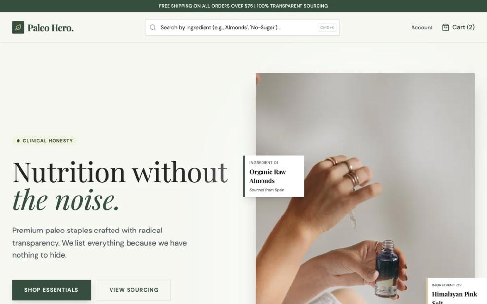 All Prompts
Paleo Hero - Transparent Nutrition
Editorial design system for wellness and D2C brands. Focuses on transparency with ingredient search, annotations, and specs for building trust.
Prompt
# Paleo Hero - Transparent Nutrition

{
  "summary": "A clean, high-contrast wellness design focusing on ingredient transparency and premium reliability. It balances organic warmth (cream/sage) with clinical authority (forest green/slate) using high-quality serif typography and structured grid layouts.",
  "style": {
    "description": "The style is defined by a sophisticated mix of organic and clinical aesthetics. Typography pairs 'Playfair Display' for high-impact editorial headings with 'DM Sans' for functional, readable UI text. The color scheme is 95% light-toned, using cream (#F5F7F0) and sage (#EBF2CE) to create an airy, natural feel, contrasted by sharp forest green (#364D3D) for brand authority and muted gold (#DCC79B) for premium indicators. Micro-interactions focus on smooth entry reveals (20px slide-up over 0.6s) and deep informational reveals on hover.",
    "prompt": "Create a design system using a background of #F5F7F0 (Cream) and text in #252424 (Obsidian). Use #364D3D (Forest Green) for primary buttons and brand elements, #DCC79B (Gold) for accents and ratings, and #EBF2CE (Sage) for callout badges. Headings should use Playfair Display, weight 700, with tight letter-spacing. Body text should use DM Sans, weight 400, in #525A64 (Slate Blue-Gray). Implement a 0.6s slide-up entrance animation for main sections. All containers should have minimal rounding (rounded-sm) to maintain a precise, clinical look. Hover states for cards should trigger a deep-blur forest green overlay (#364D3D at 95% opacity) for high-contrast content delivery."
  },
  "layout_and_structure": {
    "description": "The layout is a logical flow from high-level branding to deep technical proof. It uses a structured grid system (max-width 7xl) with generous whitespace and clear section dividers.",
    "prompts": [
      {
        "part": "Announcement Bar",
        "prompt": "A thin top bar with background #364D3D and text #F5F7F0. Use 12px font size, medium weight, uppercase with tracking-wide. Center the text for shipping alerts or transparency statements."
      },
      {
        "part": "Sticky Navigation",
        "prompt": "Height: 80px, background #F5F7F0 with 95% opacity and backdrop-blur. Left: Serif logo in #364D3D. Center: A persistent ingredient search bar (min-width 400px) with #364D3D/20 border and a CMD+K keyboard shortcut indicator. Right: Text links for 'Account' and 'Cart' with associated icons."
      },
      {
        "part": "Hero Section",
        "prompt": "Two-column grid. Left side: Large Playfair Display H1 (text-7xl, #252424) featuring italic forest green accents. CTA block with two buttons: Primary (#364D3D solid) and Secondary (transparent with #364D3D border). Right side: Large product photography featuring floating 'Ingredient Annotations'—white boxes with #364D3D left-borders containing specific sourcing details."
      },
      {
        "part": "Transparency Badge Strip",
        "prompt": "A full-width section with background #FFFFFF/50 and thin borders. Use 6 columns featuring icon-and-text pairs (e.g., 'Gluten Free'). Icons should be in #364D3D. Apply a 70% grayscale filter that transitions to full color on hover."
      },
      {
        "part": "Product Grid with Ingredient Reveal",
        "prompt": "3-column grid of 4:5 aspect-ratio cards. Each card contains a product image that, on hover, reveals a full #364D3D overlay with a serif ingredient list and nutrition facts. Include a 'Best Seller' badge in Sage (#EBF2CE) and star ratings in Gold (#DCC79B)."
      },
      {
        "part": "Sourcing Philosophy",
        "prompt": "Split section: 5-column image with a floating founder quote box; 7-column content area with H2 'The No List'. Use a 2x2 grid for value propositions featuring circular #364D3D/10 icons and bold DM Sans headings."
      },
      {
        "part": "Verified Review Grid",
        "prompt": "3-column layout of white cards. Each card includes a 5-star gold rating, timestamp, bold headline, and body text. Footer of the card must show a 'Verified Purchase' badge with a #364D3D checkmark icon."
      },
      {
        "part": "Footer",
        "prompt": "Large background block of #364D3D with #F5F7F0 text. 4-column structure: Brand description/socials, Shop links, Learn links, and Legal info. Use Gold (#DCC79B) for small uppercase column headers."
      }
    ]
  },
  "special_ui_components": [
    {
      "component": "Ingredient Search Filter",
      "description": "A persistent UI element designed to build trust by allowing users to filter by specific ingredients immediately.",
      "prompt": "Implement a text input with a #364D3D/20 border. Add a search icon on the left in Slate gray. Include a right-aligned shortcut badge (CMD+K) with a thin border and uppercase 10px font. On focus, the border should transition to solid #364D3D with a subtle shadow-md."
    },
    {
      "component": "Floating Ingredient Annotation",
      "description": "Callout boxes that point to parts of an image to explain sourcing or quality.",
      "prompt": "A small white rectangle (max-width 160px) with a 4px left-border of either #364D3D (Forest) or #DCC79B (Gold). Top text: Uppercase label in 10px Slate. Middle text: Bold serif ingredient name. Bottom text: Italic 10px slate sourcing detail."
    },
    {
      "component": "Ingredient Reveal Overlay",
      "description": "A full-card hover state that replaces the product image with technical data.",
      "prompt": "On hover of a product card, an absolute-positioned div with background #364D3D and 95% opacity fades in. Content is centered: 'Complete Ingredient List' label in Gold, followed by a white serif list. A 'Add to Cart' button is anchored at the bottom with a 50% horizontal translation."
    }
  ]
}