All Prompts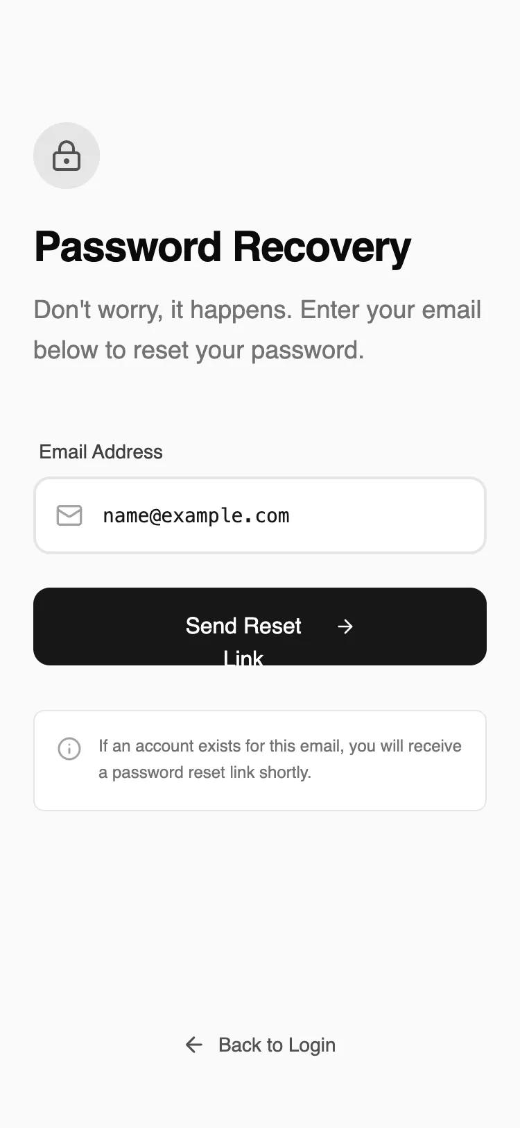 All Prompts
mobile applayoutauth
Password Recovery
UI-компонент: макет восстановления пароля для мобильных приложений. Одно поле ввода, быстрая и понятная форма для сброса пароля.
by Shirley LouLive Preview
Prompt
# Password Recovery

{
  "summary": "A minimalist, distraction-free password recovery screen for mobile. It features a stark neutral color palette, clear information hierarchy, and professional typography with functional micro-animations for feedback.",
  "style": {
    "description": "The style is a 'refined wireframe' aesthetic using a neutral grayscale palette (background #F9FAFB, borders #E5E5E5, primary #171717). Typography pairs 'Satoshi' (geometric sans) for headings and UI with 'JetBrains Mono' for input data to enhance legibility. Animations include subtle staggered vertical fades (10px translateY) and haptic-like active states.",
    "prompt": "Create a design with a minimalist monochrome aesthetic. \n- **Color Palette**: Background: #F9FAFB (Neutral 50); Border/Secondary: #E5E5E5 (Neutral 200); Text: #171717 (Neutral 900); Subtext: #737373 (Neutral 500). \n- **Typography**: Primary Heading: 'Satoshi' Bold, 30px, tracking-tight; Body: 'Satoshi' Regular, 18px; Input text: 'JetBrains Mono', 14px for technical clarity. \n- **Border Radius**: Consistent 12px (rounded-xl) for buttons and inputs; 8px (rounded-lg) for secondary cards. \n- **Animations**: Entrance: 0.6s ease-out fade-in with 10px upward slide. Stagger elements by 100ms. \n- **Interactions**: Buttons should scale to 0.98 on click. Input fields should shift border from #E5E5E5 to #171717 (2px width) on focus."
  },
  "layout_and_structure": {
    "description": "A vertically stacked mobile layout using a flex-column structure (justify-between) to pin the navigation link to the bottom. Max-width of 448px (max-w-md) for desktop compatibility while optimized for mobile edge-to-edge padding.",
    "prompts": [
      {
        "part": "Header Section",
        "prompt": "Top-aligned content area starting with a 32px top margin. Includes a 48x48px circular icon container (Background #E5E5E5) housing a 24px lock icon. Below the icon, a Bold 30px title 'Password Recovery' followed by a light gray descriptive paragraph with 1.625 line-height."
      },
      {
        "part": "Form Section",
        "prompt": "Centrally placed form with a 24px vertical gap between elements. Label is 14px font-medium #404040. Input field is 56px (h-14) tall with a 2px border, leading icon (20px) at 16px left-padding, and uses a monospace font for user input. Primary button is 56px tall, solid #171717 background, white text, containing an arrow icon that slides 4px right on hover."
      },
      {
        "part": "Information Box",
        "prompt": "A 32px top-margin informational card with a #FFFFFF background and 1px #E5E5E5 border. Uses a 12px (text-xs) font size for technical notes. Includes a small info icon aligned to the top-left of the text block."
      },
      {
        "part": "Footer Navigation",
        "prompt": "Fixed at the bottom with 34px bottom padding. A full-width link with a 14px font size. Features a 'Back to Login' label with a left-pointing arrow icon. Transition the text color from #525252 to #0A0A0A on hover."
      }
    ]
  },
  "special_ui_components": [
    {
      "component": "Interactive Input Field",
      "description": "Icon-integrated input with monospace font.",
      "prompt": "Height: 56px; Background: #FFFFFF; Border: 2px solid #E5E5E5; Focus-Border: 2px solid #171717; Padding-left: 48px; Font: 'JetBrains Mono' 14px. The icon should change color from #A3A3A3 to #171717 when the input is focused."
    },
    {
      "component": "Haptic Primary Button",
      "description": "High-contrast CTA with hover transform.",
      "prompt": "Height: 56px; Background: #171717; Text: #FFFFFF; Border-radius: 12px; On Hover: Background #262626, Icon translates X by 4px; On Active: Scale 0.98."
    }
  ],
  "special_notes": "MUST: Maintain a 24px (px-6) horizontal gutter for all elements. MUST: Use JetBrains Mono exclusively for the actual text input field to signal technical accuracy. MUST: Keep borders at exactly 2px for inputs and 1px for cards to maintain hierarchy. DO NOT: Use any saturated colors or shadows; rely on contrast and spacing for depth."
}