All Prompts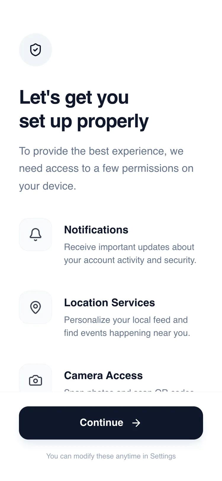 All Prompts
mobile applayoutpermission request
Permissions Primer Wireframe
Wireframe для запроса разрешений в мобильных приложениях. Минималистичный дизайн, чистая палитра, подходит для финтех, SaaS, HealthTech.
by Shirley LouLive Preview
Prompt
# Permissions Primer Wireframe

{
  "summary": "A clean, professional mobile interface for explaining system permissions. It uses a vertical stack of descriptive rows, a high-impact header, and a sticky primary action button to guide users through necessary app access points with clarity and intent.",
  "style": {
    "description": "Professional minimalist style using the 'Satoshi' sans-serif typeface and a 'Slate' scale color palette. The aesthetic relies on generous whitespace, subtle border contrasts, and high-quality typography hierarchy to establish trust. Interactions are subtle, focusing on smooth hover states and tactile button feedback.",
    "prompt": "Create a design with a white background (#FFFFFF) and a primary text color of Slate-900 (#0F172A). Use the 'Satoshi' font family: H1 headings at 32px (font-black, 900 weight, tracking-tight); Body text at 18px (font-medium, 500 weight, #64748B); Permission labels at 18px (font-bold, 700 weight, #0F172A); and Permission descriptions at 15px (#64748B). Color palette: Primary Action #0F172A, Background #FFFFFF, Soft Backgrounds #F8FAFC, Borders #F1F5F9. Corner radii should be 1rem (16px) for permission icons and buttons, and full (circle) for the header icon. Use a cubic-bezier(0.4, 0, 0.2, 1) transition for hover states. Implementation should include a sticky footer with a backdrop-blur (12px) and a border-t of #F8FAFC."
  },
  "layout_and_structure": {
    "description": "A three-part vertical layout: a fixed-width header for context, a scrollable main body for permission rows, and a sticky footer for the primary call to action.",
    "prompts": [
      {
        "part": "Header Section",
        "prompt": "Top-aligned section with 56px (pt-14) padding. Includes a 56x56px rounded-full circle in #F1F5F9 containing a 24px icon. Followed by an 8 unit (32px) margin-bottom to a 32px bold heading. Beneath the heading, provide a 1.5-line-height description paragraph using #64748B."
      },
      {
        "part": "Permissions List",
        "prompt": "A vertical stack of rows with 40px (space-y-10) spacing. Each row is a flex container with items-start. The left element is a 56x56px square with 16px (rounded-2xl) corners, a #F8FAFC background, and a 1px #F1F5F9 border. The right element is a text container with a 20px (ml-5) gap. The label is 18px bold, and the description is 15px with normal leading. Ensure icons within boxes have 80% opacity."
      },
      {
        "part": "Sticky Action Footer",
        "prompt": "A bottom-pinned container with 34px bottom padding and 24px top padding. Background is white at 95% opacity with a blur effect. Contains a full-width 56px height button with #0F172A background, 16px rounded corners, and a 17px bold white label. Include a secondary 12px caption text in #94A3B8 centered below the button."
      }
    ]
  },
  "special_ui_components": [
    {
      "component": "Permission Icon Container",
      "description": "A soft-bordered square icon box with hover feedback.",
      "prompt": "W-14 H-14 (56px) box, bg-slate-50 (#F8FAFC), border-slate-100 (#F1F5F9), rounded-2xl. On hover, background shifts to Slate-100 (#F1F5F9) using a 200ms transition. Centered icon should be 24px size."
    },
    {
      "component": "Primary Action Button",
      "description": "A high-emphasis black button with an arrow indicator.",
      "prompt": "W-full H-14 (56px), bg-slate-900 (#0F172A), rounded-2xl. Text: 17px weight-700 white. Includes a 20px icon (arrow-right) with a 12px gap from text. Box-shadow: 0 10px 15px -3px rgba(15, 23, 42, 0.1), 0 4px 6px -4px rgba(15, 23, 42, 0.1)."
    }
  ],
  "special_notes": "Do not use interactive toggles or switches; this design is for education/intent, not direct setting manipulation. Ensure the 'Continue' button has a subtle 0.98 scale transform on click for tactile feedback. Maintain strict alignment between the icon boxes and the text labels (align text baseline carefully with top icon padding)."
}