All Prompts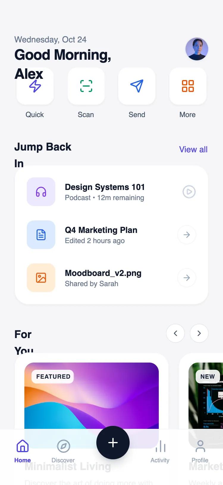 All Prompts
mobile apphomelayout
Personalized Section Stack
Персонализированный стек секций: гибкий вертикальный контейнер с условным отображением контента, адаптирующийся под пользователя. Идеален для AI-приложений и рекомендательных систем.
by Shirley LouLive Preview
Prompt
# Personalized Section Stack

Mobile personalized home layout with reusable content sections. Vertical stack of variable-height sections, each with title and content container. Sections include recommendations, recent items, shortcuts. Sections are interchangeable and conditionally rendered. Design should feel coherent and unified regardless of section order or presence. Use modern, clean aesthetic with clear visual hierarchy, smooth spacing, and flexible grid-based cards. Include section headers with optional action buttons, content areas with varied layouts (grids, lists), and consistent typography. Demonstrate multiple section types with smooth spacing and visual separation.

Here is a reference implementation:

~~~html
<!DOCTYPE html>
<html lang="en">
<head>
    <meta charset="UTF-8">
    <meta name="viewport" content="width=device-width, initial-scale=1.0">
    <title>Personalized Home Layout</title>
    <meta name="view-transition" content="same-origin">
    <script src="https://cdn.tailwindcss.com"></script>
    <script src="https://code.iconify.design/iconify-icon/1.0.7/iconify-icon.min.js"></script>
    <link href="https://api.fontshare.com/v2/css?f[]=switzer@300,400,500,600,700&display=swap" rel="stylesheet">
    <style>
        body {
            font-family: 'Switzer', sans-serif;
        }
        /* Hide scrollbar for Chrome, Safari and Opera */
        .no-scrollbar::-webkit-scrollbar {
            display: none;
        }
        /* Hide scrollbar for IE, Edge and Firefox */
        .no-scrollbar {
            -ms-overflow-style: none;  /* IE and Edge */
            scrollbar-width: none;  /* Firefox */
        }

        .glass-nav {
            background: rgba(255, 255, 255, 0.85);
            backdrop-filter: blur(12px);
            -webkit-backdrop-filter: blur(12px);
        }
    </style>
</head>
<body>
    <div class="w-full h-screen flex flex-col bg-[#F5F5F7] text-slate-900 overflow-hidden">
        <!-- Floating Header -->
        <header class="shrink-0 absolute top-0 left-0 right-0 z-20 px-6 pt-14 pb-2 flex justify-between items-center pointer-events-none">
            <div class="flex flex-col pointer-events-auto">
                <span class="text-sm font-medium text-slate-500">Wednesday, Oct 24</span>
                <h1 class="text-2xl font-bold tracking-tight">Good Morning, Alex</h1>
            </div>
            <button class="pointer-events-auto w-10 h-10 rounded-full bg-white border border-slate-200 flex items-center justify-center shadow-sm active:scale-95 transition-transform">
                <img src="https://images.unsplash.com/photo-1534528741775-53994a69daeb?q=80&w=200&auto=format&fit=crop" alt="Profile" class="w-full h-full rounded-full object-cover">
            </button>
        </header>

        <!-- Main Scrollable Content -->
        <main class="flex-1 overflow-y-auto no-scrollbar pt-28 pb-32">

            <!-- SECTION 1: Shortcuts (Grid Layout) -->
            <section class="px-6 mb-8">
                <div class="grid grid-cols-4 gap-4">
                    <!-- Shortcut Item -->
                    <div class="flex flex-col items-center gap-2 group cursor-pointer">
                        <div class="w-16 h-16 rounded-2xl bg-white border border-slate-100 shadow-sm flex items-center justify-center text-indigo-600 group-active:scale-95 transition-all duration-200">
                            <iconify-icon icon="lucide:zap" class="text-2xl"></iconify-icon>
                        </div>
                        <span class="text-xs font-medium text-slate-600">Quick</span>
                    </div>
                    <!-- Shortcut Item -->
                    <div class="flex flex-col items-center gap-2 group cursor-pointer">
                        <div class="w-16 h-16 rounded-2xl bg-white border border-slate-100 shadow-sm flex items-center justify-center text-emerald-600 group-active:scale-95 transition-all duration-200">
                            <iconify-icon icon="lucide:scan-line" class="text-2xl"></iconify-icon>
                        </div>
                        <span class="text-xs font-medium text-slate-600">Scan</span>
                    </div>
                    <!-- Shortcut Item -->
                    <div class="flex flex-col items-center gap-2 group cursor-pointer">
                        <div class="w-16 h-16 rounded-2xl bg-white border border-slate-100 shadow-sm flex items-center justify-center text-blue-600 group-active:scale-95 transition-all duration-200">
                            <iconify-icon icon="lucide:send" class="text-2xl"></iconify-icon>
                        </div>
                        <span class="text-xs font-medium text-slate-600">Send</span>
                    </div>
                    <!-- Shortcut Item -->
                    <div class="flex flex-col items-center gap-2 group cursor-pointer">
                        <div class="w-16 h-16 rounded-2xl bg-white border border-slate-100 shadow-sm flex items-center justify-center text-orange-600 group-active:scale-95 transition-all duration-200">
                            <iconify-icon icon="lucide:layout-grid" class="text-2xl"></iconify-icon>
                        </div>
                        <span class="text-xs font-medium text-slate-600">More</span>
                    </div>
                </div>
            </section>

            <!-- SECTION 2: Recent Activity (List Layout) -->
            <section class="px-6 mb-8">
                <div class="flex justify-between items-end mb-4">
                    <h2 class="text-lg font-bold text-slate-900">Jump Back In</h2>
                    <a href="#" class="text-sm font-medium text-indigo-600 hover:text-indigo-700">View all</a>
                </div>
                <div class="bg-white rounded-3xl p-2 shadow-sm border border-slate-100">
                    <!-- List Item 1 -->
                    <div class="flex items-center gap-4 p-3 hover:bg-slate-50 rounded-2xl transition-colors cursor-pointer">
                        <div class="w-12 h-12 rounded-xl bg-violet-100 text-violet-600 flex items-center justify-center shrink-0">
                            <iconify-icon icon="lucide:headphones" class="text-xl"></iconify-icon>
                        </div>
                        <div class="flex-1 min-w-0">
                            <h3 class="text-sm font-bold text-slate-900 truncate">Design Systems 101</h3>
                            <p class="text-xs text-slate-500 truncate">Podcast • 12m remaining</p>
                        </div>
                        <iconify-icon icon="lucide:play-circle" class="text-2xl text-slate-300 hover:text-indigo-600 transition-colors"></iconify-icon>
                    </div>
                    <!-- List Item 2 -->
                    <div class="flex items-center gap-4 p-3 hover:bg-slate-50 rounded-2xl transition-colors cursor-pointer">
                        <div class="w-12 h-12 rounded-xl bg-blue-100 text-blue-600 flex items-center justify-center shrink-0">
                            <iconify-icon icon="lucide:file-text" class="text-xl"></iconify-icon>
                        </div>
                        <div class="flex-1 min-w-0">
                            <h3 class="text-sm font-bold text-slate-900 truncate">Q4 Marketing Plan</h3>
                            <p class="text-xs text-slate-500 truncate">Edited 2 hours ago</p>
                        </div>
                        <div class="w-8 h-8 rounded-full border border-slate-100 flex items-center justify-center">
                            <iconify-icon icon="lucide:arrow-right" class="text-slate-400"></iconify-icon>
                        </div>
                    </div>
                    <!-- List Item 3 -->
                    <div class="flex items-center gap-4 p-3 hover:bg-slate-50 rounded-2xl transition-colors cursor-pointer">
                        <div class="w-12 h-12 rounded-xl bg-orange-100 text-orange-600 flex items-center justify-center shrink-0">
                            <iconify-icon icon="lucide:image" class="text-xl"></iconify-icon>
                        </div>
                        <div class="flex-1 min-w-0">
                            <h3 class="text-sm font-bold text-slate-900 truncate">Moodboard_v2.png</h3>
                            <p class="text-xs text-slate-500 truncate">Shared by Sarah</p>
                        </div>
                        <div class="w-8 h-8 rounded-full border border-slate-100 flex items-center justify-center">
                            <iconify-icon icon="lucide:arrow-right" class="text-slate-400"></iconify-icon>
                        </div>
                    </div>
                </div>
            </section>

            <!-- SECTION 3: Recommendations (Horizontal Scroll) -->
            <section class="mb-8 overflow-hidden">
                <div class="px-6 flex justify-between items-end mb-4">
                    <h2 class="text-lg font-bold text-slate-900">For You</h2>
                    <div class="flex gap-2">
                        <button class="w-8 h-8 rounded-full border border-slate-200 flex items-center justify-center bg-white hover:bg-slate-50 text-slate-600">
                            <iconify-icon icon="lucide:chevron-left"></iconify-icon>
                        </button>
                        <button class="w-8 h-8 rounded-full border border-slate-200 flex items-center justify-center bg-white hover:bg-slate-50 text-slate-600">
                            <iconify-icon icon="lucide:chevron-right"></iconify-icon>
                        </button>
                    </div>
                </div>

                <div class="flex overflow-x-auto gap-4 px-6 pb-4 snap-x no-scrollbar">
                    <!-- Card 1 -->
                    <div class="min-w-[260px] bg-white rounded-3xl p-4 border border-slate-100 shadow-sm snap-start flex flex-col">
                        <div class="relative w-full h-36 rounded-2xl overflow-hidden mb-4 bg-slate-100">
                            <img src="https://images.unsplash.com/photo-1618005182384-a83a8bd57fbe?q=80&w=400&auto=format&fit=crop" alt="Abstract Art" class="w-full h-full object-cover">
                            <span class="absolute top-3 left-3 bg-white/90 backdrop-blur px-2 py-1 rounded-lg text-[10px] font-bold uppercase tracking-wider text-slate-800">Featured</span>
                        </div>
                        <h3 class="text-lg font-bold text-slate-900 mb-1">Minimalist Living</h3>
                        <p class="text-sm text-slate-500 line-clamp-2 mb-4">Discover the art of doing more with less in your daily routine.</p>
                        <div class="mt-auto flex items-center gap-2">
                            <div class="flex -space-x-2 overflow-hidden">
                                <img class="inline-block h-6 w-6 rounded-full ring-2 ring-white" src="https://images.unsplash.com/photo-1500648767791-00dcc994a43e?w=100&h=100&fit=crop" alt=""/>
                                <img class="inline-block h-6 w-6 rounded-full ring-2 ring-white" src="https://images.unsplash.com/photo-1472099645785-5658abf4ff4e?w=100&h=100&fit=crop" alt=""/>
                            </div>
                            <span class="text-xs font-medium text-slate-400">+12 others</span>
                        </div>
                    </div>

                    <!-- Card 2 -->
                    <div class="min-w-[260px] bg-white rounded-3xl p-4 border border-slate-100 shadow-sm snap-start flex flex-col">
                        <div class="relative w-full h-36 rounded-2xl overflow-hidden mb-4 bg-slate-100">
                            <img src="https://images.unsplash.com/photo-1551288049-bebda4e38f71?q=80&w=400&auto=format&fit=crop" alt="Data" class="w-full h-full object-cover">
                            <span class="absolute top-3 left-3 bg-white/90 backdrop-blur px-2 py-1 rounded-lg text-[10px] font-bold uppercase tracking-wider text-slate-800">New</span>
                        </div>
                        <h3 class="text-lg font-bold text-slate-900 mb-1">Market Trends</h3>
                        <p class="text-sm text-slate-500 line-clamp-2 mb-4">Weekly analysis of the top performing sectors and assets.</p>
                        <div class="mt-auto flex items-center gap-2">
                            <div class="h-1 w-full bg-slate-100 rounded-full overflow-hidden">
                                <div class="h-full bg-emerald-500 w-3/4 rounded-full"></div>
                            </div>
                            <span class="text-xs font-medium text-slate-400 whitespace-nowrap">75% Match</span>
                        </div>
                    </div>
                </div>
            </section>

            <!-- SECTION 4: Daily Goals (Widget Style) -->
            <section class="px-6 mb-8">
                <h2 class="text-lg font-bold text-slate-900 mb-4">Today's Goals</h2>
                <div class="grid grid-cols-2 gap-3">
                    <div class="bg-indigo-600 rounded-3xl p-5 text-white flex flex-col justify-between h-32 relative overflow-hidden">
                        <iconify-icon icon="lucide:droplets" class="text-3xl opacity-80"></iconify-icon>
                        <div>
                            <div class="text-2xl font-bold">1.2L</div>
                            <div class="text-xs opacity-70">Water Intake</div>
                        </div>
                        <!-- Decor -->
                        <div class="absolute -right-4 -bottom-4 w-20 h-20 rounded-full bg-white/10 blur-xl"></div>
                    </div>
                    <div class="bg-white rounded-3xl p-5 border border-slate-100 shadow-sm flex flex-col justify-between h-32">
                        <div class="flex justify-between items-start">
                            <iconify-icon icon="lucide:footprints" class="text-3xl text-orange-500"></iconify-icon>
                            <span class="text-xs font-bold bg-orange-100 text-orange-700 px-2 py-1 rounded-full">-12%</span>
                        </div>
                        <div>
                            <div class="text-2xl font-bold text-slate-900">4,290</div>
                            <div class="text-xs text-slate-500">Steps Taken</div>
                        </div>
                    </div>
                </div>
            </section>

        </main>

        <!-- Bottom Navigation -->
        <footer class="shrink-0 absolute bottom-0 w-full pb-[34px] bg-white/90 backdrop-blur-xl border-t border-slate-100 z-50">
            <nav class="flex justify-between items-center px-6 pt-4">
                <a href="#" id="nav-home" class="flex flex-col items-center gap-1 text-indigo-600">
                    <iconify-icon icon="lucide:home" class="text-2xl"></iconify-icon>
                    <span class="text-[10px] font-bold">Home</span>
                </a>
                <a href="#" id="nav-discover" class="flex flex-col items-center gap-1 text-slate-400 hover:text-slate-600 transition-colors">
                    <iconify-icon icon="lucide:compass" class="text-2xl"></iconify-icon>
                    <span class="text-[10px] font-medium">Discover</span>
                </a>
                <!-- FAB Placeholder (Optional Center Action) -->
                <div class="-mt-8">
                    <button class="w-14 h-14 rounded-full bg-slate-900 text-white shadow-lg shadow-slate-900/20 flex items-center justify-center hover:scale-105 active:scale-95 transition-transform">
                        <iconify-icon icon="lucide:plus" class="text-2xl"></iconify-icon>
                    </button>
                </div>
                <a href="#" id="nav-activity" class="flex flex-col items-center gap-1 text-slate-400 hover:text-slate-600 transition-colors">
                    <iconify-icon icon="lucide:bar-chart-2" class="text-2xl"></iconify-icon>
                    <span class="text-[10px] font-medium">Activity</span>
                </a>
                <a href="#" id="nav-profile" class="flex flex-col items-center gap-1 text-slate-400 hover:text-slate-600 transition-colors">
                    <iconify-icon icon="lucide:user" class="text-2xl"></iconify-icon>
                    <span class="text-[10px] font-medium">Profile</span>
                </a>
            </nav>
        </footer>
    </div>
</body>
</html>
~~~