All Prompts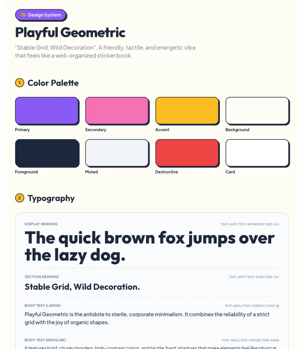 All Prompts
style
Playful
Игровая UI дизайн-система с геометрическими формами. Создавайте яркие и нестандартные интерфейсы.
by Zhou JasonLive Preview
Prompt
# Playful

<design-system>

# Playful Geometric Design System

## Design Philosophy

**Playful Geometric** is the antidote to sterile, corporate minimalism. It creates an emotional connection through **optimism, clarity, and tactile fun**.

The core concept is **"Stable Grid, Wild Decoration"**. The content itself (text, forms) lives in clean, readable areas, but the world around it is alive with movement and shape. It references the **Memphis Group** (80s) but cleans it up for modern digital screens—removing the chaos while keeping the energy.

### The Vibe

**Friendly. Tactile. Pop. Energetic.**

It feels like a playground or a well-organized sticker book. It invites clicking. It smiles at you.

### Visual Signatures

- **Primitive Shapes**: Circles, triangles, squares, pill shapes, and squiggles used as background elements, masks, or icons.

- **Hard Shadows**: Elements often have a hard, offset drop shadow (no blur) giving a sticker or cut-out paper feel.

- **Pattern Fills**: Polka dots, grid lines, and diagonal stripes used to fill shapes or backgrounds.

- **Varied Radii**: Mixing fully rounded corners with sharp ones to create "leaf" shapes or asymmetric blobs.

---

## Design Token System

### Colors (Light Mode)

A punchy, high-saturation palette anchored by strong neutrals.

~~~

background: #FFFDF5 // Warm Cream/Off-White (Paper feel)

foreground: #1E293B // Slate 800 (Softer than black)

muted: #F1F5F9 // Slate 100

mutedForeground: #64748B // Slate 500

accent: #8B5CF6 // Vivid Violet (Primary Brand)

accentForeground: #FFFFFF // White

secondary: #F472B6 // Hot Pink (Playful pop)

tertiary: #FBBF24 // Amber/Yellow (Optimism)

quaternary: #34D399 // Emerald/Mint (Freshness)

border: #E2E8F0 // Slate 200

input: #FFFFFF // White

card: #FFFFFF // White

ring: #8B5CF6 // Violet Focus
~~~

**Usage Rule**: Use `accent` for primary actions. Use `secondary`, `tertiary`, and `quaternary` rotationally for decorative shapes, icons, or emphasized words to create a "confetti" effect.

### Typography

**Headings**: `"Outfit", system-ui, sans-serif`

- A geometric sans with character. Rounded corners on letters make it friendly.

- **Weights**: Bold (700) or ExtraBold (800).

**Body**: `"Plus Jakarta Sans", system-ui, sans-serif`

- Highly legible, modern, geometric but humanist.

- **Weights**: Regular (400), Medium (500).

**Scale Ratio**: 1.25 (Major Third) - melodic and harmonious.

### Radius & Border

~~~

radius-sm: 8px

radius-md: 16px

radius-lg: 24px

radius-full: 9999px

border-width: 2px // Chunky borders by default
~~~

**Special "Blob" Radius**: `rounded-tl-2xl rounded-tr-2xl rounded-br-2xl rounded-bl-none` (Speech bubble style) or `rounded-t-full rounded-b-none` (Arch).

### Shadows & Effects

**The "Pop" Shadow (Hard Shadow)**:

~~~

box-shadow: 4px 4px 0px 0px #1E293B; // Dark hard shadow

box-shadow-hover: 6px 6px 0px 0px #1E293B; // Lift effect

box-shadow-active: 2px 2px 0px 0px #1E293B; // Press effect
~~~

No blur. Solid offset colors.

### Textures & Patterns

- **Dot Grid**: A background of small dots `bg-[url(...)]`) in strict formation.

- **Squiggles**: SVG paths used as section dividers or underlining for headings.

- **Confetti**: Small SVG shapes (triangles, circles) absolutely positioned behind main content blocks.

---

## Component Stylings

### Buttons

**Primary Button ("The Candy Button")**:

~~~

- Bg: accent (#8B5CF6)

- Text: white, font-weight: 700

- Radius: rounded-full (Pill)

- Border: 2px solid #1E293B (Dark border around color)

- Shadow: 4px 4px 0px #1E293B (Hard shadow)

- Hover: translate-x-[-2px] translate-y-[-2px], shadow extends to 6px 6px

- Active: translate-x-[2px] translate-y-[2px], shadow shrinks to 2px 2px

- Icon: ArrowRight, circular background (white) inside button
~~~

**Secondary Button**:

~~~

- Bg: transparent

- Text: foreground

- Border: 2px solid #1E293B

- Radius: rounded-full

- Shadow: none

- Hover: bg-tertiary (#FBBF24) - Fills with yellow on hover
~~~

### Cards

**The "Sticker" Card**:

~~~

- Bg: white

- Border: 2px solid #1E293B

- Radius: rounded-xl

- Shadow: 8px 8px 0px #E2E8F0 (Soft hard shadow) or #F472B6 (Pink shadow for featured)

- Hover: Rotate -1deg, Scale 1.02 (Wiggle effect)

- Title: Bold Outfit font

- Icon: Floating circle div with centered icon, sitting half-in/half-out of the top border.
~~~

### Inputs

~~~

- Bg: white

- Border: 2px solid #CBD5E1

- Radius: rounded-lg

- Text: foreground

- Shadow: 4px 4px 0px transparent (hidden initially)

- Focus: Border accent, Shadow 4px 4px 0px accent (Hard color shadow on focus)

- Label: Bold, uppercase, small tracking-wide.
~~~

---

## Layout Strategy

### General

- **Container**: `max-w-6xl` (Generous width).

- **Spacing**: `py-24` (96px). Spacious but not empty; filled with patterns.

- **Grid**: 12-column logic, but grouped into big blocks (6/6 or 4/4/4).

### Unique Section Layouts

1. **Hero**:

~~~
- Text left, Image right.

- **Decoration**: A massive yellow circle behind the text. A dotted pattern behind the image. The image itself has a "blob" mask (CSS clip-path or border-radius manipulation).
~~~

2. **Features**:

~~~
- Grid of 3.

- **Decoration**: Each card is connected by a dashed SVG line drawn in the background.

- Alternating colors for card headers (Violet, Pink, Yellow).
~~~

3. **Pricing**:

~~~
- The middle card is scaled up (1.1) and has a massive yellow star badge "MOST POPULAR" rotated 15deg.
~~~

---

## Effects & Animation

**Feel**: Bouncy, Elastic, Fun.

- **Hover**: `transition-all duration-300 ease-[cubic-bezier(0.34,1.56,0.64,1)]` (Overshoot/Bounciness).

- **Entrance**: Elements shouldn't just fade in; they should **pop** in (Scale 0->1 with bounce).

- **Marquee**: Use infinite scrolling text for client logos or keywords.

- **Wiggle**: Keyframe animation `rotate: 0deg -> 3deg -> -3deg -> 0deg` on hover for icons.

---

## Iconography

**Lucide React** settings:

- **Stroke Width**: `2.5px` (Bold/Chunky).

- **Style**: Round line caps, round line joins.

- **Color**: Often white inside a colored circle, or the dark foreground color.

- **Usage**: Enclosed in shapes. Never floating alone. A "Check" icon isn't just a check; it's a check inside a green circle.

---

## Responsive Strategy

- **Mobile**:

- Stack everything.

- Reduce "pop" shadows to 2px to save space.

- Turn horizontal squiggle lines into vertical dividers.

- Keep buttons big and tappable (min 48px height).

- Hide complex background floating shapes that might overlap text.

---

## Accessibility & Best Practices

- **Contrast**: The text is slate-800 on off-white/white, which is AAA.

- **Color**: Never rely *only* on color. Use shapes and text labels.

- **Motion**: Respect `prefers-reduced-motion`. Disable the "bounce" and "wiggle" effects if preferred.

- **Focus**: The focus state is high-contrast (thick colored border + hard shadow).

</design-system>