All Prompts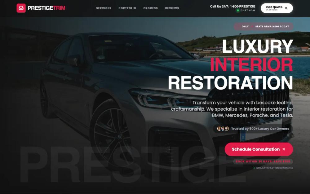 All Prompts
landing pagedark modeautomotive serviceluxury serviceb2b high-ticketbefore-afterbrutalist designhigh contrasthigh conversion pageglassmorphismcrimson luxuryprofessional landingdark luxury branding
Premium Dark B2B Service Landing
Шаблон премиум-лендинга в темном режиме для B2B-услуг. Высококонтрастный дизайн с акцентами для привлечения премиум-клиентов. Идеально для автосервиса, реставрации.
by Shirley LouLive Preview
Prompt
# Premium Dark B2B Service Landing

{
  "summary": "A premium service-oriented landing page using a dark luxury theme, aggressive typography, and interactive portfolio components to build authority and trust for high-ticket crafts.",
  "style": {
    "description": "The style is defined by a 'Dark Luxury' theme. It uses a high-contrast color scheme of #e11d48 (Crimson), #121212 (Off-Black), and #ffffff (White). Typography pairs 'Cal Sans' for bold, tight-tracking headlines with 'Poppins' for clean, readable body text. Visual elements include deep glassmorphism (backdrop-filter: blur(16px)), subtle borders (rgba(255, 255, 255, 0.08)), and crimson gradients. Animations use a smooth cubic-bezier(0.4, 0, 0.2, 1) curve for reveal-on-scroll effects.",
    "prompt": "Create a design with a background of #121212 and an accent color of #e11d48. Use 'Cal Sans' for headers with a font-weight of 700-900 and tight letter-spacing. Use 'Poppins' for body copy. Implement a 'glass-dark' style for the header using background: rgba(18, 18, 18, 0.85), backdrop-filter: blur(16px), and a 1px solid white/5 border. Primary buttons should be #e11d48 with white text, or pure white with black text and a high-glow shadow. Secondary containers should be #1a1a1a with 1px border. Use a crimson-to-dark-red gradient (linear-gradient(135deg, #e11d48 0%, #be123c 100%)) for major CTA sections. All transitions should follow cubic-bezier(0.4, 0, 0.2, 1) and scroll reveals should have a 30px Y-axis offset."
  },
  "layout_and_structure": {
    "description": "A structured long-form landing page with distinct modular sections: Sticky Header, Hero with Urgency Badge, Horizontal Trust Bar, Asymmetric Service Grid, Horizontal Portfolio, Grid Testimonials, and a High-Impact Gradient CTA.",
    "prompts": [
      {
        "part": "Header",
        "prompt": "Fixed 80px height header with glassmorphism effect (#121212, 85% opacity, 16px blur). Left-aligned logo with a 40px rounded icon box. Center-aligned navigation links in uppercase, 12px font size, tracking-widest. Right-aligned utility section containing a phone number and a 'Get Quote' button with a dual-line label (Primary text: font-bold 14px, secondary text: 9px opacity 70%)."
      },
      {
        "part": "Hero Section",
        "prompt": "Minimum height 95vh. Background image with 60% opacity and black gradients fading from left and bottom. Top-aligned urgency badge with a pulsing icon and 'Only [X] Remaining' text. Massive 80px headlines in Cal Sans, using crimson (#e11d48) for emphasis. Subtext max-width 600px, font-size 20px. Includes a social proof avatar stack with 'Trusted by' text. Primary CTA button with an 'arrow-up-right' icon that translates on hover."
      },
      {
        "part": "Trust Bar",
        "prompt": "Minimalist 120px height section with a 4-column grid. Each column contains a 40px icon in gray-500 that turns crimson on hover, a bold title, and a small subtext. Each item has a hover-triggered tooltip in #1a1a1a with detailed credential information."
      },
      {
        "part": "Services Grid",
        "prompt": "A two-column layout where the left column is sticky and contains a large 'Showroom Quality' headline and an expandable service comparison table. The right column contains large 40px-rounded cards. Featured cards use the #e11d48 background with white text, while standard cards use #1a1a1a. Cards include 'Included in Price' details using an HTML <details> accordion style."
      },
      {
        "part": "Portfolio Showcase",
        "prompt": "Horizontal scrolling section with 'no-scrollbar' utility. Transformation cards are 500px wide with 3rem border-radius. Inside each card is a 50/50 split before/after view. Left side is grayscale/darkened; right side is full color with a 'Restored' badge. Hovering over a card reveals a floating 'ROI' badge in the center using backdrop-blur-xl and white text. Bottom of card contains bold vehicle name and completion time stats."
      },
      {
        "part": "Testimonials",
        "prompt": "3-column grid of cards with #1a1a1a background and 2.5rem corner radius. Includes 5-star rating icons in crimson. Quotes are 20px font-size, bold, and italic. User profile section at the bottom features a 48px rounded-square avatar with a grayscale-to-color hover transition."
      },
      {
        "part": "Final CTA",
        "prompt": "Full-width section with a 3rem rounded inner container using a linear-gradient from #e11d48 to #be123c. Giant 80px typography with 'black/30' opacity for secondary words. Two centered 20px font-size buttons: one pure black, one pure white. Footer area includes license/certified badges with bold uppercase tracking."
      }
    ]
  },
  "special_ui_components": [
    {
      "component": "Transformation Compare Card",
      "description": "A dual-state image card showcasing dramatic quality improvements.",
      "prompt": "Design a 550px tall card with 3rem border-radius. Split horizontally into two containers. Left container: image with grayscale(100%), contrast(150%), and brightness(50%). Right container: image with standard coloring. Add a floating badge in the center (opacity 0, transition to 100 on hover) that says 'Est. Value +$X' with a 20px white text on a translucent glass background. Use a duration-1000ms transition for image reveals."
    },
    {
      "component": "Floating Status Indicator",
      "description": "A live-chat or availability indicator with a pulsing animation.",
      "prompt": "Create a 8px circle with background-color #22c55e. Apply a 'pulse-green' animation: 0% and 100% at scale(1) with 0px shadow, 50% at scale(1.2) with 8px shadow of rgba(34, 197, 94, 0). Pair with a 10px font-weight-bold uppercase text label."
    }
  ]
}