All Prompts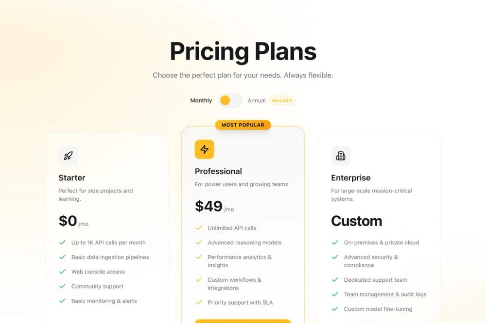 All Prompts
ui componentpricinglanding page
Pricing
Секция цен для SaaS и цифровых продуктов. Три тарифа с переключением мес/год, выделенным Pro-планом, глaссморфизмом и анимацией.
by Zhou JasonLive Preview
Prompt
# Pricing

You are given a task to integrate an existing React component in the codebase

~~~/README.md
# Pricing Plans Component

A responsive, high-conversion pricing section component with a monthly/annual billing toggle.

## Features

- **Toggle Switch**: Smooth interaction for Monthly/Annual billing.
- **Highlighted Tier**: "Pro" plan pops out with distinct styling and shadow.
- **Glassmorphism**: Subtle backdrop blurs and gradients for a modern feel.
- **Animations**: Entrance animations and hover states powered by `framer-motion`.
- **Responsive**: 3-column grid that stacks gracefully on mobile.
- **Dark Mode Ready**: Built with Tailwind CSS variables (`hsl`) for easy theming.

## Usage

```tsx
import { PricingPlans } from '@/sd-components/7706eac8-adfb-4bd1-b56b-4b6dc954a4c9';

function MyPage() {
  return (
    <div>
      <PricingPlans />
    </div>
  );
}
```

## Props

Currently, the component manages its own state for the toggle and uses internal data for the plans. To make it dynamic, you can refactor the `plans` array to be passed as a prop.

## Customization

The component uses Tailwind's `bg-primary`, `bg-background`, `text-foreground` etc. Ensure your project has these CSS variables defined in your global CSS or Tailwind config.
~~~

~~~/src/App.tsx
import React from 'react';
import { PricingPlans } from './Component';

export default function App() {
  return (
    <div className="min-h-screen bg-black text-white">
      <PricingPlans />
    </div>
  );
}
~~~

~~~/package.json
{
  "name": "pricing-plans",
  "version": "1.0.0",
  "description": "A responsive pricing section with monthly/annual toggle",
  "dependencies": {
    "react": "^18.2.0",
    "react-dom": "^18.2.0",
    "framer-motion": "^10.16.4",
    "lucide-react": "^0.309.0",
    "clsx": "^2.1.0",
    "tailwind-merge": "^2.2.0"
  }
}
~~~

~~~/src/Component.tsx
import React, { useState } from 'react';
import { motion, AnimatePresence } from 'framer-motion';
import { Check, Star, Zap, Shield, BarChart3, Users, Building2, Rocket } from 'lucide-react';
import { clsx, type ClassValue } from 'clsx';
import { twMerge } from 'tailwind-merge';

function cn(...inputs: ClassValue[]) {
  return twMerge(clsx(inputs));
}

type BillingCycle = 'monthly' | 'annual';

interface PlanFeature {
  text: string;
  included: boolean;
}

interface PricingPlan {
  id: string;
  name: string;
  description: string;
  price: {
    monthly: number;
    annual: number;
  };
  features: PlanFeature[];
  highlight?: boolean;
  ctaText: string;
  icon: React.ElementType;
}

const plans: PricingPlan[] = [
  {
    id: 'starter',
    name: 'Starter',
    description: 'Perfect for side projects and learning.',
    price: { monthly: 0, annual: 0 },
    icon: Rocket,
    ctaText: 'Start Building',
    features: [
      { text: 'Up to 1K API calls per month', included: true },
      { text: 'Basic data ingestion pipelines', included: true },
      { text: 'Web console access', included: true },
      { text: 'Community support', included: true },
      { text: 'Basic monitoring & alerts', included: true },
    ],
  },
  {
    id: 'pro',
    name: 'Professional',
    description: 'For power users and growing teams.',
    price: { monthly: 49, annual: 470 }, // 470/12 approx 39/mo
    icon: Zap,
    highlight: true,
    ctaText: 'Upgrade to Pro',
    features: [
      { text: 'Unlimited API calls', included: true },
      { text: 'Advanced reasoning models', included: true },
      { text: 'Performance analytics & insights', included: true },
      { text: 'Custom workflows & integrations', included: true },
      { text: 'Priority support with SLA', included: true },
    ],
  },
  {
    id: 'enterprise',
    name: 'Enterprise',
    description: 'For large-scale mission-critical systems.',
    price: { monthly: 999, annual: 9999 }, // Custom usually
    icon: Building2,
    ctaText: 'Contact Sales',
    features: [
      { text: 'On-premises & private cloud', included: true },
      { text: 'Advanced security & compliance', included: true },
      { text: 'Dedicated support team', included: true },
      { text: 'Team management & audit logs', included: true },
      { text: 'Custom model fine-tuning', included: true },
    ],
  }
];

export function PricingPlans() {
  const [billingCycle, setBillingCycle] = useState<BillingCycle>('monthly');

  return (
    <section className="relative w-full overflow-hidden bg-background py-24 text-foreground selection:bg-primary/30">
      {/* Background Decor */}
      <div className="pointer-events-none absolute inset-0 overflow-hidden">
        <div className="absolute left-1/2 top-0 -ml-[50%] h-[50rem] w-[100rem] -translate-x-1/2 opacity-20 bg-[radial-gradient(ellipse_at_top,hsl(var(--primary))_0%,transparent_70%)] blur-3xl" />
        <div className="absolute bottom-0 right-0 h-[40rem] w-[40rem] translate-x-1/2 translate-y-1/2 rounded-full bg-accent/10 blur-[100px]" />
      </div>

      <div className="container relative z-10 mx-auto px-4 md:px-6">
        {/* Header */}
        <div className="mb-16 text-center">
          <motion.h2
            initial={{ opacity: 0, y: 20 }}
            whileInView={{ opacity: 1, y: 0 }}
            viewport={{ once: true }}
            transition={{ duration: 0.5 }}
            className="text-4xl font-bold tracking-tight sm:text-5xl lg:text-6xl font-sans"
          >
            Pricing Plans
          </motion.h2>
          <motion.p
            initial={{ opacity: 0, y: 20 }}
            whileInView={{ opacity: 1, y: 0 }}
            viewport={{ once: true }}
            transition={{ duration: 0.5, delay: 0.1 }}
            className="mt-4 text-lg text-muted-foreground"
          >
            Choose the perfect plan for your needs. Always flexible.
          </motion.p>

          {/* Toggle */}
          <motion.div
            initial={{ opacity: 0, scale: 0.9 }}
            whileInView={{ opacity: 1, scale: 1 }}
            viewport={{ once: true }}
            transition={{ duration: 0.5, delay: 0.2 }}
            className="mt-8 flex items-center justify-center gap-4"
          >
            <span className={cn("text-sm transition-colors", billingCycle === 'monthly' ? "text-foreground font-medium" : "text-muted-foreground")}>
              Monthly
            </span>
            <button
              onClick={() => setBillingCycle(c => c === 'monthly' ? 'annual' : 'monthly')}
              className="relative h-8 w-14 rounded-full bg-muted p-1 ring-1 ring-border transition-all hover:ring-primary/50 focus:outline-none focus-visible:ring-2 focus-visible:ring-primary"
            >
              <motion.div
                className="h-6 w-6 rounded-full bg-primary shadow-sm"
                layout
                transition={{ type: "spring", stiffness: 500, damping: 30 }}
                animate={{ x: billingCycle === 'monthly' ? 0 : 24 }}
              />
            </button>
            <span className={cn("text-sm transition-colors flex items-center gap-2", billingCycle === 'annual' ? "text-foreground font-medium" : "text-muted-foreground")}>
              Annual
              <span className="rounded-full bg-primary/10 px-2 py-0.5 text-[10px] font-semibold text-primary ring-1 ring-inset ring-primary/20">
                Save 20%
              </span>
            </span>
          </motion.div>
        </div>

        {/* Grid */}
        <div className="grid gap-8 lg:grid-cols-3 xl:gap-10">
          {plans.map((plan, index) => (
            <PriceCard
              key={plan.id}
              plan={plan}
              billingCycle={billingCycle}
              index={index}
            />
          ))}
        </div>

        <motion.p
          initial={{ opacity: 0 }}
          whileInView={{ opacity: 1 }}
          viewport={{ once: true }}
          transition={{ delay: 0.8, duration: 1 }}
          className="mt-12 text-center text-sm text-muted-foreground"
        >
          All plans include a 14-day free trial. No credit card required.
        </motion.p>
      </div>
    </section>
  );
}

function PriceCard({ plan, billingCycle, index }: { plan: PricingPlan; billingCycle: BillingCycle; index: number }) {
  const isCustom = plan.price.monthly > 500; // Simple logic for "Custom" display
  const priceDisplay = isCustom
    ? 'Custom'
    : `$${billingCycle === 'monthly' ? plan.price.monthly : Math.floor(plan.price.annual / 12)}`;

  const Icon = plan.icon;

  return (
    <motion.div
      initial={{ opacity: 0, y: 30 }}
      whileInView={{ opacity: 1, y: 0 }}
      viewport={{ once: true, margin: "-50px" }}
      transition={{ duration: 0.5, delay: index * 0.1 + 0.3 }}
      className={cn(
        "relative flex flex-col rounded-3xl p-8 backdrop-blur-xl transition-all duration-300",
        plan.highlight
          ? "bg-gradient-to-b from-muted/50 to-background border border-primary/50 ring-1 ring-primary/30 shadow-[0_0_40px_-10px_rgba(251,191,36,0.15)] md:-mt-4 md:mb-4 lg:z-10"
          : "bg-card/40 border border-border/50 hover:bg-card/60 hover:border-primary/20"
      )}
    >
      {plan.highlight && (
        <div className="absolute -top-4 left-1/2 -translate-x-1/2 rounded-full bg-gradient-to-r from-primary to-accent px-4 py-1 text-xs font-bold uppercase tracking-wider text-black shadow-lg">
          Most Popular
        </div>
      )}

      {/* Card Header */}
      <div className="mb-6">
        <div className={cn("mb-4 inline-flex h-12 w-12 items-center justify-center rounded-xl", plan.highlight ? "bg-primary text-black" : "bg-muted text-foreground")}>
          <Icon className="h-6 w-6" />
        </div>
        <h3 className="text-xl font-semibold text-foreground">{plan.name}</h3>
        <p className="mt-2 text-sm text-muted-foreground">{plan.description}</p>
      </div>

      {/* Price */}
      <div className="mb-6 flex items-baseline gap-1">
        <span className="text-4xl font-bold tracking-tight text-foreground">
           {/* Animated Number could go here, but keeping it simple for stability */}
           {priceDisplay}
        </span>
        {!isCustom && (
          <span className="text-sm text-muted-foreground">
            /mo
            {billingCycle === 'annual' && <span className="block text-xs font-normal text-primary">billed annually</span>}
          </span>
        )}
      </div>

      {/* Features */}
      <ul className="mb-8 flex-1 space-y-4">
        {plan.features.map((feature, i) => (
          <li key={i} className="flex items-start gap-3 text-sm text-muted-foreground">
            <Check className={cn("h-5 w-5 shrink-0", plan.highlight ? "text-primary" : "text-emerald-500")} />
            <span className="leading-5">{feature.text}</span>
          </li>
        ))}
      </ul>

      {/* CTA */}
      <button
        className={cn(
          "group inline-flex w-full items-center justify-center gap-2 rounded-xl px-4 py-3 text-sm font-semibold transition-all focus:outline-none focus:ring-2 focus:ring-primary focus:ring-offset-2 focus:ring-offset-background",
          plan.highlight
            ? "bg-primary text-primary-foreground hover:bg-primary/90 shadow-[0_4px_14px_0_rgba(251,191,36,0.39)]"
            : "bg-secondary text-secondary-foreground hover:bg-secondary/80"
        )}
      >
        {plan.ctaText}
        <Zap className={cn("h-4 w-4 transition-transform group-hover:fill-current", plan.highlight ? "" : "opacity-0")} />
      </button>
    </motion.div>
  );
}

// Named export as well
export { PricingPlans as default };
~~~

Implementation Guidelines

1. Analyze the component structure, styling, animation implementations
2. Review the component's arguments and state
3. Think through what is the best place to adopt this component/style into the design we are doing
4. Then adopt the component/design to our current system

Help me integrate this into my design