All Prompts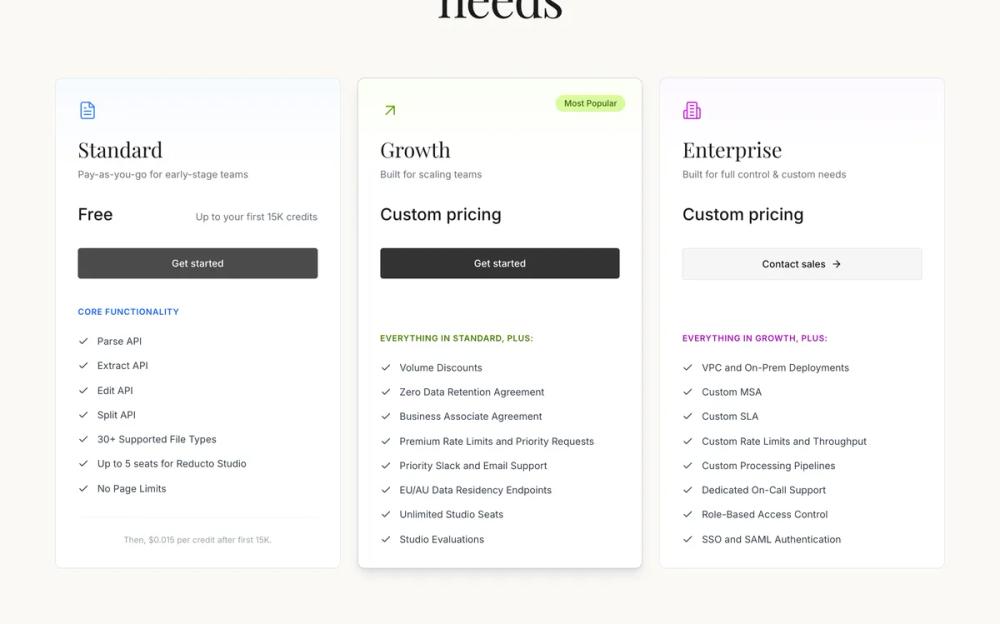 All Prompts
ui componentlanding pagepricing
Pricing
Компонент UI "Pricing" для лендинга. Три карточки тарифов (Standard, Growth, Enterprise) с сравнением функций. Адаптивный дизайн.
by Zhou JasonLive Preview
Prompt
# Pricing

You are given a task to integrate an existing React component in the codebase

~~~/README.md
# Pricing Section

A sophisticated, responsive pricing section component built with React and Tailwind CSS. It features a clean, elegant design with serif typography, distinct card styles for different tiers (Standard, Growth, Enterprise), and subtle gradient details.

## Features

- **Responsive Grid Layout**: Adapts from single column on mobile to three columns on desktop.
- **Elegant Typography**: Uses a mix of Serif (titles) and Sans-serif (body) fonts for a refined look.
- **Distinct Visual Hierarchy**: Each plan has unique subtle color accents (Blue, Green, Purple).
- **Feature Comparison**: Clear checklists for plan features.
- **"Most Popular" Badge**: Highlight for the growth plan.

## Dependencies

- `lucide-react`: For icons.
- `clsx` & `tailwind-merge`: For robust class name handling.
- `framer-motion`: (Optional) Can be added for entrance animations.

## Usage

```tsx
import { PricingSection } from '@/sd-components/be5c7492-f1a4-4866-a917-b91f20478ca3';

function App() {
  return (
    <PricingSection />
  );
}
```

## Props

The component currently uses internal data for the pricing plans. To make it dynamic, you can refactor the `plans` array to be passed via props.

```typescript
// Example interface for future prop extension
interface PricingSectionProps {
  title?: string;
  subtitle?: string;
  plans?: Plan[];
}
```
~~~

~~~/src/App.tsx
import React from 'react';
import { PricingSection } from './Component';

export default function App() {
  return (
    <div className="min-h-screen bg-[#FAF9F6]">
      <PricingSection />
    </div>
  );
}
~~~

~~~/package.json
{
  "name": "pricing-section",
  "version": "1.0.0",
  "description": "A sophisticated pricing section featuring elegant serif typography and distinct plan cards.",
  "dependencies": {
    "lucide-react": "^0.300.0",
    "framer-motion": "^10.0.0",
    "clsx": "^2.0.0",
    "tailwind-merge": "^2.0.0",
    "react": "^18.2.0",
    "react-dom": "^18.2.0"
  }
}
~~~

~~~/src/Component.tsx
import React from 'react';
import {
  FileText,
  ArrowUpRight,
  Building2,
  Check,
  DollarSign,
  ArrowRight
} from 'lucide-react';
import { clsx, type ClassValue } from 'clsx';
import { twMerge } from 'tailwind-merge';

// Utility for class merging
function cn(...inputs: ClassValue[]) {
  return twMerge(clsx(inputs));
}

// Plan Types
interface PlanFeature {
  text: string;
  included: boolean;
}

interface Plan {
  id: string;
  name: string;
  description: string;
  price: string;
  priceNote?: string;
  buttonText: string;
  buttonVariant: 'primary' | 'secondary';
  popular?: boolean;
  icon: React.ElementType;
  iconColor: string;
  gradientColor: string;
  accentColor: string;
  featuresTitle: string;
  features: PlanFeature[];
}

const plans: Plan[] = [
  {
    id: 'standard',
    name: 'Standard',
    description: 'Pay-as-you-go for early-stage teams',
    price: 'Free',
    priceNote: 'Up to your first 15K credits',
    buttonText: 'Get started',
    buttonVariant: 'primary',
    icon: FileText,
    iconColor: 'text-blue-500',
    gradientColor: 'from-blue-50/80 via-blue-50/30 to-transparent',
    accentColor: 'text-blue-600',
    featuresTitle: 'CORE FUNCTIONALITY',
    features: [
      { text: 'Parse API', included: true },
      { text: 'Extract API', included: true },
      { text: 'Edit API', included: true },
      { text: 'Split API', included: true },
      { text: '30+ Supported File Types', included: true },
      { text: 'Up to 5 seats for Reducto Studio', included: true },
      { text: 'No Page Limits', included: true },
    ],
  },
  {
    id: 'growth',
    name: 'Growth',
    description: 'Built for scaling teams',
    price: 'Custom pricing',
    buttonText: 'Get started',
    buttonVariant: 'primary',
    popular: true,
    icon: ArrowUpRight,
    iconColor: 'text-lime-600',
    gradientColor: 'from-lime-50/80 via-lime-50/30 to-transparent',
    accentColor: 'text-lime-700',
    featuresTitle: 'EVERYTHING IN STANDARD, PLUS:',
    features: [
      { text: 'Volume Discounts', included: true },
      { text: 'Zero Data Retention Agreement', included: true },
      { text: 'Business Associate Agreement', included: true },
      { text: 'Premium Rate Limits and Priority Requests', included: true },
      { text: 'Priority Slack and Email Support', included: true },
      { text: 'EU/AU Data Residency Endpoints', included: true },
      { text: 'Unlimited Studio Seats', included: true },
      { text: 'Studio Evaluations', included: true },
    ],
  },
  {
    id: 'enterprise',
    name: 'Enterprise',
    description: 'Built for full control & custom needs',
    price: 'Custom pricing',
    buttonText: 'Contact sales',
    buttonVariant: 'secondary',
    icon: Building2,
    iconColor: 'text-fuchsia-600',
    gradientColor: 'from-fuchsia-50/80 via-fuchsia-50/30 to-transparent',
    accentColor: 'text-fuchsia-700',
    featuresTitle: 'EVERYTHING IN GROWTH, PLUS:',
    features: [
      { text: 'VPC and On-Prem Deployments', included: true },
      { text: 'Custom MSA', included: true },
      { text: 'Custom SLA', included: true },
      { text: 'Custom Rate Limits and Throughput', included: true },
      { text: 'Custom Processing Pipelines', included: true },
      { text: 'Dedicated On-Call Support', included: true },
      { text: 'Role-Based Access Control', included: true },
      { text: 'SSO and SAML Authentication', included: true },
    ],
  },
];

export function PricingSection() {
  return (
    <section className="w-full min-h-screen bg-[#FAF9F6] py-20 px-4 md:px-8 font-sans selection:bg-purple-100 selection:text-purple-900">
      <div className="max-w-7xl mx-auto">
        {/* Header Section */}
        <div className="text-center mb-20 space-y-6">
          <div className="inline-flex items-center gap-2 text-sm font-medium text-[#65a30d]">
            <span className="flex items-center justify-center w-4 h-4 rounded-full border border-[#65a30d] text-[10px]">
              <DollarSign size={10} />
            </span>
            Flexible plans
          </div>

          <h1 className="font-serif text-5xl md:text-7xl text-[#1a1a1a] leading-[1.1] max-w-4xl mx-auto tracking-tight">
            Choose the plan <br />
            that <span className="text-[#A020F0] italic px-1 font-serif">best fits</span> your <br />
            needs
          </h1>
        </div>

        {/* Pricing Cards Grid */}
        <div className="grid grid-cols-1 md:grid-cols-3 gap-6 max-w-7xl mx-auto">
          {plans.map((plan) => (
            <div
              key={plan.id}
              className="relative flex flex-col bg-white border border-gray-200 rounded-lg overflow-hidden transition-all duration-300 hover:shadow-lg hover:border-gray-300"
            >
              {/* Subtle Top Gradient */}
              <div className={cn("absolute top-0 left-0 right-0 h-32 bg-gradient-to-b opacity-60", plan.gradientColor)} />

              {/* Most Popular Badge */}
              {plan.popular && (
                <div className="absolute top-6 right-6 bg-[#d9f99d] text-[#3f6212] text-xs font-medium px-3 py-1 rounded-full">
                  Most Popular
                </div>
              )}

              <div className="relative p-8 flex flex-col h-full">
                {/* Icon */}
                <div className={cn("mb-6", plan.iconColor)}>
                  <plan.icon size={28} strokeWidth={1.5} />
                </div>

                {/* Header Info */}
                <div className="mb-8">
                  <h3 className="font-serif text-3xl text-[#1a1a1a] mb-2">{plan.name}</h3>
                  <p className="text-gray-500 text-sm">{plan.description}</p>
                </div>

                {/* Price */}
                <div className="mb-8 flex items-baseline gap-2 flex-wrap">
                  <span className="text-2xl font-medium text-[#1a1a1a]">{plan.price}</span>
                  {plan.priceNote && (
                    <span className="text-gray-500 text-sm ml-auto">{plan.priceNote}</span>
                  )}
                </div>

                {/* Action Button */}
                <button
                  className={cn(
                    "w-full py-3 px-6 rounded text-sm font-medium transition-colors mb-10 flex items-center justify-center gap-2 group",
                    plan.buttonVariant === 'primary'
                      ? "bg-[#4a4a4a] hover:bg-[#333333] text-white"
                      : "bg-[#f5f5f5] hover:bg-[#e5e5e5] text-[#1a1a1a] border border-gray-200"
                  )}
                >
                  {plan.buttonText}
                  {plan.buttonVariant === 'secondary' && (
                    <ArrowRight size={16} className="transition-transform group-hover:translate-x-1" />
                  )}
                </button>

                {/* Features List */}
                <div className="mt-auto">
                  <p className={cn("text-xs font-semibold tracking-wider uppercase mb-6", plan.accentColor)}>
                    {plan.featuresTitle}
                  </p>
                  <ul className="space-y-4">
                    {plan.features.map((feature, idx) => (
                      <li key={idx} className="flex items-start gap-3 text-sm text-gray-700">
                        <Check size={16} className="shrink-0 mt-0.5" />
                        <span className="leading-snug">{feature.text}</span>
                      </li>
                    ))}
                  </ul>
                </div>

                {/* Standard Plan Footnote */}
                {plan.id === 'standard' && (
                  <div className="mt-8 pt-6 border-t border-gray-100 text-center">
                    <p className="text-xs text-gray-400">
                      Then, $0.015 per credit after first 15K.
                    </p>
                  </div>
                )}
              </div>
            </div>
          ))}
        </div>
      </div>
    </section>
  );
}

export default PricingSection;
~~~

Implementation Guidelines

1. Analyze the component structure, styling, animation implementations
2. Review the component's arguments and state
3. Think through what is the best place to adopt this component/style into the design we are doing
4. Then adopt the component/design to our current system

Help me integrate this into my design