All Prompts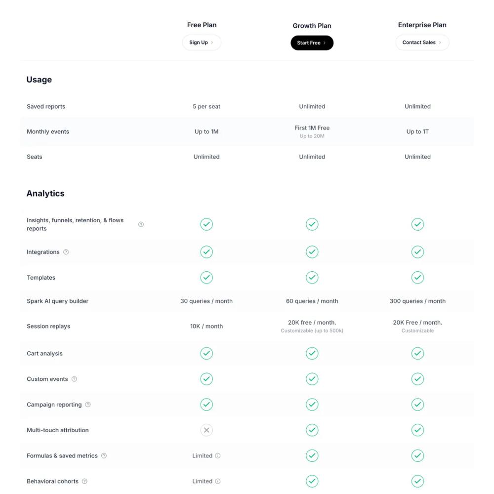 All Prompts
ui componentpricinglanding page
Pricing Comparison Table
Таблица сравнения цен: UI компонент для лендингов. Отображает тарифы (Free, Growth, Enterprise) с детальными списками функций и индикаторами статуса.
by Zhou JasonLive Preview
Prompt
# Pricing Comparison Table

You are given a task to integrate an existing React component in the codebase

~~~/README.md
# Pricing Comparison Table

A comprehensive, responsive pricing comparison table component designed to showcase features across multiple pricing tiers (Free, Growth, Enterprise).

## Features

- **Detailed Feature Comparison**: Organize features into collapsible sections (Usage, Analytics).
- **Visual Status Indicators**: Clear checkmarks, cross icons, and text descriptors for feature availability.
- **Sticky Header**: Headers remain visible while scrolling for better context.
- **Responsive Design**: Horizontal scrolling for smaller screens to preserve data density.
- **Add-on & Tooltip Support**: Support for "Add-on" indicators and information tooltips.
- **Alternating Row Styles**: Zebra-striping for improved readability of long lists.

## Usage

```tsx
import { PricingComparisonTable } from '@/sd-components/b4e650cd-0ff9-4142-a18e-99e19e7a4172';

function PricingPage() {
  return (
    <div>
      <h1>Choose Your Plan</h1>
      <PricingComparisonTable />
    </div>
  );
}
```

## Props

The component currently uses internal static data for the demonstration. To make it dynamic, you can extend the `PRICING_DATA` constant or accept it as a prop.

## Dependencies

- `lucide-react`: For icons (Check, X, Info).
- `clsx` & `tailwind-merge`: For robust class name handling.
- Tailwind CSS: For styling.
~~~

~~~/src/App.tsx
import React from 'react';
import { PricingComparisonTable } from './Component';

export default function App() {
  return (
    <div className="min-h-screen bg-white">
      <PricingComparisonTable />
    </div>
  );
}
~~~

~~~/package.json
{
  "name": "pricing-comparison-table",
  "version": "1.0.0",
  "description": "A detailed pricing comparison table component",
  "main": "src/Component.tsx",
  "dependencies": {
    "react": "^18.2.0",
    "react-dom": "^18.2.0",
    "lucide-react": "^0.300.0",
    "clsx": "^2.1.0",
    "tailwind-merge": "^2.2.0"
  }
}
~~~

~~~/src/Component.tsx
import React from 'react';
import { Check, X, Info, ChevronRight, HelpCircle } from 'lucide-react';
import { clsx, type ClassValue } from 'clsx';
import { twMerge } from 'tailwind-merge';

// --- Utils ---
function cn(...inputs: ClassValue[]) {
  return twMerge(clsx(inputs));
}

// --- Types ---
type FeatureStatus =
  | { type: 'text'; value: string; subValue?: string }
  | { type: 'check' }
  | { type: 'cross' }
  | { type: 'addon' }
  | { type: 'limited'; text?: string };

interface FeatureRow {
  name: string;
  hasInfo?: boolean;
  free: FeatureStatus;
  growth: FeatureStatus;
  enterprise: FeatureStatus;
}

interface Section {
  title: string;
  features: FeatureRow[];
}

// --- Data ---
const PRICING_DATA: Section[] = [
  {
    title: "Usage",
    features: [
      {
        name: "Saved reports",
        free: { type: 'text', value: "5 per seat" },
        growth: { type: 'text', value: "Unlimited" },
        enterprise: { type: 'text', value: "Unlimited" },
      },
      {
        name: "Monthly events",
        free: { type: 'text', value: "Up to 1M" },
        growth: { type: 'text', value: "First 1M Free", subValue: "Up to 20M" },
        enterprise: { type: 'text', value: "Up to 1T" },
      },
      {
        name: "Seats",
        free: { type: 'text', value: "Unlimited" },
        growth: { type: 'text', value: "Unlimited" },
        enterprise: { type: 'text', value: "Unlimited" },
      },
    ]
  },
  {
    title: "Analytics",
    features: [
      {
        name: "Insights, funnels, retention, & flows reports",
        hasInfo: true,
        free: { type: 'check' },
        growth: { type: 'check' },
        enterprise: { type: 'check' },
      },
      {
        name: "Integrations",
        hasInfo: true,
        free: { type: 'check' },
        growth: { type: 'check' },
        enterprise: { type: 'check' },
      },
      {
        name: "Templates",
        free: { type: 'check' },
        growth: { type: 'check' },
        enterprise: { type: 'check' },
      },
      {
        name: "Spark AI query builder",
        free: { type: 'text', value: "30 queries / month" },
        growth: { type: 'text', value: "60 queries / month" },
        enterprise: { type: 'text', value: "300 queries / month" },
      },
      {
        name: "Session replays",
        free: { type: 'text', value: "10K / month" },
        growth: { type: 'text', value: "20K free / month.", subValue: "Customizable (up to 500k)" },
        enterprise: { type: 'text', value: "20K Free / month.", subValue: "Customizable" },
      },
      {
        name: "Cart analysis",
        free: { type: 'check' },
        growth: { type: 'check' },
        enterprise: { type: 'check' },
      },
      {
        name: "Custom events",
        hasInfo: true,
        free: { type: 'check' },
        growth: { type: 'check' },
        enterprise: { type: 'check' },
      },
      {
        name: "Campaign reporting",
        hasInfo: true,
        free: { type: 'check' },
        growth: { type: 'check' },
        enterprise: { type: 'check' },
      },
      {
        name: "Multi-touch attribution",
        free: { type: 'cross' },
        growth: { type: 'check' },
        enterprise: { type: 'check' },
      },
      {
        name: "Formulas & saved metrics",
        hasInfo: true,
        free: { type: 'limited', text: "Limited" },
        growth: { type: 'check' },
        enterprise: { type: 'check' },
      },
      {
        name: "Behavioral cohorts",
        hasInfo: true,
        free: { type: 'limited', text: "Limited" },
        growth: { type: 'check' },
        enterprise: { type: 'check' },
      },
      {
        name: "Custom properties",
        hasInfo: true,
        free: { type: 'cross' },
        growth: { type: 'check' },
        enterprise: { type: 'check' },
      },
      {
        name: "Borrowed properties",
        hasInfo: true,
        free: { type: 'cross' },
        growth: { type: 'check' },
        enterprise: { type: 'check' },
      },
      {
        name: "Impact & statistical significance",
        hasInfo: true,
        free: { type: 'cross' },
        growth: { type: 'check' },
        enterprise: { type: 'check' },
      },
      {
        name: "Account-level behavioral analytics",
        hasInfo: true,
        free: { type: 'cross' },
        growth: { type: 'addon' },
        enterprise: { type: 'addon' },
      },
      {
        name: "Monitoring & alerts",
        hasInfo: true,
        free: { type: 'cross' },
        growth: { type: 'text', value: "5 per project" },
        enterprise: { type: 'check' },
      },
      {
        name: "Anomaly detection",
        hasInfo: true,
        free: { type: 'cross' },
        growth: { type: 'cross' },
        enterprise: { type: 'check' },
      },
      {
        name: "Root cause analysis",
        hasInfo: true,
        free: { type: 'cross' },
        growth: { type: 'cross' },
        enterprise: { type: 'check' },
      },
      {
        name: "Experiment reporting",
        hasInfo: true,
        free: { type: 'cross' },
        growth: { type: 'cross' },
        enterprise: { type: 'addon' },
      },
      {
        name: "Feature Flags",
        hasInfo: true,
        free: { type: 'cross' },
        growth: { type: 'cross' },
        enterprise: { type: 'addon' },
      },
      {
        name: "Cross-product analytics",
        hasInfo: true,
        free: { type: 'cross' },
        growth: { type: 'cross' },
        enterprise: { type: 'check' },
      },
      {
        name: "Signal correlation analysis",
        hasInfo: true,
        free: { type: 'cross' },
        growth: { type: 'cross' },
        enterprise: { type: 'check' },
      },
      {
        name: "Metric Trees",
        hasInfo: true,
        free: { type: 'cross' },
        growth: { type: 'cross' },
        enterprise: { type: 'addon' },
      },
    ]
  }
];

// --- Components ---

const StatusCell = ({ status }: { status: FeatureStatus }) => {
  switch (status.type) {
    case 'check':
      return (
        <div className="flex justify-center items-center w-full h-full">
          <div className="rounded-full border border-emerald-500 p-1">
             <Check className="w-5 h-5 text-emerald-500" strokeWidth={2.5} />
          </div>
        </div>
      );
    case 'cross':
      return (
        <div className="flex justify-center items-center w-full h-full">
          <div className="rounded-full border border-gray-300 p-1">
            <X className="w-5 h-5 text-gray-400" strokeWidth={2.5} />
          </div>
        </div>
      );
    case 'text':
      return (
        <div className="flex flex-col items-center justify-center text-center text-sm text-gray-600 font-medium">
          <span>{status.value}</span>
          {status.subValue && <span className="text-gray-400 text-xs mt-0.5">{status.subValue}</span>}
        </div>
      );
    case 'addon':
      return (
        <div className="flex items-center justify-center gap-1.5 text-sm text-gray-500 font-medium">
          <span>Add-on</span>
          <Info className="w-3.5 h-3.5 text-gray-400" />
        </div>
      );
    case 'limited':
      return (
        <div className="flex items-center justify-center gap-1.5 text-sm text-gray-500 font-medium">
          <span>{status.text}</span>
          <Info className="w-3.5 h-3.5 text-gray-400" />
        </div>
      );
    default:
      return null;
  }
};

const HeaderButton = ({
  label,
  variant = 'outline'
}: {
  label: string;
  variant?: 'outline' | 'solid' | 'ghost'
}) => {
  return (
    <button className={cn(
      "group flex items-center justify-center gap-1 px-4 py-2.5 rounded-full text-xs font-semibold transition-all duration-200",
      variant === 'solid' && "bg-black text-white hover:bg-gray-800 shadow-sm",
      variant === 'outline' && "bg-white text-gray-900 border border-gray-200 hover:border-gray-300 hover:bg-gray-50",
      variant === 'ghost' && "bg-transparent text-gray-600 hover:text-gray-900"
    )}>
      {label}
      <ChevronRight className={cn(
        "w-3 h-3 transition-transform duration-200 group-hover:translate-x-0.5",
        variant === 'solid' ? "text-white/70" : "text-gray-400"
      )} />
    </button>
  );
};

export function PricingComparisonTable() {
  return (
    <div className="w-full bg-white font-sans text-gray-900 p-6 md:p-12 overflow-x-auto">
      <div className="min-w-[900px] max-w-6xl mx-auto">

        {/* Sticky Header */}
        <div className="sticky top-0 z-10 bg-white/95 backdrop-blur-sm border-b border-gray-100 pb-4 mb-8">
           <div className="grid grid-cols-[300px_1fr_1fr_1fr] gap-4 items-end">
              <div className="text-2xl font-bold tracking-tight text-gray-900 pb-2">
                {/* Empty corner or could be "Compare Plans" */}
              </div>

              <div className="flex flex-col items-center gap-3 pb-2">
                <span className="text-base font-semibold text-gray-900">Free Plan</span>
                <HeaderButton label="Sign Up" variant="outline" />
              </div>

              <div className="flex flex-col items-center gap-3 pb-2">
                <span className="text-base font-semibold text-gray-900">Growth Plan</span>
                <HeaderButton label="Start Free" variant="solid" />
              </div>

              <div className="flex flex-col items-center gap-3 pb-2">
                <span className="text-base font-semibold text-gray-900">Enterprise Plan</span>
                <HeaderButton label="Contact Sales" variant="outline" />
              </div>
           </div>
        </div>

        {/* Content */}
        <div className="flex flex-col gap-12">
          {PRICING_DATA.map((section, sIndex) => (
            <div key={section.title} className="flex flex-col">
              <h3 className="text-xl font-bold text-gray-900 mb-6 px-4">{section.title}</h3>

              <div className="flex flex-col rounded-xl overflow-hidden border border-gray-100/50">
                {section.features.map((feature, fIndex) => (
                  <div
                    key={feature.name}
                    className={cn(
                      "grid grid-cols-[300px_1fr_1fr_1fr] gap-4 py-4 px-4 items-center transition-colors hover:bg-gray-50/80",
                      fIndex % 2 === 0 ? "bg-white" : "bg-gray-50/50"
                    )}
                  >
                    <div className="flex items-center gap-2 pr-4">
                      <span className="text-sm text-gray-700 font-medium">{feature.name}</span>
                      {feature.hasInfo && (
                        <div className="group relative">
                          <HelpCircle className="w-3.5 h-3.5 text-gray-400 cursor-help" />
                          {/* Simple tooltip placeholder */}
                          <div className="absolute left-full top-1/2 -translate-y-1/2 ml-2 w-48 p-2 bg-gray-900 text-white text-xs rounded opacity-0 invisible group-hover:opacity-100 group-hover:visible transition-all z-20 pointer-events-none">
                            More info about {feature.name}
                          </div>
                        </div>
                      )}
                    </div>

                    <div className="flex justify-center">
                      <StatusCell status={feature.free} />
                    </div>

                    <div className="flex justify-center">
                      <StatusCell status={feature.growth} />
                    </div>

                    <div className="flex justify-center">
                      <StatusCell status={feature.enterprise} />
                    </div>
                  </div>
                ))}
              </div>
            </div>
          ))}
        </div>

        {/* Footer / CTA area could go here */}
        <div className="mt-16 bg-gray-900 rounded-2xl p-8 md:p-12 text-center text-white">
          <h3 className="text-2xl font-bold mb-4">Ready to get started?</h3>
          <p className="text-gray-400 mb-8 max-w-xl mx-auto">Join over 26,000 companies using our platform to grow their business.</p>
          <div className="flex items-center justify-center gap-4">
            <button className="px-6 py-3 bg-white text-black rounded-full font-semibold hover:bg-gray-100 transition-colors">
              Create Free Account
            </button>
            <button className="px-6 py-3 bg-transparent border border-white/20 text-white rounded-full font-semibold hover:bg-white/10 transition-colors">
              Contact Sales
            </button>
          </div>
        </div>

      </div>
    </div>
  );
}

export default PricingComparisonTable;
~~~

Implementation Guidelines

1. Analyze the component structure, styling, animation implementations
2. Review the component's arguments and state
3. Think through what is the best place to adopt this component/style into the design we are doing
4. Then adopt the component/design to our current system

Help me integrate this into my design