All Prompts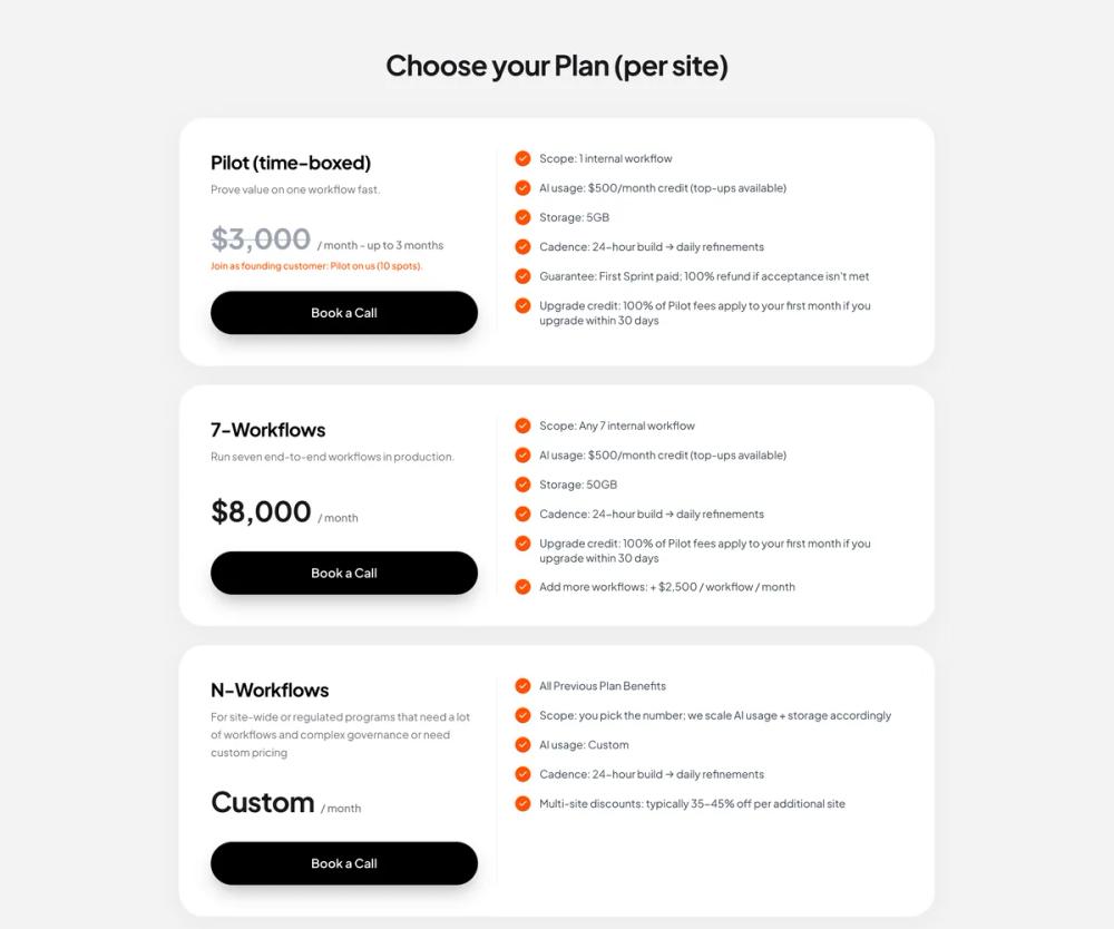 All Prompts
ui componentpricing
Pricing Section
UI компонент: Секция цен. Чистый дизайн, вертикальные карточки с разделением деталей и преимуществ. Кнопки с 3D-эффектом, оранжевые галочки. Для высокой конверсии.
by Zhou JasonLive Preview
Prompt
# Pricing Section

You are given a task to integrate an existing React component in the codebase

~~~/README.md
# PricingSection

A premium, clean pricing section with vertically stacked cards. Features a distinct split layout within each card (plan details vs features), distinctive pill-shaped black buttons with 3D depth, and orange accent checkmarks.

## Usage

```tsx
import { PricingSection } from '@/sd-components/3d62571d-f0d1-4953-98d6-cb7dc79c5d67';

function Page() {
  return (
    <div className="bg-gray-100 min-h-screen">
      <PricingSection
        onBookCall={(planId) => console.log(`Selected plan: ${planId}`)}
      />
    </div>
  );
}
```

## Props

| Prop | Type | Default | Description |
|------|------|---------|-------------|
| `onBookCall` | `(planId: string) => void` | - | Callback fired when user clicks "Book a Call" |
| `className` | `string` | - | Optional custom class for the container |

## Features

- **Responsive Design**: Vertically stacked cards that adapt to mobile and desktop layouts.
- **Split Layout**: Clean separation between plan summary and feature details.
- **Visual Depth**: Subtle shadows and rounded corners create a premium "card" aesthetic.
- **Interactive Buttons**: Custom styled buttons with hover and active states.
- **Accent Integration**: Uses brand accent color (orange) for checkmarks and highlights.
~~~

~~~/src/App.tsx
import React from 'react';
import { PricingSection } from './Component';
import { Smile } from 'lucide-react';

export default function App() {
  return (
    <div className="min-h-screen bg-[#F3F3F3] relative font-sans">
      <PricingSection
        onBookCall={(id) => console.log('Book call clicked for:', id)}
      />

      {/* Footer Branding for Context */}
      <div className="max-w-5xl mx-auto px-6 py-8 pb-16 opacity-90">
        <div className="flex items-center gap-2">
          <div className="bg-[#FF4F00] text-white p-1.5 rounded-lg">
             <Smile className="w-6 h-6 stroke-[2.5]" />
          </div>
          <span className="font-bold text-xl tracking-tight text-[#111]">Humble</span>
        </div>
      </div>
    </div>
  );
}
~~~

~~~/package.json
{
  "name": "pricing-section",
  "description": "A premium pricing section component",
  "version": "1.0.0",
  "dependencies": {
    "lucide-react": "^0.300.0",
    "clsx": "^2.1.0",
    "tailwind-merge": "^2.2.0"
  }
}
~~~

~~~/src/Component.tsx
import React from 'react';
import { Check } from 'lucide-react';

interface PlanFeature {
  text: string;
}

interface Plan {
  id: string;
  name: string;
  description: string;
  price: string;
  priceNote?: string;
  priceStrikethrough?: boolean;
  alertText?: string;
  features: string[];
  buttonText: string;
}

interface PricingSectionProps {
  /**
   * Callback function when the "Book a Call" button is clicked
   */
  onBookCall?: (planId: string) => void;
  /**
   * Optional custom class name for the container
   */
  className?: string;
}

const plans: Plan[] = [
  {
    id: 'pilot',
    name: 'Pilot (time-boxed)',
    description: 'Prove value on one workflow fast.',
    price: '$3,000',
    priceNote: '/ month - up to 3 months',
    priceStrikethrough: true,
    alertText: 'Join as founding customer: Pilot on us (10 spots).',
    features: [
      'Scope: 1 internal workflow',
      'AI usage: $500/month credit (top-ups available)',
      'Storage: 5GB',
      'Cadence: 24-hour build → daily refinements',
      'Guarantee: First Sprint paid; 100% refund if acceptance isn\'t met',
      'Upgrade credit: 100% of Pilot fees apply to your first month if you upgrade within 30 days'
    ],
    buttonText: 'Book a Call'
  },
  {
    id: '7-workflows',
    name: '7-Workflows',
    description: 'Run seven end-to-end workflows in production.',
    price: '$8,000',
    priceNote: '/ month',
    features: [
      'Scope: Any 7 internal workflow',
      'AI usage: $500/month credit (top-ups available)',
      'Storage: 50GB',
      'Cadence: 24-hour build → daily refinements',
      'Upgrade credit: 100% of Pilot fees apply to your first month if you upgrade within 30 days',
      'Add more workflows: + $2,500 / workflow / month'
    ],
    buttonText: 'Book a Call'
  },
  {
    id: 'n-workflows',
    name: 'N-Workflows',
    description: 'For site-wide or regulated programs that need a lot of workflows and complex governance or need custom pricing',
    price: 'Custom',
    priceNote: '/ month',
    features: [
      'All Previous Plan Benefits',
      'Scope: you pick the number; we scale AI usage + storage accordingly',
      'AI usage: Custom',
      'Cadence: 24-hour build → daily refinements',
      'Multi-site discounts: typically 35-45% off per additional site'
    ],
    buttonText: 'Book a Call'
  }
];

export function PricingSection({ onBookCall, className = '' }: PricingSectionProps) {
  return (
    <section className={`font-sans py-16 px-4 md:px-6 max-w-5xl mx-auto ${className}`}>
      <h2 className="text-3xl md:text-4xl font-bold text-center mb-12 tracking-tight text-primary">
        Choose your Plan (per site)
      </h2>

      <div className="flex flex-col gap-6">
        {plans.map((plan) => (
          <div
            key={plan.id}
            className="bg-white rounded-[2rem] p-8 md:p-10 shadow-[0_8px_30px_rgba(0,0,0,0.04)] border border-gray-100/50"
          >
            <div className="grid grid-cols-1 lg:grid-cols-12 gap-8 lg:gap-12">
              {/* Left Column: Info & Price */}
              <div className="lg:col-span-5 flex flex-col h-full">
                <h3 className="text-2xl font-bold mb-2 tracking-tight">{plan.name}</h3>
                <p className="text-muted-foreground text-sm mb-8 leading-relaxed">
                  {plan.description}
                </p>

                <div className="mt-auto">
                  <div className="flex items-baseline flex-wrap gap-2 mb-2">
                    <span className={`text-4xl font-bold tracking-tight ${plan.priceStrikethrough ? 'line-through decoration-2 decoration-gray-400/50 text-gray-400' : 'text-primary'}`}>
                      {plan.price}
                    </span>
                    <span className="text-muted-foreground text-sm font-medium">
                      {plan.priceNote}
                    </span>
                  </div>

                  {plan.alertText && (
                    <p className="text-[#FF4F00] text-xs font-medium mb-6">
                      {plan.alertText}
                    </p>
                  )}

                  <div className={plan.alertText ? "" : "mt-8"}>
                    <button
                      onClick={() => onBookCall?.(plan.id)}
                      className="w-full bg-black text-white font-semibold py-4 px-6 rounded-full
                      shadow-[0_12px_24px_-6px_rgba(0,0,0,0.3),inset_0_1px_1px_rgba(255,255,255,0.25)]
                      hover:shadow-[0_16px_32px_-8px_rgba(0,0,0,0.4),inset_0_1px_1px_rgba(255,255,255,0.3)]
                      hover:bg-gray-950 active:scale-[0.99] transition-all duration-300 ease-out"
                    >
                      {plan.buttonText}
                    </button>
                  </div>
                </div>
              </div>

              {/* Right Column: Features */}
              <div className="lg:col-span-7 relative">
                {/* Desktop Divider */}
                <div className="hidden lg:block absolute left-[-1.5rem] top-0 bottom-0 w-[1px] bg-gray-100"></div>

                {/* Mobile Divider */}
                <div className="block lg:hidden w-full h-[1px] bg-gray-100 mb-8"></div>

                <ul className="space-y-4">
                  {plan.features.map((feature, idx) => (
                    <li key={idx} className="flex items-start gap-3">
                      <div className="flex-shrink-0 mt-0.5">
                        <div className="bg-[#FF4F00] rounded-full p-1 w-5 h-5 flex items-center justify-center">
                          <Check className="w-3 h-3 text-white stroke-[3]" />
                        </div>
                      </div>
                      <span className="text-sm text-gray-700 leading-snug pt-0.5">
                        {feature}
                      </span>
                    </li>
                  ))}
                </ul>
              </div>
            </div>
          </div>
        ))}
      </div>
    </section>
  );
}

export default PricingSection;
~~~

Implementation Guidelines

1. Analyze the component structure, styling, animation implementations
2. Review the component's arguments and state
3. Think through what is the best place to adopt this component/style into the design we are doing
4. Then adopt the component/design to our current system

Help me integrate this into my design