All Prompts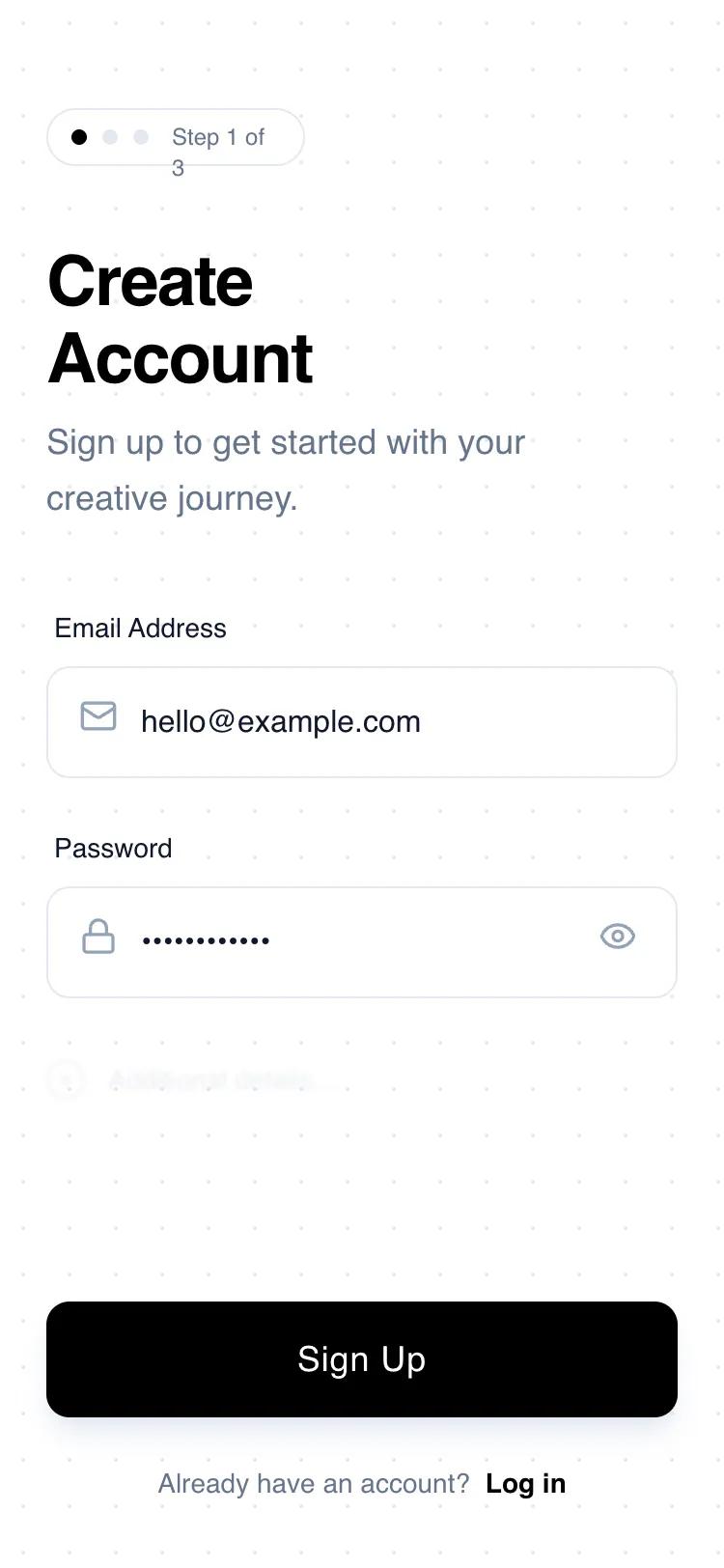 All Prompts
authmobile applayoutsignup
Progressive Sign-Up
Минималистичный UI для регистрации в мобильных приложениях. Использует прогрессивное раскрытие, высокую контрастность и простоту для удобной регистрации.
by Shirley LouLive Preview
Prompt
# Progressive Sign-Up

{
  "summary": "A clean, wireframe-style mobile sign-up screen featuring a progressive step indicator, geometric headlines, and minimalist input fields on a subtle grid background.",
  "style": {
    "description": "The style is defined by a 'digital blueprint' aesthetic. It pairs 'Space Grotesk' for display elements with 'Switzer' for high-readability body text. The color scheme is strictly monochrome: Pure White (#FFFFFF), Deep Black (#000000), and a spectrum of Slate Grays (#0F172A to #E5E7EB). Animations are subtle, focusing on scale-down active states and smooth transitions for focus indicators. A 24px radial-dot grid pattern provides texture without clutter.",
    "prompt": "Create a high-fidelity wireframe UI with a white background featuring a 24px radial-gradient dotted grid (#E5E7EB dots). Use 'Space Grotesk' for headers (font-weight: 600) and 'Switzer' for body/inputs (font-weight: 400, 500). Primary color is #000000; secondary elements use Slate-500 (#64748B). Components must have a border-radius of 12px (rounded-xl). Apply a 'focus-within' state on inputs that changes border color to #000000 and adds a subtle 2px glow. Buttons should include a scale-down effect (0.98) on click and a soft shadow (shadow-slate-200)."
  },
  "layout_and_structure": {
    "description": "A vertical mobile portrait layout consisting of a header with progress tracking, a central form area, and a bottom-pinned primary action and footer.",
    "prompts": [
      {
        "part": "Header Section",
        "prompt": "Top-aligned section starting at 56px from top. Include a 'Step Indicator' pill (white background, Slate-200 border, rounded-full) containing three 8px circles (first is black, others are light gray) and 'Step 1 of 3' text. Below this, place a two-line heading 'Create\\nAccount' in 36px font-size, followed by a light gray descriptive paragraph at 80% maximum width."
      },
      {
        "part": "Form Area",
        "prompt": "Central content area with 40px top padding. Each field group consists of a 14px medium-weight label and a 56px tall input container. Input containers have a 1px border (#E5E7EB) and 12px corner radius. Include Lucide-style icons (Mail, Lock) at 20px size positioned 16px from the left. Add a password visibility toggle icon on the right for password fields."
      },
      {
        "part": "Progressive Disclosure Hint",
        "prompt": "Below the main inputs, add a 'future field' placeholder: a div with 40% opacity and a 1px Gaussian blur. It should feature a 20px hollow circle with a plus icon and the text 'Additional details...' to signify more steps to come."
      },
      {
        "part": "Footer and CTA",
        "prompt": "Position the primary button at the bottom of the scroll view. The button is full-width, 56px tall, solid black with white 18px medium text. Below the button, add a centered footer with 34px bottom padding containing 'Already have an account? Log in' text, where 'Log in' is bold and features a 1px underline-offset-4 decoration."
      }
    ]
  },
  "special_ui_components": [
    {
      "component": "Progressive Step Indicator",
      "description": "A pill-shaped status bar that tracks onboarding progress.",
      "prompt": "Create a pill-shaped container (padding: 6px 12px) with border: 1px solid #E5E7EB. Inside, align three 8px dots horizontally. Dot 1: #000000. Dot 2 & 3: #E5E7EB. Followed by text 'Step 1 of 3' in 12px Space Grotesk, medium weight, color #64748B."
    },
    {
      "component": "Tactile Primary Button",
      "description": "A high-contrast button with depth and interaction feedback.",
      "prompt": "Design a button with background: #000000, color: #FFFFFF, height: 56px, border-radius: 12px. Add box-shadow: 0 10px 15px -3px rgba(229, 231, 235, 0.8). On active/pressed state, apply transform: scale(0.98) and transition: all 150ms cubic-bezier(0.4, 0, 0.2, 1)."
    }
  ],
  "special_notes": "Maintain strict 24px horizontal padding throughout. Do not use vibrant colors; stick to the black/white/slate theme. Ensure all icons have consistent stroke weights. The 'blurred hint' section must be non-interactive but visible enough to suggest the journey continues."
}