All Prompts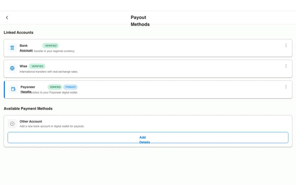 All Prompts
QA Refined Payout Methods - Native Implementation
UI-компонент для управления выплатами в финтех-приложениях. Мобильный дизайн, фокус на доступности и удобстве. Идеально для SaaS, банковских интерфейсов.
by Rahul MeenaLive Preview
Prompt
# QA Refined Payout Methods - Native Implementation

{
  "summary": "A refined, mobile-first design system for payment method management. It uses a clean white-surface architecture on an off-white background, structured with card-based layouts, status chips for verification states, and clear visual hierarchy for primary accounts using accent markers.",
  "style": {
    "description": "A high-fidelity mobile UI style using AvenirNextWorld typography weights (Bold 700, Demi 600, Medium 500, Regular 400). Color palette is anchored by a corporate blue (#0075E1) and balanced by soft status indicators. Shadows mimic React Native Paper Elevation 2 for a subtle lifting effect.",
    "prompt": "Use a background color of rgb(251, 253, 249) and surface color of #FFFFFF. Typography must follow specific weights: Bold (700) for headers, Demi (600) for subtitles, Medium (500) for UI labels, and Regular (400) for descriptions. Key colors: Primary Blue #0075E1, Text-Primary #252526, Text-Muted #6C6C6C, Border #C0C0C0. Borders should be 1px solid #C0C0C0 with a 8px border-radius. Shadows for cards must be '0px 1px 2px rgba(0, 0, 0, 0.12), 0px 1px 1px rgba(0, 0, 0, 0.24)'. Buttons and interactive elements must have a minimum touch target of 44x44px. Status chips use uppercase text with 10px font size and 16px border-radius: Verified (#C8F1DE bg, #004324 text), Primary (#CCE7FA bg, #0075E1 text)."
  },
  "layout_and_structure": {
    "description": "Modular vertical stack designed for mobile viewports, incorporating platform-safe areas and consistent spacing rhythms.",
    "prompts": [
      {
        "part": "Platform-Safe Header",
        "prompt": "Height: 56px plus env(safe-area-inset-top). Background: #FFFFFF. Border-bottom: 1px #E5E5E5. Features a top divider of 0.5px #19182326. Title centered at 20px Bold, #252526. Back action button must be 44x44px on the far left."
      },
      {
        "part": "Section Container",
        "prompt": "Padding-x: 16px. Padding-y: 24px. Gap between sections: 32px. Section titles use 16px Bold, #252526 with a 16px bottom margin."
      },
      {
        "part": "Payment Method Cards",
        "prompt": "Horizontal layout: 40x40px icon container (bg #F4FAFE, radius 8px) on the left, followed by content area, and an absolute-positioned kebab menu (44x44px target) at top-right. For 'Primary' accounts, add a 4px vertical accent bar (#0075E1) on the far-left edge. Text wrapping is mandatory for descriptions (no clipping)."
      },
      {
        "part": "Action Section",
        "prompt": "Cards for adding new items use a light-gray icon container (#F6F6F6). Below the description, include an outlined button: 48px height, 1px border #0075E1, text 14px Demi #0075E1. Include an active state with 10% opacity blue overlay."
      }
    ]
  },
  "special_ui_components": [
    {
      "component": "Status Chip / Pill",
      "description": "Compact indicators for account status or priority.",
      "prompt": "Height: 22px. Radius: 16px. Padding: 4px 12px. Text: 10px, Medium (500), Uppercase, tracking-wider. Success variant: bg #C8F1DE, text #004324. Brand variant: bg #CCE7FA, text #0075E1."
    },
    {
      "component": "Primary Card Accent",
      "description": "A vertical visual marker for the selected or primary payment method.",
      "prompt": "Absolute position at left: 0, top: 0, bottom: 0. Width: 4px. Color: #0075E1. Ensures the card feels highlighted without changing its internal layout structure."
    }
  ]
}