All Prompts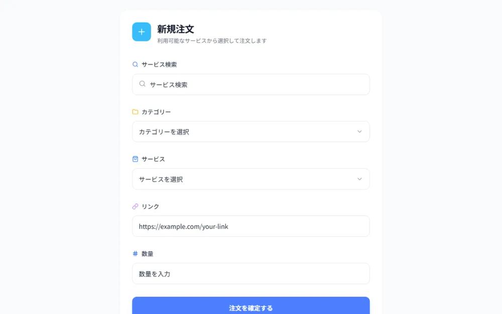 All Prompts
comboboxui componentordermenu
Refined Order Form UI
UI компонент формы заказа: выпадающий список с дизайном, иконками, анимацией. Идеально для выбора опций и ввода данных.
by オッシーKUNLive Preview
Prompt
# Refined Order Form UI

Create a refined combobox/dropdown component matching the provided design style. Features: Clean white background with subtle borders, left-aligned labels with icon badges (emoji/icon style), dropdown triggers with chevron icons on the right, smooth animations. Include states for: text input fields with search icons, category/service selector dropdowns, link input field with URL placeholder. Use consistent spacing, typography, and the same visual style as the reference image. Color scheme: blue accents (#4B7EFC or similar), neutral gray text, clean white inputs. Make it production-ready with smooth interactions.

Here is a reference implementation:
```html
<!DOCTYPE html>
<html lang="ja">
<head>
    <meta charset="UTF-8">
    <meta name="viewport" content="width=device-width, initial-scale=1.0">
    <script src="https://cdn.tailwindcss.com"></script>
    <script src="https://code.iconify.design/iconify-icon/1.0.7/iconify-icon.min.js"></script>
    <link rel="preconnect" href="https://fonts.googleapis.com">
    <link rel="preconnect" href="https://fonts.gstatic.com" crossorigin>
    <link href="https://fonts.googleapis.com/css2?family=Inter:wght@400;500;600&display=swap" rel="stylesheet">
    <style>
        body {
            font-family: 'Inter', -apple-system, BlinkMacSystemFont, sans-serif;
            background-color: #f8fafc;
            color: #1a1a1a;
            -webkit-font-smoothing: antialiased;
        }

        .form-input-shadow {
            box-shadow: 0 1px 2px rgba(0, 0, 0, 0.05);
        }

        .dropdown-menu {
            opacity: 0;
            transform: translateY(-10px) scale(0.98);
            pointer-events: none;
            transition: all 0.2s cubic-bezier(0.16, 1, 0.3, 1);
        }

        .group:focus-within .dropdown-menu {
            opacity: 1;
            transform: translateY(0) scale(1);
            pointer-events: auto;
        }

        .input-ring:focus-within {
            border-color: #4B7EFC;
            box-shadow: 0 0 0 1px #4B7EFC;
        }

        /* Custom scrollbar for dropdowns */
        .custom-scrollbar::-webkit-scrollbar {
            width: 4px;
        }
        .custom-scrollbar::-webkit-scrollbar-track {
            background: transparent;
        }
        .custom-scrollbar::-webkit-scrollbar-thumb {
            background: #e2e8f0;
            border-radius: 10px;
        }
    </style>
</head>
<body>
    <div class="min-h-screen flex items-center justify-center p-6">
        <div class="w-full max-w-2xl bg-white rounded-3xl p-8 shadow-sm border border-gray-100">

            <!-- Header Section -->
            <div class="flex items-start gap-4 mb-10">
                <div class="w-12 h-12 bg-sky-400 rounded-xl flex items-center justify-center flex-shrink-0">
                    <iconify-icon icon="lucide:plus" class="text-white text-2xl font-bold"></iconify-icon>
                </div>
                <div>
                    <h1 class="text-2xl font-bold tracking-tight text-gray-900">新規注文</h1>
                    <p class="text-gray-500 text-sm mt-1">利用可能なサービスから選択して注文します</p>
                </div>
            </div>

            <!-- Form Container -->
            <div class="space-y-8">

                <!-- サービス検索 -->
                <div class="space-y-3">
                    <div class="flex items-center gap-2 text-gray-700 font-medium">
                        <iconify-icon icon="lucide:search" class="text-[#4B7EFC]"></iconify-icon>
                        <label class="text-[15px]">サービス検索</label>
                    </div>
                    <div class="relative input-ring border border-gray-200 rounded-xl transition-all duration-200">
                        <span class="absolute left-4 top-1/2 -translate-y-1/2 text-gray-400">
                            <iconify-icon icon="lucide:search" class="text-lg"></iconify-icon>
                        </span>
                        <input
                            type="text"
                            placeholder="サービス検索"
                            class="w-full py-3.5 pl-11 pr-4 bg-transparent outline-none text-gray-800 placeholder:text-gray-400"
                        >
                    </div>
                </div>

                <!-- カテゴリー (Select Component) -->
                <div class="space-y-3 group relative">
                    <div class="flex items-center gap-2 text-gray-700 font-medium">
                        <iconify-icon icon="lucide:folder" class="text-amber-400"></iconify-icon>
                        <label class="text-[15px]">カテゴリー</label>
                    </div>
                    <button
                        id="category-select-btn"
                        class="w-full flex items-center justify-between py-3.5 px-4 bg-white border border-gray-200 rounded-xl text-left hover:border-gray-300 transition-all duration-200 input-ring"
                    >
                        <span class="text-gray-800">カテゴリーを選択</span>
                        <iconify-icon icon="lucide:chevron-down" class="text-gray-400 text-lg group-focus-within:rotate-180 transition-transform"></iconify-icon>
                    </button>

                    <!-- Dropdown Content (Apple Style) -->
                    <div class="dropdown-menu absolute z-50 w-full mt-2 bg-white/80 backdrop-blur-xl border border-gray-200 rounded-2xl shadow-2xl p-2 custom-scrollbar max-h-60 overflow-y-auto">
                        <div class="px-3 py-2 text-[13px] font-semibold text-gray-400 uppercase tracking-wider">人気カテゴリ</div>
                        <button class="w-full text-left px-3 py-2.5 rounded-lg hover:bg-[#4B7EFC] hover:text-white transition-colors group/item">
                            <div class="flex items-center justify-between">
                                <span>SNSマーケティング</span>
                                <iconify-icon icon="lucide:check" class="hidden group-active/item:block"></iconify-icon>
                            </div>
                        </button>
                        <button class="w-full text-left px-3 py-2.5 rounded-lg hover:bg-[#4B7EFC] hover:text-white transition-colors">
                            コンテンツ制作
                        </button>
                        <button class="w-full text-left px-3 py-2.5 rounded-lg hover:bg-[#4B7EFC] hover:text-white transition-colors">
                            広告運用代行
                        </button>
                        <div class="h-[1px] bg-gray-100 my-1"></div>
                        <button class="w-full text-left px-3 py-2.5 rounded-lg hover:bg-[#4B7EFC] hover:text-white transition-colors">
                            その他
                        </button>
                    </div>
                </div>

                <!-- サービス (Select Component) -->
                <div class="space-y-3">
                    <div class="flex items-center gap-2 text-gray-700 font-medium">
                        <iconify-icon icon="lucide:shopping-bag" class="text-blue-500"></iconify-icon>
                        <label class="text-[15px]">サービス</label>
                    </div>
                    <button
                        id="service-select-btn"
                        class="w-full flex items-center justify-between py-3.5 px-4 bg-white border border-gray-200 rounded-xl text-left hover:border-gray-300 transition-all duration-200 input-ring"
                    >
                        <span class="text-gray-800">サービスを選択</span>
                        <iconify-icon icon="lucide:chevron-down" class="text-gray-400 text-lg"></iconify-icon>
                    </button>
                </div>

                <!-- リンク -->
                <div class="space-y-3">
                    <div class="flex items-center gap-2 text-gray-700 font-medium">
                        <iconify-icon icon="lucide:link" class="text-purple-400"></iconify-icon>
                        <label class="text-[15px]">リンク</label>
                    </div>
                    <div class="input-ring border border-gray-200 rounded-xl transition-all duration-200">
                        <input
                            type="url"
                            placeholder="https://example.com/your-link"
                            class="w-full py-3.5 px-4 bg-transparent outline-none text-gray-800 placeholder:text-gray-300"
                        >
                    </div>
                </div>

                <!-- 数量 -->
                <div class="space-y-3">
                    <div class="flex items-center gap-2 text-gray-700 font-medium">
                        <iconify-icon icon="lucide:hash" class="text-blue-600"></iconify-icon>
                        <label class="text-[15px]">数量</label>
                    </div>
                    <div class="input-ring border border-gray-200 rounded-xl transition-all duration-200">
                        <input
                            type="number"
                            placeholder="数量を入力"
                            class="w-full py-3.5 px-4 bg-transparent outline-none text-gray-800 placeholder:text-gray-300"
                        >
                    </div>
                </div>

                <!-- Submit Button (Added for production feel) -->
                <button
                    id="submit-btn"
                    class="w-full mt-4 bg-[#4B7EFC] hover:bg-[#3b6ee0] text-white font-semibold py-4 rounded-xl shadow-lg shadow-blue-500/20 active:scale-[0.98] transition-all"
                >
                    注文を確定する
                </button>

            </div>
        </div>
    </div>

    <script>
        // Interactive functionality for dropdown buttons to handle focus state toggle
        const selects = document.querySelectorAll('button[id$="-select-btn"]');
        selects.forEach(btn => {
            btn.addEventListener('click', (e) => {
                e.stopPropagation();
                // In a real app, we would manage the visibility state here
                // For this UI mockup, CSS :focus-within handles the visual part
            });
        });
    </script>
</body>
</html>
```