All Prompts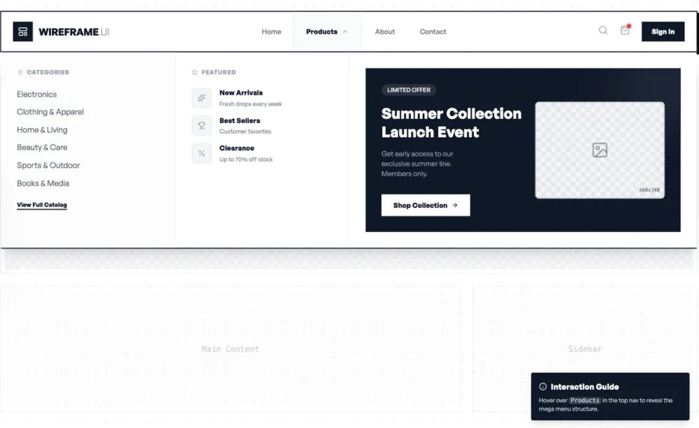 All Prompts
shopifynavigationlayoutecommerce
Responsive Wireframe Mega Menu
Адаптивное мега-меню Wireframe для интернет-магазинов. Сочетает ссылки с визуальными блоками товаров/коллекций для быстрого перехода.
by Shirley LouLive Preview
Prompt
# Responsive Wireframe Mega Menu

Create a responsive wireframe for a mega menu navigation layout with:

- Top navigation bar with logo/brand and menu trigger
- Mega dropdown menu structure showing:
  - Column 1: Categories list (6-8 items with subcategories)
  - Column 2: Featured links section (5-6 items)
  - Column 3: Promo block (promotional banner with image placeholder and CTA)
- Make it fully responsive:
  - Desktop: 3-column layout side by side
  - Tablet: 2-column layout with promo below
  - Mobile: Single column stack with accordion-style categories
- Use wireframe style: gray boxes for content blocks, borders for sections, clean typography
- Show hover/active states for interactive elements
- Include spacing and alignment guides
- Keep it minimalist and functional

Here is a reference implementation:

~~~html
<!DOCTYPE html>
<html lang="en">
<head>
  <meta charset="UTF-8">
  <meta name="viewport" content="width=device-width, initial-scale=1.0">
  <title>Wireframe Mega Menu</title>
  <script src="https://cdn.tailwindcss.com"></script>
  <script src="https://code.iconify.design/iconify-icon/1.0.7/iconify-icon.min.js"></script>
  <link href="https://api.fontshare.com/v2/css?f[]=general-sans@400,500,600,700&display=swap" rel="stylesheet">
  <style>
    body {
      font-family: 'General Sans', sans-serif;
      /* Dot pattern background for wireframe feel */
      background-image: radial-gradient(#e5e7eb 1px, transparent 1px);
      background-size: 20px 20px;
    }

    /* Wireframe-specific utility for image placeholders */
    .wireframe-img {
      background-color: #f3f4f6;
      background-image: linear-gradient(45deg, #e5e7eb 25%, transparent 25%, transparent 75%, #e5e7eb 75%, #e5e7eb),
                        linear-gradient(45deg, #e5e7eb 25%, transparent 25%, transparent 75%, #e5e7eb 75%, #e5e7eb);
      background-size: 20px 20px;
      background-position: 0 0, 10px 10px;
    }

    /* Hide scrollbar for cleaner preview */
    .no-scrollbar::-webkit-scrollbar {
      display: none;
    }
    .no-scrollbar {
      -ms-overflow-style: none;
      scrollbar-width: none;
    }

    /* Mobile interaction logic without JS */
    #mobile-menu-state:checked ~ nav .mobile-menu {
      display: block;
      max-height: 100vh;
      opacity: 1;
    }

    #mobile-submenu-state:checked ~ .mobile-submenu {
      max-height: 1000px;
      opacity: 1;
      margin-top: 1rem;
    }

    #mobile-submenu-state:checked ~ label .arrow-icon {
      transform: rotate(180deg);
    }
  </style>
</head>
<body>
  <div class="min-h-screen flex flex-col items-center pt-10 px-4">

    <!-- Hidden Checkboxes for Mobile State Management -->
    <input type="checkbox" id="mobile-menu-state" class="hidden">

    <!-- Main Navigation Container -->
    <nav class="w-full max-w-[1440px] bg-white border-2 border-gray-900 shadow-[4px_4px_0px_0px_rgba(0,0,0,1)] relative z-50">

      <!-- Top Bar -->
      <div class="h-20 px-6 flex items-center justify-between border-b-0 md:border-b-0">

        <!-- Logo Area -->
        <a href="#" id="brand-logo" class="flex items-center gap-3 group">
          <div class="w-10 h-10 bg-gray-900 flex items-center justify-center text-white">
            <iconify-icon icon="lucide:layout-template" width="20"></iconify-icon>
          </div>
          <span class="text-xl font-bold tracking-tight text-gray-900 group-hover:text-gray-600 transition-colors">WIREFRAME<span class="font-normal text-gray-400">.UI</span></span>
        </a>

        <!-- Desktop Menu Links -->
        <div class="hidden lg:flex items-center h-full">
          <ul class="flex items-center h-full">
            <li class="h-full flex items-center px-6 border-l-2 border-transparent hover:bg-gray-50 transition-colors cursor-pointer">
              <a href="#" id="nav-home" class="text-sm font-medium text-gray-500 hover:text-gray-900">Home</a>
            </li>

            <!-- Mega Menu Trigger -->
            <li class="group h-full flex items-center">
              <button id="nav-products" class="h-full flex items-center gap-2 px-6 border-l-2 border-transparent border-r-2 hover:bg-gray-50 hover:border-gray-100 transition-all cursor-pointer">
                <span class="text-sm font-bold text-gray-900">Products</span>
                <iconify-icon icon="lucide:chevron-down" class="text-gray-400 group-hover:rotate-180 transition-transform duration-300"></iconify-icon>
              </button>

              <!-- Desktop Mega Menu Dropdown -->
              <div class="absolute top-full left-0 w-full bg-white border-t-2 border-b-2 border-gray-900 shadow-xl opacity-0 invisible group-hover:opacity-100 group-hover:visible transition-all duration-200 ease-out transform origin-top">
                <div class="w-full max-w-[1440px] mx-auto">
                  <div class="grid grid-cols-12 divide-x-2 divide-gray-100">

                    <!-- Column 1: Categories (3 cols) -->
                    <div class="col-span-3 p-8 bg-gray-50/50">
                      <div class="flex items-center gap-2 mb-6 text-gray-400 uppercase text-xs font-bold tracking-wider">
                        <iconify-icon icon="lucide:list"></iconify-icon>
                        Categories
                      </div>
                      <ul class="space-y-3">
                        <li><a href="#" id="cat-electronics" class="flex items-center justify-between text-gray-600 hover:text-gray-900 hover:translate-x-1 transition-all group/item">
                          Electronics <iconify-icon icon="lucide:arrow-right" class="opacity-0 group-hover/item:opacity-100 text-xs"></iconify-icon>
                        </a></li>
                        <li><a href="#" id="cat-clothing" class="flex items-center justify-between text-gray-600 hover:text-gray-900 hover:translate-x-1 transition-all group/item">
                          Clothing & Apparel <iconify-icon icon="lucide:arrow-right" class="opacity-0 group-hover/item:opacity-100 text-xs"></iconify-icon>
                        </a></li>
                        <li><a href="#" id="cat-home" class="flex items-center justify-between text-gray-600 hover:text-gray-900 hover:translate-x-1 transition-all group/item">
                          Home & Living <iconify-icon icon="lucide:arrow-right" class="opacity-0 group-hover/item:opacity-100 text-xs"></iconify-icon>
                        </a></li>
                        <li><a href="#" id="cat-beauty" class="flex items-center justify-between text-gray-600 hover:text-gray-900 hover:translate-x-1 transition-all group/item">
                          Beauty & Care <iconify-icon icon="lucide:arrow-right" class="opacity-0 group-hover/item:opacity-100 text-xs"></iconify-icon>
                        </a></li>
                        <li><a href="#" id="cat-sports" class="flex items-center justify-between text-gray-600 hover:text-gray-900 hover:translate-x-1 transition-all group/item">
                          Sports & Outdoor <iconify-icon icon="lucide:arrow-right" class="opacity-0 group-hover/item:opacity-100 text-xs"></iconify-icon>
                        </a></li>
                        <li><a href="#" id="cat-books" class="flex items-center justify-between text-gray-600 hover:text-gray-900 hover:translate-x-1 transition-all group/item">
                          Books & Media <iconify-icon icon="lucide:arrow-right" class="opacity-0 group-hover/item:opacity-100 text-xs"></iconify-icon>
                        </a></li>
                      </ul>
                      <a href="#" id="view-all-cats" class="inline-block mt-6 text-xs font-bold text-gray-900 underline decoration-2 underline-offset-4 hover:text-blue-600">View Full Catalog</a>
                    </div>

                    <!-- Column 2: Featured Links (3 cols) -->
                    <div class="col-span-3 p-8">
                      <div class="flex items-center gap-2 mb-6 text-gray-400 uppercase text-xs font-bold tracking-wider">
                        <iconify-icon icon="lucide:star"></iconify-icon>
                        Featured
                      </div>
                      <ul class="space-y-4">
                        <li>
                          <a href="#" id="feat-new" class="group/card flex items-start gap-4">
                            <div class="w-10 h-10 bg-gray-100 rounded-md border border-gray-200 flex items-center justify-center text-gray-400 group-hover/card:bg-gray-900 group-hover/card:text-white transition-colors">
                              <iconify-icon icon="lucide:sparkles"></iconify-icon>
                            </div>
                            <div>
                              <h4 class="text-sm font-bold text-gray-900 group-hover/card:text-blue-600 transition-colors">New Arrivals</h4>
                              <p class="text-xs text-gray-500 mt-1">Fresh drops every week</p>
                            </div>
                          </a>
                        </li>
                        <li>
                          <a href="#" id="feat-best" class="group/card flex items-start gap-4">
                            <div class="w-10 h-10 bg-gray-100 rounded-md border border-gray-200 flex items-center justify-center text-gray-400 group-hover/card:bg-gray-900 group-hover/card:text-white transition-colors">
                              <iconify-icon icon="lucide:trophy"></iconify-icon>
                            </div>
                            <div>
                              <h4 class="text-sm font-bold text-gray-900 group-hover/card:text-blue-600 transition-colors">Best Sellers</h4>
                              <p class="text-xs text-gray-500 mt-1">Customer favorites</p>
                            </div>
                          </a>
                        </li>
                        <li>
                          <a href="#" id="feat-sale" class="group/card flex items-start gap-4">
                            <div class="w-10 h-10 bg-gray-100 rounded-md border border-gray-200 flex items-center justify-center text-gray-400 group-hover/card:bg-gray-900 group-hover/card:text-white transition-colors">
                              <iconify-icon icon="lucide:percent"></iconify-icon>
                            </div>
                            <div>
                              <h4 class="text-sm font-bold text-gray-900 group-hover/card:text-blue-600 transition-colors">Clearance</h4>
                              <p class="text-xs text-gray-500 mt-1">Up to 70% off stock</p>
                            </div>
                          </a>
                        </li>
                      </ul>
                    </div>

                    <!-- Column 3: Promo Block (6 cols) -->
                    <div class="col-span-6 p-8">
                      <div class="h-full w-full bg-gray-900 text-white p-8 relative overflow-hidden group/promo">
                        <!-- Decorative circle -->
                        <div class="absolute -right-10 -top-10 w-40 h-40 bg-gray-800 rounded-full blur-2xl group-hover/promo:scale-150 transition-transform duration-700"></div>

                        <div class="relative z-10 flex h-full">
                          <div class="flex-1 flex flex-col justify-center">
                            <span class="inline-block px-3 py-1 bg-white/10 backdrop-blur-sm text-xs font-medium rounded-full w-fit mb-4">LIMITED OFFER</span>
                            <h3 class="text-3xl font-bold mb-4 leading-tight">Summer Collection<br>Launch Event</h3>
                            <p class="text-gray-400 text-sm mb-8 max-w-[200px]">Get early access to our exclusive summer line. Members only.</p>
                            <button id="cta-promo" class="w-fit px-6 py-3 bg-white text-gray-900 text-sm font-bold hover:bg-gray-200 transition-colors flex items-center gap-2">
                              Shop Collection
                              <iconify-icon icon="lucide:arrow-right"></iconify-icon>
                            </button>
                          </div>

                          <!-- Wireframe Image Placeholder -->
                          <div class="w-1/2 h-full pl-6 flex items-center justify-center">
                             <div class="w-full aspect-[4/3] wireframe-img border-2 border-dashed border-gray-600/50 rounded-lg flex items-center justify-center relative">
                                <iconify-icon icon="lucide:image" class="text-4xl text-gray-600/50"></iconify-icon>
                                <!-- Size Guide Label -->
                                <div class="absolute bottom-2 right-2 text-[10px] text-gray-500 font-mono">400x300</div>
                             </div>
                          </div>
                        </div>
                      </div>
                    </div>

                  </div>
                </div>
              </div>
            </li>

            <li class="h-full flex items-center px-6 border-l-2 border-transparent hover:bg-gray-50 transition-colors cursor-pointer">
              <a href="#" id="nav-about" class="text-sm font-medium text-gray-500 hover:text-gray-900">About</a>
            </li>
            <li class="h-full flex items-center px-6 border-l-2 border-transparent hover:bg-gray-50 transition-colors cursor-pointer">
              <a href="#" id="nav-contact" class="text-sm font-medium text-gray-500 hover:text-gray-900">Contact</a>
            </li>
          </ul>
        </div>

        <!-- Desktop Utility Icons -->
        <div class="hidden lg:flex items-center gap-6">
          <button id="search-trigger" class="text-gray-400 hover:text-gray-900 transition-colors">
            <iconify-icon icon="lucide:search" width="20"></iconify-icon>
          </button>
          <button id="cart-trigger" class="text-gray-400 hover:text-gray-900 transition-colors relative">
            <iconify-icon icon="lucide:shopping-bag" width="20"></iconify-icon>
            <span class="absolute -top-1 -right-1 w-3 h-3 bg-red-500 rounded-full border border-white"></span>
          </button>
          <a href="#" id="login-btn" class="px-5 py-2.5 bg-gray-900 text-white text-sm font-bold hover:bg-gray-700 transition-colors">
            Sign In
          </a>
        </div>

        <!-- Mobile Menu Toggle -->
        <label for="mobile-menu-state" class="lg:hidden p-2 text-gray-900 cursor-pointer hover:bg-gray-100">
          <iconify-icon icon="lucide:menu" width="24"></iconify-icon>
        </label>
      </div>

      <!-- Mobile Menu (Collapsed by default) -->
      <div class="mobile-menu hidden lg:hidden w-full bg-white border-t-2 border-gray-100 overflow-y-auto max-h-0 transition-all duration-300">
        <div class="p-6 space-y-4">

          <a href="#" class="block py-3 text-lg font-bold text-gray-900 border-b border-gray-100">Home</a>

          <!-- Mobile Accordion -->
          <div class="border-b border-gray-100 pb-2">
            <input type="checkbox" id="mobile-submenu-state" class="hidden">
            <label for="mobile-submenu-state" class="flex items-center justify-between py-3 cursor-pointer group">
              <span class="text-lg font-bold text-gray-900">Products</span>
              <iconify-icon icon="lucide:chevron-down" class="arrow-icon transition-transform duration-300 text-gray-400"></iconify-icon>
            </label>

            <!-- Submenu Content -->
            <div class="mobile-submenu max-h-0 overflow-hidden transition-all duration-500 opacity-0">
              <div class="pl-4 space-y-6">
                <!-- Mobile Categories -->
                <div class="space-y-3">
                  <div class="text-xs font-bold text-gray-400 uppercase tracking-wider mb-2">Categories</div>
                  <a href="#" class="block text-gray-600">Electronics</a>
                  <a href="#" class="block text-gray-600">Clothing & Apparel</a>
                  <a href="#" class="block text-gray-600">Home & Living</a>
                  <a href="#" class="block text-gray-600">Beauty & Care</a>
                  <a href="#" class="block text-gray-600">Sports & Outdoor</a>
                </div>

                <!-- Mobile Featured -->
                <div class="space-y-3">
                  <div class="text-xs font-bold text-gray-400 uppercase tracking-wider mb-2">Featured</div>
                  <a href="#" class="flex items-center gap-3 text-gray-900 font-medium">
                    <iconify-icon icon="lucide:sparkles" class="text-gray-400"></iconify-icon>
                    New Arrivals
                  </a>
                  <a href="#" class="flex items-center gap-3 text-gray-900 font-medium">
                    <iconify-icon icon="lucide:trophy" class="text-gray-400"></iconify-icon>
                    Best Sellers
                  </a>
                </div>

                <!-- Mobile Promo -->
                <div class="bg-gray-100 p-4 rounded-lg mt-4">
                  <div class="aspect-video wireframe-img rounded mb-3 flex items-center justify-center border border-dashed border-gray-300">
                    <iconify-icon icon="lucide:image" class="text-2xl text-gray-400"></iconify-icon>
                  </div>
                  <h4 class="font-bold text-gray-900">Summer Sale</h4>
                  <p class="text-xs text-gray-500 mt-1 mb-3">50% off select items</p>
                  <button class="w-full py-2 bg-gray-900 text-white text-xs font-bold rounded">Shop Now</button>
                </div>
              </div>
            </div>
          </div>

          <a href="#" class="block py-3 text-lg font-bold text-gray-900 border-b border-gray-100">About</a>
          <a href="#" class="block py-3 text-lg font-bold text-gray-900 border-b border-gray-100">Contact</a>

          <div class="pt-4 flex flex-col gap-3">
            <a href="#" class="block w-full py-3 text-center border-2 border-gray-900 text-gray-900 font-bold hover:bg-gray-50">Sign In</a>
            <a href="#" class="block w-full py-3 text-center bg-gray-900 text-white font-bold hover:bg-gray-800">Create Account</a>
          </div>
        </div>
      </div>
    </nav>

    <!-- Page Content Placeholder to show context -->
    <main class="w-full max-w-[1440px] mt-12 grid grid-cols-1 md:grid-cols-12 gap-6 relative z-0 opacity-50">
      <!-- Hero Section Wireframe -->
      <div class="col-span-1 md:col-span-12 h-[400px] bg-white border-2 border-gray-200 p-2">
        <div class="w-full h-full wireframe-img flex items-center justify-center flex-col gap-4 border border-dashed border-gray-300">
          <span class="text-gray-400 font-mono">Hero Banner Area</span>
          <div class="w-20 h-1 bg-gray-300"></div>
        </div>
      </div>

      <!-- Content Blocks -->
      <div class="col-span-1 md:col-span-8 h-64 bg-white border-2 border-gray-200 p-2">
        <div class="w-full h-full bg-gray-50 flex items-center justify-center">
          <span class="text-gray-400 font-mono">Main Content</span>
        </div>
      </div>
      <div class="col-span-1 md:col-span-4 h-64 bg-white border-2 border-gray-200 p-2">
        <div class="w-full h-full bg-gray-50 flex items-center justify-center">
          <span class="text-gray-400 font-mono">Sidebar</span>
        </div>
      </div>
    </main>

    <!-- Instructions Overlay -->
    <div class="fixed bottom-8 right-8 bg-gray-900 text-white p-4 rounded shadow-lg max-w-xs z-40 hidden md:block">
      <h4 class="font-bold flex items-center gap-2">
        <iconify-icon icon="lucide:info"></iconify-icon>
        Interaction Guide
      </h4>
      <p class="text-xs text-gray-300 mt-2">
        Hover over <span class="font-mono bg-gray-700 px-1 rounded">Products</span> in the top nav to reveal the mega menu structure.
      </p>
    </div>

  </div>
</body>
</html>
~~~