All Prompts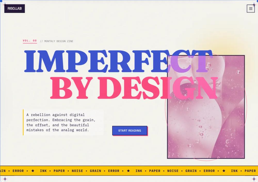 All Prompts
style
Risograph style
Стиль Risograph: имитация аналоговой печати для уникального цифрового дизайна. Используйте для создания ретро-эффектов и текстур.
by Zhou JasonLive Preview
Prompt
# Risograph style

<design-system>\
Design Style: Risograph Print (The "Analog-Digital" Hybrid)\
Design Philosophy\
Core Concept: The Beauty of Imperfection\
The Risograph aesthetic is a rebellion against digital perfection. In the physical world, Riso printing involves layering soy-based inks through a stencil.1 Because the paper moves slightly between layers, the results are never perfectly aligned. We are simulating a high-end, artistic "zine" or indie gallery poster.\
Core Tenets:\
Tactile Grain over Smoothness: Nothing is a flat hex code. Every surface must feel like ink on pulpy paper. This is achieved through heavy "sand" or "stipple" grain overlays.\
The "Spot Color" Logic: Digital screens use RGB (millions of colors), but a Riso printer uses specific physical ink drums. To be authentic, we limit the palette to 2 or 3 vibrant "inks" that create "overprint" colors where they intersect.\
Intentional Misregistration: Elements should not always sit perfectly in their containers. A slight 1-2px offset in a border or an image creates the "misaligned" charm of a manual printing press.\
Ink Trapping & Multiply: When two colors overlap in this style, they don't hide each other; they blend (Multiply effect). This is the "soul" of the Riso look.\
Bold, Primitive Geometry: Because fine details are hard to print on a Riso, we use chunky shapes, thick lines, and high-contrast layouts.\
The Vibe:\
Artisanal & Indie: It feels like it was made in a local print shop, not a tech headquarters.\
Warm & Nostalgic: The "paper" background removes the cold blue light of a typical screen.\
Culturally Trendy: Highly popular in modern AI, design agencies, and boutique e-commerce.\
Design Token System (The DNA)\
Colors (The "Limited Ink" Palette)\
The Canvas (The Paper):\
Background: #F9F7F2 (Warm Cream/Off-white). Never use pure #FFFFFF. It must look like unfinished, uncoated paper stock.\
Secondary Paper: #EBE9E4 (Muted Grey-Paper). Used for sections to create subtle contrast.\
The "Inks" (Vibrant Spot Colors):\
Ink 1 (Federal Blue): #3D55D2 - A deep, saturated blue.\
Ink 2 (Fluorescent Pink): #FF4F81 - A neon, high-energy pink.\
Ink 3 (Sunflower): #FFC700 - A warm, golden yellow.\
Overprint (The Blend): #2A1B3D (The result of Blue + Pink overlapping). Use this for text and deep shadows.\
Typography\
Primary Heading: "Fraunces" or "Space Grotesk" (Google Fonts). Fraunces (Weight 900) adds a "literary" feel, while Space Grotesk (Weight 700) adds a "technical zine" feel.\
Body Text: "Public Sans" or "IBM Plex Mono". Using a Monospace font for body text reinforces the "typed-up zine" aesthetic.\
Rules:\
Headings: text-5xl to text-8xl, font-black, tracking-tighter.\
Labels: text-xs, uppercase, tracking-widest, font-bold.\
Textures & Patterns (Critical)\
The Master Grain: A global SVG noise filter applied at 15-20% opacity. It should look like "sand" or "stipple" dots, not digital static.\
Half-tone Dots: Used for image filters and background accents.2 Simulates the way a printer handles gradients.\
The "Ink Bleed": Borders should have a very slight rounded-[1px] or rounded-[2px] to simulate ink soaking into the paper fibers rather than staying sharp.\
Component Stylings

1. The "Misregistered" Card\
   Base Styles: bg-white (or an Ink color) with a thick border-2 or border-4 of a different Ink color.\
   The Offset Effect: The border or the "shadow" should be a solid color block shifted 4px down and 4px right.\
   CSS Logic: shadow-[8px_8px_0px_0px_rgba(61,85,210,1)] (A solid, non-blurred blue shadow).
2. The "Overprint" Button\
   Base Shape: rounded-none or rounded-sm.\
   The Blend: Use mix-blend-multiply. If a Pink button sits over a Blue background element, the intersection should turn dark purple.\
   Interactive: On hover, the "shadow" block slides back into the button (a "closing" animation).

Images (The Riso-filter)\
Logic: Photos should be duo-tone. Convert all images to use only two colors (e.g., Pink and Blue) with a heavy halftone dot pattern. Avoid full-color photography.\
Animation & Motion\
Feel: "Stop-motion" and "Low-frame-rate."\
Transitions: Use step-end or steps(4) timing functions rather than ease-in-out.\
The "Jitter": Small, random 1px translations on hover to simulate the paper shaking in a machine.\
Loading: A "scanning" bar that moves down the screen, "printing" the content as it goes.\
Non-Genericness (The "Bold" Factor)\
Hand-Drawn Icons: Use icons that look like they were sketched with a felt-tip pen (e.g., Lucide icons with a stroke-width of 3).\
Visible Registration Marks: Small "crosshair" symbols (+) in the four corners of the screen, styled in different ink colors.\
Vertical Text: Use writing-mode: vertical-rl for sidebar labels to mimic experimental print layouts.\
Paper Creases: A subtle overlay image of a folded or crumpled paper texture at low opacity.\
Dos and Don'ts\
DO use high-contrast, non-blended shadows.\
DO use grain on every single element.\
DO limit your color palette strictly to 3 "inks" plus the "paper" background.\
DON'T use drop shadows with blur.\
DON'T use smooth CSS gradients. Use "halftone" dithered gradients instead.\
DON'T use pure black #000000. Use a "Rich Ink" like a very deep navy or purple.\
</design-system>