All Prompts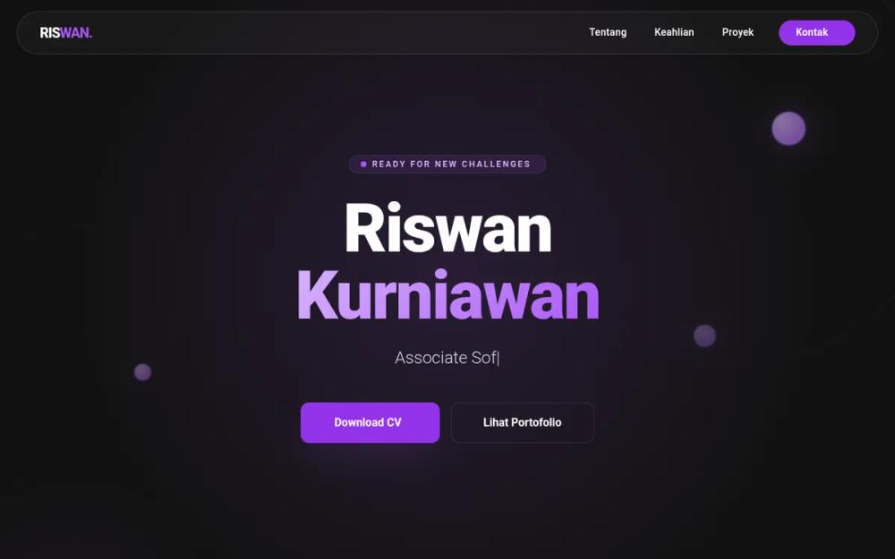 All Prompts
Riswan Kurniawan - Portfolio Modern Corporate
Современный UI-шаблон для корпоративного портфолио. Минимализм, фиолетовая тема, темный режим. Идеален для IT, SaaS, инжиниринга.
by Yuda setiawanLive Preview
Prompt
# Riswan Kurniawan - Portfolio Modern Corporate

{
  "summary": "A sophisticated dark-mode portfolio design that blends corporate professionalism with futuristic 'glassmorphism' and geometric ornaments. The design features a primary monochromatic purple palette against a charcoal backdrop, utilizing bold typography, interactive cards, and smooth micro-interactions to create an engaging developer-centric user experience.",
  "style": {
    "description": "The style is defined by a 'Glassmorphism on Deep Charcoal' theme. Typography pairs Montserrat (Extra Bold/Black) for headlines with Poppins for body text, creating a modern, readable hierarchy. The color palette centers on Purple (#A855F7) and Lavender (#D8B4FE) gradients against a #121212 background. Animations include a typing effect for subtitles, floating 3D spheres with radial gradients, and smooth hover transitions on card borders.",
    "prompt": "Create a modern corporate minimalist UI with a 'Futuristic Purple' theme. \n- **Color Palette**: Background: #121212 (Deep Charcoal); Primary: #A855F7 (Purple); Secondary: #D8B4FE (Light Lavender); Text: #FFFFFF; Accents: rgba(168, 85, 247, 0.2) for glass effects.\n- **Typography**: Headers in 'Montserrat' (Black/900 weight) with tight tracking; Body text in 'Poppins' (Light/Regular, 300-400 weight). Use font-size 8xl for hero titles and 4xl for section headers.\n- **Visual Elements**: \n    - **Glassmorphism**: Cards with `background: rgba(255, 255, 255, 0.03)`, `backdrop-filter: blur(10px)`, and `border: 1px solid rgba(168, 85, 247, 0.2)`.\n    - **Ornaments**: Circular floating spheres using `radial-gradient(circle at 30% 30%, #D8B4FE, #A855F7)` with a soft 40px glow shadow.\n    - **Gradients**: Use text-clipping for `linear-gradient(135deg, #D8B4FE 0%, #A855F7 100%)` on keyword highlights.\n- **Animations**: Implement a floating animation for background spheres (`translateY(-20px)` over 6s), a blinking cursor typing effect for hero subtitles, and `view-transition` API support for page/state changes."
  },
  "layout_and_structure": {
    "description": "The layout is a single-page long-form structure with a sticky pill-shaped navigation. It uses a centered hero section followed by multi-column grids for content, with significant whitespace to maintain a 'minimalist corporate' feel.",
    "prompts": [
      {
        "part": "Navigation Bar",
        "prompt": "A sticky, pill-shaped navigation bar centered at the top. Use a glassmorphism background (`rgba(255,255,255,0.03)`) with a white/10 border. Include a bold brand logo on the left (e.g., 'RISWAN.') and navigation links + a 'Contact' CTA button with a purple background (#9333EA) on the right. Max-width 7xl."
      },
      {
        "part": "Hero Section",
        "prompt": "Full-height centered layout. Top element: A small, pulsing status pill 'Ready for New Challenges'. Center element: A massive two-line headline with Montserrat Black font, the second word using a purple gradient. Below title: A typing animation text area for job roles. Bottom element: Dual CTA buttons - one solid purple with a download icon, one outlined with a hover-fill effect."
      },
      {
        "part": "About Section",
        "prompt": "Two-column grid with a 1:1 ratio. Left side: A stylized avatar or decorative element within a glassmorphism card, featuring background blurs and animated floating dots. Right side: Section title prefixed with a purple slash ('/'), followed by clean body text and two small statistics cards highlighting core philosophies (e.g., 'Clean Architecture')."
      },
      {
        "part": "Technical Skills Grid",
        "prompt": "A 3-column grid of vertical glassmorphism cards. Each card contains: 1. A rounded-square icon container with 20% purple opacity. 2. A bold category title. 3. A list of skills with matching brand icons (using Iconify) and subtle gray-400 text color."
      },
      {
        "part": "Project Cards",
        "prompt": "A 2-column grid of large feature cards. Top half: A placeholder graphic or icon on a #262626 background. Bottom half: Content area with tech-stack pills (pill-shaped, small text, purple border), a project title, a short description, and a 'Case Study' link that changes color on card hover."
      },
      {
        "part": "Contact Footer",
        "prompt": "A large-scale 'Action Card' layout. A centered glassmorphism box with a 3rem border radius. Features a high-impact 'Let's Collaborate' headline, a massive white CTA button, and a row of social media links (LinkedIn, GitHub, Email) with icon-and-text pairs that turn purple on hover. Background should feature large, blurry purple blobs in the corners for depth."
      }
    ]
  },
  "special_ui_components": [
    {
      "component": "Floating 3D Sphere",
      "description": "Animated decorative background elements that give the page depth.",
      "prompt": "Create a div with `border-radius: 50%`, `background: radial-gradient(circle at 30% 30%, #D8B4FE, #A855F7)`. Apply a `box-shadow: 0 0 40px rgba(168, 85, 247, 0.4)` and a keyframe animation that translates Y by -20px and rotates 10deg over a 6s infinite loop."
    },
    {
      "component": "Status Indicator Pill",
      "description": "A micro-component showing availability.",
      "prompt": "A small pill-shaped container with `background: rgba(168, 85, 247, 0.1)`, `border: 1px solid rgba(168, 85, 247, 0.2)`. Inside, include a pulsing dot using two spans: one static purple circle and one `animate-ping` circle for a sonar effect."
    },
    {
      "component": "Glass-Card with Hover Border",
      "description": "The primary container for all sections.",
      "prompt": "Implement a card with `backdrop-filter: blur(10px)` and `background: rgba(255, 255, 255, 0.03)`. On hover, the `border-color` should transition from `rgba(255,255,255,0.1)` to `#A855F7` over 300ms."
    }
  ]
}