All Prompts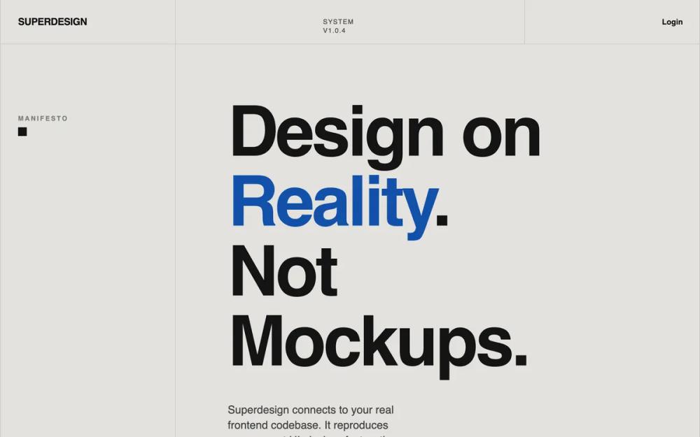 All Prompts
landing pagestylepageblue accentlight mode
SaaS Landing Page for Developer Tool
Дизайн-система для SaaS Landing Page: modernist, cream/cobalt, крупная типографика, 12-колоночная сетка. Идеально для dev-инструментов, агентств.
by Shirley LouLive Preview
Prompt
# SaaS Landing Page for Developer Tool

{
  "summary": "A sophisticated, 'Reality-First' design system that rejects typical SaaS fluff in favor of a structured, modernist, and technical aesthetic. It uses a strict grid, monochromatic base with a single vibrant blue accent, and heavy typographic contrast to establish authority and clarity.",
  "style": {
    "description": "The style is defined by a 'Poster Modernist' approach: high-impact sans-serif typography with negative letter-spacing and compressed leading, a flat color palette without gradients or shadows, and a functional grid system. Typography uses 'Aileron' or 'General Sans' in heavy weights for headings and mono/sans for labels. The color palette centers on a soft cream (#E3E2DE) background, deep black text (#141414), and a high-performance primary blue (#1351AA).",
    "prompt": "### Color Palette\n- **Primary Background**: `#E3E2DE` (Cream)\n- **Primary Accent**: `#1351AA` (Cobalt Blue)\n- **Primary Text**: `#141414` (Jet Black)\n- **Secondary Text**: `#444343` (Deep Gray)\n- **Muted Text/Labels**: `#7A7A7A` (Gray)\n- **Dividers/Borders**: `#C7C7C7` (Light Gray)\n\n### Typography\n- **Font Family**: 'General Sans' or 'Aileron' (Sans-serif)\n- **Hero Headlines**: Font-size: 8rem - 12rem; weight: 900 (Black); line-height: 0.85; letter-spacing: -0.04em; text-transform: uppercase or normal-case with aggressive tracking.\n- **Section Headlines**: Font-size: 5rem - 7rem; weight: 700; line-height: 0.9; letter-spacing: -0.03em.\n- **Body Text**: Font-size: 1.125rem; weight: 400; line-height: 1.5; color: `#444343`.\n- **Labels/UI Elements**: Font-size: 0.75rem; weight: 700; uppercase; letter-spacing: 0.2em; color: `#7A7A7A`.\n\n### Structural Elements\n- **Grid**: Strict 12-column layout. Typically, columns 1-3 are reserved for section labels/metadata, while 4-12 contain the primary content.\n- **Borders**: All sections separated by 1px solid `#C7C7C7` borders. No border-radius (0px corners throughout).\n- **Shadows**: None. Use flat color blocks for depth.\n- **Animations**: Fast, linear transitions (0.3s) for color changes. No 'bouncy' or 'organic' easing."
  },
  "layout_and_structure": {
    "description": "A grid-locked vertical flow where each section is explicitly demarcated by horizontal dividers. The layout utilizes a 'Label Sidebar' pattern where the leftmost 3 columns of a 12-column grid are used for metadata, labels, or navigation hints.",
    "prompts": [
      {
        "part": "Navigation",
        "prompt": "Sticky 80px height bar with a 1px bottom border (#C7C7C7). Background is cream (#E3E2DE) with 95% opacity and backdrop-blur. 12-column grid layout: Columns 1-3 contain the logo (uppercase, bold, tracking-tight). Columns 4-9 are empty or contain status indicators. Columns 10-12 contain right-aligned navigation links (text-sm, font-semibold)."
      },
      {
        "part": "Hero Section",
        "prompt": "Minimum height 85vh. Split into 12 columns. Columns 1-3: Vertical border on right, contains a 'Manifesto' label and a 16px black square icon. Columns 4-12: Massive headline (6xl to 9xl) with tight leading. Use a span to color one key word in Cobalt Blue (#1351AA). Below the headline, use a 2-column internal grid for a 400px wide paragraph and a CTA cluster (one solid blue rectangular button, one underlined text link)."
      },
      {
        "part": "Feature/System Grid",
        "prompt": "Section label 'SYSTEM' in the left sidebar (Cols 1-3). Main content area (Cols 4-12) features a large 3-word headline stacked vertically. Below that, a 3-column equal-width grid. Each cell has 1px borders, a mono-spaced index number (01, 02, 03), a bold h3 title, and a small paragraph. Cells should have a hover state of `white/20` background."
      },
      {
        "part": "Comparison List",
        "prompt": "Section label 'WHY DIFFERENT' in the sidebar. Main content area features a vertical stack of full-width items. Each item is 100px-150px tall, separated by a 1px top border. Items contain a small mono index number and a large (text-5xl) bold title. On hover, the title transitions from black to Cobalt Blue (#1351AA)."
      },
      {
        "part": "Pricing/Access Section",
        "prompt": "Minimum height 50vh. Section label 'ACCESS' in sidebar. Main content area features an 8xl headline 'Start Exploring'. Below, a subheadline with two lines of text. Bottom right contains a large, black rectangular CTA button with high-contrast cream text, padding 20px 40px."
      }
    ]
  },
  "special_ui_components": [
    {
      "component": "Poster Button",
      "description": "A high-contrast, zero-radius rectangular button.",
      "prompt": "Rectangular shape with 0px border-radius. Padding: 16px 32px. Font: 14px, Bold, Uppercase, Tracking-wider. Primary variant: Background #1351AA, Text #E3E2DE. Secondary variant: Background #141414, Text #E3E2DE. Hover state: Transition background color to #141414 over 0.3s."
    },
    {
      "component": "Typographic List Item",
      "description": "Large interactive list items with a sidebar index.",
      "prompt": "A container with 1px border-top and no border-radius. Contains a small '00X' index in mono font (#7A7A7A) and a large header (text-5xl, weight-bold). Interaction: On container hover, the header text color changes to #1351AA. Implementation uses a flex-row with 'items-start'."
    },
    {
      "component": "Grid Sidebar Label",
      "description": "Sticky section labels used to navigate the grid.",
      "prompt": "Positioned in a column 3 units wide. Text is 12px, font-bold, color #7A7A7A, uppercase, tracking-0.2em. The label should be 'sticky' with a top-32 spacing so it remains visible while scrolling through the section's content."
    }
  ]
}