All Prompts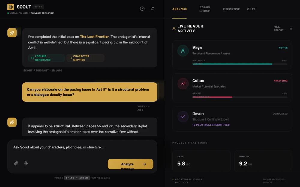 All Prompts
Scout AI - Refined Interface
Премиальный UI интерфейс ИИ в темной теме. Сочетает аналитику и типографику для креативных инструментов, финтеха, SaaS.
by AJ HartLive Preview
Prompt
# Scout AI - Refined Interface

{
  "summary": "A high-end, data-driven AI analysis dashboard featuring a split-screen layout. The left side serves as a focused chat interface for human-AI interaction, while the right side displays live activity metrics and specialist panels. The design aesthetic is 'Analytical Luxury', combining deep obsidian backgrounds with metallic gold accents and precise metadata labels.",
  "style": {
    "description": "The style is centered on 'Premium Obsidian'. It pairs Cabinet Grotesk for bold, authoritative headings and Satoshi for legible, clean body text. The primary color is a rich gold (#D4A84B), often applied via gradients or as a highlight against a deep black (#09090B) background. Layouts are strictly aligned with generous padding (px-8) and subtle dividers (rgba(255, 255, 255, 0.08)) to maintain structural clarity.",
    "prompt": "Create a dark-themed UI using a base background of #09090B. Typography: Use 'Cabinet Grotesk' for headers (font-weight: 700-800) and 'Satoshi' for body/UI text (weights: 400, 500, 700). Colors: Primary Gold #D4A84B, Secondary Dark #0C0C0E, Success Emerald #10B981, and Warning Rose #FB7185. Gradient: 'gold-gradient' is linear-gradient(135deg, #D4A84B 0%, #B88A2D 100%). Border-radius: Use 2xl (16px) for message bubbles and 24px for input containers. Animations: Use a 1.5s pulse for active indicators and 0.2s cubic-bezier for hover states. Micro-metadata: All labels should be uppercase, tracking-widest, font-bold, with font-size: 9px to 11px."
  },
  "layout_and_structure": {
    "description": "A two-panel horizontal layout. The left panel (55% width) handles the conversational flow and user input. The right panel (45% width) acts as a persistent dashboard for context and analytics.",
    "prompts": [
      {
        "part": "Header",
        "prompt": "Height 80px, background #09090B at 80% opacity with backdrop-blur-md. Border-bottom: 1px solid rgba(255,255,255,0.05). Left side: Logo with a 28x28 gold icon box, title in Cabinet Grotesk, and a version tag in a small box (font-size: 9px, uppercase). Subtitle shows active status with an emerald pulse dot."
      },
      {
        "part": "Chat Area",
        "prompt": "Scrollable area with px-8 padding and 40px vertical spacing between messages. Scout messages use a #18181B background bubble with a subtle 1px border. User messages are right-aligned using a solid #D4A84B background with black text. Include timestamps in uppercase 10px bold text below each message."
      },
      {
        "part": "Input Area",
        "prompt": "Floating at the bottom with a max-width of 896px. The container uses background #141417, 24px border-radius, and a soft 2xl shadow. Includes a 2-row textarea for input and a bottom toolbar with attachment/mic icons on the left and a 'gold-gradient' button (height: 44px, px-7) on the right labeled 'Analyze Message'."
      },
      {
        "part": "Activity Panel",
        "prompt": "Background #0C0C0E with a left border divider. Top navigation consists of 80px high horizontal tabs with uppercase text; the active tab has a 2px bottom gold border. Content area displays reader cards (vertical stack) and a 'Project Vital Signs' grid (2x2 layout)."
      }
    ]
  },
  "special_ui_components": [
    {
      "component": "Analysis Metric Card",
      "description": "A dark card for displaying specific data points within a chat message.",
      "prompt": "Background: rgba(0,0,0,0.4); Border: 1px solid rgba(255,255,255,0.05); Padding: 20px; Border-radius: 12px. Features a top row with uppercase header and activity icon, and a 2-column grid below for metrics (label + large bold value)."
    },
    {
      "component": "Reader Specialist Card",
      "description": "Interactive participant profile card used in the activity dashboard.",
      "prompt": "Background: rgba(24,24,27,0.3); Border: 1px solid rgba(255,255,255,0.05). Hover state: border-zinc-700. Contains a 48x48 circular avatar with a colored glow, a name/status row, and a progress bar at the bottom with a 4px height and colored fill matching the avatar's theme (e.g., teal, rose, purple)."
    }
  ],
  "special_notes": "MUST: Maintain the hierarchy of metadata—always use uppercase with high tracking for labels. MUST: Use the gold gradient only for primary actions and brand identifiers. MUST NOT: Use standard scrollbars; use a 4px width custom scrollbar with a #27272A thumb. MUST: Use semantic colors (emerald/rose) only for data-driven feedback within analysis modules."
}