All Prompts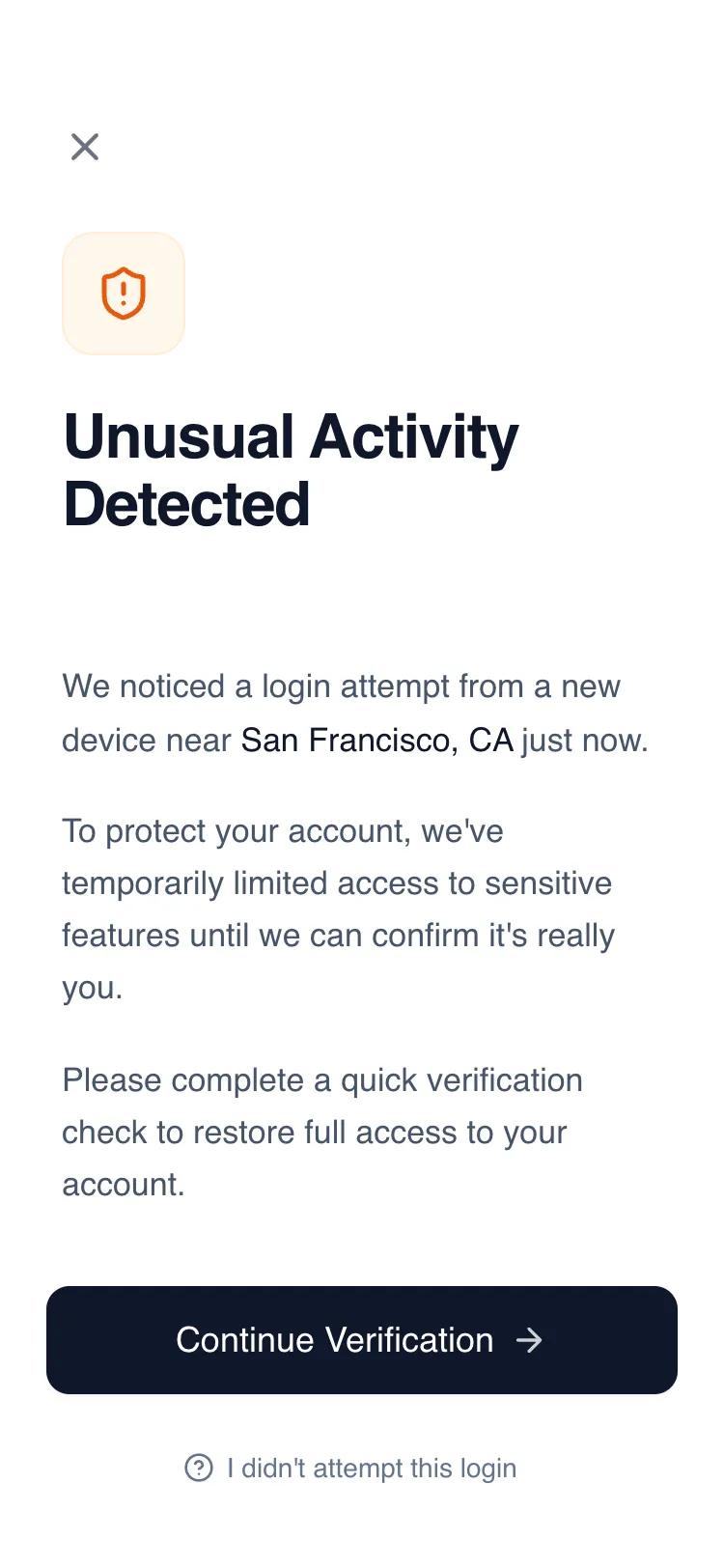 All Prompts
mobile appauthlayout
Security Verification Screen
Экран верификации безопасности для мобильных приложений. Чистый дизайн для аутентификации, защиты аккаунта, подтверждения личности в финтехе и банках.
by Shirley LouLive Preview
Prompt
# Security Verification Screen

{
  "summary": "A minimalist, high-trust security alert screen for mobile, using a focused vertical layout, sophisticated typography, and a single accent color to communicate urgency without panic.",
  "style": {
    "description": "The style is defined by its clean, professional, and serious tone. It uses 'General Sans' for typography with high-contrast font weights (Medium 500 to Semibold 600). The color palette is dominated by Slate-900 (#0F172A) and White (#FFFFFF), with a soft Orange accent (#EA580C) for warnings. UI elements feature large border radii (12px-16px) and subtle interactions like scale-down on click.",
    "prompt": "Create a design following a professional security aesthetic. Typography: Use 'General Sans'; Headings should be text-slate-900, 32px, font-semibold, leading-1.1; Body text should be text-slate-600, 17px, font-medium, leading-1.6. Palette: Primary Action #0F172A (Slate-900), Warning Accent #EA580C (Orange-600) with a light background #FFF7ED (Orange-50). Border Radii: 12px for buttons, 16px for icon containers. Buttons: Primary should be 56px height, text-white, with a hover scale interaction of 0.98. Spacing: 32px horizontal padding for content, 24px vertical spacing between paragraphs. Icons: Use Lucide-style line icons with 2px stroke width."
  },
  "layout_and_structure": {
    "description": "A vertical flex layout optimized for mobile screens (375px+). It consists of a utility header, a scrollable central content area, and a fixed/sticky footer with a background gradient blend.",
    "prompts": [
      {
        "part": "Header",
        "prompt": "Positioned at the top with pt-14 (approx 56px) top padding. Contains a single 40px square 'Close' or 'Back' button on the left, using an icon-only approach (Lucide:x) with a text-gray-500 color and 100% border-radius for the hover state."
      },
      {
        "part": "Visual Identity Section",
        "prompt": "Located at the top of the main content area with a mb-10 (40px) margin. Features a 64px x 64px container with a 16px border-radius (bg-orange-50, border-orange-100). Inside, a 30px Orange-600 icon (shield-alert) represents the status. Below this is the main H1 heading, 'Unusual Activity Detected', with 32px font size and tracking-tight."
      },
      {
        "part": "Content Body",
        "prompt": "Text-heavy section using 17px text-slate-600. Paragraphs are separated by 20px (space-y-5). Use inline font-weight variations to highlight specific data (e.g., location or device name) in text-slate-900."
      },
      {
        "part": "Footer Actions",
        "prompt": "A fixed bottom area with 34px bottom padding. It uses a gradient transition from transparent to solid white at the top to ensure readability over scrolling content. Includes a full-width 56px height primary button (Continue) and a secondary text link (Help) with an icon prefix, centered below the button with a 20px top margin."
      }
    ]
  },
  "special_ui_components": [
    {
      "component": "Security Icon Badge",
      "description": "A layered icon container for status indicators.",
      "prompt": "Create a 64px square container with a bg-color of #FFF7ED (Orange-50) and a 1px border of #FFEDD5 (Orange-100). Set border-radius to 16px. Center a 30px Lucide-style icon in color #EA580C inside."
    },
    {
      "component": "Gradient Mask Footer",
      "description": "A sticky footer that blends into the page content.",
      "prompt": "Design a footer container with a background gradient starting from transparent at the top to #FFFFFF at 30% height. Add a primary button with height: 56px, background: #0F172A, border-radius: 12px, font-size: 18px. Add a :active { transform: scale(0.98); } transition."
    }
  ],
  "special_notes": "MUST use 'General Sans' or a similar geometric sans-serif for the trust-based look. MUST ensure the primary button has a subtle shadow-sm. DO NOT use aggressive red colors; stick to the calculated orange tones to maintain a serious but calm tone. MUST maintain exactly 32px (px-8) side padding for the content text while the footer can use slightly tighter 24px (px-6) padding."
}