All Prompts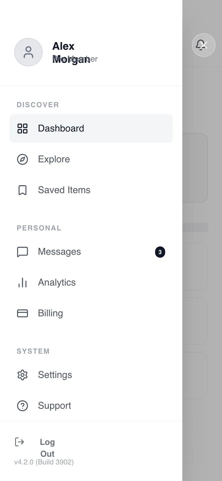 All Prompts
mobile appnavigationlayout
Side drawer navigation
Боковая навигационная панель для мобильных приложений. Скрывает меню, сохраняя чистоту основного экрана. Идеальна для сложных интерфейсов.
by Shirley LouLive Preview
Prompt
# Side drawer navigation

Here is a reference implementation:

~~~html
<!DOCTYPE html>
<html lang="en">
<head>
  <meta charset="UTF-8">
  <meta name="viewport" content="width=device-width, initial-scale=1.0">
  <title>Wireframe Navigation Drawer</title>
  <script src="https://cdn.tailwindcss.com"></script>
  <script src="https://code.iconify.design/iconify-icon/1.0.7/iconify-icon.min.js"></script>
  <link href="https://fonts.googleapis.com/css2?family=Manrope:wght@300;400;500;600;700&display=swap" rel="stylesheet">
  <style>
    body {
      font-family: 'Manrope', sans-serif;
      -webkit-font-smoothing: antialiased;
    }
    /* Hide scrollbar for cleaner UI */
    .no-scrollbar::-webkit-scrollbar {
      display: none;
    }
    .no-scrollbar {
      -ms-overflow-style: none;
      scrollbar-width: none;
    }
  </style>
</head>
<body>
  <!-- ROOT CONTAINER: Mobile Screen (375x812) -->
  <div class="w-full h-screen bg-white text-gray-900 overflow-hidden relative flex flex-col">

    <!-- BACKGROUND LAYER (The "Closed State" Content) -->
    <div class="flex-1 flex flex-col w-full h-full transform transition-transform duration-300">

      <!-- Header -->
      <header class="shrink-0 pt-14 px-6 pb-4 flex items-center justify-between border-b border-gray-100">
        <button id="btn-open-menu" class="w-10 h-10 -ml-2 flex items-center justify-center rounded-full hover:bg-gray-100 text-gray-900 transition-colors">
          <iconify-icon icon="lucide:menu" class="text-2xl"></iconify-icon>
        </button>
        <span class="text-base font-semibold tracking-tight text-gray-900">Dashboard</span>
        <button id="btn-notifications" class="w-10 h-10 -mr-2 flex items-center justify-center rounded-full hover:bg-gray-100 text-gray-900 transition-colors">
          <iconify-icon icon="lucide:bell" class="text-xl"></iconify-icon>
        </button>
      </header>

      <!-- Main Content (Simulated Feed) -->
      <main class="flex-1 overflow-y-auto px-6 pt-6 pb-[34px] space-y-8 no-scrollbar">
        <!-- Welcome Section -->
        <div class="space-y-2">
          <div class="h-8 w-2/3 bg-gray-200 rounded-md animate-pulse"></div>
          <div class="h-4 w-1/2 bg-gray-100 rounded-md"></div>
        </div>

        <!-- Stats Grid (Wireframe) -->
        <div class="grid grid-cols-2 gap-4">
          <div class="aspect-[4/3] bg-gray-50 border border-gray-200 rounded-xl p-4 flex flex-col justify-between">
            <div class="w-8 h-8 rounded-full bg-gray-200"></div>
            <div class="space-y-2">
              <div class="h-6 w-12 bg-gray-300 rounded"></div>
              <div class="h-3 w-16 bg-gray-200 rounded"></div>
            </div>
          </div>
        </div>

        <!-- Recent List (Wireframe) -->
        <div class="space-y-4">
          <div class="flex items-center justify-between">
            <div class="h-5 w-24 bg-gray-200 rounded"></div>
            <div class="h-4 w-12 bg-gray-100 rounded"></div>
          </div>
          <!-- List Items -->
          <div class="space-y-3">
            <div class="h-20 w-full border border-gray-100 rounded-xl p-3 flex items-center gap-4">
              <div class="w-14 h-14 bg-gray-100 rounded-lg shrink-0"></div>
              <div class="flex-1 space-y-2">
                <div class="h-4 w-3/4 bg-gray-200 rounded"></div>
                <div class="h-3 w-1/2 bg-gray-100 rounded"></div>
              </div>
            </div>
            <div class="h-20 w-full border border-gray-100 rounded-xl p-3 flex items-center gap-4">
              <div class="w-14 h-14 bg-gray-100 rounded-lg shrink-0"></div>
              <div class="flex-1 space-y-2">
                <div class="h-4 w-2/3 bg-gray-200 rounded"></div>
                <div class="h-3 w-1/2 bg-gray-100 rounded"></div>
              </div>
            </div>
            <div class="h-20 w-full border border-gray-100 rounded-xl p-3 flex items-center gap-4">
              <div class="w-14 h-14 bg-gray-100 rounded-lg shrink-0"></div>
              <div class="flex-1 space-y-2">
                <div class="h-4 w-3/4 bg-gray-200 rounded"></div>
                <div class="h-3 w-1/3 bg-gray-100 rounded"></div>
              </div>
            </div>
          </div>
        </div>
      </main>
    </div>

    <!-- FOREGROUND LAYER: Navigation Drawer System -->
    <!-- Initially hidden: pointer-events-none + opacity/transform states -->
    <div id="drawer-overlay" class="absolute inset-0 z-50 flex overflow-hidden pointer-events-none">

      <!-- Backdrop (Tap outside to dismiss) -->
      <!-- Initial State: opacity-0 -->
      <div id="drawer-backdrop" class="absolute inset-0 bg-black/30 backdrop-blur-[2px] opacity-0 transition-opacity duration-300" aria-hidden="true"></div>

      <!-- Side Drawer Panel -->
      <!-- Initial State: -translate-x-full -->
      <div id="drawer-panel" class="relative w-[82%] max-w-[320px] bg-white h-full shadow-2xl flex flex-col -translate-x-full transform transition-transform duration-300 ease-out">

        <!-- Drawer Header: User Profile -->
        <div class="shrink-0 pt-16 pb-8 px-6 border-b border-gray-100">
          <div class="flex items-center gap-4">
            <div class="w-12 h-12 rounded-full bg-gray-200 flex items-center justify-center text-gray-500 overflow-hidden border border-gray-300">
              <iconify-icon icon="lucide:user" class="text-2xl"></iconify-icon>
            </div>
            <div class="flex flex-col">
              <span class="font-bold text-gray-900 text-lg leading-tight">Alex Morgan</span>
              <span class="text-sm text-gray-500">Pro Member</span>
            </div>
          </div>
        </div>

        <!-- Scrollable Navigation Content -->
        <nav class="flex-1 overflow-y-auto px-4 py-6 space-y-8 no-scrollbar" id="drawer-nav-content">

          <!-- Group 1: Main -->
          <div class="space-y-1">
            <p class="px-3 text-xs font-bold text-gray-400 uppercase tracking-widest mb-2">Discover</p>
            <a href="#" id="nav-link-dashboard" class="nav-item flex items-center gap-4 px-3 py-3 rounded-lg bg-gray-100 text-gray-900 font-medium">
              <iconify-icon icon="lucide:layout-grid" class="text-xl"></iconify-icon>
              <span>Dashboard</span>
            </a>
            <a href="#" id="nav-link-explore" class="nav-item flex items-center gap-4 px-3 py-3 rounded-lg text-gray-600 hover:bg-gray-50 hover:text-gray-900 transition-colors font-medium">
              <iconify-icon icon="lucide:compass" class="text-xl"></iconify-icon>
              <span>Explore</span>
            </a>
            <a href="#" id="nav-link-saved" class="nav-item flex items-center gap-4 px-3 py-3 rounded-lg text-gray-600 hover:bg-gray-50 hover:text-gray-900 transition-colors font-medium">
              <iconify-icon icon="lucide:bookmark" class="text-xl"></iconify-icon>
              <span>Saved Items</span>
            </a>
          </div>

          <!-- Group 2: Account -->
          <div class="space-y-1">
            <p class="px-3 text-xs font-bold text-gray-400 uppercase tracking-widest mb-2">Personal</p>
            <a href="#" id="nav-link-messages" class="nav-item flex items-center gap-4 px-3 py-3 rounded-lg text-gray-600 hover:bg-gray-50 hover:text-gray-900 transition-colors font-medium">
              <iconify-icon icon="lucide:message-square" class="text-xl"></iconify-icon>
              <span>Messages</span>
              <span class="ml-auto bg-gray-900 text-white text-[10px] font-bold px-1.5 py-0.5 rounded-full">3</span>
            </a>
            <a href="#" id="nav-link-analytics" class="nav-item flex items-center gap-4 px-3 py-3 rounded-lg text-gray-600 hover:bg-gray-50 hover:text-gray-900 transition-colors font-medium">
              <iconify-icon icon="lucide:bar-chart-2" class="text-xl"></iconify-icon>
              <span>Analytics</span>
            </a>
            <a href="#" id="nav-link-billing" class="nav-item flex items-center gap-4 px-3 py-3 rounded-lg text-gray-600 hover:bg-gray-50 hover:text-gray-900 transition-colors font-medium">
              <iconify-icon icon="lucide:credit-card" class="text-xl"></iconify-icon>
              <span>Billing</span>
            </a>
          </div>

          <!-- Group 3: App -->
          <div class="space-y-1">
            <p class="px-3 text-xs font-bold text-gray-400 uppercase tracking-widest mb-2">System</p>
            <a href="#" id="nav-link-settings" class="nav-item flex items-center gap-4 px-3 py-3 rounded-lg text-gray-600 hover:bg-gray-50 hover:text-gray-900 transition-colors font-medium">
              <iconify-icon icon="lucide:settings" class="text-xl"></iconify-icon>
              <span>Settings</span>
            </a>
            <a href="#" id="nav-link-support" class="nav-item flex items-center gap-4 px-3 py-3 rounded-lg text-gray-600 hover:bg-gray-50 hover:text-gray-900 transition-colors font-medium">
              <iconify-icon icon="lucide:help-circle" class="text-xl"></iconify-icon>
              <span>Support</span>
            </a>
          </div>

        </nav>

        <!-- Drawer Footer -->
        <div class="shrink-0 p-6 border-t border-gray-100">
          <button id="btn-logout" class="nav-item flex items-center gap-3 text-gray-500 hover:text-gray-900 transition-colors text-sm font-semibold w-full">
            <iconify-icon icon="lucide:log-out" class="text-lg"></iconify-icon>
            <span>Log Out</span>
          </button>
          <p class="mt-4 text-xs text-gray-400 font-medium">v4.2.0 (Build 3902)</p>
        </div>

      </div>

      <!-- Close Button Area (Visual cue + dismiss zone) -->
      <!-- Initial State: opacity-0 -->
      <div id="drawer-close-area" class="flex-1 h-full relative opacity-0 transition-opacity duration-300 cursor-pointer">
        <button id="btn-close-drawer" class="absolute top-14 left-4 w-10 h-10 rounded-full bg-white/20 backdrop-blur-md flex items-center justify-center text-white border border-white/30 hover:bg-white/30 transition-colors">
           <iconify-icon icon="lucide:x" class="text-xl"></iconify-icon>
        </button>
      </div>

    </div>

  </div>

  <script>
    // Interactive Logic for Navigation Drawer
    document.addEventListener('DOMContentLoaded', () => {
      const openBtn = document.getElementById('btn-open-menu');
      const closeBtn = document.getElementById('btn-close-drawer');
      const overlay = document.getElementById('drawer-overlay');
      const backdrop = document.getElementById('drawer-backdrop');
      const panel = document.getElementById('drawer-panel');
      const closeArea = document.getElementById('drawer-close-area');
      const navItems = document.querySelectorAll('.nav-item');

      // Open Drawer
      function openDrawer() {
        // Enable pointer events on the overlay container
        overlay.classList.remove('pointer-events-none');

        // Fade in backdrop and close area
        backdrop.classList.remove('opacity-0');
        closeArea.classList.remove('opacity-0');

        // Slide in panel
        panel.classList.remove('-translate-x-full');
      }

      // Close Drawer
      function closeDrawer() {
        // Disable pointer events after transition (delay managed by CSS transition, but logic implies immediate toggle of state classes)
        // We keep pointer-events-none off until fully closed? No, immediate prevention is better for UX to avoid stray clicks.
        // Actually, let's delay the pointer-events-none to allow animation if needed, but for "pointer-events-none" it's safe to apply immediately to stop interaction,
        // but that might kill the close button click if we are not careful?
        // No, the close button is inside the overlay. If we add pointer-events-none to overlay, the close button stops working immediately?
        // Yes. So we should rely on the visual transition, and toggle pointer-events-none only after animation completes,
        // OR just toggle the state and let the user wait.
        // BETTER: Toggle the visual states immediately. The pointer-events-none should be applied *after* the transition to avoid cutting off the click event?
        // Actually, if I add pointer-events-none, it applies to children unless they override.
        // Let's use a timeout for the clean up of pointer-events, or just let it stay interactive until it fades out?
        // Simplest: Toggle state classes. Use 'pointer-events-none' to control whether the overlay blocks the main content.

        backdrop.classList.add('opacity-0');
        closeArea.classList.add('opacity-0');
        panel.classList.add('-translate-x-full');

        // Wait for transition (300ms) before hiding interaction
        setTimeout(() => {
          overlay.classList.add('pointer-events-none');
        }, 300);
      }

      // Event Listeners
      openBtn.addEventListener('click', openDrawer);
      closeBtn.addEventListener('click', (e) => {
        e.stopPropagation(); // Prevent triggering other clicks
        closeDrawer();
      });
      backdrop.addEventListener('click', closeDrawer);

      // Close when clicking the empty area around the close button
      closeArea.addEventListener('click', (e) => {
        if (e.target === closeArea) {
          closeDrawer();
        }
      });

      // Close when clicking any navigation item
      navItems.forEach(item => {
        item.addEventListener('click', closeDrawer);
      });
    });
  </script>
</body>
</html>
~~~