All Prompts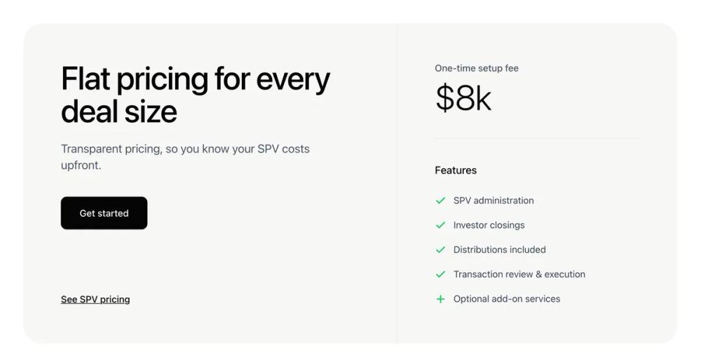 All Prompts
ui componentpricinglanding page
Single Pricing
Компонент UI: раздел цен с двумя колонками, акцентом на фиксированную плату и списком функций. Идеален для лендингов.
by Zhou JasonLive Preview
Prompt
# Single Pricing

You are given a task to integrate an existing React component in the codebase

~~~/README.md
# PricingSection

A clean, minimalist pricing section component that features a flat pricing model with a list of features. Designed to replicate the AngelList SPV pricing aesthetic.

## Features

- **Split Layout**: Clear separation between value proposition and pricing details.
- **Responsive Design**: Stacks vertically on mobile, side-by-side on desktop.
- **Customizable**: Props for all text content, pricing, and features.
- **Clean Aesthetic**: Uses a specific light gray background (#F7F7F6) and crisp typography.

## Usage

```tsx
import { PricingSection } from '@/sd-components/6f77fca3-aa4d-4c79-902d-b929bdf19d76';

function MyPage() {
  return (
    <PricingSection
      heading="Simple Pricing"
      price="$10k"
      onGetStarted={() => console.log('Clicked')}
    />
  );
}
```

## Props

| Prop | Type | Default | Description |
|------|------|---------|-------------|
| heading | string | "Flat pricing..." | Main headline text |
| subheading | string | "Transparent pricing..." | Subtitle text below headline |
| price | string | "$8k" | The large price display |
| feeLabel | string | "One-time setup fee" | Label above the price |
| features | PricingFeature[] | (default list) | List of features to display |
| onGetStarted | () => void | - | Callback for the primary button |
| onSeePricing | () => void | - | Callback for the secondary link |

## Types

```ts
interface PricingFeature {
  label: string;
  included: boolean;
  isAddOn?: boolean; // Renders a Plus icon instead of Check
}
```
~~~

~~~/src/App.tsx
import React from 'react';
import { PricingSection } from './Component';

export default function App() {
  return (
    <div className="min-h-screen bg-white flex items-center justify-center p-4">
      <PricingSection />
    </div>
  );
}
~~~

~~~/package.json
{
  "name": "pricing-section",
  "version": "1.0.0",
  "description": "A minimalist, two-column pricing section component",
  "dependencies": {
    "react": "^18.2.0",
    "react-dom": "^18.2.0",
    "lucide-react": "^0.294.0",
    "clsx": "^2.0.0",
    "tailwind-merge": "^2.1.0"
  }
}
~~~

~~~/src/utils.ts
import { type ClassValue, clsx } from "clsx";
import { twMerge } from "tailwind-merge";

export function cn(...inputs: ClassValue[]) {
  return twMerge(clsx(inputs));
}
~~~

~~~/src/Component.tsx
import React from 'react';
import { Check, Plus } from 'lucide-react';
import { cn } from './utils';

interface PricingFeature {
  label: string;
  included: boolean;
  isAddOn?: boolean;
}

interface PricingSectionProps {
  className?: string;
  heading?: string;
  subheading?: string;
  price?: string;
  feeLabel?: string;
  features?: PricingFeature[];
  onGetStarted?: () => void;
  onSeePricing?: () => void;
}

const defaultFeatures: PricingFeature[] = [
  { label: 'SPV administration', included: true },
  { label: 'Investor closings', included: true },
  { label: 'Distributions included', included: true },
  { label: 'Transaction review & execution', included: true },
  { label: 'Optional add-on services', included: true, isAddOn: true },
];

export function PricingSection({
  className,
  heading = "Flat pricing for every deal size",
  subheading = "Transparent pricing, so you know your SPV costs upfront.",
  price = "$8k",
  feeLabel = "One-time setup fee",
  features = defaultFeatures,
  onGetStarted = () => console.log('Get started clicked'),
  onSeePricing = () => console.log('See pricing clicked'),
}: PricingSectionProps) {
  return (
    <div className={cn("w-full max-w-[1200px] mx-auto p-4 md:p-6", className)}>
      <div className="flex flex-col lg:flex-row bg-[#F7F7F6] rounded-[32px] overflow-hidden min-h-[500px]">
        {/* Left Section - Hero & CTA */}
        <div className="flex-1 p-8 md:p-12 lg:p-16 flex flex-col justify-between">
          <div className="space-y-6">
            <h2 className="text-4xl md:text-5xl lg:text-[56px] leading-[1.1] font-medium tracking-tight text-[#050505]">
              {heading}
            </h2>
            <p className="text-lg md:text-xl text-[#4B5563] font-normal max-w-md">
              {subheading}
            </p>
            <div className="pt-4">
              <button
                onClick={onGetStarted}
                className="bg-[#050505] text-white px-8 py-4 rounded-lg font-medium text-base hover:bg-black/90 transition-all duration-200 shadow-sm"
              >
                Get started
              </button>
            </div>
          </div>

          <div className="mt-12 lg:mt-0">
            <button
              onClick={onSeePricing}
              className="text-[#050505] font-medium text-base underline underline-offset-4 decoration-1 hover:decoration-2 transition-all"
            >
              See SPV pricing
            </button>
          </div>
        </div>

        {/* Right Section - Pricing Details */}
        <div className="flex-1 lg:max-w-[480px] lg:border-l border-gray-200/60 p-8 md:p-12 lg:p-16 flex flex-col">
          <div className="space-y-2">
            <span className="text-[#4B5563] text-base font-medium block">
              {feeLabel}
            </span>
            <div className="text-5xl md:text-6xl font-light tracking-tight text-[#050505]">
              {price}
            </div>
          </div>

          <div className="h-px bg-gray-200 w-full my-10" />

          <div className="space-y-6">
            <h3 className="text-[#050505] font-medium text-lg">Features</h3>
            <ul className="space-y-4">
              {features.map((feature, index) => (
                <li key={index} className="flex items-start gap-3">
                  <div className="mt-1 shrink-0">
                    {feature.isAddOn ? (
                      <Plus className="w-5 h-5 text-[#22C55E]" strokeWidth={2.5} />
                    ) : (
                      <Check className="w-5 h-5 text-[#22C55E]" strokeWidth={2.5} />
                    )}
                  </div>
                  <span className="text-[#374151] text-base font-normal leading-relaxed">
                    {feature.label}
                  </span>
                </li>
              ))}
            </ul>
          </div>
        </div>
      </div>
    </div>
  );
}

export default PricingSection;
~~~

Implementation Guidelines

1. Analyze the component structure, styling, animation implementations
2. Review the component's arguments and state
3. Think through what is the best place to adopt this component/style into the design we are doing
4. Then adopt the component/design to our current system

Help me integrate this into my design