All Prompts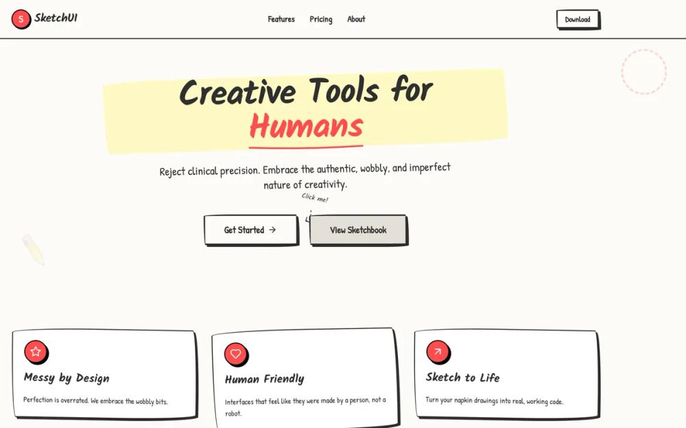 All Prompts
style
Sketch
Sketch: стилизуй UI под "нарисованный" вручную. Идеально для аутентичности и цифрового творчества.
by Zhou JasonLive Preview
Prompt
# Sketch

<design-system>

# Design Philosophy

The Hand-Drawn design style celebrates authentic imperfection and human touch in a digital world. It rejects the clinical precision of modern UI design in favor of organic, playful irregularity that evokes sketches on paper, sticky notes on a wall, and napkin diagrams from a brainstorming session.

**Core Principles:**

- **No Straight Lines**: Every border, shape, and container uses irregular border-radius values to create wobbly, hand-drawn edges that reject geometric perfection

- **Authentic Texture**: The design layer paper grain, dot patterns, and subtle background textures to simulate physical media (notebook paper, post-its, sketch pads)

- **Playful Rotation**: Elements are deliberately tilted using small rotation transforms (-2deg to 2deg) to break rigid grid alignment and create casual energy

- **Hard Offset Shadows**: Reject soft blur shadows entirely. Use solid, offset box-shadows (4px 4px 0px) to create a cut-paper, layered collage aesthetic

- **Handwritten Typography**: Use exclusively handwritten or marker-style fonts (Kalam, Patrick Hand) that feel human and approachable, never corporate or sterile

- **Scribbled Decoration**: Add visual flourishes like dashed lines, hand-drawn arrows, tape effects, thumbtacks, and irregular shapes to reinforce the sketched aesthetic

- **Limited Color Palette**: Stick to pencil blacks, paper whites, correction marker red, and post-it yellow for bold but cohesive simplicity

- **Intentional Messiness**: Embrace overlap, asymmetry, and visual "mistakes" that make the design feel spontaneous and creative rather than manufactured

**Emotional Intent:**

This style should feel approachable, creative, human-centered, and fun. It lowers barriers and invites interaction by appearing unfinished and work-in-progress, making users feel like collaborators rather than consumers. Perfect for creative tools, brainstorming platforms, educational content, or any product that wants to emphasize human creativity over corporate polish.

# Design Token System

## Colors (Single Palette - Light Mode)

- **Background**: `#fdfbf7` (Warm Paper)

- **Foreground**: `#2d2d2d` (Soft Pencil Black - never pure black)

- **Muted**: `#e5e0d8` (Old Paper / Erased Pencil)

- **Accent**: `#ff4d4d` (Red Correction Marker)

- **Border**: `#2d2d2d` (Pencil Lead)

- **Secondary Accent**: `#2d5da1` (Blue Ballpoint Pen)

## Typography

- **Headings**: `Kalam` (wght 700) - Looks like a thick felt-tip marker.

- **Body**: `Patrick Hand` (wght 400) - Legible but distinctly handwritten.

- **Scale**: Large and readable. Headings should vary in size dramatically to look like emphasized notes.

## Radius & Border

- **Wobbly Borders**: CRITICAL. Do NOT use standard `rounded-*` classes alone.

- **Technique**: Use inline `style={{ borderRadius: ... }}` with multiple values to create irregular organic ellipses.

- Example: `border-radius: 255px 15px 225px 15px / 15px 225px 15px 255px;`

- Store reusable radius values in config as `wobbly` and `wobblyMd`

- **Border Width**: Thick and variable. `border-2` is the minimum. Use `border-[3px]` or `border-4` for emphasis.

- **Style**: `border-solid` is default for most elements. Use `border-dashed` for secondary elements, dividers, and sketchy overlays.

## Shadows/Effects

- **Hard Offset Shadows**: No blur. Just a solid offset to create a cut-paper, layered collage aesthetic.

- Standard: `box-shadow: 4px 4px 0px 0px #2d2d2d;`

- Emphasized: `box-shadow: 8px 8px 0px 0px #2d2d2d;`

- Hover State: Reduce offset `2px 2px` or `6px 6px` to create "lifting" effect

- **Paper Texture**: Use `radial-gradient` dot pattern on body background to simulate notebook paper grain

- `backgroundImage: radial-gradient(#e5e0d8 1px, transparent 1px)`

- `backgroundSize: 24px 24px`

- **Subtle Animations**: Gentle bounce (3s duration) for decorative elements, rotation on hover for playful interaction

# Component Stylings

## Buttons

- **Shape**: Irregular wobbly oval using custom border-radius from config

- **Normal State**:

- White background, `border-[3px]` black border, black text

- Hard offset shadow: `shadow-[4px_4px_0px_0px_#2d2d2d]`

- Font: Patrick Hand (body font)

- **Hover State**:

- Background fills with Accent red `#ff4d4d`, text turns white

- Shadow reduces to `shadow-[2px_2px_0px_0px_#2d2d2d]`

- Subtle translate: `translate-x-[2px] translate-y-[2px]`

- **Active State**:

- Shadow disappears completely (button "presses flat")

- Translate increases: `translate-x-[4px] translate-y-[4px]`

- **Secondary Variant**: Uses muted background `#e5e0d8`, hovers to blue `#2d5da1`

## Cards/Containers

- **Base Style**: White background `#ffffff`) with wobbly black border `border-2`)

- **Border Radius**: Use `wobblyMd` radius from config for medium containers

- **Shadow**: Subtle `3px 3px 0px 0px rgba(45, 45, 45, 0.1)` for depth

- **Decoration Options**:

- `decoration="tape"`: Translucent gray bar positioned at top center with slight rotation

- `decoration="tack"`: Red circular thumbtack at top center

- No decoration for minimal aesthetic

- **Special Treatments**:

- Post-it yellow background `#fff9c4` for feature cards

- Speech bubble style for testimonials with geometric tail using border-based triangle

- Sticky-note tags for section labels

## Inputs

- **Style**: Full box with wobbly borders (not just underline)

- **Border**: `border-2` with wobbly radius matching button aesthetic

- **Font**: Patrick Hand (body font) for authentic hand-written feel

- **Background**: White with placeholder text in muted color `#2d2d2d/40`

- **Focus State**:

- Border changes to blue `#2d5da1`

- Ring effect: `ring-2 ring-[#2d5da1]/20`

- No standard outline, maintains wobbly aesthetic

# Layout Strategy

- **Grid System**: Use Tailwind's responsive grid `md:grid-cols-2`, `md:grid-cols-3`) but add visual irregularity

- **Rotation**: Apply small rotations `rotate-1`, `-rotate-2`) to cards, images, and decorative elements

- **Breaking Alignment**:

- Stats: Organic shapes with varied border-radius instead of perfect circles

- Cards: Slight rotation on hover `hover:rotate-1` or `hover:-rotate-1`)

- Pricing: Scale up highlighted card slightly on desktop `md:scale-105`)

- **Overlap & Layering**:

- Overlapping avatar circles with negative margin `-space-x-4`)

- Decorative elements positioned absolutely outside parent bounds

- Speech bubble tails extending beyond card borders

- **Whitespace**:

- Consistent section padding `py-20`) for rhythm

- Generous gap in grids `gap-8`) to prevent crowding

- Max-width containers `max-w-5xl`, `max-w-3xl`) for focused content

- **Z-Index Layering**: Decorative SVG backgrounds at low z-index, step numbers elevated with `z-10`

# Non-Genericness (Bold Choices)

**Unique Visual Signatures:**

- **NO STRAIGHT LINES**: Every container, button, card, and frame uses irregular border-radius values—never standard Tailwind rounded classes

- **Hand-Drawn SVG Decorations**:

- Arrow pointing to hero CTA with dashed path

- Squiggly connecting line between "How It Works" steps

- Corner frame marks on hero image placeholder

- **Authentic Paper Effects**:

- Tape strips (translucent gray rectangles) on feature cards

- Thumbtack pins (colored circles) for card decoration

- Dashed circle overlay highlighting popular pricing tier

- Speech bubble geometric tails on testimonials

- **Playful Typography Treatments**:

- Rotating exclamation mark in hero headline

- Wavy underline decoration on navigation links and footer headers

- Drop-cap first letter treatment in Product Detail section

- Post-it yellow sticky-note tag on Product Detail card

- **Scribbled Accents**:

- Bouncing decorative circle near hero image (desktop only)

- Dashed borders on secondary elements and dividers

- Emoji sketches in blog post placeholders

- Line-through hover effect on footer links

- **Interactive Personality**:

- Buttons "press flat" by eliminating shadow on active state

- Cards rotate slightly on hover

- Blog cards increase shadow offset on hover for "lift" effect

- Grayscale-to-color transition on blog images (removed in final implementation for simplicity)

# Effects & Animation

- **Hover**: "Jiggle" effect. `hover:rotate-1` or `hover:-rotate-2`.

- **Transition**: `transition-transform duration-100` (Fast and snappy).

# Spacing, Layout & Iconography

- **Max Width**: `max-w-5xl` (Keep it contained like a sketchbook).

- **Icons**: `lucide-react` icons with `stroke-width={2.5}` or `3`.

- **Icon Style**: Enclose key icons in rough circles.

# Responsive Strategy

**Mobile-First Approach:**

- **Typography Scaling**:

- Headings: `text-4xl md:text-5xl` or `text-5xl md:text-6xl`

- Body text: `text-lg md:text-xl` or `text-base md:text-xl`

- Buttons: `text-lg md:text-2xl`

- **Layout Stacking**:

- All grids collapse to single column on mobile, expand to 2-3 columns on `md:` breakpoint

- Hero switches from 2-column to stacked with `md:grid-cols-2`

- Stats: 2-column grid on mobile `grid-cols-2`), 4-column on desktop `md:grid-cols-4`)

- **Hide Decorative Elements**:

- Hand-drawn arrow near CTA: `hidden md:block`

- Bouncing decorative circle: `hidden md:block`

- Squiggly connecting line in "How It Works": `hidden md:block`

- Dashed circle on pricing card: `hidden md:block`

- **Maintain Core Aesthetic**:

- Keep wobbly borders and handwritten fonts on all screen sizes

- Reduce rotation slightly if needed `-rotate-1` instead of `-rotate-2`)

- Maintain hard offset shadows (never add blur)

- Preserve playful personality and irregular shapes

- **Touch-Friendly Targets**:

- Buttons use minimum `h-12` (48px) for accessibility

- Adequate spacing between interactive elements with `gap-8`

- **Spacing Adjustments**:

- Section padding remains `py-20` for vertical rhythm

- Reduce horizontal padding when needed: `px-6`

- Stats scale down: `h-24 w-24 md:h-32 md:w-32`

- Pricing cards: `p-6 md:p-8` for better mobile fit

</design-system>